Monday, January 31, 2011

Stuart Hawkins: Broken Welcome @Feuer

JTF (just the facts):
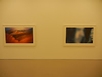
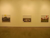
A total of 9 large scale color photographs, famed in white with no mats, and hung in the entry and main gallery spaces. All of the works are c-prints made in 2010, sized either 44x55 or 46x52, and printed in editions of 5. The show also includes one fiberglass sculpture (in the center of the main room) and one video (running roughly 10 minutes). (Installation shots at right.)

Comments/Context: Stuart Hawkins' playful photographs of an abandoned planned community near Rajarhat, India, explore the competing mix of aspirational optimism and empty failure that haunts unfinished developments all over the world. Starting with the rawness of exposed concrete slabs, vacant muddy lots, and unmanned cranes, she introduces an element of preschool dramatic play, where a yellow cardboard circle becomes the sun and four plastic brooms arranged in a square become a laundry room. Her staged scenes "finish" the unfinished buildings, bringing back a sense of the hopeful anticipation that had been lost when the workers walked away.
.
Hawkins' cheerful humor softens the blow of her satire: a jaunty paper mailbox with a bright red flag sits on a pole above some muddy ruts, a white picket fence painted on brown paper is held up in front of an ugly corrugated tin barrier, and sunny houses on cardboard are held up alongside a weedy highway recolonized by local cows. She tells idealistic stories, based on light-hearted and unpretentious dreams of a better future. The sculpture in the center of the gallery reinforces the imperfect reality: a massive carved stone with the word WELCOME prominently engraved, deeply cracked right down the middle with a white ribbon holding the pieces together. There is a palpable feeling of failed delusional expansion, dashed hopes, and leftover wreckage.

In a sea of photography of boarded-up houses, unbuilt foundations, and forlorn empty streets, her works come back to the commonality of human striving for something more. They remind us of how powerful the dream of a picture window with curtains can really be, and how quickly that magic can disappear into the nothingness of construction debris.
.
Collector's POV: The photographs in this show are priced at $7500 each. Hawkins' work has not yet appeared in the secondary markets, so gallery retail is likely the only option for interested collectors at this point.
.
My favorite image in this show was Rooftop Garden, 2010; it's the image on the right in the bottom installation shot. I like the way the simple green circles and triangles are placed on the unfinished exposed rebar poles and transformed into imaginary potted topiaries and carefully pruned evergreens.

Rating: * (one star) GOOD (rating system described here)

Transit Hub:
  • Feature: Art in America (here)
  • Review: NY Times, 2006 (here)
Through February 19th

Zach Feuer Gallery
528 West 22nd Street
New York, NY 10011

Friday, January 28, 2011

Photography at the VIP Art Fair

Before I get too far into my comments on my personal experience at the VIP Art Fair (here), I want to go on the record and say that I think this kind of endeavor is something that makes complete sense and should be welcomed and embraced by collectors. As a group, we're perfectly used to seeing thumbnail sized works in auction catalogs and gallery emails, and expanding that communication method to a smoother computer-based interface for an art fair experience is entirely logical. It was only a matter of time before someone aggregated the critical mass of the world's best contemporary art galleries into this kind of online venture, and I look forward to seeing this kind of venue evolve and succeed in the future.

I've actually been busy traveling this week, so I only had a brief moment to check into the site on Tuesday. I visited a gallery or two, saw the interface of images on virtual walls, thought it looked fine, and decided to come back later when I had more time to browse around. That free time didn't actually materialize until Thursday afternoon, when I again logged in and hoped to dig around. I'm deeply sorry to report that this visit was an unfortunate bust. For better or worse, I am a PC user, with Internet Explorer as my browser. Apparently some time between Tuesday and Thursday, it was determined that Internet Explorer was not going to be supported anymore, and so when I logged in, I was urged to download an alternate browser. Having no time or inclination to do this, I went ahead anyway, knowing that this wasn't likely to be successful, and found that I was now unable to access any of the booths. I clicked through to Pace/MacGill for example, it seemed to load, and then gave me nothing but a grey screen - no silhouetted man, no artworks on the white wall, nothing. This was true for every single gallery in the entire fair, which was discouraging.

The only way I could see any images at all was to use the search capability. So I filtered for "Photograph" and was given a series of lists not dissimilar from an online auction catalog: thumbnail image, title, date, other details, and the gallery name. When I clicked through to see a larger image, I was sent to the gallery booth, which was of course, as I've already explained, a grey void. And although I had paid for the VIP privilege of seeing prices, I couldn't actually get any specific prices (since they were in the booths I assume); all I could do was sort the lists by price buckets (i.e. $100K - $250K). Any normal person would now have given up in exasperation or gone back and downloaded an alternate browser as instructed, but I persevered a bit longer to try and get a cursory handle on what photography was on offer, regardless of the failures of the interface I was using.

The show itself is divided into four sections: Premier Large, Premier Medium, Focus, and Emerging. I was able to use the sorting capabilities to determine that there were the following number of photographs on offer in each section:

Premier Large: 206 (out of 1017 total works available)
Premier Medium: 76/472
Focus: 65/169
Emerging: 38/214

Add that up and take a percentage and you'll find that a solid 20.57% of the fair was photography.

The pricing system cut the works into 9 buckets. I've tallied the number of photographic works in each bucket across the four gallery sections and placed those numbers in parentheses:

$1 million + (0)
$500K to $1 million (3)
$250K to $500K (15)
$100K to $250K (33)
$50K to $100K (58)
$25K to $50K (88)
$10K to $25K (108)
$5K to $10K (86)
$0 to $5K (18)

Statistical minded folks will realize that these numbers don't add up to the same total as the ones in the section above, diced by gallery section. I have no idea why the system doesn't true up; my guess is that somewhere the totals got hard coded and then the galleries switched in new pieces as the fair progressed, misaligning the totals.

Since there were so few high end lots, I've decided to outline them in summary here, in order by artist's name, with their gallery locations:

$500K to $1 million

1 Gursky @Spruth Magers
1 Gursky @Gagosian
1 Prince @Gladstone

$250K to $500K

1 Abramovic @Kelly
1 Arbus @Pace/MacGill
1 Rodney Graham @Donald Young
1 Nixon (Brown sisters) @Pace/MacGill
1 Penn (cigarette) @Fraenkel
1 Prince @Sadie Coles
1 Sherman @Metro
1 Sherman @Spruth Magers
1 Sugimoto (theater) @Fraenkel
1 Sugimoto (theater) @Koyanagi
1 Sugimoto (theater) @Pace
1 Sugimoto (seascape) @Pace
1 Sugimoto (drive-in) @Pace/MacGill
1 Wall @Marian Goodman

$100K to $250K

1 Abramovic @Lia Rumma
1 Aitken @Eva Pressenhuber
1 Avedon (American West) @Fraenkel
1 Avedon (Francis Bacon) @Pace/MacGill
1 Matthew Barney @Gladstone
1 Hai Bo @Pace/MacGill
1 Bochner @Fraenkel
1 Close @Pace/MacGill
1 Crewdson @Luhring Augustine
1 Demand @Spruth Magers
1 Eliasson @i8
1 Frank @Pace/MacGill
1 Gilbert & George @Bernier Eliades
3 Rodney Graham @Donald Young
1 Horn @Hauser & Wirth
1 Isaac Julien @Victoria Miro
1 Rafael Lozano-Hemmer @OMR
1 Maier-Aichen @Gagosian
1 Mapplethorpe (calla) @Xavier Hufkens
1 Mikhailov @Pace/MacGill
1 Neshat @ Gladstone
1 Roman Opalka @Yvon Lambert
1 Ruff @Lia Rumma
3 Ruff @Mai 36
1 Ruff (substrat) @Zwirner
1 Struth @Hyundai
1 Struth @Marian Goodman
1 Hank Willis Thomas @Shainman
1 Hannah Wilke @Alison Jacques

In general, while many of the major contemporary art galleries were represented here, only three photography specialist galleries were in attendance that I could see: Pace/MacGill, Fraenkel, and Yancey Richardson.

So I'm afraid this is all the information I can provide, given my limited visit to the fair. As a result, my takeaways on the VIP Art Fair are more in the vain of "what might have been". The concept seems entirely valid and workable, especially for photography, and the brief glimpse I saw of the full interface earlier in the week gave me hope that such a model could work effectively; with roughly 400+ lots of photography on offer, it's the semi-equivalent of one extra large, high end auction catalog. The execution this first time was more than a bit spotty, but I hope this doesn't deter the organizers from improving the glitches for next year. As collectors, we're absolutely ready for such an online fair, if the backend mechanics can run more smoothly.

Thursday, January 27, 2011

Thoughts on Atomization

This past weekend, I found myself sitting at a post opening dinner, engaging in a wide ranging discussion with a handful of the artists who were included in the show. The conversation turned to the idea of influences, where artists of the past and present were related to the contemporary work that these artists were producing. The discussion went down the tangent of whether these artists would agree that they might be "children of Agnes Martin" (this was a drawings group show). What came next was a whole raft of caveats and conditions: her ideas had been internalized, reformulated, synthesized, and turned into something entirely new and original by these artists, so tying back to Martin might or might not be entirely relevant. I have come to think of this as the "atomization" argument for contemporary art: there are no longer any important patterns, everything is individually different, the concept that certain artists might naturally cluster into movements (or -isms), groups, connections or shared ideas is either passe or mildly insulting. To me, it's a conversation killer; there's no answer to complete randomness.

On one hand, I entirely support the idea of celebrating the raw creativity of artists of all kinds and seeing their work as something that stands alone as a representation of the voice of a single individual. But in our hyper-connected world, I find the idea that there are no patterns or influences to be unsatisfying. We constantly complain that the art world is an echo chamber where everyone is talking to each other and themselves inside this small bubble. How can it be that when taken at a summary level, all of contemporary art is just chaos? To me this is a defeatist attitude; the problem seems too hard to solve, so we give up and conclude that there is no solution.

I think the main challenge is that the sheer number of accomplished artists/photographers has grown exponentially over the past few decades; there are just so many more people finding their way into the gallery and museum worlds that trying to track them all has become an overwhelming task. Critics and scholars used to have manageable numbers of artists to try and categorize and sift into buckets. 50 or 75 years ago, it wasn't impossible to group 10 or 15 artists from New York into one group and 10 or 15 others from Paris into another based on stylistic characteristics or conceptual theories; with a vast increase in the number of artists at work, this kind of sifting by hand has become incredibly complex.

I've started to think that the critical analysis of trends in art has really become a new kind of data analysis problem, and one that can really only be tackled with the help of computers. While I am a true believer in patterns and influences, I am increasingly skeptical of the ability of any one critic, curator or scholar to impose his or her own framework onto this large data set. Such a process is inherently biased by those data points (artists in this case) that are most easily recalled or known; it just isn't statistically valid in any way, and is prone to both flaws of logic and flights of arrogance.

I'd like to believe that instead of trying to dictate a set of frameworks in a top down manner that we could derive actual patterns by looking at the data from the bottom up. So follow this thought experiment for a moment. Let's start with the goal of making sense of the past 10 years of contemporary photography, the period from 2000 to 2009.

As a jumping off point, I think we would need to select the top 100 most influential contemporary photographers alive and working at that time. My guess is that we might be able to agree on the top 60 or 70 without much fuss, and then it would get a little tougher to choose who's in and who's out, but let's assume for the moment that we could pick 100 to start, and that we could layer in more later as necessary. For each photographer, we would then need to map his or her work across the ten year period, laying out important individual pictures and larger series or projects into discrete years, i.e. Project A ran from 2001 through 2003, Project B was in 2004, Project C got started in 2004 and continued through 2008, Important Picture 1 was made in 2002, Important Picture 2 was made in 2007 etc. We would then be able to slice through the data set in year 2002 for example (like a core sample) and see what each of the 100 was doing at that particular moment.

With this as the basic backdrop, we could then layer in a variety of other influence points, specifically the publication of a photobook/monograph or a museum exhibition or gallery show, where other artists may have been exposed to the work. There will of course be time delays between the making of a picture and its showing up in one of these forms, but this can be accounted for - the influence is just delayed a bit. We could also add in details of geography, schools attended/teachers, or even social network connections of close friends and colleagues. Conceivably, specifics of subject matter, technical process or genre (still life, portraiture, landscape etc.) might also be tallied, and major external events (like September 11th or the economic crisis) could be introduced.

So now imagine we have this deep database of the top 100 photographers and all these discrete data points about what was going on in the past decade. While the data visualization problem is indeed tricky (Edward Tufte here we come), I'd like to believe that lots of connections and patterns would start to emerge from this data, and that these conclusions would be more inherently valid than my personal opinion about which photographers should be grouped together. I'm not saying there is a "right" answer exactly, only that such a process might yield some insights that we have heretofore been unable to discern due to the immense size of the data analysis problem. Once the scaffolding is put in place, there really isn't any reason that the next 100 or next 500 photographers on the list couldn't be added in, it's just a question of effort and information gathering. We might also layer in connections to earlier photographers or artists in other media (children of Diane Arbus or Walker Evans for example), if the photographers themselves went on the record that these were real influences (rather than implied by critics or scholars).

Of course, this straw man idea has flaws, and I'm sure you'll highlight them in the comments. But even if this particular structure doesn't quite work, seems too "computerish", or would likely be too unruly or impractical, I remain unwilling to accept "atomization" as the natural state of contemporary photography (or contemporary art) on a going forward basis. We need better solutions than one brain coming up with a magic map of the artistic landscape; if we wait for this, we may never get a coherent analysis. And I'm not ready to throw up my hands and give into to the absence of patterns. There must be a better way, and I for one think it will come from a radically different approach to analyzing the data.

Wednesday, January 26, 2011

Ray K. Metzker: Intimations @Laurence Miller

JTF (just the facts): A total of 45 black and white works, variously framed in black and white and matted, and hung in the entry space and main gallery area. 22 of the images are sized 8x10 and were taken between 1956 and 1981; these prints are a mix of primarily vintage and a few later prints, in varying edition sizes (unique, 2, 3, 5, 6, 10, 25). Another 8 of the images are printed slightly larger at 11x14, spanning the years 1964-1983; these are printed in editions of 3, 5, 20, 25, or 30. There are 6 composite works in the show, each with a date when the images were taken and another when they were assembled; the works on display come from 1964/1964, 1965/2002, 1964/2006 (2), 1963/2006, and 1965/2006. Most are unique, although one was made in an edition of 3; outside dimensions for these works range from 15x18 to 31x22. Finally, there are a group of 9 images each 16x20 from 1981-2004; they are printed in editions of 6, 10 or 25. (Installation shots at right.)

Comments/Context: Congratulations for staying power and long term commitment are probably in order for Ray Metzker and Laurence Miller, who are partnering for an astounding 20th solo show at the gallery. This particular exhibit includes a dense sampler of images from Metzker's recent European retrospective Light Lines, which originated at the Musée de l'Elysée, Lausanne, in 2007, and traveled to a few additional locations.
.
I've previously written plenty of times (see the links below) about Metzker's mastery of light and dark, the power of his blacks, his expert use of contrast, and the craftsmanship of his prints, so I won't rehash many of those same arguments and celebrations again here. What we have in this show is really "a little of this, a little of that": a few early urban images from Chicago, a couple of pictures from 1960s Europe, a few more from 1960s Philadelphia, a handful of composites and double frames, a few beach scenes, some 1970s New Mexico images, a Pictus Interruptus or two, some 1980s city scenes, and a handful of more recent landscapes and Philadelphia shots. As such, the exhibit steps back away from any particular project, and gives a more 50,000 foot view of the evolution of Metzker's photographic approach, highlighting both recurring themes (city sidewalks, solitary figures, shadows, multiple images) and new directions in appetizer-sized bites.
.
Apart from a few newly composed composites of repeated figures against deep black backgrounds, I'm not sure there is much here that will be haltingly new for experienced Metzker supporters; there are just wasn't enough space in this small gallery to give each of these separate bodies of work room to breathe. But this in no way diminishes the consistent quality of the work on view or the richness and variety of Metzker's meticulous graphic control. There is roughly 50 years of innovative monochrome experimentation on these walls, a succinct summary of the development of a striking and underappreciated photographic vocabulary.
.
Collector's POV: The prices for the works in this show are as follows. The 8x10s range in price from $6000 all the way to $55000, with many intermediate prices along the way. The 11x14s fall between $7500 and $35000, and the 16x20s range from $5000 to $12000. The composites are available between $35000 and $50000.
.
Metzker's work was much more available in the secondary markets in 2010 than in most recent years. Prices ranged between $1000 and $10000. The most recent composite to be found at auction sold for $22500 in 2009.
.
My favorite image in this show was the multiple exposure building abstraction, Chicago Loop, 1957; it's the image on the far right in the second installation shot. While we would certainly enjoy having a composite in our collection, the slashing lines of this early city scene would fit well with other images we already own.
.
Rating: * (one star) GOOD (rating system described here)
.
Transit Hub:
  • Review: New Yorker (here)
  • Exhibit: The Photographs of Ray K. Metzker @Nelson-Atkins Museum of Art, 2011 (here)
  • Past Gallery Shows: AutoMagic (review here), Wanderings (review here)
  • Book: Light Lines (review here)
Through February 26th

20 West 57th Street
New York, NY 10019

Tuesday, January 25, 2011

Book: Steve Martin, An Object of Beauty

JTF (just the facts): Published in 2010 by Grand Central Publishing (here). 304 pages, with 22 reproductions of artworks. (Cover shot at right, via Amazon.)

Comments/Context: Even though I knew Steve Martin's new novel had nothing to do with photography in particular, I couldn't help picking it up to see how he would take on collecting and the larger world of contemporary art. In general, my expectations and standards for art world fiction are exceedingly low; I've breezed my way through plenty of marginal stories of heists, forgeries, and intrigues over the years, happy to consume and discard them as the disposable entertainment that they are. The difference here is that Martin is himself an art collector, and so has almost certainly lived variations on many of the vignettes that pepper his story. As a result, when he opens up his biting wit, he is able to aim it with exacting precision, slicing the soft underbelly of auction houses, galleries, and fellow collectors with sparkling, almost gleeful flair.

The skeleton of the story is perfectly logical and predictable: a young woman (Lacey Yeager) starts as a junior cataloguer at Sotheby's, works her way up into the American Paintings department, leaves to become a director at an uptown gallery, and eventually opens her own gallery in Chelsea. Martin then takes this simple framework and embellishes it with a combination of insightful insider commentary (museum visits, individual painting explications, market analysis, and smart collector-driven thoughts) and a smorgasbord of art world scheming (bid rigging, dealer arbitrage, back room deals with museums, FBI investigations, various flavors of deception, and a pervasive streak of ambitious sexuality), hanging it on a chronological timeline that includes both the exuberant booms and the punishing busts of the past decade. It's all held together by the singular personality of his heroine, whose appetite for success is both insatiable and often reckless. Her driving aspirations lead her down plenty of opportunistic alleys, and while her triumphs cover her failures in the short term, in the end, she makes some poor choices that ultimately leave her in disgrace.

I found the ending of the book to be surprisingly depressing. This is particularly odd, since this novel is bursting with so many snappy one-liner comebacks and salty dialogue snippets that you'd expect to come away with a wry smile and a hearty chuckle (his disemboweling of a pair of clueless collectors and their Joseph Beuys felt suit is joyfully withering). And not that Lacey didn't deserve her eventual comeuppance; she did, that's clear. But when you close the cover on this story, it leaves you with a sad, deflated feel, as if all the machinations came to nothing, as if the whole art world was just a sham. As a collector who still finds moments of amazement every time I make a gallery tour, I found this conclusion to be overly jaded and pessimistic. Sure, the art market has its ridiculousness and its human imperfections, but I still believe that the art itself turns all of that nonsense into noise.

That said, this is a light and diverting satire, with plenty of juicy descriptive tidbits and moments of blinding repartee. Enjoy it for its sharp sarcastic humor, and watch with pleasure as Martin shrewdly cuts the workings of the art market to shreds.

Transit Hub:

  • Reviews: NY Times (here), Washington Post (here), Huffington Post (here), Salon (here)

Monday, January 24, 2011

Eve Sonneman: Sight/Sound @Haime

JTF (just the facts): A total of 8 color works, framed in white and matted, and hung in the small front room space. All of the works are diptychs, printed on Cibachrome paper, with titles in pencil on the mat. Each work is 20x30 framed, printed in editions of 10. The images were made between 1976 and 1980. (Installation shots at right.)

Comments/Context: This small show is a reprise of the late 1970s Sonneman images that were on view in the Starburst show last year at Princeton (review here), with a couple of additions/replacements.
.
Each work is a pairing of two images, taken just moments apart and often from slightly different angles, like two adjacent frames from a contact sheet or a film strip. At the time, the use of color and the more cinematic approach were both quite radical; they opened up new avenues for the definition of photographic narrative, adding the elements of elapsed time and alternate perspective. A crop duster flies over a field of brown stubble, goldfish in bowls sit in a sidewalk display, tourists take pictures from the top of the World Trade Center, and an artful selection of items sits on a red blanket on a rocky beach; in each case, we start with one view and then are given a second, which subtly changes our perception of what was really going on in the first place.

In seeing these images again, I came away most interested by the technique of time-delayed pairings, more so than by any specific example on display. It seems to me that this seemingly simple innovation has surprisingly powerful resonance and continued relevance, even 30+ years later.

Collector's POV: The works in this show are priced at $25000 each. Sonneman's work is not readily available on the secondary markets, so gallery retail is likely the only option for interested collectors at this point.
My favorite image in the show was Newspaper, New York, 1980; it's the middle picture in the top installation shot. I like the interplay of the all-over shadows, and the movement of the blown newspaper across the frame.
.
Rating: * (one star) GOOD (rating system described here)

Transit Hub:
Through January 29th

Nohra Haime Gallery
730 Fifth Avenue
New York, NY 10019

Friday, January 21, 2011

McDermott & McGough: Of Beauty and Being @Cheim & Read

JTF (just the facts): A total of 19 color works, framed in brown wood and matted, and displayed in the larger main gallery space, divided by a single wall. All of the works were made using the tricolor carbon ("carbro") printing process and were made in 2010 (although they are "dated" 1955 in their individual titles). The prints generally range in size from 30x18 to 30x25 (or reverse), with one image at 26x26; all are available in editions of 7. (Installation shots at right.)

Comments/Context: McDermott & McGough have made a photographic career out of reviving antique processes and using them to make modern images in a variety of historically accurate styles. Over the years, they've successfully recreated salt, gum, palladium and cyanotype prints (among others), and firmly entrenched themselves in an anachronistic 19th century lifestyle. The pair's newest body of work fast forwards them into the 20th century (smack into the middle of the 1950s via the exuberant color of the carbro process), and provides the perfect jolt of energy for these slushy, cold winter days.
.
In many ways, this is pitch perfect art about art. The works on view reference and reinterpret 1950s commercial advertising and fashion photography (via vibrant magazine covers and pin-up nudes) and deeply mine the aesthetic of Paul Outerbridge (particularly the staged still lifes). They also make passing references to a parade of photographic stars, from Steichen and Penn, to Man Ray and Blumenfeld, even appropriating and restaging Roy Lichtenstein. A walk through the gallery is one witty insider joke after another, all executed in ebullient saturated color; bright red nail polish and electric green palm leaves never looked so good. The work is outlandish and glamorous, garish and showy, nostalgic and strikingly fresh.

These images are a terrific reminder of the pure unadulterated joy to be found in the carbro process; the colors are so blindingly crisp and bright, it's hard not to be seduced by their incandescent charms. If this show doesn't put a smile on your face, you'd better check your pulse.

Collector's POV: Each of the works in this show is priced in an upward ratcheting edition, beginning at $6000, continuing upward through $8000, and ending at $12000. While McDermott & McGough have been making their images for years, very few of these works have entered the secondary markets. As such, gallery retail is likely the only option for interested collectors at this point.

While there were plenty of terrific images in this show, if I was forced to choose just one, I would likely pick the nude, A Woman Alone, 1955, 2010, for its swirling, radiant mix of pink and blue (with a nod to Blumenfeld); it's second from the right in the top installation shot, and is reproduced on thick cardstock as a gallery announcement.

Rating: ** (two stars) VERY GOOD (rating system described here)
.
Transit Hub:
  • Review: New Yorker (here)
  • Feature: Art in America, 2010 (here)
  • Exhibit: An Experience of Amusing Chemistry @IMMA, 2008 (here)
Through February 12th
.
547 West 25th Street
New York, NY 10001

Thursday, January 20, 2011

David Allee: Dark Day @Morgan Lehman

JTF (just the facts): A total of 9 color photographs, framed in black and not matted, and hung in the single room gallery space. All of the works are chromogenic prints taken in 2010. Each of the works comes in a smaller size (30x40 or 30x45, in editions of 7) and a larger size (40x60 or 60x80, in editions of 3). (Installation shots at right.)

Comments/Context: David Allee's newest images are built on a relatively simple technical premise: select a subject with an overdose of blindingly bright glare, and then make a significantly underexposed photograph, where the camera only captures a very small percentage of the available light. The result is a gathering of images that are largely dark, with highlights and details that emerge from the engulfing blackness.

Most of the pictures here are architectural studies of abstracted glass and steel, where the windows have become opaque and the light catches the graph paper geometries of the structural framing. In others, a wooden boardwalk is punctuated by straight lines of glimmering round screw heads and a subway train shines and glistens in a soup of utter darkness. While not every image on view is durably memorable, the process-driven idea underneath the pictures and the unreal view of the world it generates are worth a quick look.

Collector's POV: The works in this show are priced as follows. The smaller 30x40 and 30x45 prints are $4200 each, while the larger prints are either $5900 (40x60) or $8600 (60x80). Allee's work has not yet reached the secondary markets, so gallery retail is likely the only option for interested collectors at this point.

My favorite image in the show was 12:40 pm, Wishing Well, 2010; it's the picture on the right in the top installation shot. I like the way the light (both the shimmering glare off the surface of the water and the glints of the coins underneath) is turned into a constellation of blurred pinpricks.

Rating: * (one star) GOOD (rating system described here)

Transit Hub:
Through February 19th

Morgan Lehman Gallery
535 West 22nd Street
New York, NY 10011

Wednesday, January 19, 2011

Sam Samore: The Dark Suspicion @D'Amelio Terras

JTF (just the facts): A total of 7 large scale color photographs, framed in white and not matted, and hung in the main gallery space. All of the works are archival ink prints on rag paper taken in 2011, each 34x60 or reverse, in editions of 2+1AP. (Installation shots at right.)

Comments/Context: We've all heard the metaphor of the multiple faces that each of us has, the masks we wear in different situations, or the many facets of personality that are contained in one single person. Sam Samore's new photographs try to capture this subtle multiplicity via impressionistic images of women's faces, piled on top of each other in intersecting planes.
.
The fragmenting that Samore employs is almost Cubist in its approach: faces are seen from multiple angles and distances, mixing near and far, profile and frontal, all at the same time; most are covered in washes of soft painterly color and dominated by enlarged grainy close-ups. These multiple partial images create a sense of fleeting cinematic motion, of wisps of personality flashing and disappearing. In the best of the works, the many faces seem to coalesce into one, multi-dimensional portrait; in others, the faces separate into a kind of disconnected intertwined chaos. A few of the pictures effectively employ the 1980s Robert Palmer whitewash and red lipstick look for a heightened sense of unreal contrast.

In the end, these images don't depict anyone in specific, but a kind of dreamworld woman, caught in a series of psychological iterations and multi-step fantasies. As such, they seem ephemeral, a momentary glimpse of a variety of female roles and personalities, collapsed into one.

Collector's POV: The prints in this show are priced at $22000 each. Samore's works have been available in the secondary markets from time to time, with recent sales coming between $4000 and $16000.

My favorite image in the show was The Dark Suspicion #1, 2011; it's the horizontal image on the right in the middle installation shot. I like the way the overlapping faces are shown at three different distances, creating a multi-layered composition of echoes.

Rating: * (one star) GOOD (rating system described here)
.
Transit Hub:
  • Exhibit: The Suicidist @MoMA PS1, 2006 (here)
Through February 19th
.
525 West 22nd Street
New York, NY 10011

Tuesday, January 18, 2011

Todd Hido: Fragmented Narratives @Silverstein

JTF (just the facts): A total of 28 color images, framed in black with no mat, and hung in the entry area, front room, and main gallery spaces. The chromogenic prints come in three sizes (or reverse): 20x24 (in editions of 10+3AP), 30x38 (in editions of 5+1AP) and 38x48 (in editions of 3+1AP). The images were taken between 1995 and 2010. (Installation shots at right.)

Comments/Context: Todd Hido's new show is in many ways a mini-retrospective: it takes a handful of fresh new images and mixes them together with selections from a variety of older projects, going back to the mid 1990s. What is special here is that instead of being displayed in traditional chronological order, the pictures have been sequenced and sifted into clusters and groups, creating enigmatic, unknowable narratives from combinations and juxtapositions of misty wet landscapes, quiet interiors, shadowy female nudes, and night lit houses.

Hido's careful recontextualization of his work links single images into implied settings and cinematic stories, where a trailer, a barren road, and an austere nude can come together to create a lonely, introspective atmosphere. A similar combination of nocturnal houses with glowing windows, a vacant room or two, and a vulnerable, expressionless woman are woven into somber, open-ended suburban vignettes, where the viewer provides both the connections and the ultimate meaning.

Taken together, the works go beyond documentation of dreary physical surroundings to map deeper layers of emotional and psychological terrain, where snowy tracks, a crumpled pillow, and an unguarded pose are the clues to a personal mystery. While many of the images can stand well enough on their own as individual narrative threads, I was struck by how powerful and resonant they became when they were knit into a fabric. What is evident from this show is that Hido's projects from the past decade are all infused with a common underlying spirit, and that each distinct subject matter genre provides a different entry point into the larger tonal environment he is so tenderly exploring.

Collector's POV: The prices for Hido's work have inched up slightly since his last gallery show here in 2009. As a reminder, the prints come in three sizes, with new prices: $3650 for the 20x24 works, $6000 for the 30x38 works, and $9200, $9800, 0r $11800 for the 38x48 works. Examples of Hido's work have become more common at auction in recent years, finding buyers between $2000 and $24000.
.
There were actually several images in this show that I liked quite a bit. If forced to choose, I would likely select the empty blue bedroom (#3878, second from right in the third installation shot from the top), for its rich muted palette and its melancholy mood.
.
Rating: ** (two stars) VERY GOOD (rating system described here)
.
Transit Hub:
  • Artist site (here)
  • A Road Divided @Silverstein, 2009 (DLK COLLECTION review here)
Through February 12th
.
Bruce Silverstein Gallery
535 West 24th Street
New York, NY 10011

Monday, January 17, 2011

Richard Misrach: Graecism Portfolio @Richardson

JTF (just the facts): A total of 6 color photographs, framed in white and matted, and hung in the small Project Gallery in the back. All of the prints are vintage dye transfer prints, each roughly 16x20, drawn from a portfolio of 12 images that was published by Grapestake Gallery in an edition of 25. The images were taken between 1978 and 1981. This exhibit supports a larger show of Mars scenes by Kahn & Selesnick on view in the main gallery. (Installation shots at right.)

Comments/Context: Richard Misrach's Graecism portfolio chronologically falls between his flash lit nighttime Hawaiian jungles and his Desert Cantos. Stylistically, the works follow in the footsteps of the jungle pictures, using a similar strobe lighting/long exposure technique to add bright light to the foreground of otherwise dark outdoor scenes, but in this case, his subjects are the ruins of Greece and Rome: temples, columns, and weathered fallen stone.

The ideas I found exciting in the Hawaiian landscapes (their departure from traditional rules of landscape) can also be seen in some of these architectural pictures. Instead of taking the obvious postcard views in the serenity of the sunset/twilight, Misrach has broken up the picture plane with columns that have been bleached white by the flash, making them jump out of the surrounding and encroaching shadows. Another image documents the nothingness of a bare dirt patio looking out into blackness. For the most part, he resists the temptation to do what has been done before by tourists across the ages, and instead explores the unexpected and often jarring contrasts of color and light introduced by the strobe.

Prior to seeing this show, I hadn't ever encountered images from this project, so this small exhibit provided a nice gap filler for my understanding of Misrach's history.

Collector's POV: The six images in this show are being sold separately (rather than as a portfolio), each at $5000. Misrach is officially represented in New York by Pace/MacGill Gallery (here) and in San Francisco by Fraenkel Gallery (here). Misrach's works are generally available in the secondary markets, especially his desert images; these have typically ranged from $2000 to $12000, with a few outliers even higher. His newer works of more significant size have also begun to enter the auction markets; these have generally ranged between $40000 and $80000.
.
My favorite image in the show was Athena, Nike (column), 1979; it's the image on the far right in the bottom installation shot. I like the way the brightly lit column cuts directly through the center of the frame, breaking up the view of the temple in the background.
.
Rating: * (one star) GOOD (rating system described here)

Transit Hub:
  • Recent 2010 show @PaceWildenstein (DLK COLLECTION review here)
Richard Misrach: Graecism Portfolio
Through February 19th

535 West 22nd Street
New York, NY 10011

Friday, January 14, 2011

Deborah Luster, Tooth For An Eye @Shainman

JTF (just the facts): A total of 35 individual black and white works, along with 1 diptych, 1 pair of videos, and 1 table and cabinet installation, displayed in the entry gallery and the main divided space in the back. All of the photographs are toned gelatin silver prints mounted on Dibond, made between 2008 and 2010. 30 of the images are sized 24x30, and come in editions of 3+1. 5 of the images are printed larger, either 49x61 (in editions of 2+1) or 55x55 (in editions of 1+1); the diptych is a pair of 49x61 prints (in an edition of 2+1). A pair of videos run on iPads with cast aluminum frames, in an edition of 5+1. The table and cabinet installation includes 6 bound ledgers, with three of the ledgers open and on display; these books include smaller prints from the same series. A monograph of this body of work is forthcoming from Twin Palms (here). (Installation shots at right.).
.
Comments/Context: I first encountered the work of Deborah Luster a few years ago in connection with her massive portraiture project documenting inmates in Louisiana's prisons. Part of what resonated most strongly with those images was the sense that photographs could be used to ward off forgetting, to ensure that individuals who were invisible were somehow remembered. This same sense of elusive and disappearing history is at the heart of Luster's newest pictures, which capture locations in New Orleans where violent homicides have taken place.

Luster's round black and white images create the impression of looking through a keyhole, where a small degree of curvature and distortion surrounds the central location. The pictures are a taxonomy of overlooked non-places: grimy sidewalks, overgrown alleys, empty street corners, abandoned buildings, quiet train tracks and graffiti covered passageways. Both lacking in people and any visible evidence which could be used to pinpoint the spot of the crimes (chalk circles, blood stains or the like), it is impossible to actually see what happened in these specific locations; the violence has long disappeared from view (whether recent or decades past), and yet it lingers over the grey scenes like a heavy cloud. Notes chronicle the spectrum of horrors, often with multiple incidents occurring at the same site: drive by shooting, stabbing, found in a ditch, shot in the head, beaten with baseball bat, wrapped in a carpet and shot, run over.

Luster's investigation of the nature of memory as applied to a place recalls work as diverse as Angela Strassheim's black light crime scene interiors, Mark Klett's rephotography and Sally Mann's corpses, where places and objects provide clues to a forgotten history, where time has eroded part of the narrative but left remnants behind for viewers to use to imagine both the past and future. Luster's images in particular ask questions about the downstream reverberations of violence, and about how the cycle of homicides and victims can be broken. In her works, a forgettable garbage area or a motel balcony has been infused with the concealed imprint of a remembered incident; how or whether these places can escape their history and begin again is unknown.

I think this work displays an unusual inversion of strength, where the backstory and conceptual framework is much stronger than the individual images themselves would be on their own; often the deserted sidewalk or vacant lot is just that, framed in a formal, documentary manner, and made whole by the knowledge of the murder that is conspicuously absent. As such, I think these photographs will work best in book form, where the relentless piling on of location after location that will come with the flipping of the pages will help to reinforce the scale and immensity of the invisible history; a single image, separated from this larger narrative will likely be somewhat less powerful, especially to those who blow by the wall text and don't understand what the scene represents. That said, Luster's project is a thorough and mature investigation of a complicated and ultimately unphotographable subject - the effects of painful human memory on a weary and indifferent landscape of concrete and brick.

Collector's POV: The works in this show are priced as follows. The smaller 24x30 prints are $5000 each, while the larger prints are either $14000 (46x61) or $16000 (55x55). The photographic diptych is $25000, while the pair of videos is $12000. The table/cabinet installation is $85000. Luster's work has little or no auction history, so gallery retail is likely the only option for interested collectors at this point.

My favorite image in the exhibit was Tooth For An Eye, Ledger 03-04, Location: 1100 Block North Prieur, Date(s): Feb 27, 2007, Name(s) Herbert Preston (19), Notes: Recently returned Katrina evacuee. Gunshots to head and body. 2008-2010. It's the image on the left in the group of three below. I liked the interwoven geometries of the plywood boards, the awnings, and the paint dripped stairs.
.
Rating: * (one star) GOOD (rating system described here)

Transit Hub:
  • Review: Times-Picayune (here)
  • One Big Self: Prison Photography (here)
Through February 5th

513 West 20th Street
New York, NY 10011

Thursday, January 13, 2011

Paul McDonough, New York City, 1973-1978 @Wolf

JTF (just the facts): A total of 21 black and white photographs, framed in silver and matted, and hung in the single room gallery space. All of the prints are modern gelatin silver prints, made from negatives taken between 1973 and 1978. 20 of the prints on view are 16x20, available in editions of 15; there is a single larger print over the reception desk (30x40), in an edition of 7. A monograph of this body of work has recently been published by Umbrage Books (here) and is available from the gallery for $45. (Installation shots at right.)

Comments/Context: Paul McDonough's 1970's New York street photography fits neatly into the broad category so famously defined by Winogrand, Friedlander, Levitt, Meyerowitz and many others. While we've seen a mountain of this kind of work before (going back to Cartier-Bresson) and can pick out plenty of visual echoes and influences in this show, it doesn't diminish the fact that McDonough was consistently able to select and compose surprising moments of memorable warmth from the barrage of foot traffic on the city's sidewalks.
.
This genre of photography lives and dies on the whims of synchronicity - that ability to see a composition resolving itself as it happens, and the subsequent skill in framing and capturing that fleeting moment to highlight its transient juxtapositions, relationships and details. McDonough does it again and again in this selection of pictures: a passing handful of women all in fur coats, two men watching a parade perched on standpipes, a young couple with matching midair forks, three kids climbing on the same bent tree branch, a collection of people playing flutes and drinking from straws. His ironies are subtly amusing rather than aggressively harsh or biting, where short-lived gestures and glances tie a picture together without being too obvious. There is a terrific image of a disheveled artist with a bushy beard (a dead ringer for Hagrid of Harry Potter fame) earnestly measuring the chin of an ancient bust at the Met while wrestling with a large sketchpad; the visual back and forth of the similar faces is endearingly clear without being overly jokey.
.
I'll admit that when I walked in, I was thinking I would bored by this show. And at first glance, McDonough's street photographs don't have a vivid or immediately recognizable signature style like those of Winogrand or Friedlander; instead, they have a cleverness that grows on you, as you investigate and unpack their everyday instants of wonder. In the end, although his work is not as well known as many of his contemporaries, there are too many well constructed pictures here to discount his talent as repeated accident. So instead, chalk this show up to yet another rediscovery of hidden excellence, buried in forgotten flat files for far too many decades, now ready to reemerge and fill in the gaps of an important period in recent photographic history.

Collector's POV: The works on view are priced as follows. The 16x20 prints are $2500 each, while the 30x40 print is $4500. McDonough's prints (vintage or modern) have little auction history in recent years, so gallery retail is likely the only option for interested collectors at this point.

My favorite image in the show is Three Car Salesman, 1973; it's second from the left in the top installation picture. The three men in suits stand together, each with one shoe poised on the window sill, underneath a sales sign shouting "450 cars to choose from"; beyond the visual echo of their three bodies, it's like a scene out of Glengarry Glen Ross.
.
Rating: * (one star) GOOD (rating system described here)

Transit Hub:
  • Reviews: New Yorker (here), Wall Street Journal (here)
  • Features: Lens (here), Paris Review (here)
Extended through January 29th
.
528 West 28th Street
New York, NY 10001