Friday, December 23, 2011

The Radical Camera: New York's Photo League, 1936-1951 @Jewish Museum

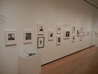
JTF (just the facts): A total of 150 black and white photographs from 73 different photographers, framed in black and matted, and chronologically/thematically displayed against grey, green, yellow, and dark blue walls through a winding series of adjoining gallery spaces. The prints cover the period from roughly 1910 to 1959, with a concentration between 1936 and 1951. An exhibition catalog has been published by Yale University Press (here) and is available in the bookshop for $50. The installation shots at right are courtesy of The Jewish Museum/Christine McMonagle.

The show is divided into titled sections. These sections and the photographers included are detailed below, with numbers of works and dates in parentheses.
.
Precursors
.
Lewis Hine (3, 1910, 1912, 1920)
Paul Strand (2, 1915, 1920)
1 video newsreel (1931)

The Great Depression/Harlem Document
.
Berenice Abbott (2, 1937)
Alexander Alland (3, 1938)
Lucy Ashjian (4, 1938, 1939)
Harold Corsini (1, 1939)
Jack Delano (1, 1940)
Robert Disraeli (1, 1934)
Arnold Eagle (1, 1935)
Eliot Elisofon (3, 1937, 1940)
Morris Engel (3, 1937, 1938)
Sid Grossman (2, 1936, 1940)
Rosalie Gwathmey (1, 1940)
Consuelo Kanaga (1, 1937)
Sidney Kerner (1, 1938)
Rebecca Lepkoff (1, 1939)
Richard Lyon (1, 1937)
Jack Manning (2, 1939)
Lisette Model (1, 1940)
Arnold Newman (1, 1940)
Sol Prom (1, 1938)
Walter Rosenblum (3, 1938)
Arthur Rothstein (1, 1935)
Joe Schwartz (2, 1936, 1939)
Lee Sievan (1, 1940)
Aaron Siskind (5, 1937, 1938, 1940)
Rolf Tietgens (1, 1938)
John Vachon (1, 1938)
Dan Weiner (1, 1939)
Max Yavno (1, 1940)
2 glass cases (syllabus, notes, membership cards, newspaper articles, magazine spreads, books)
.
The War Years
.
Lou Bernstein (2, 1943, 1947)
Bernard Cole (1, 1944)
Harold Feinstein (1, 1945)
Godfrey Frankel (1, 1945)
George Gilbert (1, 1942)
Sid Grossman (2, 1945)
Rosalie Gwathmey (1, 1945)
Morris Huberland (2, 1941, 1942)
Arthur Leipzig (1, 1946)
Rebecca Lepkoff (1, 1947)
Helen Levitt (1, 1940)
Sol Libsohn (1, 1945)
Sonia Handelman Meyer (1, 1946)
Lisette Model (3, 1940, 1942, 1945)
David Robbins (2, 1941, 1944)
Walter Rosenblum (2, 1944)
Edwin Roskam (1, 1944)
Arthur Rothstein (1, 1946)
Fred Stein (1, 1945)
Louis Stettner (3, 1940, 1951)
Lou Stoumen (1, 1940)
Paul Strand (1, 1938)
Elizabeth Timberman (1, 1944)
Weegee (5, 1938, 1940, 1941, 1943, 1945)
Ida Wyman (1, 1945)
4 glass cases (book, installation/judging photos, magazines, brochures, flyers, party photos)
.
The Red Scare
.
Vivian Cherry (2, 1947)
Robert Disraeli (1, 1950)
Morris Engel (1, 1947)
Rosalie Gwathmey (1, 1948)
N. Jay Jaffee (1, 1948)
Arthur Leipzig (2, 1949, 1950)
Rebecca Lepkoff (1, 1947)
Sol Libsohn (1, 1949)
Jerome Liebling (2, 1948, 1949)
Tosh Matsumoto (1, 1950)
Sonia Handelman Meyer (2, 1945, 1946)
Ruth Orkin (1, 1948)
Marion Palfi (2, 1948, 1949)
Rae Russel (1, 1947)
Edward Schwartz (1, 1952)
Erika Stone (1, 1947)
David Vestal (1, 1949)
Sandra Weiner (1, 1948)
Ida Wyman (1, 1947)
2 glass cases (newspapers, books, meeting notes, letters, photograph)
.
A Center for American Photography
.
Nancy Bulkeley (1, 1946)
Ann Cooper (1, 1950)
Arnold Eagle (1, 1950)
Morris Engel (1, 1938)
Leo Goldstein (1, 1950)
Sid Grossman (2, 1947, 1948)
N. Jay Jaffee (1, 1950)
Sy Kattelson (3, 1948, 1949, 1950)
Rebecca Lepkoff (1, 1948)
Jack Lessinger (1, 1950)
Leon Levinstein (2, undated)
Jerome Liebling (1, 1953)
Sam Mahl (1, 1949)
Phyllis Dearborn Masser (1, 1948)
Marvin Newman (2, 1949, 1951)
Ruth Orkin (1, 1950)
Ann Zane Shanks (1, 1955)
Larry Silver (1, 1951)
W. Eugene Smith (2, 1951)
Louis Stettner (1, 1951)
Dan Weiner (4, 1948, 1949, 1950)
Bill Witt (1, 1948)
Ida Wyman (1, 1950)
Max Yavno (1, 1949)
George Zimbel (1, 1951)
2 glass cases (magazine spreads, Photo Notes, exhibit catalogues, installation/remodeling photos)
1 video film (1953)
1 interactive map
.
Coda
.
Sid Grossman (1, 1959)
1 glass case (book, teaching photo)
1 documentary film (2011)

Comments/Context: The short hand story of the New York Photo League has always been a bit too overly easy for my liking: a few notable artistic names, some left leaning politics, and a muddy and inconclusive interpretation of its lasting influence on photography and the history of the city. I think that's why I found this more comprehensive and inclusive retelling to be so much more exciting and useful; it's not just a hackneyed, one-sided narrative about communists, but a broad, interwoven confluence of politics, history, geography, and photography, with a strong undercurrent of healthy artistic debate.
.
Walking through the twisting galleries, I found myself thinking about the Photo League in the context of a diagram. From one corner comes the march of history: the Great Depression, World War II, and the Cold War, each with its own very real impacts on daily life in New York. From another corner comes the melting pot of the urban city itself: the people, the individual neighborhoods, the street life of mixed classes, races, religions, and ethnicities. And from a third corner comes the evolution of photography as a medium: the remnants of the between the wars Modernism, the arrival of the flexible hand held camera and the weekly magazines filled with photojournalism, and the beginnings of a more personal and subjective kind of image making. At the center of this diagram sits the New York Photo League, documenting the truths found on the streets of this great city, under the changing pressures of history, tugged in different artistic directions, trying to balance and synthesize these competing forces. Seen in this way, I suddenly started to understand where the Photo League really fits, and why the work on the walls looks the way it does.

This show is roughly chronological, and this design allows the viewer to see the evolving stylistic approaches being employed by League members over the years of the club's existence. Simplistically, one can imagine a continuum, at one end, documentary photography informed by activism, engagement and advocacy, a witness with an ideological purpose and a particular kind of social commentary to put forth. At the other end lies documentary photography informed by more subjective concerns, including individual emotions/reactions, aesthetics, formalism, and more personal questioning. As the years passed from 1936 to 1951 (the beginning and end of the League's operation), it is possible to watch this internal debate raging on, where a new sensibility gradually starts to take hold. This evolving definition of documentary/street photography didn't of course end here; these same issues remain intensely relevant and hotly argued on both sides even today.

With Hine and Strand as artistic precursors and with Abbott as a teacher, it isn't surprising that the Great Depression pictures start with a formal clarity and slowly evolve toward more progressive messages, likely as a result of the crushing economic times. Bridges and storefronts, vacant lots and crumbling tenement buildings, these kinds of subjects slowly give way to more human stories, particularly the Harlem Document pictures, which take a heavier handed look at poverty and unemployment in the black community. While these images are seen today with an eye for their overly negative stereotypes, they still represent a style of activist, engaged street photography that held favor with many of the members at the time.

With the arrival of World War II, the subject matter changed again: soldiers, white hatted sailors, mothers, political rallies, crowded protests, blurred motion coming into the frame with more regularity. In these pictures, the aesthetic schism starts to appear more clearly, with some members moving down a more atmospheric path, telling smaller and more marginal stories with empathy, humor, and even dark irony. These are more individual scenes, often environmental portraits, with an increasing level of compositional freedom and experimentation. As the Cold War deepened and the Photo League was blacklisted (and ultimately disbanded a few years later), the stylistic changes became more widespread. Using aerial views, mirrors, reverse angles, silhouettes, complex graphical overlaps, and a host of other approaches, the Photo League's brand of street photography became much more diverse, and by the early 1950s, it bore very little resemblance to the work from the late 1930s. The mood was harsher, the compositions more personal and less purely documentary.

What I like best about this show is its rag tag, unwieldy inclusiveness; there are dozens of names included here that have been largely forgotten, and yet their images fit together into a logical progression that seems fluid with the benefit of time. For me, I finally started to visually understand the small steps that made up the aesthetic and conceptual changes that took place between the 1930s and the 1950s, those missing evolutionary links between Abbott and Frank; The Americans now seems to me less like a thunder strike of genius out of nowhere and more like an innovative, original extrapolation from visual ideas that were already beginning to percolate around. This excellent show tells a uniquely New York story, and is worth a visit simply for the rich historical details of life in the city that it provides. But the reason I found this to be one of the best photography shows of the year is that it also successfully fills in an important (and largely missing) gap in the recounting of the American photographic narrative. Not only do I now have an increased appreciation for the talents of the many members of the New York Photo League (many of whom have been unjustly overlooked), I now understand much more clearly how the larger artistic puzzle fits together.
.
Collector's POV: Given this is a museum show, there are, of course, no posted prices. Given the wide number of included artists, it seems fitting to forego the specific secondary market discussion that usually fills this section.
.
Rating: *** (three stars) EXCELLENT (rating system described here)
.
Transit Hub:
  • Features/Reviews: Wall Street Journal (here), Lens (here), NY Times (here), New Yorker (here), Artnet (here), Photograph (here)
The Radical Camera: New York's Photo League, 1936-1951
Through March 25th

The Jewish Museum
1109 5th Ave at 92nd St
New York, NY 10128

Administrative Note: This will be the last post of the year. I'll return again in the New Year, beginning with the end of year roundups of the best shows and top photography venues of 2011. Happy Holidays!

Thursday, December 22, 2011

The Checklist: 12/22/11

Checklist 12/22/11

New reviews added this week in red.

Uptown

ONE STAR: After the Gold Rush: Met: January 2: review
ONE STAR: Cecil Beaton: Museum of the City of New York: February 20: review
ONE STAR: Photographic Treasures from the Collection of Alfred Stieglitz: Met: February 26: review

Midtown

ONE STAR: Erwin Blumenfeld: Edwynn Houk: January 7: review
ONE STAR: New Photography 2011: MoMA: January 16: review
TWO STARS: Reinstalled Permanent Collection: MoMA: March 2012: review

Chelsea

ONE STAR: Uta Barth: Tanya Bonakdar: December 22: review
TWO STARS: Robert Heinecken: Friedrich Petzel: December 22: review
ONE STAR: Sharon Core: Yancey Richardson: December 23: review
THREE STARS: Nan Goldin: Matthew Marks: December 23: review
TWO STARS: Richard Mosse: Jack Shainman: December 23: review
ONE STAR: John Baldessari: High Line: December 30: review
ONE STAR: Andrew Borowiec: Sasha Wolf: January 7: review
ONE STAR: The Wedding: Andrea Rosen: January 21: review

SoHo/Lower East Side/Downtown

TWO STARS: Lee Friedlander: Janet Borden: December 31: review
ONE STAR: Mel Bochner: Peter Freeman: January 14: review

Elsewhere Nearby

ONE STAR: Type A: Aldrich Museum: December 31: review
TWO STARS: Walker Evans: Florence Griswold Museum: January 29: review

Wednesday, December 21, 2011

The Wedding (The Walker Evans Polaroid Project) @Rosen

JTF (just the facts): A total of 83 color photographs by Walker Evans, framed in white and matted, and hung in the large single room main gallery. All of the works are SX-70 Polaroids made in 1973 or 1974, sized roughly 4x3. The exhibit also includes 4 photographic diptychs by Roni Horn. These works are iris-printed photographs on Somerset Satin paper, each panel sized 22x22. The images were made in 1998, 1999, 2000, and 2007, and are available in editions of 15+3AP. Additional supporting photographs include an 1887 Eadweard Muybridge collotype from Animal Locomotion (sized 19x24), and a Eugene Atget albumen storefront from 1900 (sized 9x7); these two photographs are displayed in the entrance area. The installation also includes a selection of oak furniture by Gustav Stickley, an 19th century architectural model of a cooper's workshop, and a 19th century English birdhouse. This exhibit was curated by Ydessa Hendeles; a spiral bound catalog of the show is available for free at the reception desk (and is worth taking). (Installation shots at right.)

Comments/Context: One of the unforeseen consequences of a proliferation of art on the Internet is that we have inadvertently (and permanently) diluted the meaning of the word "curator". We're all choosers, selectors, organizers, editors and like-ers now, whether we are celebrities, gallery owners, scholars/academics, collectors, or idle watchers. At one level, this is mighty freeing and empowering, breaking down old restrictive barriers and letting in some much needed fresh air. But at another, we seem to be losing sight of the nuances of old school curating craftsmanship and excellence that go miles beyond just gathering a bunch of pictures under a clever theme for a group show.

While this show takes place at the Andrea Rosen Gallery and selling is ostensibly going on, a retail experience seems wholly beyond the point of this exhibition. The art objects on view transcend being works by Walker Evans or Roni Horn or whoever, and become elements of an elaborate theatrical set piece. Taken together, the individual items have been meticulously arranged and sequenced to highlight internal relationships and connections that have very little to do with their inherent Walker Evans-ness or Roni Horn-ness. The hand of the curator is so evident here that it trumps the underlying works themselves; we've entered the carefully controlled world of Ydessa Hendeles, and it is the sum of the parts that matters.

This kind of mixed media, open ended, metaphorical curation is rarely seen in Chelsea these days; it's such an unusual animal that we've almost forgotten how to react to such a complex presentation. My first reaction upon entering the main gallery space was to notice its clean geometries and the manipulation of scale going on: tiny Polaroids interrupted by larger prints, surrounding small church pews leading to a grand central object, in this case, an ornate, domed birdcage made of intricate polished wood. As I circled the gallery, the Evans Polaroids drew me into an intimate dialogue, vicariously wandering and circling the vernacular architecture just like Evans himself, moving in and out, around and across, seeing silhouettes and then details in succession. The Horn images of birds forced me to physically move back, to take them in as objects related to the central bird cage, and then to move back in to see their delicate layers of feathers in an architectural manner. The overall result is a sense of fluidity and motion that isn't linear but more swirling and rhythmic, the movement through space not strict and rigid, but more loose and serendipitous than it appears on the surface.

While there are a number of individual standouts mixed in among the works on display, many of the Evans Polaroids aren't hugely memorable, and are of more interest as a process flow, like contact sheets where we can see the photographer moving from frame to frame with deliberate action. There is a palpable sense of Evans testing the limits of the camera, figuring out how his eye could control the output of the device in ways that he wanted. Some work and some don't, but seen together, there is the real feeling of being along for the ride with a master.

What I like best about this installation is that there is some curatorial risk taking going on here. Hendeles didn't just give us a static ring of Evans Polaroids, but an immersive environment that draws from those Polaroids, one that offers additional less obvious pathways to explore; there are multiple "ways in" to this exhibit, leading to different contextual conclusions. I also appreciate the clear move to take photography out of its own separate artistic silo and to mix it together with other decorative arts that can provide alternate resonances. Her setting provides a richer experience of Evans' late work, offering us ways to look and see that are beyond the simple or straightforward.

Collector's POV: The prints in this show are priced as follows. The Walker Evans Polaroids are priced at $7000 each, and the Roni Horn diptychs are either $85000, $120000, or NFS (she is represented by Hauser & Wirth here). Evans' late Polaroids do come up for sale at auction from time to time; prices in recent years have ranged between $1000 and $5000.
.
Rating: * (one star) GOOD (rating system described here)
.
Transit Hub:
  • Features/Reviews: Vogue (here), Opening Ceremony (here)
The Wedding (The Walker Evans Polaroid Project)
Through February 4th
.
Andrea Rosen Gallery
525 West 24th Street
New York, NY 10011

Tuesday, December 20, 2011

High Line Billboard: John Baldessari


JTF (just the facts): A single billboard, 25x75 feet, displayed at the corner of 18th Street and 10th Avenue in Chelsea. The work is entitled The First $100,000 I Ever Made and is print on vinyl, from 2011.

Comments/Context: Plunked down in the middle of a Chelsea parking lot, John Baldessari's monumental photograph of a real $100,000 bill is a disconcerting symbol for a neighborhood full of retail art galleries. By replacing the normal fare of forgettable movie ads and holiday sale announcements with a not-so-subtle swipe at the dollar driven world in the streets below, Baldessari successfully jolted me out of my huddled winter stupor and made me look again.

What I like best is that Baldessari's work is more than just a snappy one-liner; it mixes photographic appropriation and Pop art, with a surprisingly current-events relevant Conceptual zinger. I'm pretty sure Woodrow Wilson was never particularly brash, but in this setting, his serious Big Brother visage seems both judgmental and confrontational, and depending on your point of view, the steely-eyed critique can point in many different directions. Baldessari's wild transformation of scale is simultaneously absurd, cautionary, and perspective-changing, and it's absolutely worth a detour down the High Line, even if the winter winds are blowing.

Collector's POV: This work was not overtly for sale, nor are there many comparables in terms of scale in recent auction history. Baldessari is represented in New York by Marian Goodman Gallery (here).

Rating: * (one star) GOOD (rating system described here)

Transit Hub:
  • Reviews: Daily Beast (here), Gawker (here), Arts Observer (here)
John Baldessari
Through December 30th
.
Billboard at 18th Street and 10th Avenue

Monday, December 19, 2011

Andrew Borowiec: Along the Ohio @Wolf

JTF (just the facts): A total of 28 black and white photographs, framed in grey and matted, and double hung in the single room gallery space. All of the prints are gelatin silver prints, taken between 1984 and 1998. The modern prints on display are each 16x20, in editions of 10. A monograph of this body of work was published by Johns Hopkins University Press in 2000 (here). (Installation shots at right.)

Comments/Context: Andrew Borowiec's photographs of the industrial Midwest are deceptively understated; with just a quick, cursory glance over them, one could easily miss their complexity. Hovering in tones of middle grey, they document working class neighborhoods hemmed in by sprawling factories and power plants, the presence of the Ohio River never far from view. Their sober deadpan formality silences the landscape, leaving behind clusters of crowded houses and slowly decaying communities.

What makes these pictures exciting is the density and structural complexity of Borowiec's compositions; they're almost Friedlander-esque in their layers and details, albeit with a much more earnest severity. Nearly every image has something to discover: toys strewn across a front yard, fake raccoons decorating electric meters, a meandering street leading to a trestle bridge, a pair of ceramic poodles, a nest of overhead electric wires. White picket fences, abandoned cars, ATV tracks, overgrown greenery, and satellite dishes come together to tell a story of a worn down Midwestern existence, where flood waters overrun downtown streets and basketball courts, and smokestacks and cooling towers loom in the hazy distance.

Nearly every image in this show has robust front to back design, where foreground, middleground, and background are carefully modulated to create intricate juxtapositions and spatial overlaps. A kind of controlled chaos consistently emerges, where shapes and patterns interact under the guise of struggling lives. In the end, Borowiec's pictures capture a sense of quiet, muddling through perseverance, with an eye for the subtle photographic arrangement that transforms the mundane into something new.

Collector's POV: The prints on view are priced based on their place in the edition, starting at $2400 and rising to $3000. Borowiec's work has very little secondary market history, so gallery retail is likely the only option for interested collectors at this point.

Rating: * (one star) GOOD (rating system described here)

Transit Hub:
  • Artist site (here)
  • Exhibit: Akron Art Museum, 2010 (here)
Andrew Borowiec: Along the Ohio
Through January 7th

Sasha Wolf Gallery
528 West 28th Street
New York, NY 10001

Thursday, December 15, 2011

The Checklist: 12/15/11

Checklist 12/15/11

New reviews added this week in red.

Uptown

ONE STAR: After the Gold Rush: Met: January 2: review
ONE STAR: Cecil Beaton: Museum of the City of New York: February 20: review
ONE STAR: Photographic Treasures from the Collection of Alfred Stieglitz: Met: February 26: review

Midtown

ONE STAR: Jessica Eaton: Higher Pictures: December 17: review
ONE STAR: Erwin Blumenfeld: Edwynn Houk: January 7: review
ONE STAR: New Photography 2011: MoMA: January 16: review
TWO STARS: Reinstalled Permanent Collection: MoMA: March 2012: review

Chelsea

TWO STARS: Daniel Gordon: Wallspace: December 17: review
ONE STAR: Andreas Gursky: Gagosian: December 17: review
ONE STAR: Uta Barth: Tanya Bonakdar: December 22: review
TWO STARS: Robert Heinecken: Friedrich Petzel: December 22: review
ONE STAR: Sharon Core: Yancey Richardson: December 23: review
THREE STARS: Nan Goldin: Matthew Marks: December 23: review
TWO STARS: Richard Mosse: Jack Shainman: December 23: review

SoHo/Lower East Side/Downtown

TWO STARS: Lee Friedlander: Janet Borden: December 31: review
ONE STAR: Mel Bochner: Peter Freeman: January 14: review

Elsewhere Nearby

ONE STAR: Type A: Aldrich Museum: December 31: review
TWO STARS: Walker Evans: Florence Griswold Museum: January 29: review

Wednesday, December 14, 2011

Robert Heinecken: Copywork @Petzel

JTF (just the facts): A total of 56 photographic works, variously framed and matted, and displayed in the entry area, the large main gallery space, and a smaller back room. The works were made using a dizzying variety of processes: 21 works made up of Polaroids, 10 repurposed magazines, 3 collages, 6 works made of film/transparencies, 3 using lithography, 2 gelatin silver prints, 1 emulsion on canvas, and 10 dye bleach prints mounted on foamcore. The images were made between 1963 and 1994, and with exception of the foamcore prints which were executed a few years after their negative dates, nearly all are vintage. No edition information was available on the checklist. Individual sizes range from roughly 10x8 (magazines) to 96x192 (collage). (Installation shots at right.)
 
Comments/Context: The long entry hallway at Friedrich Petzel is covered in framed grids of Polaroids, and as I came off the street and passed from work to work, it became clear that I was in the midst of a meticulous, often hilarious, anthropological study of stock advertising photography. Facial expressions, hands on hips poses, matching clothing, nightgown lengths, the way arms are folded, how multiple models are posed together, they're all broken down, deconstructed, and exposed for both their identifiable patterns and puzzling ridiculousness. Photography that we normally breeze by and take for granted is proven to be carefully controlled and manipulated, this conclusion delivered with a tone of subtle, chuckle-inducing mockery. As a show opener, it's a perfect prelude to this mini-retrospective of the work of Robert Heinecken.

Heinecken's long career (as both an influential teacher and accomplished artist) is filled with rigorous explorations and deft parsings of the many meanings of photography. While often lumped in with other California conceptualists or associated with those at the beginnings of photographic appropriation, his path took him places few others have traveled: into the depths of consumerism, unpacking, mixing, and reusing nearly every known image reproduction process, combining hard core pornography, war imagery and comically empty advertising into a heady intellectual brew.

The best of the works in this show have a vital, bomb-throwing quality to them: a soldier gleefully holding two severed heads roughly printed over magazine ads brimming with love, porn collated into the pages of the New Yorker, jaunty life-sized cardboard cutouts undermined and made silly with guns, booze, and money (not to mention a claw hand for Andre Agassi in his 1980s mullet days). All of the works on display upend expectations in one way or another, from the weirdly trashy Tuxedo Striptease to the three dimensional collages made of crumpled but recognizable ads. While not every visual deconstruction is completely successful, there are plenty of robust underlying ideas, questions, and politics to keep the work engaging.

As a sampler, this show brings together light jokes and scathing critiques, understated beauty and explicit sexuality, brainy conceptualism and ironic juxtaposition. It's smart, witty, and caustically brash. But what I like best about this gathering of work is Heinecken's intense investigation of the medium, his willingness to disrespectfully rip into accepted truths and pull them apart, looking for the sometimes harsh effects and unplanned outcomes of an image saturated world.
.
Collector's POV: The works in this show range in price from $2000 to $250000, with plenty on intermediate prices ($8000, $15000, $20000, $25000, $30000, $50000, $60000, $65000, $120000, $150000). Heinecken's work is not routinely available in the secondary markets for photography, with only a handful of lots coming up for sale in any given year. Prices have ranged from $1000 to nearly $100000 in recent years, with a few high end outcomes coming at the Polaroid collection sale in 2010.
.
Rating: ** (two stars) VERY GOOD (rating system described here)
.
Transit Hub:
  • Features/Reviews: Village Voice (here), New Yorker (here), TimeOut New York (here), WNYC Gallerina (here)
Through December 22nd

Friedrich Petzel Gallery
535 West 22nd Street
New York, NY 10011

Tuesday, December 13, 2011

Cecil Beaton: The New York Years @MCNY

JTF (just the facts): A total of 96 photographs, variously framed and matted, and hung against wallpapered and white walls in the entry area and a large gallery space with several interior dividers. The prints are a mix of gelatin silver, bromide and pigment ink prints, taken between 1924 and 1970, although most were taken in the 1930s. No physical dimensions or edition information was available. The exhibit also includes 27 watercolor/ink sketches and drawings, 6 full body costumes, 1 video, and 16 glass cases containing magazines, books, letters, contact sheets, programs, and other related ephemera. A catalog of the exhibition has been published by Skira Rizzoli (here) and is available from the book shop for $65. (Installation shots at right.)

Comments/Context: While there is certainly plenty of photography on display at the new Cecil Beaton show at the MCNY, I'm not sure it makes sense to call it a photography show in the narrow sense of the definition. Instead of limiting the scope to just his photographs, this flashy exhibit broadens out to tell the story of an artistic Renaissance man, society gadabout, and relentless self-promoter, including watercolor sketches of award-winning costume designs he made for Broadway shows, movies, and the opera, published volumes of his journals, and even his own wallpaper designs. These artistic threads are then woven together with his celebrity and society portraits (seemingly just as often of himself as of famous people) and his fashion work for Vogue, tying it all together in a sumptuous and elegant package.

As a photographer, Beaton was essentially a classicist. While his compositions show borrowings and sprinklings from the avant-garde and Surrealism, he returned again and again to overtly staged interior scenes, heavy on theatricality and dramatic romance. It didn't matter if it was Greta Garbo, Mona Williams, Audrey Hepburn, or Marilyn Monroe, Beaton brought a refined sense of glamour to his portraits and commissions, following in the footsteps of De Meyer and adding a touch of more modern panache and sophistication. While he may not have been a wildly inventive visual innovator with his camera, the aura of his personality clearly became part of his productions, adding sparkle and excitement to mix.

This is a show brimming with visual stimuli, which in a way distracts from its ability to make an intimate or compelling case for the quality of the photographs. But the "going in all different directions" feel of this installation is tremendously effective in painting a picture of Beaton as a frenetic man about town, a multi-talented artist working a dozen projects at once while jamming in a few society portraits between cocktails. It's not so much "Beaton the photographer" as it is "Beaton the force of nature", whirling through New York in a tuxedo, hobnobbing with celebrities and society dames, multiplying the vibrancy of the artistic community with more than just his camera.

Collector's POV: Given this is a museum show, there are, of course, no posted prices. Beaton's photographs are generally available in the secondary markets, with a decent number of prints coming up for sale each year. Recent prices have ranged from $500 to roughly $8000, mostly correlated to the fame of the sitter. Similarly, I'm sure there are Beaton images of now-unknown society figures that can be had for even less.

Rating: * (one star) GOOD (rating system described here)


Transit Hub:
  • Features/Reviews: NY Times (here), New Yorker (here), T Magazine (here), Artnet (here)
  • Book Review: NY Times (here)
Cecil Beaton: The New York Years
Through February 20th

Museum of the City of New York
1220 Fifth Avenue at 103rd Avenue
New York, NY 10029

Monday, December 12, 2011

The Exacting Eye of Walker Evans @Florence Griswold Museum

JTF (just the facts): A total of 185 photographs, variously framed and matted, and hung in a series of three connected gallery spaces. The prints are a mix of gelatin silver prints, archival pigment prints and Polaroids, taken between 1930 and 1975. While no dimensions or edition information was available on the wall labels, the prints range in size from small SX-70 instant prints to much larger posthumous enlargements. The exhibit also includes 5 Fortune spreads and 6 actual magazines (in glass cases), 1 exhibition poster, and a group of 20 signs, displayed either as actual artifacts or framed scans. (Installation shots at right.)
.
Comments/Context: While the level of scholarship applied to the work of master photographer Walker Evans has been exactingly high over the years, this sampler-style exhibit is a reminder that there are plenty of pleasures to be had in simply seeing (again) selected great works from an important artist's career. It's been over a decade since the Met's last retrospective (not including the superlative postcard themed show a few years ago), so perhaps we are due for a refrain from Evans, if only as a reminder of his lasting originality and continuing influence.
.
The first room of this show is a parade of Evans' Depression-era photography, mixing "normal" sized prints with eye-catching enlargements of some of his most famous images: Alabama tenant farmers, the penny picture studio, spare geometric churches and vernacular storefront architecture, painted murals and folk art signage, the auto graveyard. That every picture in the room was made between 1935 and 1936 is a testament to just how productive and innovative Evans was during that time.
.
The next room tries to wrap an "editor" label around a bunch of disparate work; I'm not sure this catch-all tells us much about nearly three decades of Evans' output, but I don't think it matters much. There are standout images from Cuba and the subway portrait series on display, as well as a number of spreads from Fortune. These are matched with some of Evans' early color work from the late 1950s, his massive tool still lifes, and two portfolios of his "best" images produced in the 1970s, along with a handful of lesser known Connecticut themed pictures from his time living nearby and teaching at Yale.
.
The final room is dedicated to Evans' well known love of American signage and his late exploration of the SX-70 Polaroid. A few actual signs are intermixed with digital scans of rusty relics and product advertising; these are then juxtaposed with Evans' photographs capturing abstract fragments of lettering or documenting particularly quirky examples of American graphic history. Two nearby grids of close-up, flash-strewn facial portraits show Evans searching for the visual boundaries of this new camera.
.
While this show can't claim to be comprehensive or to break new academic ground, I think it does provide a solid, viewer friendly round-up of many of Evans' important bodies of work. It left me feeling like I wanted to dig deeper into his Fortune years and his last decade in color, both of which lie a bit outside the mainstream of the Evans narrative. All in, if you're hankering for an authentic dose of Evans' "lyric documentary" style, a quick trip up the road to Old Lyme will amply satisfy your cravings.
 
Collector's POV: Given this is a museum show, there are, of course, no posted prices. Evans' prints are routinely available in the secondary markets, with dozens of prints coming up for auction every year. Recent prices have ranged from $1000 to nearly $200000, with vintage prints of his most iconic images at the top end of that range.
.
Rating: ** (two stars) VERY GOOD (rating system described here)
   
Transit Hub:
  • Special exhibit companion site (here)
  • Features/Reviews: Hartford Courant (here), The Day (here)
The Exacting Eye of Walker Evans
Through January 29th
.
96 Lyme Street
Old Lyme, CT 06371

Thursday, December 8, 2011

The Checklist: 12/08/11

Checklist 12/08/11

New reviews added this week in red.

Uptown

ONE STAR: After the Gold Rush: Met: January 2: review
ONE STAR: Photographic Treasures from the Collection of Alfred Stieglitz: Met: February 26: review

Midtown

ONE STAR: Edward Burtynsky: Howard Greenberg: December 10: review
ONE STAR: Jessica Eaton: Higher Pictures: December 17: review
ONE STAR: Erwin Blumenfeld: Edwynn Houk: January 7: review
ONE STAR: New Photography 2011: MoMA: January 16: review
TWO STARS: Reinstalled Permanent Collection: MoMA: March 2012: review

Chelsea

TWO STARS: Edward Burtynsky: Bryce Wolkowitz: December 10: review
TWO STARS: Daniel Gordon: Wallspace: December 17: review
ONE STAR: Andreas Gursky: Gagosian: December 17: review
ONE STAR: Uta Barth: Tanya Bonakdar: December 22: review
ONE STAR: Sharon Core: Yancey Richardson: December 23: review
THREE STARS: Nan Goldin: Matthew Marks: December 23: review
TWO STARS: Richard Mosse: Jack Shainman: December 23: review

SoHo/Lower East Side/Downtown

TWO STARS: Lee Friedlander: Janet Borden: December 31: review
ONE STAR: Mel Bochner: Peter Freeman: January 14: review

Elsewhere Nearby

ONE STAR: Type A: Aldrich: December 31: review

Mel Bochner, Photography Before the Age of Mechanical Reproduction @Freeman

JTF (just the facts): A total of 18 works in a variety of media, hung in the two room divided gallery space. 9 of the works are made up of photographic prints (broadly defined), ranging from silhouetted c-prints mounted on aluminum and color Polaroids to photographic negatives and a set of 6 images executed in different processes (gelatin silver, platinotype, collodio-chloride, albumen, cyanotype, and salt). The other works on view are drawings (8) and powder pigment directly on the wall (1). Most of the works are vintage to the period 1967-1969, or have recently been re-executed (dated 2011); there are two new works from 2010/2011. The six image set of photographs is made up of prints each 20x24, and has been executed in an edition of 11+7. The large Color Crumple works range in size from 96x46 to 95x62, and are available in editions of 3+1. The other photographic works range in size from 4x3 to 75x71. (Installation shots at right.)

Comments/Context: Long before the debates over the definition of truth in photography brought about by the digital revolution, Conceptual Art (and its cousin conceptual photography) explored the boundaries of what a photograph was and wasn't, what it could and could not represent, often with a mischievous sense of intellectual braininess. Mel Bochner has been a part of those discussions since the 1960s, and his newest works remind us that these thorny questions are far from completely answered.

The entry wall of the gallery contains a grid of six images, each a simple photograph of the same index card with the sentence "Photography Cannot Record Abstract Ideas" written on it, attributed to the Encyclopedia Britannica (shown in the middle of the top installation shot). If a photograph was an objective record of reality, perhaps the phrase on the card might have the ring of truth. But Bochner has taken this image and printed it six different times with six different antique processes, resulting in prints that range from silver and beige to light blue and chocolate brown. While the only variation is the chemical process being used, the final "reality" we are presented varies widely from image to image, not only in color and tonality, but it sharpness and contrast. Which one might be the true "truth"? Of course, the answer is that Bochner has done exactly what the card said he could not: record an abstract idea using photography. It has the feel of a witty mathematical proof, complete with a clever QED.

Most of the rest of the works in the show push and pull on the ideas of flatness and three-dimensionality, starting with a rigidly geometric white on black, and iterating and exploring from there. Preparatory drawings and quick Polaroids show Bochner refining the ideas in oil and shaving cream, and various of the final works have an optical illusion quality, where a clearly crumpled surface turns out to be completely flat, the lines of the grid becoming twisted and distorted. While the graphics are a bit dated, the concepts that support the pieces remain fresh and perplexing.

I think this exhibit is a good reminder that the conceptual questions that surround photography are not somehow all answered or "done"; original visual and thought experimentation combined with definitional explication are still valid paths forward that continue to yield unexpected, new results. As the medium evolves, old questions are brought forth once again to be answered in new (perhaps contradictory) ways. I'd like to believe this kind of show will encourage others to revisit and reengage with the thinking that underlies conceptual photography, generating a renaissance of ideas tuned for 21st century photographic discourse.

Collector's POV: Many of the works in this show are marked NFS. For those with stated prices, the Color Crumples are $225000 each, as is the Surface Dis/Tension (Recursion) work cut into 16 parts. A somewhat smaller gridded image is $75000 and the set of 6 photographic prints is $32000. The blue powder pigment on the wall is $350000. Bochner's works are surprisingly absent from the secondary markets for photography; while there may be an auction history for his works in other media, there is little or no recent record in the stand alone photography sales we track. As such, gallery retail may be the only viable option for photography collectors at this point, even though Bochner has been exploring the boundaries of photography for decades.

Rating: * (one star) GOOD (rating system described here)

Transit Hub:
Mel Bochner, Photography Before the Age of Mechanical Reproduction
Through January 28th

Peter Freeman, Inc.
560 Broadway
New York, NY 10012

Wednesday, December 7, 2011

Merry Christmas from Lee Friedlander @Borden

JTF (just the facts): A total of 48 black and white photographs, framed in dark grey and matted, and hung in the main gallery space. All of the prints are gelatin silver prints, printed 16x20 or reverse for both 35mm and square format images. The works were taken between 1963 and 2010, and the prints were made between 2003 and 2011. Friedlander does not edition his prints, so there are no edition sizes/numbers. (Installation shots at right.)

Comments/Context: Given how prolific Lee Friedlander has been over his long career, it isn't particularly surprising that he can dig back into his archives and unearth groups of pictures that turn on a common theme. Just pick a visual motif, a geography, a time period, or a specific subject matter, sort out the 50 or so best or most representative, and voila, it's the makings of another book. This show uses this approach to paint an offbeat portrait of the Christmas season, gathering pictures made over five decades into a sampler of Friedlander's signature visual devices, each with a holiday twist.

While there is an entire review to be written here about rotting garlands, tired paper window decorations, insanely over-the-top front lawns, broken roadsigns, and snowless dirty holiday cheer, and about what Friedlander might be pointing out about our uniquely American Christmas celebrations (wryly cynical or understatedly optimistic?), I was actually struck more by Friedlander's toolbox of photographic techniques than by his underlying commentary. Fresh from his Whitney show, there are Santas framed by rental car interiors and decorated with side mirror picture-in-picture reflections. Another set of photographs uses the empty beds of pickup trucks as a spatial device, adding angles and distance to decorations in windows and on middle distance house fronts. Telephone poles (complete with imitation greenery on top) make repeated appearances, dividing compositions. Storefront window displays enable multiple layers of refractions, mixing the staged scenes of the items for sale (look for the S&M Santa) with echoes of nearby street decor. Even chain link fence dividers and shadow self portraits are thrown in with oddly fashionable nativity scenes and West Texas holiday sidewalks.

Sure, there is something off kilter or quietly strange about each of these Christmas adornments; but there is more here than found tinsel, trashy blow-up lawn ornaments, wreaths on solar panels, and audaciously pedestrian baubles and gewgaws. These are extremely well made photographs that capture a tiny bit of Christmas spirit in the midst of making a much more complicated and mature artistic statement. Only Lee Friedlander takes a street scene covered in fuzzy faux trees, interrupts it with a telephone pole, and uses the pane of a phone booth to frame the people on the far corner, or uses skewed iron railings, front stoop stairs, and overflowing garbage cans to tell a chaotic visual story about Christmas in Brooklyn. Every single picture has visual pyrotechnics and hidden Christmas jokes to unpack, so take your time and savor these holiday eccentricities.

Collector's POV: The prints in this show are priced at $8500 each. Friedlander's work is routinely available in the secondary markets, with prices at auction ranging from approximately $2000 to as much as $80000 in recent years.

Rating: ** (two stars) VERY GOOD (rating system described here)

Transit Hub:
  • Reviews: WSJ (here), Time LightBox (here)
Merry Christmas from Lee Friedlander
Through December 31st

Janet Borden, Inc.
560 Broadway
New York, NY 10012

Monday, December 5, 2011

Richard Mosse, Infra @Shainman

JTF (just the facts): A total of 26 large scale color photographs, framed in grey and unmatted, and hung in the entry area, the large back divided gallery, and two smaller side rooms. All of the works are digital c-prints, made in 2010 or 2011. Each image is generally available in a small and large size; smaller sizes include 20x24, 28x35, and 40x50 (or reverse), all in editions of 5+1, and larger sizes include 48x60, 72x90, and 72x106 (or reverse), in editions of 2+1. A monograph of this body of work is being published by Aperture (here). (Installation shots at right.)

Comments/Context: Richard Mosse's new images of the conflict in the eastern Congo push the definitional edges of photojournalism in both clever and confrontational ways. His photographs simultaneously operate on intertwined levels of documentary truth and artistic interpretation, mixing a reporter's eye for the facts of the story and an artist's eye for the mood.

Stripped of their color, Mosse's pictures would seem similar to images of war and rebellion that we see everyday: charismatic rebel leaders in fatigues surrounded by rag tag bunches of soldiers, the fight slipping in and out of the jungle, ravaging the countryside and then disappearing like a wisp of smoke. But the challenge is to get beyond these semi-posed units, the makeshift camps, and the military marches through the undergrowth to capture the disorienting, emotional landscape of the shifting alliances, the wins and losses, the destructive impact on the local people and the land itself, and the general inexplicable gruesomeness of it all. Like Conrad's The Heart of Darkness, Mosse's body of work takes the real and makes it exaggerated and surreal.

What is so obviously different and shockingly new here is Mosse' palette. Using discontinued Kodak Aerochrome infrared film, he has transformed dense pockets of jungle greenery and wide pastoral hillsides into a topsy-turvy Dr. Seuss world, where pink and red have become the dominant colors. River valleys, steep rock slides and undulating pastures are seemingly covered with bushes of cotton candy and hills of bubblegum. Soldiers wear pink berets and stand in towering undergrowth reminiscent of bright red Christmas pointsettas. The photographs are both joltingly wrong and quite beautiful, forcing the viewer to look again and again, trying to make sense of what is being presented. And this, of course, is the point; it's impossible to go down the rabbit hole of the Congo and have the situation seem normal or comprehensible. Even simple grazing cows look alien and out of place.
.
While I admire the eye-popping, memorable distinctiveness of these images, I think Mosse's expansion of his photojournalistic boundaries is even more important. He has used unexpected color reversal as a metaphorical device, a method for providing a sense of the place that goes beyond the visual details caught on film. While his war-time compositions may look familiar, the entire aesthetic experience is unsettling and perplexing, undermining our ability to derive answers or draw conclusions. The wild palette tells us that we have entered an alternate reality of some kind, and that things are not what they seem. In the end, this inversion seems both highly appropriate and durably original, and I am confident that these images will continue to stand out for many years to come, instantly recognizable as the uncertainty of rebel warfare, stunningly turned on its head.
.
Collector's POV: The prints in this show are priced based on size. Here's the breakdown: 20x24 - $5500, 28x35 - $6500, 40x50 - $9500, 48x60 - $16000, 72x90 - $20000, 72x106 - $25000. Mosse's work is not readily available in the secondary markets, so gallery retail is really the only option for interested collectors at this point.
.
Rating: ** (two stars) VERY GOOD (rating system described here)
.
Transit Hub:
  • Artist site (here)
  • Interview: Conscientious (here)
  • Feature: Flavorwire (here)
Richard Mosse, Infra
Through December 23rd

513 West 20th Street
New York, NY 10011

Friday, December 2, 2011

Andreas Gursky @Gagosian

JTF (just the facts): A total of 13 large scale color works, framed in brown wood and unmatted, and hung in a pair of divided gallery spaces. There are 6 works from the Bangkok series in the left hand gallery. These are inkjet prints, each sized 121x89 or 121x93, printed in editions of 6, and made in 2011. There are 7 works from the Oceans series in the right hand gallery. These are c-prints, sized 134x98, 137x98, or 96x179 (or reverse), also printed in editions of 6, and made in 2010. A catalog is available from the Gagosian shop for $120 (here). No photography is allowed in the galleries, so the installation shots at right come from the Gagosian website.
.
Comments/Context: Since I have a significant amount of respect for the outstanding and innovative work of the German photographer Andreas Gursky, the easiest thing to do in this review would be to fall in line with the rest of the sycophantic, fawning critics and tell you that these new works are equally as astonishing and groundbreaking as many of his true and undeniable masterpieces. But the fact is, they are not. There, I've said it: the emperor (and he is undeniably the emperor of contemporary photography) has no clothes, at least at the moment.

Of the two new bodies of work on view in this show, the Oceans series has more to recommend it. Using satellite imagery, Gursky has stitched together omniscient view, weather-less composite images of the world's oceans, large expanses of blue with fragments of more recognizable continents and land masses intruding on the edges. These works are printed at such a gargantuan scale that they envelop the viewer, drawing us into the depths of the wide seas. I like the conceptual inversion going on here, where Gursky is capturing the negative space of the globe, upending our education about what the continents are supposed to look like. If someone asked me "what is the shape of South America?", I could immediately bring a decently accurate image to my mind's eye; ask me "what is the shape of the Pacific Ocean?", and I'd be a bit stumped. Gurksy's photographs flatten out the roundness of the globe, tweaking the distortions for broadening effect; the oceans are huge, engulfing, and somehow new. That said, the major innovation here is the monumental scale; if these pictures were 20x24, we'd all say ho hum and think they were intriguing if forgettable scientific shots from National Geographic. And so while this explosion of size does change our perception of the content, the whole group comes off a bit flat for me (no pun intended), especially when seen as a series; perhaps staged as a single image dwarfing a low ceilinged room of other art, one of these Oceans might be a bit more powerful.

Gursky's newest series of Bangkok water abstractions is, I'm very sorry to report, simply dreadful; the folks at Gagosian must have cringed when they saw that this was the work that would inaugurate their new representation relationship. The works are dark bodies of reflected water, where the refractions shatter into abstract fragments of light. More than a few have heavy-handed gestural references to the AbEx masters (Newman and Still are seen repeatedly), with zips and flames dancing through the blackness. These oil slick reflections are interrupted by small pieces of digital debris: clumps of greenery, plastic shampoo bottles, and other snippets of trash and pollution that float into the painterly abstractions, mixing a kind of real world truth into the swaths of energetic pigment. While I intellectually understand the conceptual dichotomy Gursky is going for (beauty and ugliness intertwined), the fact is that photographic reflections on water have been done endlessly; recently by artists like Jessica Backhaus (Venice canals), but also by every amateur photographer in the world (including myself). Once again, excessive scale is the only thing that changes the game here; not only are these pictures visually lifeless, they don't tell us anything new. I expect much more from Gursky, and to say I was underwhelmed by these images is a significant understatement; mostly I was just bored.

On its visual merits alone, this show could have conceivably earned my first zero star review in the history of this site, which pains me severely given my love for Gursky's previous work. That said, after much reflection, I think it jumps just barely to the one star category, mostly because I would recommend seeing this work to consider for yourself how one of our most shining stars could swing and miss so egregiously.

Collector's POV: The prints from the Bangkok series are priced at 400000 Euros each, while the prints from the Oceans series are generally 450000 Euros, with the exception of the largest panoramic work which is 500000 Euros. Gursky's works are routinely among the most expensive photographs available in the secondary markets, consistently fetching upwards of $1 million dollars at auction. His Rhein II recently broke the record for the most expensive photograph ever sold at auction, topping $4.3 million.

Rating: * (one star) GOOD (rating system described here)
.
Transit Hub:
  • Reviews: Artforum (here), New Yorker (here), New York (here)
Andreas Gursky
Through December 17th

Gagosian Gallery
522 West 21st Street
New York, NY 10011