Tuesday, January 31, 2012

Perspectives 2012 @ICP

JTF (just the facts): A group show consisting of the work of 3 photographers, variously framed and matted, and hung against white walls in a series of three connected rooms on the entire upper level of the museum. Starting at the entry to the exhibit, there are a total of 13 photographs by Chien-Chi Chang from his series China Town. 6 are gelatin silver prints and the other 7 are chromogenic prints. They are all framed in silver with no mat and hung edge to edge as diptychs and triptychs based on the relationships of the families depicted. The works were taken between 1998 and 2008. In the side room, there are a total of 11 photographs by Greg Girard from his series Half the Surface of the World. All of the prints are chromogenic prints, framed in silver with no mat. The works were taken between 2008 and 2009. And in the main space, there are a total of 12 images by Anna Shteynshleyger from her series City of Destiny. All of the prints are archival inkjet prints, framed in brown wood with no mat. The works were taken between 2002 and 2011. No dimension or edition information was provided for any of the works on view. Since photography is unfortunately not allowed in the ICP galleries, the images for this show come via the ICP website. (Photographs by Chien-Chi Chang, Greg Girard, and Anna Shteynshleyger, top to bottom, respectively.)

Comments/Context: This year's version of the ICP's annual Perspectives show gathers together three bodies of recent work that revolve around the idea of transplanted communities and the process of creating a feeling of home in a new environment. It's a loose theme that allows for divergent photographic approaches and cultural contexts.

Chien-Chi Chang's contrasting images of fathers working in New York and families back in China are the most successful. The men are photographed in black and white, sitting in cramped dormitories after a day of hard work, drinking beer, eating noodles, and calling home. The women and children are photographed in color, wives caring for babies, girls watching TV and lounging around. The contrast of these two worlds documents the dislocations that are occurring, where distance impedes communication and sacrifices are being made on both sides in the hopes of something better for the family. I liked the down time simplicity of these pictures, where the quiet loneliness of the subjects comes through.

Greg Girard's photographs follow in a long line of military base photography, but center not so much on the juxtaposition of opposing cultures but on the attempt to create a slice of the United States in far away lands. At bases in Kora and Japan, he finds big box stores, sculpted suburbs with manicured lawns, regulation US Postal Service mail boxes, ATMs and Pepsi trucks. Kids play on residential sidewalks, and American style news comes from military TV anchors and the Stars and Stripes newspaper. His images have the atmosphere of a surreal stage set, where small details of the underlying local world poke through at odd moments.

Anna Shteynshleyger's images of her life in an Orthodox Jewish community in Des Plaines, Illinois, are the most understated and subtle, to the point of being less durably memorable. The photographs are opaque and closed, the meanings less identifiable: a bare lightbulb in a room, carnations on a windowsill, a bird's nest on the hood of a car, an uncle standing in the greenery, a still life of backyard leftovers and pink Crocs. From these images, I was less able to connect with the narrative being told, or to resonate with the particular nuances of this cultural world and its challenges. I needed a few more clues to understand why these moments mattered.

All three of these projects likely function best in book form, where an aggregation of images can tell a broader and more robust story. That said, Chang's photographs will resonate most with me going forward, as I think he was most able to document the complexities of the underlying emotional state of an uprooted, transplanted life.

Collector's POV: This is a museum show, so of course, there are no posted prices. In general, these three photographers have little or no consistent secondary market history; as such, gallery retail is likely the only option for interested collectors at this point. Chien-Chi Chang is part of Magnum; his vintage and modern prints are available directly from the Magnum Print Room (here) or via the Chi-Wen Gallery in Taipei (here). Greg Girard is represented by Monte Clark Gallery in Vancouver and Toronto (here). Anna Shteynshleyger is represented by Dvir Gallery in Tel Aviv (here).
.
Rating: * (one star) GOOD (rating system described here)
.
Transit Hub:
  • Chien-Chi Chang Magnum Photos page (here)
  • Greg Girard artist site (here)
  • Anna Shteynshleyger artist site (here)
Perspectives 2012
Through May 6th

1133 Avenue of the Americas
New York, NY 10036

Monday, January 30, 2012

Magnum Contact Sheets @ICP

JTF (just the facts): A group show consisting of the work of 22 photographers, framed in black or enlarged and pinned directly to the wall, and hung against dark grey walls in a single room on the lower level of the museum. Many of the vintage contact sheets are shown in a large glass case in the center of the room, and copies of the recent book are arrayed on a bench along one wall. The show was curated by Kristen Lubben. A monograph of the larger collection was published in 2011 by Thames & Hudson (here); a special version with a limited edition print is also available (here). Since photography is unfortunately not allowed in the ICP galleries, the images for this show come via the ICP website. (Contact sheets from Rene Burri, Jonas Bendicksen and Philippe Halsman, top to bottom, respectively.)

The following photographers are included in the show, with the date of images in the contact sheet(s) in parentheses. Each photographer is represented by one sheet (some vintage, some modern) unless otherwise noted:

Eve Arnold (1959)
Jonas Bendicksen (2000)
Rene Burri (1963, plus 2 smaller contact sheets)
Cornell Capa (1961)
Robert Capa (1944, plus 1 individual print)
Chien-Chi Chang (2008)
Elliott Erwitt (1953)
Martine Franck (1976)
Leonard Freed (1978)
Bruce Gilden (1984)
Burt Glinn (1957)
Jim Goldberg (1989)
Philippe Halsman (1948)
Thomas Hoepker (1966)
Josef Koudelka (1968)
Susan Meiselas (1975, plus 1 smaller contact sheet)
Inge Morath (1957)
Trent Parke (2000)
Martin Parr (1985)
Marc Riboud (1953)
George Rodger (1940)
Alex Webb (1978)

Comments/Context: Right up front, I should confess that I am a lover of contact sheets. Seeing an entire roll of film displayed frame by frame is for me the ultimate expression of the photographic process, and I never seem to tire of poring over misfires and accidents on the way to the triumphant finish. The unaltered contact sheet represents (in a convenient short hand) the way the photographer's brain works, how he or she solves visual problems, and how chance and experimentation play a part in the picture making.
.
At a detailed level, this show offers the ability to trail along behind the creation of some of photography's most iconic images: Robert Capa comes ashore at Normandy, Marc Riboud watches a painter high atop the Eiffel Tower, Rene Burri circles seemingly unnoticed around Che Guevara, and Josef Koudelka stands in the streets of revolutionary Prague. I was fascinated by the handful of images Martin Parr made of his famous New Brighton sunbather under the crusty treads of an excavator. He discovered the scene, moved around cautiously looking for the right compositional angle, and then was rewarded with the arrival of a small girl and the exact timing of a passerby in the background. It all happens in a handful of pictures, but it's a tight example of the calculating, iterative, construction of a terrific photograph.

For working photographers, this show should be on the required syllabus, since it proves that there is no one right way to work; below the specifics of the well-known images, the exhibit works on a more abstract level, exploring the nature of seeing, in-camera editing,and the passing of time. Some masters shoot only a frame or two when presented with a visual idea, and then move on rather quickly. Others snap frame after frame of variants on the same image, fine tuning angles and relationships until the magic happens. Still others set up a picture's underlying architecture and then wait for something unexpected to happen. I was just as interested in how these individual photographers worked, as in the eventual alchemy that produced a particular winner. I thoroughly enjoyed watching Susan Meiselas playing with adjacent/secondary cropped nude bodies in the contact sheet from her Carnival Strippers project, working to get just the right balance in the overall frame.

The accompanying catalogue is a wrist-breaking doorstop, but seems to offer hours of tracking and vicarious stalking of your most admired photographers. In our futuristic digital age, these contact sheets are now relics from a bygone era, but they still provide both an unmatched record of pathways of the artist's mind and a valuable teaching tool. In the end, it's just as interesting to see the ones that didn't work, on the way to finding the one that eventually did.
.
Collector's POV: Contact sheets like these are rarely if ever found in the secondary markets, since they tend to be archived with the artist's negatives and papers rather than released as finished works. As such, there is no straightforward way to determine a current market value for these kinds of prints, either vintage or modern. Perhaps the safest answer here is "priceless"?

Rating: ** (two stars) VERY GOOD (rating system described here)
.
Transit Hub:
  • Magnum Photos page (here)
  • Book Reviews: NY Times (here), Guardian (here)
Magnum Contact Sheets
Through May 6th

International Center of Photography
1133 Avenue of the Americas
New York, NY 10036

Friday, January 27, 2012

Claire Beckett, Simulating Iraq @Wadsworth Atheneum

JTF (just the facts): A total of 18 large scale color photographs, framed in white and unmatted, and hung in a single room gallery space on the first floor of the museum. All of the prints are archival inkjet prints, sized 40x30 or reverse. The images were taken in 2008 and 2009. (Installation shots at right.)

Comments/Context: Claire Beckett's recent photographs turn on the idea of upending our expectations. Taken at specialized military training sites around the US, her smart, sometimes dissonant images document artificial, stage set versions of Iraq and Afghanistan, staffed with "soldiers" and "civilians" and used for simulations and training exercises. Nearly every picture is an inversion or a breakdown of reality as we know it, each one undermining our ability to impose our now ingrained stereotypes.

Her images of these fabricated towns look plausibly real from far away, but up close, the makeshift mosques are made of rough plywood and the warrens of interlocking alleys and buildings are cinderblocks painted the color of sand. Simplistic forms and fake brickwork provide an illusory backdrop for small narratives and role playing exercises played out by the soldiers: Al-Qaeda terrorist cells making IEDs, Taliban fighters hoarding machine guns, nurses and injured marines, and unsuspecting locals and civilians drinking tea in the village square. Beckett's portraits of these "actors" have an even more surreal quality. Marines and locals from nearby American towns dress up in tunics, robes and headscarves and are given Iraqi or Afghani names and elaborate backstories, but their blue eyes, fair skin, and work boots provide incongruous cultural mixtures and contrasts. Fresh makeup and perfect nails adorn a young "Iraqi nurse" and fake carcasses hang from a "butcher shop". Everything is a visual approximation, a window-dressed stand-in for the real.
.
I like the fact that these pictures are free from a specific point of view; they aren't slanted or pushing a particular agenda. Their matter-of-fact conceptual oddity is part of what makes them so successful - they are open for any number of complex interpretations or conclusions. Beckett's photographs capture a different side of these conflicts than we have seen previously, broadening the ultimate story of our approach to these long running wars.

Collector's POV: Since this is a museum exhibition, there are, of course, no posted prices. Beckett's photography has no secondary market history, so gallery retail is likely the only viable option for interested collectors at this point. She is represented in Boston by Carroll and Sons (here).

Rating: * (one star) GOOD (rating system described here)

Transit Hub:
  • Artist site (here)
  • Interview: Big, Red & Shiny (here)
Claire Beckett, Simulating Iraq
Matrix 163
Through March 4th
.
Wadsworth Atheneum Museum of Art
600 Main Street
Hartford, CT 06103

Thursday, January 26, 2012

The Checklist: 01/26/12

Checklist 1/26/12

New reviews added this week in red.

Uptown

ONE STAR: Cecil Beaton: Museum of the City of New York: February 20: review
ONE STAR: Photographic Treasures from the Collection of Alfred Stieglitz: Met: February 26: review
THREE STARS: The Radical Camera: New York's Photo League: Jewish Museum: March 25: review

Midtown

TWO STARS: Vivian Maier: Howard Greenberg: January 28: review
ONE STAR: Massimo Vitali: Bonni Benrubi: February 4: review
ONE STAR: Robert Bourdeau: Edwynn Houk: February 18: review
TWO STARS: Reinstalled Permanent Collection: MoMA: March 28: review

Chelsea

ONE STAR: Pierre Gonnord: Hasted Kraeutler: February 4: review
TWO STARS: Joel Sternfeld: Luhring Augustine: Februay 4: review
ONE STAR: The Wedding: Andrea Rosen: February 4: review
ONE STAR: Jitka Hanzlová: Yancey Richardson: February 11: review
TWO STARS: Shirin Neshat: Gladstone: February 11: review
ONE STAR: Bertien van Manen: Yancey Richardson: February 11: review
TWO STARS: August Sander/Seydou Keita: Walther Collection: March 10: review

SoHo/Lower East Side/Downtown

ONE STAR: Mel Bochner: Peter Freeman: January 28: review

Elsewhere Nearby

TWO STARS: Walker Evans: Florence Griswold Museum: January 29: review
ONE STAR: Patti Smith: Wadsworth Atheneum: February 19: review

Wednesday, January 25, 2012

Robert Bourdeau @Houk

JTF (just the facts): A total of 24 black and white photographs, framed in black and matted, and hung in the main gallery space. All of the works are vintage (or printed with a year or two) gelatin silver prints, many toned with gold, alternately available in editions of 15 or 30. Physical dimensions range between 8x12 and 11x14 (or reverse). The images were originally taken between 1981 and 2005. (Installation shots at right.)

Comments/Context: Robert Bourdeau's recent photographs of decaying industrial architecture are in many ways a throwback to a time when superlative black and white craftsmanship was regarded as the pinnacle of photographic achievement. His images celebrate the tactile quality of surface texture with an almost fetish-like reverence, making stained steel and flaking concrete glow with burnished gold-toned glory.

Bourdeau's compositions crop out the sky, centering down on fragments of piping and industrial cement, where boilers, engines, furnaces, ladders, and railings criss-cross in layered abstract geometries. Residues drip down the sides of steel tubs, walls erode and crumble, swirls and imperfections decorating every inch of disused, dusty equipment. These are formal pictures, where shapes, angles and patterns have been arranged with care, their subtle tonalities enhanced by exacting printing. They have the echo of Bourdeau's friend and teacher, Minor White, the rotting hulks infused with an almost spiritual grace.

While we have all certainly seen these kinds of industrial subjects over and over again across the history of the medium, that doesn't take away from the fact that these are undeniably well made photographs. They're almost like old cabaret songs or jazz standards being sung once again; they're entirely familiar but still noteworthy when executed with such obvious technical expertise.

Collector's POV: The prints in this show are priced at $8500 each.
Bourdeau's work has not yet reached the secondary markets with any regularity, so gallery retail is likely the only option for interested collectors at this point.
.
Rating: * (one star) GOOD (rating system described here)
.
Transit Hub:
Robert Bourdeau
Through February 18th

Edwynn Houk Gallery
745 Fifth Avenue
New York, NY 10151

Tuesday, January 24, 2012

Shirin Neshat, The Book of Kings @Gladstone

JTF (just the facts): A total of 56 black and white photographs, framed in black and unmatted, and hung in the main gallery space, the reception hallway, and a smaller side room. The show also includes a new three-channel video installation entitled OverRuled, on view in a separate darkened room. 45 of the photographs come from the series Masses and are ink on LE gelatin silver prints, each sized 40x30, in editions of 5+2AP. 6 of the photographs come from the series Patriots and are also ink on LE gelatin silver prints, each sized, 60x45, also in editions of 5+2AP. And 3 of the photographs come from the series Villains and are also ink on LE gelatin silver prints, each sized 99x50, also in editions of 5+2AP. The other two works in the reception hallway are 47x60 and 62x49, with similar details in terms of process and edition size. All of the works were made in 2012. (Installation shots at right.)

Comments/Context: Shirin Neshat's newest photographs are a direct response to recent political events in the Middle East, encompassing both the Green Movement in Iran in 2009 and the broader protests and revolutions of the Arab Spring. Her images take her back to her mid 1990s aesthetic style (spare black and white portraits with faces covered in painstakingly detailed calligraphy) and apply this haunting look to contrasting groups of participants (Masses, Patriots and Villains) in the struggle for power and freedom.

The Masses portraits are hung in a overpowering 3x15 grid that covers an entire wall with serious, staring head shots. Her subjects run the gamut from the older generation to younger people, and each everyday face provides tiny nuances of group emotion: anxiety, uncertainty, resignation, hope, aspiration. The Patriots images step back to show torso level portraits, with the universally young subjects placing their right hands over their hearts. These activist faces have even more intense expressions: defiance, fervor, pride, devotion, even potentially hatred(the image of Nida is particularly striking, second from the right, at right). The calligraphic text written on their skin is larger and bolder than on the people from Masses, as if shouting rather than whispering, even though the poses are equally sober and quiet. The Villains are full length portraits of older men, where the calligraphic text has been replaced with elaborate illustrations across their bare chests like tattoos. These drawings of ancient war (complete with spurting decapitations in blood red) reinforce the feeling of implicit violence (religious or political) that hangs in the air. Taken together, these three sets of participants are made into metaphors, or symbols of simplified emotions.

I have to admit that I think it is hard to completely understand these works given my inability to read the text superimposed on the bodies and faces. For Western audiences, the calligraphy is transformed from a storytelling layer into a purely decorative motif, and I'm guessing that I'm missing quite a bit of the desired effect. Imagine trying to understand Barbara Kruger's work if you couldn't read the text; sure, there is a graphic quality we as viewers can all connect to, but the irony and juxtaposition of the images and text would be completely lost. I have the same sense of being in the dark with these images. What is being said by the text blaring from the foreheads of the Patriots? And how might it change my experience of their ultra serious faces?

With this caveat of likely misunderstanding, I do think that many of these portraits are quite beautiful, even if they are sometimes harsh and heavy handed. The whole body of work is a personal reminder of the powerful emotions that surround the abstraction of political revolution, where individuals (not types) take part in the action on the front lines.

Collector's POV: The prints in this show are priced as follows. The works from Masses are $35000 each, Patriots are $65000 each, and Villains are $85000 each. The other two photographs are $65000 and $75000 respectively. Neshat's images are regularly available in the secondary markets, particularly I Am Its Secret, which was printed in an edition of 250. Recent prices at auction have ranged from roughly $3000 to $70000.

Rating: ** (two stars) VERY GOOD (rating system described here)

Transit Hub:
  • Interview: Modern Art Notes podcast (here)
  • Review: Huffington Post (here)
Shirin Neshat, The Book of Kings
Through February 11th

Gladstone Gallery
515 West 24th Street
New York, NY 10011

Monday, January 23, 2012

Vivian Maier: Photographs from the Maloof Collection @Greenberg

JTF (just the facts): A total of 56 black and white photographs, framed in black and matted, and hung in the main gallery space and the book alcove. 31 of the prints (shown in the main space) are posthumous/modern gelatin silver prints, each sized 12x12, in editions of 15. The other 25 prints (shown in the book alcove) are lifetime gelatin silver prints, ranging in size from 4x3 to 11x14. All of the images were taken in the 1950s and 1960s. A monograph of this body of work was published by powerHouse Books in 2011 (here). (Installation shots at right.)
.
Comments/Context: Whatever we might think about the rediscovery of the 1950s street photographs of Vivian Maier, it's impossible to conclude that the press coverage has been anything but breathless and ubiquitous; if you have even the slightest interest in photography, you can't have missed this story in the past year or two. Since every feature article follows the same exact path (the nanny, the storage locker, the 100,000 negatives, the auction, etc.), I'm going to assume this thin background is by now pretty well common knowledge.
 
Photography is likely the only mainstream artistic medium where we continue to unearth potentially major talents who have been heretofore completely overlooked or lost, so Maier's emergence is by no means an isolated case. In recent years, similar stories have played out with the work of Charles Jones and Mike Disfarmer to name just two of many. I think the hard thing about such rediscoveries is that it is very difficult to place these photographers back into their original historical context, since no one of that era saw the work or was influenced by it, nor do we have any concrete information about what shows the artist saw, what people he/she met or admired, or what books were on his/her shelves; the whole artistic narrative is disconnected. Until this data is uncovered by diligent scholarship and historical study (if ever), all we can really do is look at the pictures and try to draw our own narrowly drawn hypothetical conclusions about what might have been.
 
The other challenge with such a project, especially when the work is found as an undifferentiated whole, is that we really have no sense of Maier as an editor of her own art. We don't know which pictures she thought were her best, which ones she thought were failures, and which ones she thought were interesting but not necessarily representative of what she was trying to accomplish. In this small show, there are photographs reminiscent of Friedlander, Frank, Model, Callahan, Winogrand, Levinstein, Weegee, and even Arbus. Seeing such a gathering, one might plausibly conclude that she was a photographer still searching for her own style, perhaps trying on other ways of working in the process of looking for her own, borrwing here and there and incorporating pieces she found useful. Absent verifiable connections or a complete chronology, it's impossible to say which came first, or which echo was purposeful, random, or otherwise uniquely original.
 
So it is fair to say that I came to this show with a fair amount of inherent skepticism, especially given the hype. What is evident however is that Vivian Maier was undeniably talented. Her street photographs have a sense of formal control that is too consistent to be a coincidence; there is very little motion or chance in these pictures. She had an eye for small urban gestures: the turn of head on the street, the resting of a sleeping head on the bus, the clasp of hands across a lunch table, or the matching hats and newspapers on the train. She also had a fondness for the eccentric details in people: a crop of bushy white hair under a hat, the scowling veiled faces of society women in furs, the elastic bands exploding out of a conductor's back pockets, the watch chain of a suited man sleeping in a car, or the blurry glamour of a puffy white dress in the night. There is a strong undercurrent of crisp storytelling here, even with her self-portraits, which capture her modest figure with deadpan rigor, often reflected in shop windows or store mirrors.
.
This show felt to me like a broad introductory edit, a little of everything, and I look forward to tighter slices of her work as the overall view of her photography becomes clearer. It's too early to say definitively where Maier fits or to understand how reinserting her into the march of 1950s photography might alter the agreed-upon progression, but it's safe to declare that her photographs are truly exciting and well-crafted. Much more work is clearly needed to process her voluminous output and synthesize it down into those images that represent a unique, innovative contribution to the history of the medium. That work is ongoing, so I expect this will be just the first of many Vivian Maier shows to come, bit by bit (re)defining her legacy.
.
Collector's POV: The prints in this show are priced as follows. The posthumous prints start at $1800 and rise up through $2600 and $3500 to $5000. The lifetime prints range from $4750 to $8250, with a few NFS or already sold. Maier's work has not yet reached the secondary markets, so gallery retail is likely the only option for interested collectors at this point.
 
Rating: ** (two stars) VERY GOOD (rating system described here)
.
Transit Hub:
  • Artist site/Maloof (here)
  • Artist site/Goldstein (here)
  • Reviews/Features: NY Times (here), Lens (here), New Yorker (here)
Through January 28th

Howard Greenberg Gallery
41 East 57th Street
New York, NY 10022

Friday, January 20, 2012

Jitka Hanzlová, HERE @Richardson

JTF (just the facts): A total of 10 color photographs, framed in blonde wood and matted, and hung in the back project space. All of the prints are chromogenic prints, each sized 12x8, in editions of 8. The images were taken between 1998 and 2010. (Installation shots at right.)

Comments/Context: This small show of the work of Czech photographer Jitka Hanzlová is a sampler from a decade long project to document her transplanted existence in the Ruhr region of Germany. Her vertical fragments of landscapes and three quarter environmental portraits are infused with the acute curiosity and questioning eyes of an outsider. What locals would walk by without another glance, Hanzlová investigates with crisp, almost antiseptic, precision.

Most of the images on view mix industrial infrastructure with the rural countryside: a cow meandering under an imposing concrete overpass, a man-made hillside reflected in a yellow reservoir, towering electric stanchions above a grassy soccer field, and a snow covered coal mining depression that looks like a miniature striated amphitheater. These landscapes are formal and quiet, sparse but rigid in their own way. I most enjoyed the two portraits in the show, which have a timeless quality to them. The young women pose in front of monochrome walls and yellow leaves with a kind of fresh grace and alert simplicity that is found in paintings from another age.

The whole installation left me with a lingering sense of unease. Hanzlová's photographs have a real feeling of puzzled foreignness, of noticing the subtleties of the everyday with a heightened awareness for difference.
.
Collector's POV: The prints in this show are priced at 4300€ each. Hanzlová's work has become somewhat more available in the secondary markets in recent years, particularly in the European auctions; prices have generally ranged between $1000 and $3000.
.
Rating: * (one star) GOOD (rating system described here)
.
Transit Hub:
  • BMW Paris Photo Prize, 2007 (here)
  • Feature: Frieze, 2003 (here)
Jitka Hanzlová, HERE
Through February 11th

535 West 22nd Street
New York, NY 10011

Thursday, January 19, 2012

The Checklist: 01/19/12

Checklist 1/19/12

New reviews added this week in red.

Uptown

ONE STAR: Cecil Beaton: Museum of the City of New York: February 20: review
ONE STAR: Photographic Treasures from the Collection of Alfred Stieglitz: Met: February 26: review
THREE STARS: The Radical Camera: New York's Photo League: Jewish Museum: March 25: review

Midtown

ONE STAR: Jeff Wall: Marian Goodman: January 21: review
ONE STAR: Massimo Vitali: Bonni Benrubi: February 4: review
TWO STARS: Reinstalled Permanent Collection: MoMA: March 28: review

Chelsea

ONE STAR: Alex Webb: Aperture: January 19: review
ONE STAR: Pierre Gonnord: Hasted Kraeutler: February 4: review
TWO STARS: Joel Sternfeld: Luhring Augustine: Februay 4: review
ONE STAR: The Wedding: Andrea Rosen: February 4: review
ONE STAR: Bertien van Manen: Yancey Richardson: February 11: review
TWO STARS: August Sander/Seydou Keita: Walther Collection: March 10: review
.
SoHo/Lower East Side/Downtown

ONE STAR: Mel Bochner: Peter Freeman: January 28: review

Elsewhere Nearby

TWO STARS: Walker Evans: Florence Griswold Museum: January 29: review
ONE STAR: Patti Smith: Wadsworth Atheneum: February 19: review

Patti Smith: Camera Solo @Wadsworth Atheneum

JTF (just the facts): A total of 70 black and white photographs, generally framed in black and matted, and hung in a series of four connected gallery spaces. All of the prints are gelatin silver prints taken with a Land 250 Polaroid camera, available in editions of 10; dimensions were not available. The images were taken between 1995 and 2011. The exhibit also includes 1 sculpture, 1 video (in a separate darkened room), and 4 glass cases containing poems, drawings, books, letters, Robert Mapplethorpe's slippers and marble cross, a prayer cloth, a stone, contact sheets, a camera, a portrait of Baudelaire, Pope Benedict's slippers, and her father's china teacup. A monograph of this body of work was published by Yale University Press in 2011 (here). (Installation shots at right.)

Comments/Context: Patti Smith's photography is full of ghosts. Not the scary spectral beings or spooky monsters of a horror movie, but the gentle, ephemeral imprints of lives now gone that have remained deeply resonant for her in one way or another. Her pictures are brimming with objects infused with personal significance, together a kind of artistic diary or the map of a life long journey, where ideas and influences pile up like loose memories and everyday objects become a source of spiritual inspiration.

The vast majority of the photographs on display are deceptively simple, sometimes dull, black and white still lifes or interior scenes, often taken in the available light and left grainy and shadowy, full of subtle beauty and immediacy. The show reads like a parade of heroes or a puzzle of aesthetic (I hesitate to use the word "poetic") connections: Rimbaud's fork and spoon, Keats' bed, Woolf's cane, Nureyev's slippers, Tolstoy's stuffed bear, Hesse's typewriter, Bolaño's chair. As if communing with the dead, she earnestly searches out countless graves and tombstones: Sontag, Whitman, Blake, Baudelaire, Shelley, Modigliani, Brancusi. Other pictures document her children, her guitars and workspace, religious icons and cherubs, landmarks from Paris and Vienna, with treasured items from her life with Robert Mapplethorpe never far from view. Every item is symbolic, every seemingly insignificant thing a talisman or relic.

In the hands of one less talented, these same pictures might have been cloying, pretentious and suffocatingly arty; instead, Smith's images are modest, sincere, and surprisingly lyrical. She seems altogether unaware of the danger of cliche, walking right up to the line and somehow coming away with pictures that are altogether genuine. There is a sense of deep respect and honor in these photographs, of mundane personal effects made special, and of an intense, meaningful pilgrimage made to linger in their presence and to be moved by their strength.

This is one of the more inward looking shows I have seen in quite a long time, and there were moments where I felt a little claustrophobic being allowed in so close. Together, these images are the visual journal of a solitary artistic life, each item a tiny fragment of her searching persona. I can almost image the collectors of this work placing the same kind of obsessive energy into these prints, capturing a piece of the essence of Patti Smith in the pictures, to be placed on a shelf like a beloved shrine.

Collector's POV: Since this is a museum exhibition, there are, of course, no posted prices. Smith's photography has virtually no secondary market history, so gallery retail is likely the only viable option for interested collectors at this point. She is represented in New York by Robert Miller Gallery (here).

Rating: * (one star) GOOD (rating system described here)

Transit Hub:
  • Reviews/Features: Guardian (here), BOMBLOG (here), Neon Tommy (here), Style.com (here), Hartford Courant (here)
  • Interviews: Vogue (here), ARTINFO (here)
  • DLK COLLECTION review of Just Kids (here)
Patti Smith: Camera Solo
Through February 19th

Wadsworth Atheneum Museum of Art
600 Main Street
Hartford, CT 06103

Tuesday, January 17, 2012

Jeff Wall @Goodman: A Review Conversation with A.D. Coleman

One of the challenges of trying to consistently write gallery show reviews, day in and day out, is that there is a tendency over a long period of time for the form to take over and for the structure of the essay to start to stifle the content. This is especially true in the kind of reviews I write, since I have a fairly rigid formula that I use to provide comparability between reviews. This scaffolding helps readers to easily find what they are looking for, but it creates the danger of a one-size-fits-all approach to looking at photography. It also lures me into a kind of auto-pilot state where I am filling in blanks rather than really thinking critically.

This year, I’ve decided to try some new approaches which will hopefully break some of these routines and open up some alternate avenues for discussion. Instead of the usual format, today’s review of the new Jeff Wall show at Marian Goodman is going to take the form of a back and forth conversation, the kind you might have with a friend, beginning with the normal question “What did you think of the new Jeff Wall show?” and continuing on from there, wherever the discussion might lead. Perhaps my companion and I will together pick this show clean, cut it to shreds, agree to disagree, or join hands in triumphant wonder; there is no pre-conceived path or self-fulfilling conclusion. The format will allow both of us to wander wherever the work and its underlying ideas may take us.
.
My co-conspirator today is the esteemed photography critic A.D. Coleman. I’ve read all of Coleman’s books of essays and I’ve found his writing to be among the most approachable and lucid in the world of photography criticism. This isn’t to say he treads lightly, in fact, just the opposite; his analysis and arguments are clear and penetrating, leaving little room for waffling around. In recent years, Coleman has moved away from the gallery show review as a means of contributing to the photographic conversation, and instead leaned toward more critical reporting on the medium, from the Polaroid sale and the Adams negative scandal, to more recent posts on the pepper spray meme. But I’ve convinced him to join me today to examine the Wall gallery show, and I’m hoping I’ll be up to the challenge.
.
DLK: My first reaction to this show was very similar to my reaction to Wall’s show from the fall of 2009: it feels sharply uneven. Even more so this time, I think this is a result of Wall going in many artistic directions at once. This isn’t a tight body of work, representative of a particular moment in time, self-contained and complete in its artistic statement. Instead, it is a gathering of pictures that are all traveling down different intellectual paths at different speeds. There are several large-scale color staged tableaux (perhaps what he is best known for), a large black and white portrait, a pair of landscapes (one in color and one in black and white), a still life (if we can call the grave image a still life), and a group of images that functions as a single unit (surprising for an artist who has so forcefully been a proponent of the individual, stand-alone picture). To my eye, there is a decently wide disparity in these works between those that are successful and those that are less so. Each genre or format seems to present Wall with unique visual challenges which he is dutifully exploring, but the whole doesn’t converge for me toward something I can easily make sense of.

ADC: There is indeed a sense here of someone cleaning out the fridge. The show contains 12 images all told: a four-image sequence and 8 autonomous pieces, two of them in b&w, the others in color. Four of the stand-alone works are typical Wall tableaux vivants: a rock-club scene, a boy falling out of a tree, a lecturer at a museum costume display, two boys boxing in a living room. Then there's a b&w full-length portrait of a "young man wet with rain," the four-image sequence, and three images made in Sicily in 2007 and, according to the gallery, shown here for the first time. The gallery has segregated the latter (presumably at Wall's request), presenting them separately in an immediately adjacent space: two landscapes -- one in color, one b&w -- and a study of a grave and tombstone. Impressive scale aside, these Sicilian pieces are utterly nondescript variants of images made many times before by many others. The gallery's spin control on this assortment hails Wall's "hybrid integration of the documentary and the cinematographic, the 'street' and the monumental, two directions he has pursued simultaneously, while being partial to neither." Yet I'm reminded of the Canadian humorist Stephen Leacock's impetuous young nobleman who "rode madly off in all directions."
.
DLK: That side room was a head scratcher for me as well. While it might be possible to connect these new pictures to some of Wall’s earlier straight landscapes under the umbrella of man’s impact on the land (slightly New Topographics-ish), I agree that the execution here didn’t show much that we haven’t seen before: rocky hillsides and flat sky, punctuated by electric wires. By hanging them together as a Sicilian suite, there is an implication of a larger narrative, which seems counter to most everything I assume about Wall and his artistic process. The moss-covered tombstone, with its loose brick paving and wires draped over the wall (on the left, at right), has more potential for a richer individual reading, perhaps connecting it to his earlier The Flooded Grave, but if the tombstone is to be part of this interconnected threesome, then its meaning as a single picture is given a different, presumably more Sicilian or historical, context. For me, it all arrived with a mystifying thud.

The other work which I thought missed the mark was the large black and white full length portrait (on the right, in the third installation shot). Wall’s previous works in black and white have seemed to aim for the margins of life, capturing mundane transitional moments with an inexplicable, understated, almost Hitchcockian drama. This image, while certainly detailed, didn’t offer enough of a gesture to allow me a way into some kind of narrative. The young man is standing still, dripping. Fair enough, but it certainly didn’t grab me or make me wonder what was going on. Or perhaps that’s the point: a strange kind of edge-of-life nothing is going on?

ADC: Not nearly strange enough, if so. With one exception, which I'll get to, the dramaturgy fails to persuade me. Everything's stilted, frozen, like those scenarios I remember from childhood visits to the American Museum of Natural History: mannequin Native Americans and stuffed dogs around a teepee. Even in the most ostensibly dramatic of these scenes, a boy falling from a tree, just a few feet away from a potentially injurious crash, I didn't get caught up in the potential tragedy for a second. Instead, I found myself wondering only how Wall had engineered the effect. Not because I'm jaded; I'm not immune to convincing theater. But Wall's theater doesn't persuade me to suspend my disbelief. Nor, from a Brechtian standpoint, does it in any provocative way breach the fourth wall. (Pun unintended but unavoidable).

And I'm perplexed by the claim to cinematographic concern on Wall's part, because I don't know of any cinematographer who uses, or would approve the use of by others, a visual strategy that invariably places the subject front and center in the frame, with no significant use of the edge of the frame, no selective depth of field, no activation of the foreground, no foreground-background relationships . . . it's a banal and tedious POV, one of the first habits they get you to break in film school. Even the purists at Dogme 95 gave themselves more latitude.

DLK: I agree that I didn’t exactly believe that the boy falling from the tree (on the left, in left, in the top installation shot) would imminently crash into the grass or bounce off the upturned wheelbarrow. But the best of Wall’s staged events do make me wonder about the nature of the reality that he is depicting or that I am seeing secondhand; I know it is an artificial world (at least partially) and yet the fidelity to reality makes me question this intellectual conclusion, at least for a moment. This leaves me trying to unpack what is going on, separating likely fact from likely fiction. I did find the falling boy a little reminiscent of a stop-motion Muybridge, where a physical gesture is captured photographically that we have never really seen or looked at carefully before. As with Milk, I’d say I had a sense of astonished amazement with the technical aspects of the picture, rather than a true engagement with the proposed story.

I thought both Boxing and Band & Crowd were successful tableaux in a manner we have generally come to expect from Wall. The boxing image (on the left, in the bottom installation shot) juxtaposes the quiet control of the brightly lit modern interior with the physicality of the boys’ lunging movement, while the band image (on the left, at right) has the feeling of multiple, independent vignettes compressed into one frame. I found the first very rigid and composition driven but still lyrical in its own way, while the second drew me more deeply into the small lives of the bored crowd and the earnest band members. I think the framing of the band image unbalances the natural tendency to focus on the performers, instead giving equal weight to front and back, forcing the viewer to take it all in at one glance and then move across the frame from left to right. I can easily imagine wandering around in the shifting empty space with a beer in my hand, paying only passing attention to the odd gyrations on stage, so Wall got me play along just enough to identify with his version of stitched together reality.

ADC: The only piece in the show that engaged me was what I sense is among your unfavorites -- the sequence of four comparatively small images (on the right, in the top installation shot), revolving around a battered old suitcase covered with 1930s travel stickers and the period catalogue for the Berlin-based custom tailor N. Israel, titled Authentication: Claus Jahnke, costume historian, examining a document relating to an item in his collection, 2010. Conceivably this is a fiction, the props all invented, but that would involve more elaborate forgery than anything Wall has produced before. These objects seem authentic, and I take them as such, which adds to the power of the piece.

In the first image, Wall's camera looks down on the exterior of the suitcase, whose frayed ID sticker indicates that its owner, one Hermann Rosenthal, traveled with it cabin class in a stateroom on the Holland-America line to Vancouver in 1932, presumably from Rotterdam, that company's home port. On top of the suitcase lies the catalogue, its cover showing N. Israel's line of winter clothing, in the upper right-hand corner an autographed image of Leni Riefenstahl endorsing his product line and presumably wearing one of his ski outfits. In the second, a man in his forties sits in an armchair with a box of memorabilia on his lap, studying the same catalogue; the open suitcase and several other costumes appear in the background. In the third, we see the catalogue open to a two-page spread of shirts; and in the fourth we see a real-life example of one of those shirts on a hanger, bearing the N. Israel label.

On one level, then, we have a humdrum scene, an archivist verifying an item against its available documentation. But you don't need to know a lot of history to recall that Riefenstahl was then the sexy outdoorsy star of a series of German mountaineering movies, with Adolf Hitler already among her fans; that in 1932 she'd direct her first movie, while also reading Mein Kampf and hearing Hitler speak live at a rally for the first time, becoming entranced with him; that Hitler would become chancellor of Germany in January 1933; and that all hell would then break loose. Riefenstahl certainly wouldn't be buying any more clothing from high-end German-Jewish tailors, much less serving as cover girl for their brochures. Hermann Rosenthal didn't need a weatherman. He had enough money to buy custom-tailored clothes, so he got out early, making his way to the Netherlands and thence to Canada. N. Israel most probably wasn't so savvy, or so lucky.

Thus there's a multilayered narrative within this quiet piece, one that unfolds gradually. Unlike most of Wall's work, which asks the viewer to read things into the images (preferably intentionalist readings based on the photographer's statements of purpose), this piece requires the viewer to read things out of the images, to decipher the embedded content by bringing to it not what the photographer says it means but what 20th-century history imposes on it as meaning. As that's my preferred relationship to photographs, this piece satisfies me as none of the others do.

DLK: You are right that the four-image group isn’t among my favorites, but this opinion has less to do with the content of the supposed narrative and more with the conceptual approach he is employing. For the first time, Wall has gone beyond the single image narrative and is tying multiple individual pictures together via the kind of competing, simultaneous perspectives that Barbara Probst has explored. But instead of the technical rigor and investigation into the nature of seeing that makes Probst’s works intriguing, Wall’s use of this method seems altogether quaint. We move in and around the room, zooming in and out, catching repeat glimpses or close-ups of certain details. I realize that this is all in the name of advancing a certain non-linear narrative style, but I couldn’t get past the thought that I had seen this idea done better elsewhere, and that Wall’s interpretation of the process didn’t push the concept in any new directions. It just felt derivative, not transformative, and so I didn’t engage with the story being told with the same excitement that you did.

My favorite image in the show was the extra-longly titled Ivan Sayers, Costume Designer, Lectures at the University Women’s Club, Vancouver, 7 December 2009. Virginia Newton-Moss Wears a British Ensemble c.1910 from Sayers’ Collection (on the right, at right). What I found captivating in this picture was the complexity of the glances and angles on display underneath the ordinariness of the fashion setting. Sayers is looking in one direction (apparently at the seated audience), and the model is staged a bit in front of him and looking at a slight angle to his glance, almost across the audience and to her right. The viewer looks on these two subjects from a sideways nearly tangential view, and the audience (two different sets, alternately reflected in the mirrored doors) sits to our effective left, opposite Sayers. I stood in front of this picture for several minutes trying to work it all out. To me, this kind of multiple viewpoint control is much more effective than what Wall was trying to accomplish in the multi-image set. Packing all those angles into one frame creates some durable tension (I can imagine admiring this image in a decade and still finding it entertaining), whereas separating them out and cutting our food for us takes all the fizz out, at least for me.

ADC: I don't find the Authentication series as busy as you suggest; where you see the camera "zooming in and out," I see it dwelling calmly on the minimal but telling details. Nor is it narrative in the traditional sense; it's three simple still lifes and a profile study of a man in a chair. In fact, I consider the progression as presented in the gallery arbitrary, making it a suite rather than a sequence; its content wouldn't shift radically if you reshuffled the order. But that content, and the story I sketched based on it, is inherent in the material, inescapable -- at least to anyone who recognizes the sociopolitical context of these relics. So the title becomes richly ironic, the costume historian's process of "authentication" presumably completed by locating the clothing items within the catalogue, whereas a less narrowcast historical method, such as that of Fernand Braudel, would deepen our grasp of the past century by locating all of it -- catalogue, clothing, suitcase, travel labels, even the costume historian as a type of cultural artifact -- within their respective times and places.

In fact, I could argue that this suite is the linchpin of the show (the front room's images, anyhow), with the others -- the young boxers, the boy falling from the tree, the rock club, and the small-group fashion lecture you admire most, even the b&w portrait of the wet young man -- as present-day events linked to that specific past, the boys and the costume historians conceivably descendants of Rosenthal's, living safely (or facing their own vicissitudes) in Vancouver today. But that would be a stretch.

In any case, I'm not suggesting that this little suite breaks new ground either stylistically or conceptually. Indeed, it's possible to read it as retrograde in relation to Wall's practice. Be that as it may, it's the one I've carried away with me and will think further about.

DLK: The fact that you and I have both identified at least one image (if not more than one) that we think merits some further consideration is probably the best possible place to wrap up our discussion. Wall has clearly been experimenting with a variety of storytelling elements in these pictures, some old and some new, and with varying degrees of success. But if he can come up with a small number of enduringly intriguing images on a time scale of every two years (the general span of his recent gallery shows), I am left asking myself: what more can we reasonably expect? Perhaps this particular batch wasn’t as broadly innovative as others before (maybe the problems and solutions have evolved more slowly and incrementally), and perhaps the secondary images on view here will ultimately be left in the margins, but aren’t a couple of solid outcomes every few years a standard to which many contemporary photographers would happily aspire? In the end, this show was decidedly a mixed bag, but there were just enough subtle, unexpected gestures on display here to keep me off balance, leaving me to wonder where Wall’s exacting exploration of photographic narrative might take him next.

ADC: As a critic, I try to approach each project (a book, a show) as an entity in itself, to gauge whatever satisfactions it affords and dissatisfactions it provokes, and only then to add it to the larger oeuvre in order to weigh it in relation to the whole. The question of expectations re quantity of output depends so much on the mode within which the photographer works and the processes of production within that mode that I hesitate to answer this last question. Had Robert Frank returned from the two-year period during which he generated The Americans with "a couple of solid outcomes" -- say, a dozen of the very best images in that sequence -- he surely wouldn't have had a transformative impact on his medium. On the other hand, Frederick Sommer's total redacted photographic body of work (leaving aside the late collages, the quasi-musical "scores," etc.) probably comes to less than 150 images, made over half a century -- perhaps 3 images a year on average.

And now to the usual supporting sections:

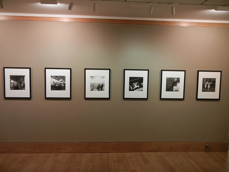
JTF (just the facts): A total of 12 large scale black and white and color works, framed in silver or brown and unmatted, and hung in the North gallery and an adjacent viewing room. 8 of the works are single images; the other is a group of four images hung together as a unit. The color works are described as either “color photographs” or inkjet prints, while the black and white works are gelatin silver prints. The prints range in size from relatively small (between 18x18 and 42x27 for the sub-parts of the four image group) to mural sized (93x169).The edition sizes include 3+1AP, 4+1AP, and 5+2AP, generally based on the physical dimensions of the work (smaller editions for larger works). All of the images were taken between 2007 and 2011. (Installation shots at right.)

Collector's POV: The works in this show are priced as follows. The single images range in price from $300000 to $700000; the four image group is $350000. Wall’s prints have only been intermittently available in the secondary markets in the past few years, with none of his best known works coming up for public sale. Recent prices have ranged between roughly $50000 and $425000, but this is more a reflection of the specific lots that have been sold at auction than a representative data set of the entire breadth of Wall’s best work.

Rating: * (one star) GOOD (rating system described here)
.
Transit Hub:
  • Reviews: NY Times (here), Artforum (here), New Yorker (here), ARTINFO (here), ArtObserved (here), Economist (here), Photograph (here), Capital New York (here)
  • A.D. Coleman’s blog, Photocritic International (here)
Jeff Wall
Through January 21st
.
24 West 57th Street
New York, NY 10019

Friday, January 13, 2012

Bertien van Manen: Let's sit down before we go @Richardson

JTF (just the facts): A total of 19 color photographs, framed in white and matted, and hung in the main gallery space. All of the prints are chromogenic prints, sized 16x20, in editions of 5. The images were taken between 1991 and 1994. A monograph of this body of work (edited by Stephen Gill) was published by Mack Books in 2011 (here), and is available from the gallery for $45. (Installation shots at right.)
.
Comments/Context: Bertien van Manen's images from the former Soviet republics have the intimate feel of family snapshots. They get inside the lives of the subjects, capturing them in quiet, unguarded moments, where the routines of ordinary life give way to small, personal joys. Unassuming and understated, the photographs are deceptively mundane.
.
And yet, in a handful of these images, there is a glorious and enveloping warmth, made stronger by careful composition. At a summer campsite, young men wander between cloth tents, picnic tables covered with the remnants of meals passed and empty vodka bottles hanging from the trees. In winter, a nighttime snowball fight catches sparkling flash-lit flakes in mid-air. Inside a house, pink leggings hang from the ceiling, flanked by a pair of boots, a green table, and a child wearing a pacifier hung by a string. And in the soft summer evening, a woman gives a man a haircut, bathed in the yellow light across the green pasture. All of these are fleeting moments that might have gone unnoticed, but to van Manen's eye, they become something altogether more powerful and memorable.
.
Other images in the show give supporting glimpses of everyday life in this particular time and place: a posed family surrounded by snowbanks, the bright red lipstick favored by the young women, skiing in bikinis and bathing suits, or groups casually hanging out on park benches. They are pictures that capture misjudged details, forgotten gestures, and small interactions, and together, they tell a nuanced story of life in 1990s Russia and its neighbors. All in, these are photographs full of subtleties, telling the other side of a better known story.
.
Collector's POV: The prints in this show are priced at $3800 each. Van Manen's work has little or no secondary market history, so gallery retail is likely the only viable option for interested collectors at this point.
 
Rating: * (one star) GOOD (rating system described here)
.
Transit Hub:
  • Artist site (here)
  • Feature: Time LightBox (here)
  • Interview: Bint PhotoBooks (here)
Bertien van Manen: Let's sit down before we go
Through February 11th
.
535 West 22nd Street
New York, NY 10011

Thursday, January 12, 2012

Checklist: 1/12/12

Checklist 1/12/12

New reviews added this week in red.

Uptown

ONE STAR: Cecil Beaton: Museum of the City of New York: February 20: review
ONE STAR: Photographic Treasures from the Collection of Alfred Stieglitz: Met: February 26: review
THREE STARS: The Radical Camera: New York's Photo League: Jewish Museum: March 25: review

Midtown

ONE STAR: New Photography 2011: MoMA: January 16: review
ONE STAR: Massimo Vitali: Bonni Benrubi: February 4: review
TWO STARS: Reinstalled Permanent Collection: MoMA: March 28: review

Chelsea

ONE STAR: Alex Webb: Aperture: January 19: review
ONE STAR: The Wedding: Andrea Rosen: January 21: review
ONE STAR: Pierre Gonnord: Hasted Kraeutler: February 4: review
TWO STARS: Joel Sternfeld: Luhring Augustine: Februay 4: review
TWO STARS: August Sander/Seydou Keita: Walther Collection: March 10: review

SoHo/Lower East Side/Downtown

ONE STAR: Mel Bochner: Peter Freeman: January 14: review

Elsewhere Nearby

TWO STARS: Walker Evans: Florence Griswold Museum: January 29: review

Wednesday, January 11, 2012

Joel Sternfeld, First Pictures @Luhring Augustine

JTF (just the facts): A total of 72 color photographs, framed in white and unmatted, and displayed in the entry, the main gallery space and the smaller back room. All of the works are modern pigment prints, sized roughly 9x13, in editions of 5+2AP. The images were taken between 1971 and 1980. The show is divided into four separate projects:

Nags Head, 1975
At the Mall, New Jersey, 1980
Rush Hour
Happy Anniversary Sweetie Face!

A monograph of this body of work has been published by Steidl (here). (Installation shots at right.)
 
Comments/Context: Looking at the early pictures of any artist offers the chance to go back to the beginning and see the experiments and false starts that ultimately evolved into a mature style. Inherent in this kind of analysis is a form of selection bias, where we already know what we are looking for, and so select those images that fit our knowledge of what came later. The opportunity to examine four of Joel Sternfeld's early photographic projects provides just this type of historical pattern matching, where we search the past for signs of the future, discovering visual ideas that were still rough and incompletely formed, but harbingers of later paths and explorations.

My initial impression of these first pictures is that they are looser and more fluid than Sternfeld's later work. His use of a hand held 35mm camera instead of the view camera he adopted later gives these images much more freedom. Some border on a snapshot aesthetic (especially the ones taken on the streets of New York and Chicago), and even the most formal of the compositions are not as strict and rigid as what would come later. In the context of this more forgiving approach, it's absolutely possible to see Sternfeld testing the limits of color, refining the idea of a carefully composed self contained narrative, and playing with subtle visual irony and cynicism, sewing the seeds of the stylistic hallmarks of his successful mature work.

There are many color exercises on these walls, both tighter still lifes and broader scenes that use color as a defining element. Chunky red high heels compete with blue woven polyester pants, a green dress balances a yellow cab, a striped bathing suit sets off deep tan lines, and a flash of blond hair piled up in a beehive has a honey glow. More complex color compositions find a boy with green shoes posed outside a suburban home of the same color (set off by bright pink flowers), a woman riding in a sky blue convertible with matching blue sunglasses, and a neon juke box flanked by lingering men and Playboy centerfolds. Sternfeld was clearly examining the play of different colors, and considering how those weights impacted the underlying structure of his pictures.

There are also plenty of stories and narratives here, many with a nuanced undercurrent of skepticism or humor. Boys with Farrah Fawcett t-shirts pop wheelies on their bikes in the driveway, a baby is carried in a laundry basket mixed in with the dirty clothes, a cop questions a ramshackle beach house resident, and an old man in sunglasses peers with trepidation at an ominously dark sky. Many of the images from Sternfeld's series of mall shots take this further, with lots of men with center-parted feathered hair, moustaches, chest hair, and gold chains posed in odd interior settings, one with an array of wigs and a fluffy dog as props. The beginnings of formality are in evidence in many of these pictures, where compositions are being pared down to their essentials. An emerging political or social edge is also apparent: smoke stacks outside the parking lot of the Tropicana, an oil tank in the window of an empty diner, or a Christina's World echo facing the Sears Auto Service building.

These early images grew more striking as I gave them more looking time. At first they seemed appropriately uneven, with a good number of misses. But even these weaker outcomes show Sternfeld pushing and trying, and the best of the lot absolutely foreshadow the Sternfeld pictures we all know. I came away extremely impressed with the rigor of Sternfeld's trial and error in his early years, his inquiries and questions given visual form, his preliminary steps thoughtful and appropriately risky.

Collector's POV: The prints in the show are priced at $7500 each. Sternfeld's work is widely available in the secondary markets, particularly his most famous images, which have been printed in editions of 50 or even 100. Recent prices have ranged between $2000 and $100000, with his most famous pictures generally in a zone between $10000 and $30000.

Rating: ** (two stars) VERY GOOD (rating system described here)
.
Transit Hub:
  • Reviews/Features: PhotoBooth (here), Capital New York (here), Guardian (here), Time LightBox (here), Wayne Ford (here), TimeOut New York (here)
  • Exhibition: FOAM, 2012 (here)
Joel Sternfeld, First Pictures
Through February 4th
.
531 West 24th Street
New York, NY 10011