Showing posts with label Magnum Photos. Show all posts

Wednesday, September 12, 2012

Lise Sarfati, On Hollywood @Milo

 
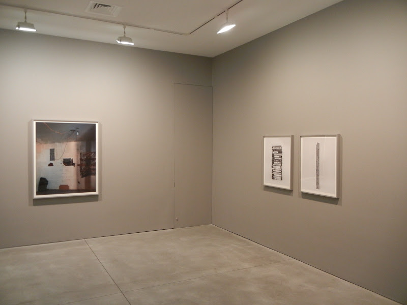
JTF (just the facts): A total of 19 color photographs, framed in white and unmatted, and hung against white walls in the East and West gallery spaces. All of the works are digital c-prints, made in 2009 or 2010. The prints in the East gallery are sized 22x30, in editions of 5+2AP; the prints in the West gallery are somewhat larger (32x44), also in editions of 5+2AP. (Installation shots at right.)
 
Comments/Context: Lise Sarfati's images of Hollywood women are a far cry from anything that might be called glamorous. These aren't pictures of the already famous or the soon to be celebrities, they're spare photographs of the countless forgotten women who have set out to chase a dream and have found the path to stardom to be much harder and grittier than they ever imagined. Aspiration mixes with vulnerability, hope with despondency, frustration with weariness: these are some of the casualties in the heartless struggle for fame.
 
Sarfati has been making solitary images of men and women for years, often composed with indirect glances, empty settings, and an.adept eye for muted color. These new works certainly fall into this larger pattern, albeit with an even grimmer mood and a dirtier palette. The back gallery is filled with head shots taken from underneath, seen with city buildings and tired, rundown storefronts (drug stores, strip clubs) in the background. There is an echo of Callahan here, but with a more cinematic West coast mystery. The women alternate between quiet confidence and fragile despair, the sense of struggle apparent in everything from their body language to their blank expressions. A dreary cigarette is never far from view, taking the edge off on a random street corner or a washed out sidewalk.
 
The photographs in the front gallery step back a few paces, making the images into wider, more narrative scenes. A blond girl smokes a bored, languorous cigarette in a cheap poolside chaise, another lingers outside a convenience store next to a fluorescent-lit green wall, and a goth girl in black coolly poses outside a closed movie theater. Women stare into storefront windows, idle near chain link fences, and sit on seedy concrete stoops, always smoking, down on their luck and waiting for something that probably isn't going to arrive; a few might be credibly be mistaken for hookers, which makes the subtle desperation in the images even more discouraging.
 
Both sets of pictures have a quiet, downtrodden grace in the face of this unforgiving environment. In Sarfati's Hollywood, life on the fringes doesn't look too appealing, but there is a sense of moody perseverance in nearly every image, of making the best of it even if the self-delusions are wearing thin.
 
Collector's POV: The prints in this show are priced as follows. The 22x30 prints range from $6600 to $10600, while the 32x44 prints range from $9300 to $13200. Sarfati's work has only been sporadically available at auction in recent years, with secondary market prices ranging from roughly $3000 to $14000. This body of work was also on view at Rose Gallery in Santa Monica, CA (here) earlier this year.

Rating: * (one star) GOOD (rating system described here)

Transit Hub:
  • Artist site (here)
  • Magnum Photos page (here)
  • Features: Time LightBox (here), Le Journal de la Photographie (here)
Through October 13th
 
245 Tenth Avenue
New York, NY 10001

Tuesday, April 24, 2012

Tim Hetherington @Milo

JTF (just the facts): A total of 35 color photographs and 2 videos,  hung in the front and back galleries and in a side viewing room. All of the prints are digital c-prints. The images from Liberia are framed in raw wood with no mat, and were taken between 2003 and 2007. The prints are sized 36x36 or 47x47, both in editions of 18+4AP. The images from Afghanistan are alternately framed in black and white with no mat, and were taken in 2008. The images are sized 18x24, 30x45, or 60x43 (or reverse), all in editions of 18+4AP. Both of these bodies of work have been released in book form: Long Story Bit by Bit: Liberia Retold published in 2009 by Umbrage (here) and Infidel published in 2010 by Chris Boot (here). (Installation shots at right.)
 
Comments/Context: Tim Hetherington's show at Yossi Milo is at once both triumphant and disheartening. I sure this audience is already completely familiar with Hetherington's tragic story, and of his death last year covering the uprising in Libya. Here was an artist who routinely took his life in his hands to tell stories he thought were important, and who ultimately paid a massive price for this dedication. When I saw these pictures more closely and in more depth, it was hard not to feel a huge amount of respect for his talent and sacrifice, while also being heavily weighed down by the thoroughly discouraging outcome.
 
Hetherington's images of the conflict in Liberia are open ended and diffuse in terms of their narrative. They seem less intent on furthering a certain point of view and instead center on turns of color and composition, in the context of an active rebellion. A splash of red carpet punctuates an airport military parade, a blue wall poses as a backdrop for a band of child soldiers, lush green tree limbs are framed by jagged white tiles, and a red jacket is interrupted by the circle of a rubber tire. Tiny details provide anchors for formal, single frame stories: a casually placed grenade, a bloody foot, a plastic spoon tucked in a waistband, or a patterned dress offset by rockets in both hands. Together, the whole body of work is atmospheric, the murky orange dusk and the penetrating gaze of a child soldier providing an overarching sense for the feel of the place.
 
I think that Hetherington's images from Afghanistan will end up being THE images from this particular war; put them on the shelf with icons by Capa and Smith and the rest of pantheon of great war photographers. What is astounding about these pictures is their sense of being inside the brotherhood. The playful wrestling, the roughly applied kiss to a reluctant recipient, the Infidel tattoo worn with pride and honor, these are stolen moments of relaxed downtime in an otherwise horrific situation. The series of sleeping soldiers captures the real vulnerability of these heroes; they're not standing at attention in perfect dress uniforms, they're asleep like any other young men, mouths open, bodies curled up, like boys in bunk beds. These works are particularly poignant when hung as a large group, when nearly the whole squad is seen at rest. The individuals then become something universal, a representation of the fragility of those we send off to fight our battles. A short film (also called Sleeping Soldiers) then juxtaposes these calm still frames with the out of breath anxiety and tension of a firefight, with bombs going off, helicopters passing overhead, and echoing chaos all around. Together, they provide an extremely strong, visceral sense of what this war feels/felt like for those on the ground. (Restrepo, Hetherington's documentary film made with Sebastian Junger, tells this story much more broadly and is a must see.)

To get such an unvarnished, unguarded look at the reality of contemporary war is rare indeed, and Hetherington clearly needed to establish an unusual bond of trust to make these photographs. This then brings us back to the sadness of this show. The work itself is evidence of an increasingly mature and original artistic voice, but the story abruptly ends here. So while we can be rightly angry and frustrated by this turn of events, Hetherington's many indelible images of the human side of the throes of war provide a permanent record we can respectfully celebrate and remember.
 
Collector's POV: The prints in this show are priced based as follows, based on the project/series. The images from both the Liberia series and the Afghanistan series range in price from $5000 to $9500, with multiple intermediate prices based on size and in ratcheting editions. Hetherington's work has very little secondary market history, so gallery retail is likely the best option for interested collectors at this point.
 
Rating: ** (two stars) VERY GOOD (rating system described here)
 
Transit Hub:
  • Magnum Photos page (here)
  • Reviews/Features: Washington Post (here), American Photo (here), Daily Beast (here), Stellazine (here), Examiner (here), Huffington Post (here)
Through May 19th

Yossi Milo Gallery
245 Tenth Avenue
New York, NY 10001

Monday, February 27, 2012

Police Work: Photographs by Leonard Freed, 1972-1979 @MCNY

JTF (just the facts): A total of 47 black and white photographs, framed in black wood and matted, and hung against dark blue walls in two adjoining rooms on the second floor of the museum. The prints are either gelatin silver (vintage) or archival pigment prints (later), taken between 1972 and 1979. No physical dimensions or edition information was available. The exhibit also includes 2 glass cases displaying 5 books by Freed, 2 magazine spreads, and a copy of his press pass. A monograph of this body of work was published by Touchstone in 1980. (Installation shots at right.)

Comments/Context: Leonard Freed's documentary photographs of 1970s era New York policemen and women tell a surprisingly even handed, matter-of-fact story about life on the beat. His pictures are less about dramatic moments, dangerous situations, and action-packed heroism, and more about the day-in, day-out life of rough and tumble police work. It's an inside look at the gritty realities of the occupation, its tedium, and the everyday people tasked with the job of trying to control an unruly world.

During these years, Freed actually rode around in patrol cars, spent time in police precincts, and tagged along for arrests and demonstrations. As a result, his photographs have an inside-the-barriers immediacy, often capturing the viewpoint of the officers or catching an unguarded moment during a break in the action. As a group, the pictures are unexpectedly comprehensive: suspects are frisked and handcuffed, bulletproof vests are put on, notes are taken, drug sales are spotted with binoculars from rooftops, confiscated handguns are forensically tested, composite sketches are drawn, and paperwork is filed. When the tension is low, the officers ham it up with parade watchers, play with kids and let them climb in the patrol car, or simply take a much-needed smoke break. Off duty, they lounge in above ground pools and ride motorcycles like the rest of us, but the sea of uniforms at one too many formal funerals is a poignant reminder of the ever present danger associated with this career choice.

What I liked best about this body of work is that it covers so much emotional landscape, without being too posed or biased. In Freed's tight photographs, the job of policing looks alternately high pressure and slack, unexpected and routine, fast paced and ploddingly boring. Knife scars, burned out buildings, vacant debris strewn lots, and a sink full of cash and syringes provide the seamy details, but there are an equal number of moments waiting, standing around, or talking with bystanders and locals. His pictures are more about the process of policing than the end results, and regardless of the particular time period, their continued strength lies in being open about the daily complexity that the job both offers and requires.

Collector's POV: Given this is a museum show, there are, of course, no posted prices. Freeds's photographs are available from time to time in the secondary markets, with perhaps a handful of prints coming up for sale each year. Recent prices have ranged from roughly $1000 to $5000. The estate of Leonard Freed is represented in New York by Bruce Silverstein Gallery (here).

Rating: * (one star) GOOD (rating system described here)

Transit Hub:
  • Magnum Photos page (here)
  • Features/Reviews: Time LightBox (here)
Police Work: Photographs by Leonard Freed, 1972-1979
Through May 6th

Museum of the City of New York
1220 Fifth Avenue at 103rd Avenue
New York, NY 10029

Wednesday, February 15, 2012

Alec Soth, Broken Manual @Kelly: A Review Conversation with Richard B. Woodward

Rather than following my normal format, today’s review of Alec Soth’s new show at Sean Kelly will once again take the form of a casual, but hopefully thoughtful, conversation. Regular readers might remember that I experimented with this collaborative approach in a recent review of the Jeff Wall show at Marian Goodman (here), where I went back and forth with longtime photo critic AD Coleman. As a reminder, this structure has no pre-sets – it’s an open ended discussion that leads wherever the ideas might take us.

I’m happy to say that Richard B. Woodward has decided to join me for today’s conversation. Woodward is an arts critic who contributes regularly to the Wall Street Journal, where he often covers major museum shows of photography from around the US, normally in longer format reviews containing a mix of historical background and artistic explication. His writing is also easily found in any number of photo books and exhibit catalogues from the past decade or two, where his essays provide lucid context and critical interpretation. I’m overjoyed to have lured him away from the tactile pleasures of the printed page and into the freewheeling online realm, at least for the moment.

DLK: I have to admit up front that I didn’t come into this show completely cold. Like many other collectors I’m sure, I had seen several prints from this series in the Weinstein Gallery booth at last year’s AIPAD and had also encountered a number of reproductions in the exhibition catalog from Soth’s retrospective at the Walker Art Center in 2010, so at some level, I knew what I was in for before I arrived. But with that caveat, I will say that I most certainly got a fuller experience of the work in this gallery show than I had previously felt.

My first reaction was at some level less about the photographs themselves as individual works (we’ll get to that in a moment I’m sure) and more about the overall mood that they create in tandem. To me, Broken Manual is an obvious progression from and intensification of the atmosphere of The Last Days of W (Soth’s previous project). We’ve clearly moved on from exhaustion (in many forms), political cynicism, tempered anger, and angst to something altogether more desperate and personal. While there is of course something action oriented about the desire to flee and disappear, I felt the heavy weight of powerlessness in this show. It’s as if these people (all men that I could see) have banged their heads against the metaphorical wall for so long (without anyone listening) that they have finally given up and retreated to the margins and wastelands of America. Whether they’re hermits, survivalists, hippies, government haters, conspiracy theorists or just plain crazy (by some definition), they’re living in a roughly similar emotional landscape, and Soth seems to have found a sense of deep empathy for parts of what made these men want to be alone. So my point is that the pictures are really capturing an abstract state of mind, and any particular authentic reality in the photographs is just a symbol of that frustrated psychological atmosphere.

RBW: I appreciate your asking me to trade fours with you on the bandstand in your club. I’m new and somewhat averse to on-line media (I don’t even have a Facebook page) but your blog is among the few that I regularly read, both to catch myself up on shows I’ve missed (you see everything) and to compare my reactions to your intelligent takes.

Like you, I had seen this body of Soth’s work before. I saw his retrospective last year at the Walker Art Center in Minneapolis, his home town, and Broken Manual was installed as part of that. The selection was, if I remember, somewhat larger but also presented in a subdued, grayish atmosphere. There were probably 10 pictures from the series in the catalog, From Here to There: Alec Soth’s America, that aren’t here.

I like this version better. It is, as you say, a deepening and a concentration of the glib and cynical tone in The Last Days of W and it’s also a logical progression from Sleeping by the Mississippi. The mood here is more crushingly sad than at the Walker. (I’ll see if I can explain why later.) We can talk in another exchange about his techniques for treating people who are not as economically advantaged or emotionally stable as he is, how he has earned their trust and whether or not you think he has betrayed it, and whether or not that’s inevitable.

But his choice to focus on men who choose to live apart from American society was smart and full of photographic possibilities. As types, they populate both our 19th century history (the Western prospector, the crazy hermit, persecuted religious sects such as the Mormons, various utopian communards) and our tabloid culture of paranoid loners and political lunatics. There was Eric Rudolph who blew up abortion clinics and attacked the Atlanta Olympic Games and went on to survive in the North Carolina woods for years. And, of course, there was “Unabomber” Ted Kaczynski who is alluded to a couple of times in the show.

Soth is one of the most thoughtful photographers around, a guy who is always wrestling with the question of where to stand in relation to his subjects and how to keep the documentary tradition vital so that he can poke his nose where it doesn’t belong and still have a clear conscience. I wonder if you felt, as I did, that one of the strengths of the show is that one feels Soth is tempted by the idea of abandoning his life as a dutiful Magnum member and breadwinner in order to go off and live in a cave. He’s trying to empathize with these men, even a skinhead neo-Nazi, and, like Arbus, he keeps asking himself, “hmm, what would happen to me if?” He sees the appeal of getting away from home, and working. In fact, that’s what he’s doing here. How different is a photographer on the road from a guy holed up in the desert? Being both inside and outside is always a hard act to pull off. How do you think he succeeds at that?

DLK: Watching parts of the documentary running in the darkened side room made me conclude that Soth got the balance generally right, not too far in (thereby losing a sense of wider perspective), and not too far apart (with the danger of a smug mocking eye). The trust he built with his subjects seems to have been easy going and genuine. That said, the installation of ephemera in the first room wouldn’t look as manic and serial killer crazy as it does unless Soth had become somewhat fascinated by the whole culture he was exploring; I don’t want to speculate on exactly how far he was drawn in, but I think he imbibed enough of the kool aid to at least intellectually understand some of the motivations. I thought some of the best moments in the film are when nothing happens, and Soth is wandering frustrated in search of something or someone he can’t seem to find; the project takes a more obsessive tone at that point, which seems somehow appropriate for the subject matter. I do agree that Soth’s overall commitment to and engagement with “disappearing” makes these pictures more successful than they would have been at arm’s length.

The only image in the whole show that I think comes to close to the exploitation line is the portrait of the tanned, naked man standing in the water lily pond (the titles of these images are universally unhelpful for identification purposes). I actually think this is a very powerful image (especially printed as large as it is), juxtaposing the swastika tattoo and Garden of Eden setting, but I do wonder a bit about the coaxing that occurred to get this shot. Of course, I don’t know the back story to the photograph, but it seems pretty unlikely to me that the man came up with standing naked in the pond all by himself. That isn’t to say that he wasn’t a willing participant; on the contrary, I think he probably was, and the starved for attention quality that many of the men have is an important and unexpected discovery that Soth makes in these pictures. While the other portraits in the show are of course somewhat posed (he’s using a large format camera after all), this is the only one that seemed a bit unnatural to me. But maybe that risk taking (by both sides) is what makes it more memorable.

RBW: I think the project is rife with exploitation, as is any project with a gross imbalance of power between photographer and subject. And most projects are! That’s the nature of photography. The opening for the show at Sean Kelly was packed with friends of Soth and other photographers who were a world apart from the subjects in the pictures. I wonder if any of the lost souls featured here has seen the work and, if they have, I’d be curious what they thought of it. I doubt any of them would be too upset. Even the fellow standing naked in the water, with shaved head and swastika tattoo, seems proud of himself and would be probably be OK with seeing himself on the walls of a Chelsea gallery.

One of the many things I like about Broken Manual is that Soth has recognized this problem of the portrayer and the portrayed, and his photographs reflect that. There is a blurry portrait that suggests it was taken with a long lens, as though these are men of whom we are slightly afraid and who are slightly afraid of us. There’s a surveillance quality to the picture. Or it could indicate an early phase of his getting to know these guys: he could only see them from afar, stalking them in the woods as though they were Bigfoot. Other pictures, including the one you cite, and another of a bearded man sleeping, show a much greater degree of trust.

He has approached these men as if he were an anthropologist. He reveals not only their portraits but their abodes, reading matter, tools (including a sex toy) and their attempt to dress up or glamorize their surroundings. The saddest picture in the show to me was the mirrored globe hanging off a branch in the middle of nowhere. Soth has photographed it in the grayest, flattest light so that it barely reflects anything. Not many disco parties in that neck of the woods, I’m guessing.

DLK: I very much agree that the grainy, out of focus photo of the bearded man in the woods captures something important about this whole project. I think you’re right on as far as the feel of voyeuristic surveillance it employs, as well as the stalking, fleeting glimpse it offers. It’s indistinct, and marginal, and just out of reach, and yet the American flag bandanna around the man’s neck somehow opens up other narrative possibilities: is this a veteran, or perhaps someone fiercely patriotic, troubled by an America that seems to have lost its way, whose only logical response was to reject it and head for the hills?

The still life images are a bit of a departure for Soth I think. Not only are they in black and white, but they are set against blank backgrounds, just like Taryn Simon’s Contraband series. And in a sense, they have an affinity with that project, in that the objects are outside societal norms in one way or another: conspiracy videos, a makeshift knife, a welded iron helmet almost medieval in its roughness, a slug dragging a trail of slime, a sex toy. I absolutely see the resonance of these objects as part of the larger story, but I wonder if they would all be as powerful if taken out of context and forced to stand alone.

I also agree that both the disco ball and the light bulb in the lonely woods are achingly sad. Here I think the return to black and white is very effective; draining away the color makes the blanket on the forest floor or the rocky camp site seem even more dismal and gloomy. Here’s where the glamour and romance of disappearing really meet the harsh reality of being alone; time seems to stand still in these pictures, in a bone tired, dispiriting way.

I’m not sure if it’s just a quirk of this particular hanging, but with fewer portraits as a percentage of the whole, I think the places (the white cave with hangers, the house built into the rock wall, the dome in the desert, the house boat covered in lights, the single light bulb interior with graffiti) and objects start to act like stand-ins for invisible people. The eccentricities pile up, but they are harder to hold on to. The photographs are indirect portraits of their owners, which when taken together as a group, takes me back to the project as an exercise in abstraction, of using symbols to document a continuum of specific behavior that all converges on an underlying set of interlocking emotions.

RBW: I like your idea that the objects are stand-ins for people. The things these guys have taken with them into the woods are not only tools, they’re also totems. A single light bulb would be a fairly grim source of illumination in a room. Hanging from a tree it’s both a surreal symbol of civilization and an indication of one man’s extreme isolation.

But I don’t understand what you mean by “exercise in abstraction.” Soth is trying to evoke a sense of loneliness and rejection and self-exile strictly through traditional documentary means: portraits, forensic or evidentiary pictures of habitat and possessions. One of those techniques would only take us so far in setting a mood about a way of life. Portraits alone couldn’t transport us to that emotional place without a lot of obtrusive text telling us what to think about the economic plight of these guys. And the light bulb, mirror globe, sex toy, boat, coat hangers, slimy slug would be too allusive--too Taryn Simon--if seen alone. You’re right that what power these objects have derives from the context and conjunction with the portraits.

The published survivalist material stacked against one wall is another documentary technique, even if it’s not photographic. The array of pamphlets and books is a sign, as you say, that Soth has burrowed deeply into this culture. He also may want to show us how many kinds of crazy there are. As I wrote before, hermits have existed throughout our history and developed their own eccentric culture. In the 1950s and ‘60s men built fall-out shelters as they prepared for nuclear war. The survivalists in Soth’s photos don’t seem to conform to any single political philosophy. They’re not all neo-Nazis or Tea Party extremists or disappointed Left-wing radicals or hippies gone to seed. But many are clearly paranoid. I was interested to hear in the documentary from the old guy who expected Obama to be assassinated as a pretext by a cabal for a government take-over.

The books help to show that these men aren’t just camping and they’re not homeless. They’re serious and determined to live apart, and they have allies in the fringes of the business world. Preaching the apocalypse can be profitable. On various radio stations and on the Internet you can find advertisements now for a Food Insurance outlet selling “gourmet” meals guaranteed to last for 25 years. The company is endorsed by Sean Hannity and Glenn Beck. Economic or ecological collapse is not as unthinkable as it was 20 years ago, and some people have already begun to build their arks for the hard rain that’s gonna fall.

DLK: I like the way Soth has captured the broad diversity of these characters, but still retained their elusiveness. Most of the photographs are the opposite of traditional portraits: eyes closed, walking away into a thicket of brambles, camouflaged in a ghillie suit, dwarfed by towering trees or overgrown greenery. Soth has effectively matched his unconventional compositions to the marginal nature of his subjects.

By the way, I didn’t mean “abstraction” to represent anything more than the simple idea that all of the works here attempt to depict something which is underneath and invisible, and therefore a step away from the literalness of what they are and a leaning toward the metaphorical of what they might represent. The pictures themselves are of course not abstract in the visual sense, they are documentary (broadly defined) as you point out. All I was trying to get at was the representational aspect of trying to convey complex emotion, which to me ends up being somewhat “abstract”. I’m probably in the semantic weeds here, so let’s move on.

Overall, I came away from this show impressed with Soth’s dedication to an unruly project, and with his ability to consciously broaden his photographic toolkit to include more subject matter types and aesthetic approaches; I certainly got the impression he was pushing himself beyond his comfort zone. From my vantage point as a collector, I’m always trying to get my head around the difference between the durable and the forgettable, and I think there are at least half a dozen photographs on view here that will likely age very well indeed, that will retain their power to startle far into the future (even when taken out of context) and will be emblematic of the particular embittered times from which they came. Many of the others will likely fill the role of quirky supporters, especially in book form where they can be additive to the overall mood. I imagine a certain slice of collectors will find this work too far out there, a bit puzzling and hard to categorize. For the most part, I found Broken Manual compelling and original, and I was left wondering whether this body of work is the terminal end point to a line of thinking that began many years ago for Soth, or whether it is some kind of intermediate transitory stage, where he has been flexing his artistic muscles a bit with a tough problem, only to pivot and apply those new strategies and techniques to something altogether different in the future. As a show, I think it cements his reputation as a leader, and leaders don’t always take the obvious path.

RBW: Here are a few last thoughts.

I agree that Soth is working on the edge of where his core artistic beliefs and training have taken him. He and several other members of Magnum, including Susan Meiselas and Jim Goldberg, are rethinking what it means to document a culture. The danger is that in trying to encompass more by nibbling around the edges of a subject to get at “an overall mood,” you take a lot of lesser photographs instead of a few dazzling ones. I don’t see any great pictures in the show, although I see a number of good ones that mesh nicely and, as you say, “half a dozen photographs on view here will likely age very well.”

He’s also, as you say, “a leader.” From what I observe and hear, he’s very generous to other photographers. His drive to succeed to work hard has not blinkered him or turned him into an egomaniac. He has an expansive attitude about what documentary photography can be and he seems dissatisfied with the status quo. I expect lots more good work from him.

We haven’t talked much about the size of the prints and how unexpectedly large or small some of them are. My first reaction upon seeing the print of the ship was, ‘why so big?’ Then, on closer inspection, it won me over. If it were smaller, you wouldn’t see the detail of the jerry-rigged wiring on the masts and the quite unglamorous domesticity that life on the water affords. (Soth must be attracted to living on a boat or being near water, as the theme turns up repeatedly in his work.)

I wasn’t sure what he gained by mixing black-and-white and color. (The black-and-white prints here are actually, as I understand, just dialed down color negatives, not made from “true” black-and-white negatives.) Then, I decided this is another way for him to keep us on our toes and not let us think we could immerse ourselves in this alien world. If everything were color or everything were black-and-white it would be much easier to feel he was a reliable guide around these men. To revert for a moment to artspeak, he was revealing his camera and photography as a mediator, and not an inclusive or impartial one.

I was a little disappointed that he didn’t include here any of the videos he has made. Several were in the Walker retrospective and they revealed what a smart, goofball he can be. They might have disrupted the sobriety of this show and we can see those aspects of his personality in the film about him that’s playing in the first gallery. Still, I thought he could have mixed up his approach and complicated the mood even further with more irreverence.

The subject of men driven by a need to remove themselves from society has been taken up by writers (Jon Kracauer’s Into the Wild) and by movie makers (Jeff Nichols’s Take Shelter) but I don’t know that many photographers have attempted it. Joel Sternfeld’s Utopia project is much more sociable. Soth has to solve the problem of showing absence and emptiness and anomie and detachment and hostility, and that’s hard to do in a photograph. Too many others, when they decide to document, say, the homeless, will take portraits and maybe the makeshift shelters they construct, leave it at that.

Soth has tried to come up with a more nuanced solution and I applaud him for it. Like you, I see it as transitional in his development. I’ll be curious to see what his next project will be. The choice of subject often determines what you photograph and how, and it’s usually the hardest decision to make. I have a hunch we’re going to see more video.

Thanks again for inviting me for a chat in your digital man cave. Let’s do it again.


And now the usual supporting sections:

JTF (just the facts): A mixed group of 26 black and white and color photographs, framed in grey wood and unmatted, and hung against grey walls in the main gallery space, the entry, and a single side room. All of the works are archival pigment prints, mounted either to paper or 4 ply museum board, all in editions of 7+3AP. Sizes range from 10x8 to 70x56 (or reverse). There are 13 black and white and 13 color images in the show. The images were taken between 2006 and 2008. The exhibit also includes an installation of Broken Manual limited editions and other ephemera related to the project. In a darkened side room, a 57 minute documentary called Somewhere to Disappear (here) is on view. A trade edition of Broken Manual is apparently forthcoming from Steidl (here). (Installation shots at right.)

Collector's POV: The prints in this show are priced as follows. The smallest 10x8 images start at $5000, and generally increase in price according to size, reaching $28000 for the largest 70x56 prints. Intermediate prices include $6000, $9000, $15000, and $20000, with a couple of images NFS. Soth's work has begun to appear in the secondary markets more consistently in recent years (a handful of lots each year), with prices ranging from roughly $4000 to $22000.

Rating: ** (two stars) VERY GOOD (rating system described here)

Transit Hub:
  • Interview: Interview (here)
  • Artist site (here)
  • Magnum Photos page (here)
  • Soth’s book publishing arm, Little Brown Mushroom (here)
Through March 11th
.
528 West 29th Street
New York, NY 10001

Tuesday, January 31, 2012

Perspectives 2012 @ICP

JTF (just the facts): A group show consisting of the work of 3 photographers, variously framed and matted, and hung against white walls in a series of three connected rooms on the entire upper level of the museum. Starting at the entry to the exhibit, there are a total of 13 photographs by Chien-Chi Chang from his series China Town. 6 are gelatin silver prints and the other 7 are chromogenic prints. They are all framed in silver with no mat and hung edge to edge as diptychs and triptychs based on the relationships of the families depicted. The works were taken between 1998 and 2008. In the side room, there are a total of 11 photographs by Greg Girard from his series Half the Surface of the World. All of the prints are chromogenic prints, framed in silver with no mat. The works were taken between 2008 and 2009. And in the main space, there are a total of 12 images by Anna Shteynshleyger from her series City of Destiny. All of the prints are archival inkjet prints, framed in brown wood with no mat. The works were taken between 2002 and 2011. No dimension or edition information was provided for any of the works on view. Since photography is unfortunately not allowed in the ICP galleries, the images for this show come via the ICP website. (Photographs by Chien-Chi Chang, Greg Girard, and Anna Shteynshleyger, top to bottom, respectively.)

Comments/Context: This year's version of the ICP's annual Perspectives show gathers together three bodies of recent work that revolve around the idea of transplanted communities and the process of creating a feeling of home in a new environment. It's a loose theme that allows for divergent photographic approaches and cultural contexts.

Chien-Chi Chang's contrasting images of fathers working in New York and families back in China are the most successful. The men are photographed in black and white, sitting in cramped dormitories after a day of hard work, drinking beer, eating noodles, and calling home. The women and children are photographed in color, wives caring for babies, girls watching TV and lounging around. The contrast of these two worlds documents the dislocations that are occurring, where distance impedes communication and sacrifices are being made on both sides in the hopes of something better for the family. I liked the down time simplicity of these pictures, where the quiet loneliness of the subjects comes through.

Greg Girard's photographs follow in a long line of military base photography, but center not so much on the juxtaposition of opposing cultures but on the attempt to create a slice of the United States in far away lands. At bases in Kora and Japan, he finds big box stores, sculpted suburbs with manicured lawns, regulation US Postal Service mail boxes, ATMs and Pepsi trucks. Kids play on residential sidewalks, and American style news comes from military TV anchors and the Stars and Stripes newspaper. His images have the atmosphere of a surreal stage set, where small details of the underlying local world poke through at odd moments.

Anna Shteynshleyger's images of her life in an Orthodox Jewish community in Des Plaines, Illinois, are the most understated and subtle, to the point of being less durably memorable. The photographs are opaque and closed, the meanings less identifiable: a bare lightbulb in a room, carnations on a windowsill, a bird's nest on the hood of a car, an uncle standing in the greenery, a still life of backyard leftovers and pink Crocs. From these images, I was less able to connect with the narrative being told, or to resonate with the particular nuances of this cultural world and its challenges. I needed a few more clues to understand why these moments mattered.

All three of these projects likely function best in book form, where an aggregation of images can tell a broader and more robust story. That said, Chang's photographs will resonate most with me going forward, as I think he was most able to document the complexities of the underlying emotional state of an uprooted, transplanted life.

Collector's POV: This is a museum show, so of course, there are no posted prices. In general, these three photographers have little or no consistent secondary market history; as such, gallery retail is likely the only option for interested collectors at this point. Chien-Chi Chang is part of Magnum; his vintage and modern prints are available directly from the Magnum Print Room (here) or via the Chi-Wen Gallery in Taipei (here). Greg Girard is represented by Monte Clark Gallery in Vancouver and Toronto (here). Anna Shteynshleyger is represented by Dvir Gallery in Tel Aviv (here).
.
Rating: * (one star) GOOD (rating system described here)
.
Transit Hub:
  • Chien-Chi Chang Magnum Photos page (here)
  • Greg Girard artist site (here)
  • Anna Shteynshleyger artist site (here)
Perspectives 2012
Through May 6th

1133 Avenue of the Americas
New York, NY 10036

Monday, January 30, 2012

Magnum Contact Sheets @ICP

JTF (just the facts): A group show consisting of the work of 22 photographers, framed in black or enlarged and pinned directly to the wall, and hung against dark grey walls in a single room on the lower level of the museum. Many of the vintage contact sheets are shown in a large glass case in the center of the room, and copies of the recent book are arrayed on a bench along one wall. The show was curated by Kristen Lubben. A monograph of the larger collection was published in 2011 by Thames & Hudson (here); a special version with a limited edition print is also available (here). Since photography is unfortunately not allowed in the ICP galleries, the images for this show come via the ICP website. (Contact sheets from Rene Burri, Jonas Bendicksen and Philippe Halsman, top to bottom, respectively.)

The following photographers are included in the show, with the date of images in the contact sheet(s) in parentheses. Each photographer is represented by one sheet (some vintage, some modern) unless otherwise noted:

Eve Arnold (1959)
Jonas Bendicksen (2000)
Rene Burri (1963, plus 2 smaller contact sheets)
Cornell Capa (1961)
Robert Capa (1944, plus 1 individual print)
Chien-Chi Chang (2008)
Elliott Erwitt (1953)
Martine Franck (1976)
Leonard Freed (1978)
Bruce Gilden (1984)
Burt Glinn (1957)
Jim Goldberg (1989)
Philippe Halsman (1948)
Thomas Hoepker (1966)
Josef Koudelka (1968)
Susan Meiselas (1975, plus 1 smaller contact sheet)
Inge Morath (1957)
Trent Parke (2000)
Martin Parr (1985)
Marc Riboud (1953)
George Rodger (1940)
Alex Webb (1978)

Comments/Context: Right up front, I should confess that I am a lover of contact sheets. Seeing an entire roll of film displayed frame by frame is for me the ultimate expression of the photographic process, and I never seem to tire of poring over misfires and accidents on the way to the triumphant finish. The unaltered contact sheet represents (in a convenient short hand) the way the photographer's brain works, how he or she solves visual problems, and how chance and experimentation play a part in the picture making.
.
At a detailed level, this show offers the ability to trail along behind the creation of some of photography's most iconic images: Robert Capa comes ashore at Normandy, Marc Riboud watches a painter high atop the Eiffel Tower, Rene Burri circles seemingly unnoticed around Che Guevara, and Josef Koudelka stands in the streets of revolutionary Prague. I was fascinated by the handful of images Martin Parr made of his famous New Brighton sunbather under the crusty treads of an excavator. He discovered the scene, moved around cautiously looking for the right compositional angle, and then was rewarded with the arrival of a small girl and the exact timing of a passerby in the background. It all happens in a handful of pictures, but it's a tight example of the calculating, iterative, construction of a terrific photograph.

For working photographers, this show should be on the required syllabus, since it proves that there is no one right way to work; below the specifics of the well-known images, the exhibit works on a more abstract level, exploring the nature of seeing, in-camera editing,and the passing of time. Some masters shoot only a frame or two when presented with a visual idea, and then move on rather quickly. Others snap frame after frame of variants on the same image, fine tuning angles and relationships until the magic happens. Still others set up a picture's underlying architecture and then wait for something unexpected to happen. I was just as interested in how these individual photographers worked, as in the eventual alchemy that produced a particular winner. I thoroughly enjoyed watching Susan Meiselas playing with adjacent/secondary cropped nude bodies in the contact sheet from her Carnival Strippers project, working to get just the right balance in the overall frame.

The accompanying catalogue is a wrist-breaking doorstop, but seems to offer hours of tracking and vicarious stalking of your most admired photographers. In our futuristic digital age, these contact sheets are now relics from a bygone era, but they still provide both an unmatched record of pathways of the artist's mind and a valuable teaching tool. In the end, it's just as interesting to see the ones that didn't work, on the way to finding the one that eventually did.
.
Collector's POV: Contact sheets like these are rarely if ever found in the secondary markets, since they tend to be archived with the artist's negatives and papers rather than released as finished works. As such, there is no straightforward way to determine a current market value for these kinds of prints, either vintage or modern. Perhaps the safest answer here is "priceless"?

Rating: ** (two stars) VERY GOOD (rating system described here)
.
Transit Hub:
  • Magnum Photos page (here)
  • Book Reviews: NY Times (here), Guardian (here)
Magnum Contact Sheets
Through May 6th

International Center of Photography
1133 Avenue of the Americas
New York, NY 10036

Monday, January 9, 2012

Alex Webb: The Suffering of Light @Aperture

JTF (just the facts): A total of 52 color photographs, framed in blond wood and matted, and hung in the main gallery space. The digital c-prints come in two sizes: 20x30 (in editions of 20) and 30x40 (in editions of 12); there are 34 of the smaller size and 18 of the larger size on view. All of the images were taken between 1978 and 2010. The display also includes one long glass case containing seven of Webb's monographs (both covers and spreads of each). A new monograph of this entire body of work was recently published by Aperture (here). (Installation shots at right.)
.
Comments/Context: Alex Webb's thirty year survey at Aperture isn't so much a greatest hits or personal best kind of show, but instead more of a once-over sifting of a long and successful career with an eye for artistry in color and composition. Bringing together elements of social documentary and street photography, his images go beyond the color we think of as uniquely American (think Shore, Eggleston, and Sternfeld) and instead capture the brash vibrant hues of the warm weather tropics. From Haiti to Mexico and Grenada to Cuba, Webb finds moments where people and color come together in layered, complex ways, echoing and reverberating across carefully structured frames. His work has reminders of Cartier-Bresson for me, but with a conscious use of color (especially toasted and softened by late afternoon and early evening light) as a distinct and handy tool.
.
Political issues and social realities are never far from Webb's glance, but even images with a clear narrative line are thrown off balance by saturated color. A Mexican border patrol raid takes place in a field of bright yellow flowers, shiny black coffins punctuate a Haitian rally, creamy almond colored water floods a town in Brazil, and school kids in orange gingham shirts stand against a glowing golden wall. Even more ephemeral and unknowable moments turn on seeing color as something quietly but undeniably spectacular: a circus lion in a saturated red cage, pink blobs of fluffy cotton candy against a pastel green truck, a gently purple Istanbul sky, or the jarring combination of a red headscarf and a blue dress on the drab streets of Haiti. Additional patterns and juxtaposed motifs add structure to his visual mix: seeing eye posters in a Bombay market, a welcoming red and yellow popcorn cart against the twilit night of seaside Greece, layers of geometric jungle gym bars in Cuba, and posters of Santa and Jesus with a crown of thorns put together with shapely legs in short shorts. Webb's photographic style isn't out front and obvious and has a surprisingly consistent lack of irony; instead, it sits behind the content with subtle but confident craftsmanship.

For me, the real excitement here was to get outside the intellectual ruts that surround American photographic color, and instead start to gather a sense for a broader, more inclusive international color. Sure, Webb is American, but his images connected me to photographers from Raghubir Singh to Martin Parr, and made me start to consider more fully how all these photographers fit together stylistically and in chronological time. My conclusion is that Webb is particularly adept at undermining the natural tendency to take a specific documentary point of view or opinion; his images shimmer with intense and complex photographic color, but they don't necessarily force the viewer toward a defined end point or showy artistic flourish. Instead, they offer a more indeterminate experience of somewhere far away, alternately raw and unexpectedly visually refined.
.
Collector's POV: While this venue is usually a non-selling environment, for this show, prices were actually available on the checklist. The 20x30 prints are $3500 and the 30x40 prints are $5000. Webb's work has very little secondary market history, so gallery retail or purchase via Magnum are probably the best options for interested collectors.
.
Rating: * (one star) GOOD (rating system described here)

Transit Hub:
  • Artist site (here)
  • Magnum Photos page (here)
  • Reviews/Features: New Yorker (here), NY Times Lens (here), Time LightBox (here)
Alex Webb: The Suffering of Light
Through January 19th
.
Aperture Gallery
547 West 27th Street
New York, NY 10001

Wednesday, March 16, 2011

Mark Power, The Sound of Two Songs @Amador

JTF (just the facts): A total of 11 color and 10 black and white photographs, framed in white and unmatted and framed in black and matted respectively, and hung against cream and grey walls in the main gallery spaces. All of the color works are type c prints, made from negatives taken between 2004 and 2006. These images are available in two sizes: 20x24 (in editions of 10) and 40x50 (in editions of 5). The black and white works are gelatin silver prints, made from negatives taken between 1993 and 1996. These images are square format, printed 20x24 with detailed captions, in editions of 10. A monograph of The Sound of Two Songs was published by Photoworks in 2010 (here). A monograph of The Shipping Forecast was published by Zelda Cheatle in 1996. (Installation shots at right.)

Comments/Context: This show is a two-for-the-price-of-one opportunity to get acquainted with the work of British photographer and Magnum Photos member Mark Power. It combines his black and white work from the 1990s with more recent color images made across Poland, providing an opportunity to compare two working styles tailored to specific projects.

The images in the back gallery come from the series The Shipping Forecast, named for the BBC Radio broadcast heard daily by listeners across the UK. Each work documents a specific coastal location and time, complete with its maritime forecast ("mainly fair" or "moderate or poor becoming good"). These seaside scenes have a dark edginess: a child lies with his dump truck near lumpy mounds of sand, boys search amid cylindrical cement blocks used to bulwark the surf, grey skies envelop beach cabanas and a deserted slide, abandoned white towels are bisected by the blackness of shadows, and cemetery plots look out over the bright horizon. Places listeners have never visited suddenly have a face, and the gathering power of the weather offers a gritty sense of impending doom.

Power's newer images of Poland find moments of quirky optimism and compositional rigor in the drab, grey Eastern European environment. Of course, there are the usual grimy apartment buildings and ugly highway sound barriers that are the staple of so much contemporary German photography. But Power seems to be drawn to the more unexpected visual contrasts and unlikely juxtapositions: a dingy elevated view of Warsaw with a pristine cloud filled blue sky straight out of a 19th century Romantic painting (almost like a LeGray two negative combination), the oddity of green tree trunks amid brick buildings, the strange metal framing of a dusty construction site entrance, the downward look at a winter skating rink (a dead ringer for Moholy-Nagy), or the bisected back view of the massive video screen used to watch the Pope's funeral by a crowd of onlookers. These pictures are like road trip discoveries, the more unusual details of today's Poland that get overlooked when we focus on the obvious or the stereotypical.

All in, this is a solid pairing of photographic projects, with ample evidence of both range and craft on display.

Collector's POV: The prints in this show are priced as follows. The color images are either $3000 for the 20x24 size or $6000 for the 40x50 size. The black and white images are $3500 each. Power's work has not been widely available in the secondary markets, so gallery retail is likely the only option for interested collectors at this point.
While I enjoyed most of the images from The Shipping Forecast series, my favorite was THAMES, Sunday, 7 January, 1996; it's in the center of the third installation shot. I liked the apocalyptic wash of thick fog covering the lone dark figure on the beach.

Rating: * (one star) GOOD (rating system described here)

Transit Hub:
  • Artist site (here)
  • Magnum Photos page (here)
  • Review: New Yorker (here)
Through March 26th

41 East 57th Street
New York, NY 10022

Monday, August 16, 2010

The Magnum Mark: Selections from the Magnum Photos Archive @FLAG Art Foundation

JTF (just the facts): A group show containing final prints, press prints, contact sheets, print maps, story notes, books, and other ephemera from the Magnum Photos Archive. The exhibition is loosely divided into sections, all displayed in the upper gallery space (on the 10th floor, installation shots at right). These include:
  • a group of "Magnum Classics" displayed over a series of walls near the stairs; all the prints are framed in silver and matted
  • a section of African images by George Rodger, including 7 prints, 3 type-written story texts, and 3 glass cases holding binders of contact sheets, notes, and magazine spreads
  • a group of print maps, each series showing a "before" print, prints with markings, and an "after" print, pinned directly to the wall under glass
  • a set of images framed so that both sides of the print are visible, to enable the viewer to see the many stamps and markings on the back
  • a series of 10 video screens along one wall, showing photographic stills in rotation
  • a projection showing a montage of images, alternating with profiles on specific photographers
  • an assortment of Magnum books/monographs on the reading desks
The following photographers are included in the various sections below, with the number of images on view in parentheses:

Magnum Classics

Abbas (1)
Eve Arnold (1)
Rene Burri (1)
Bruce Davidson (1)
Elliott Erwitt (2)
Stuart Franklin (1)
Philippe Halsman (2)
Josef Koudelka (1)
Steve McCurry (1)
Inge Morath (1)
Marc Riboud (2)

Print Maps

Burt Glinn (4)
Susan Meiselas (3)
Inge Morath (3)
David Seymour (4)
Dennis Stock (3)

Double Sided Images (framed to see both front and back)

Eve Arnold (2)
Burt Glinn (1)
Hiroshi Kubota (1)
Guy Le Querrec (1)
Constantine Manos (1)

Comments/Context: Earlier this year, Michael Dell's MSD Capital purchased a massive archive of press prints from Magnum Photos (those prints used up through 2003) and announced that the collection would ultimately be housed at the Harry Ransom Center at U Texas Austin. The FLAG Art Foundation (founded several years ago in Chelsea by collector Glenn Fuhrman, one of the managing partners of MSD Capital) is now showing a small sampler of these prints, giving us a taste for the many educational and art historical opportunities that lie within the archive.

While there are plenty of well-known, "classic" Magnum images on display, the real interest in this show lies beyond the obvious greatest hits. One large wall contains sets of images printed by Pablo Inirio, Magnum's in-house printer. They show his working process, from the initial prints from the negative, to detailed maps of dodging and burning regions and elapsed time periods, to the final images; it's a fascinating study of the intricacies of great old-school analog printing, as applied to James Dean, Marilyn Monroe, Sophia Loren, and Susan Meiselas' carnival strippers.

Along an adjacent wall, a series of press prints have been sandwiched between glass, allowing the viewer to see both sides. The back of each print is a cluttered mass of credit stamps, consignment numbers, barcodes, archive stamps, and terms of use; a large wall diagram helps decode all the different markings. Armed with this information, each print is transformed into an historical object, a physical thing which has traveled a long and winding road from photographer to viewer. Unraveling the mysteries and connections of all these stamps and notations will clearly be a rich area for further scholarly exploration.

A bank of video screens and a changing overhead projection offer a stark contrast to the details of the physical prints; the images swim by endlessly, creating a sense of visual overload, where it becomes nearly impossible to single out just one image for patient looking. Digital display technologies are clearly offering new ways to see photographs, and these media pose complicated questions about how a physical archive like Magnum's should be managed most successfully in a 21st century world.

Overall, this show has a solid mix of old favorites and arcane details and will appeal most to those who want to dig a bit deeper into the minutiae of Magnum's long success.

Collector's POV: While this is not a selling show, most of the images in the Magnum Classics section of the exhibit, along with a few other images from other sections, are available from time to time in the secondary markets, and many of the best known Magnum photographers have gallery representation outside the photo agency, so interested collectors have plenty of options for following up. UPDATE: the folks in Magnum's print sales department have reminded me that prints of most of the images on view in the exhibit are available directly from Magnum, and that there are Magnum fine art advisors available to work with collectors in New York, London, Paris, and Tokyo.

Rating: * (one star) GOOD (rating system described here)

Transit Hub:
  • Magnum Photos website (here)
The Magnum Mark: Selections from the Magnum Photos Archive
Through September 10th

FLAG Art Foundation
545 West 25th Street
9th Floor
New York, NY 10001