Current New York Photography Shows
New reviews added this week in red.
(Rating: Artist/Title: Venue: Closing Date: link to review)
Uptown
TWO STARS: Francesca Woodman: Guggenheim: June 13: review
ONE STAR: Spies in the House of Art: Met: August 26: review
ONE STAR: Naked before the Camera: Met: September 9: review
Midtown
THREE STARS: Cindy Sherman: MoMA: June 11: review
THREE STARS: Weegee: ICP: September 2: review
ONE STAR: Taryn Simon: MoMA: September 3: review
TWO STARS: The Shaping of New Visions: MoMA: April 29: review
Chelsea
TWO STARS: Cindy Sherman: Metro Pictures: June 9: review
ONE STAR: Ari Marcopolous: Marlborough Chelsea: June 16: review
ONE STAR: Lisa Oppenheim: Harris Lieberman: June 16: review
ONE STAR: Evelyn Hofer: Danziger: June 22: review
TWO STARS: Constantin Brancusi: Bruce Silverstein: June 23: review
ONE STAR: Marco Breuer: Von Lintel: June 23: review
TWO STARS: Gilbert & George: Lehmann Maupin: June 23: review
TWO STARS: Gilbert & George: Sonnabend: June 23: review
ONE STAR: Joni Sternbach: Rick Wester: June 23: review
SoHo/Lower East Side/Downtown
ONE STAR: Ryan McGinley (Grids): Team: June 2: review
ONE STAR: Ryan McGinley (Animals): Team: June 2: review
ONE STAR: David Benjamin Sherry: Salon 94 Bowery/Freemans: June 2: review
ONE STAR: Chris Wiley: Nicelle Beauchene: June 3: review
TWO STARS: Gilbert & George: Lehmann Maupin: June 23: review
Elsewhere Nearby
TWO STARS: Rising Dragon: Katonah Museum of Art: September 2: review
Forward Auction Calendar
New auctions added this week in red.
(Sale Date: Sale Title: Auction House: link to catalog)
June 6: 19th-21st Century Photography: Bassenge: catalog
June 8: Contemporary Art: Sotheby's: catalog
June 12: Masterworks of Italian Photography 1945-1975: Christie's: catalog
June 20: Photography: Van Ham: catalog
Thursday, May 31, 2012
Joni Sternbach, Surfland, Revisited 2006-2011 @Wester
 JTF (just the facts): A total of 38 black and white photographs, framed in blond wood and mounted, and hung against white walls in the single room gallery space. All of the works are unique tintypes, made between 2006 and 2011. The prints are either 8x10 or 11x17; there are 34 of the smaller size and 4 of the larger size in the show. A single glass case contains 1 limited edition book with a tintype (in an edition of 10) and 1 gravure (in an edition of 25). (Installation shots at right.)
Comments/Context: Joni Sternbach's surfer tintypes have been shown in small groups at various art fairs in recent years, and so will likely be familiar, or at least recognizable, for many collectors at this point. This show is the first in-depth New York exhibit of her work from this project, and so offers the chance to dig deeper and see a broader sample of these object prints.
.
.
Sternbach is one of a growing number of photographers who have turned away from the digital revolution, instead looking back to the dusty catalog of antique photographic processes. There is a physical slowness to these efforts, a glorious rediscovery of forgotten chemistries and laborious steps, and an embracing of the nuances and unpredictabilities of chance elements. What is tricky about such approaches is that it is easy to make pictures that look self consciously old timey. What is more difficult is to find ways to make these old processes new and relevant once again.
 I think the reason that Sternbach's wet plate collodion tintypes have been so well received is that she has chosen her subject matter so effectively, finding a way for the resulting images to simultaneously look freshly modern and quietly timeless. Her athletic subjects (both men and women) stand in board shorts and wetsuits, with sun bleached hair and tanned skin, alternately holding streamlined short boards and huge double height long boards that tower overhead. They pose along rocky beaches and expanses of sand, with the power of the sea never far from view. As individuals or in groups of two or three surfers, they stare into the camera with a sense of controlled grace and stoic dignity. The images tell simple personal stories without being overly nostalgic; some square jawed surfers look like they could have stepped right out of the 1950s, while others have a strength and confidence that seems very immediate. Sternbach has deftly used this alternative process to document a subculture, relying on its strengths to help her capture both its goofy hilarity (mermaids) and its poetic honor.
In seeing more of these prints together as one body of work, I think the quality of the darkness comes through as the defining attribute. It isn't so much that the photographs are sepia toned; it is the level of detail and boldness of engagement that emerges from the deep, rich tonality of the tintypes that is so unexpected. The process substitutes a velvety, thick atmosphere for the blinding light and immense scale of the windswept beaches, making the portraits surprisingly intimate and self contained. When all the pieces come together just right, the images shimmer back and forth between the appearance of history and the reality of vivid life.
.
 Collector's POV: The works in this show are priced at either $4400 or $6300, based on size. The limited edition book/tintype combination is $4500, and the gravure is $1800. Sternbach's work has not yet entered the secondary markets in any significant manner, so gallery retail is likely the only option for interested collectors at this point.
.
Rating: * (one star) GOOD (rating system described here)
.
.
Transit Hub:
- Artist site (here) and tumblr (here)
- Exhibits: Southeast Museum of Photography, 2012 (here), Peabody Essex Museum, 2009 (here)
Extended through August 10th
511 West 25th Street
New York, NY 10001
Wednesday, May 30, 2012
Brancusi: The Photographs @Silverstein
 JTF (just the facts): A total of 32 black and white photographs, framed in black and matted, and hung in the entry area, front room, main gallery space and back room. All of the photographs are vintage or early gelatin silver prints, taken between 1917 and 1936. Physical dimensions range from roughly 5x4 to 16x12 or reverse. A catalog of the exhibit is available from the gallery. (Installation shots at right.)
Comments/Context: The photographs that Constantin Brancusi made of his sculpture and studio are much more than static evidentiary documents of end product art objects and an overfilled workshop space. They do something quite a bit more radical, employing photography as an expressive method to entirely reinterpret these iconic works, using the interchange of light and shadow to expand our perception of the sculpted forms. Picking up from the small selection of Brancusi photographs in the Original Copy show at MoMA two years ago (review here), this show goes further in exploring how Brancusi used his camera to carefully control and expand our experience of his own work, in the process making photographs that stand on their own as fully formed artworks .
 Brancusi's images of individual sculptures show him experimenting with reflected light, shadow, glare, viewing angle, scale, background color, and even multiple exposures to heighten our awareness of texture, form, and drama. Several of the rough wooden sculptures are lit with harsh direct light, turning the three dimensional objects into flat two dimensional shapes in dark black, echoed by multiple shadows on nearby walls. Sculptures made of brass/bronze and other shiny metals capture brilliant flashes of brightness and energy, or reflect artist's tripod in hidden self-portraits. Ovoid marble objects become soft and silky, or turn and pose amid lengthy shadows. An upwards view of one of his famous Endless Columns turns the bumpy totem into an angular thrust skyward. And Brancusi's series of thin, elongated vertical birds are transformed by all these visual effects in turn: black birds with white highlights, white birds with multiple black shadows, and golden birds with radiant glints.
.
 Brancusi's wider studio views go beyond the singular attention paid to individual works and explore a deeper sense of spatial interaction between the various sculptures, pedestals, bases, and other objects in the workshop. Pairings accent contrasts of shape, form, and weight (thin and thick), while wider views mix scales into a dizzying jumble of blocky geometric forms and more refined objects. Textures overlap, and the natural light from the overhead windows brings areas of light and dark to the carefully arranged installations. When flattened into two dimensions by the camera, the studio views become complex abstract compositions, filled with interlocking relationships and spatial connections, with particular resonance in the shifting back and forth layering between figure and ground.
 While these photographs were certainly successful in increasing (or reinforcing) my appreciation for Brancusi's talents with a chisel or an axe, I think the pictures definitively show that Brancusi was equally adept at controlling mood and emphasis with his camera. This is a well-edited gathering of deceptively complicated vintage photographs, well worth the time spent to savor their intricacies.
.
 Collector's POV: The prices for the prints in this show range from $45000 to $250000. Over the past decade, Brancusi's photographic work has been intermittently available in the secondary markets, with roughly a handful of lots up for sale in any given year. Recent prices at auction have ranged between $5000 and $84000.
.
Rating: ** (two stars) VERY GOOD (rating system described here)
.
.
Transit Hub:
Through June 23rdBruce Silverstein Gallery
535 West 24th Street
New York, NY 10011
Tuesday, May 29, 2012
Evelyn Hofer @Danziger
 JTF (just the facts): A total of 41 black and white and color photographs, alternately framed in white and black and matted, and hung against white walls in the two room gallery space. 21 of the prints are dye destruction prints, sized 16x20 or somewhat larger (24x30?). The other 20 are gelatin silver prints, sized 16x20. The images were taken between 1962 and 1997, with most made in the 1960s. No edition information was available. (Installation shots at right.)
Comments/Context: Danziger Projects has recently taken on the representation of the estate of Evelyn Hofer, so this exhibit covers her work in a retrospective manner, a first pass over a variety of projects, locations and subjects across roughly forty years. The images show a fundamental understanding of the technical and compositional differences between black and white and color photography, and a thoughtful approach to picture making that played to the strengths of each palette and process.
 The straightforward formality of Hofer's black and white portraits bears a certain resemblance to those of August Sander, but her subjects are captured with a bit more environment around them, making their personal stories richer and more evocative. Gravediggers in long black coats armed with unusually long shovels pose in a narrowing alle of dark evergreens, while the headwaiter at a London Club stands with extreme seriousness and competence in his waistcoat and medals amid the hunting paintings and dark wood paneling. Mods in skinny jeans, a girl with a beehive harido, and even a quirky man in a dog funeral parlor (complete with flowers and caskets) get equally structured and formal treatment, keeping these portraits fresh and lively while still giving them a sense of universal timelessness.
 Hofer's color work builds on the same sense of exacting precision, but she deploys it in these images with much more awareness of the balance of color across the frame. A man's lime green pants pop next to a bright pink door, and the bold target and red lettering on the yellow sign of a Coney Island shooting gallery is set off by a royal blue sky and the pink wall below. Policemen alternately pose in front of frothy pink cherry blossoms and the intense red of a beer billboard, while women in funky hats and sunglasses stand outside a Harlem storefront church, flanked by a kaleidoscope of colored windows. Given that these images were taken in the mid-1960s, Hofer was clearly on the cutting edge in terms of understanding how color would permanently change the nature of photography. Like the black and whites, they remain crisp and effective, particularly since their use of color is so strong.
 The straightforward formality of Hofer's black and white portraits bears a certain resemblance to those of August Sander, but her subjects are captured with a bit more environment around them, making their personal stories richer and more evocative. Gravediggers in long black coats armed with unusually long shovels pose in a narrowing alle of dark evergreens, while the headwaiter at a London Club stands with extreme seriousness and competence in his waistcoat and medals amid the hunting paintings and dark wood paneling. Mods in skinny jeans, a girl with a beehive harido, and even a quirky man in a dog funeral parlor (complete with flowers and caskets) get equally structured and formal treatment, keeping these portraits fresh and lively while still giving them a sense of universal timelessness.
  Hofer's color work builds on the same sense of exacting precision, but she deploys it in these images with much more awareness of the balance of color across the frame. A man's lime green pants pop next to a bright pink door, and the bold target and red lettering on the yellow sign of a Coney Island shooting gallery is set off by a royal blue sky and the pink wall below. Policemen alternately pose in front of frothy pink cherry blossoms and the intense red of a beer billboard, while women in funky hats and sunglasses stand outside a Harlem storefront church, flanked by a kaleidoscope of colored windows. Given that these images were taken in the mid-1960s, Hofer was clearly on the cutting edge in terms of understanding how color would permanently change the nature of photography. Like the black and whites, they remain crisp and effective, particularly since their use of color is so strong.
 I came away from this exhibit impressed both by Hofer's consistent sense of control and by her obvious adaptability. She clearly understood which tools worked best in which circumstances, using shadowy black and white for a dapper Parisian guard, and color for the silvery flash of a Cadillac tailfin. Very, very few photographers working during this same time period straddled black and white and color with such success. This quiet, unassuming show is proof positive of her steady versatility.
.
 Collector's POV: The images in this show are priced between $9000 and $18000. Hofer's work has only been sporadically available in the secondary markets in recent years. Prices have ranged between $1000 and $11000, but this range may not be entirely representative of the true market for her best work.
Rating: * (one star) GOOD (rating system described here)
.
.
Transit Hub:
- Obituary: NY Times (here)
Through June 22nd
.
.
527 West 23rd Street
New York, NY 10011
Friday, May 25, 2012
Marco Breuer, Condition @Von Lintel
 JTF (just the facts): A total of 16 works, framed in white and unmatted, and hung against white walls in the single room gallery space. All of the works are made of chromogenic paper, which has been alternately exposed, folded, scratched, scraped and burned. Physical dimensions range from roughly 10x8 to 39x29, and each work is unique. All of the works are dated 2012. A small catalog of the exhibition is available from the gallery. (Installation shots at right, along with two up-close detail images.)
Comments/Context: Photography and drawing are two disciplines that don't seem, at first glance, to have much natural affinity for each other. While some photographers have experimented with long exposures to "draw" with light (using flashlights, candles or even lasers) and others have manipulated darkroom chemicals to produce handmade gestural effects, for the most part, these artistic methods have generally tended to stay separate. There is something intrinsically expressive and immediate about putting pen or pencil to paper that the multi-step mechanical process of photography wasn't really designed for.
.
 Marco Breuer is one of the few photographers who has consistently tried to make these two artistic circles overlap, merging the light sensitivity and chemical processes of photography with the physicality of direct interaction with the paper of drawing, via countless unexpectedly ingenious methods over the years. His newest works find him tinkering with electric hot plates and frying pans, which he has uncoiled and straightened out into magic wands that glow with intense heat. Using these makeshift tools like a conductor's baton or a calligrapher's brush, he has mixed hand-drawn motion with the effects of heat and light on photographic paper to create works that explore interlocking layers of line, texture, and color.
 The two up-close image fragments at left and right provide samples of how Breuer has used the wands to interact with the paper. Horizontal and vertical lines are etched and burned into the surface (sometimes after a step of folding the paper into grids of rectangles), while light from the orange heat turns some of the backgrounds a bright, shifting, swimming pool blue. The movement is often all-over expressive and passionate (almost manic in some cases), then receding to something more subtle, dispersed and melancholy. Burn marks, cat scratches, and thin scars create a spectrum of chance colors when interacting with the chemical coated papers: yellows and browns give way to misty light blues and wispy greys, with splashes of vibrant red or purple scraped away like a Richter squeegee. A few add another layer of colored exposure, an unexpected hint of green underneath the jittering lines.
Breuer's unconventional methods bring rough physicality back to photography, where the final image object shows the literal signs of its making. These abstract works have a sense of touch, of surface topography, of finger driven carving. Overall, I was impressed by the innovative originality in the range of elegance and complexity in these works, and Breuer has clearly shown once again that the idea of merging photography and drawing is altogether less improbable and foolhardy than we might have assumed.
 Collector's POV: The works in this show are priced between $5500 and $19500, based on size, and many were already sold when I visited the show. Breuer's work has very little secondary market history, so gallery retail is still the best option for those collectors interested in following up.
Rating: * (one star) GOOD (rating system described here)
Transit Hub:
- Interview: Artlog (here)
Through June 23rd
Von Lintel Gallery
520 West 23rd Street
New York, NY 10011
Thursday, May 24, 2012
The Checklist: 5/24/12
Current New York Photography Shows
New reviews added this week in red.
(Rating: Artist/Title: Venue: Closing Date: link to review)
Uptown
ONE STAR: Photography Is: Higher Pictures: May 26: review
TWO STARS: Francesca Woodman: Guggenheim: June 13: review
ONE STAR: Spies in the House of Art: Met: August 26: review
ONE STAR: Naked before the Camera: Met: September 9: review
Midtown
ONE STAR: August Sander: Edwynn Houk: May 26: review
THREE STARS: Cindy Sherman: MoMA: June 11: review
THREE STARS: Weegee: ICP: September 2: review
ONE STAR: Taryn Simon: MoMA: September 3: review
TWO STARS: The Shaping of New Visions: MoMA: April 29: review
Chelsea
TWO STARS: Cindy Sherman: Metro Pictures: June 9: review
ONE STAR: Ari Marcopolous: Marlborough Chelsea: June 16: review
ONE STAR: Lisa Oppenheim: Harris Lieberman: June 16: review
TWO STARS: Gilbert & George: Lehmann Maupin: June 23: review
TWO STARS: Gilbert & George: Sonnabend: June 23: review
SoHo/Lower East Side/Downtown
ONE STAR: Lillian Bassman: Staley-Wise: May 26: review
ONE STAR: Jessica Labatte: Golden: May 27: review
ONE STAR: Ryan McGinley (Grids): Team: June 2: review
ONE STAR: Ryan McGinley (Animals): Team: June 2: review
ONE STAR: David Benjamin Sherry: Salon 94 Bowery/Freemans: June 2: review
ONE STAR: Chris Wiley: Nicelle Beauchene: June 3: review
TWO STARS: Gilbert & George: Lehmann Maupin: June 23: review
Elsewhere Nearby
TWO STARS: Rising Dragon: Katonah Museum of Art: September 2: review
Forward Auction Calendar
New auctions added this week in red.
(Sale Date: Sale Title: Auction House: link to catalog)
May 30: Photographie: Villa Grisebach: catalog
June 6: 19th-21st Century Photography: Bassenge: catalog
June 20: Photography: Van Ham: catalog
Wednesday, May 23, 2012
Taryn Simon: A Living Man Declared Dead and Other Chapters I-XVIII @MoMA
 JTF (just the facts): A total of 9 multi-panel mixed-media works, framed in brown wood with cream colored mounts, and hung in a divided two room gallery space on the 3rd floor of the museum. Each work is made up of three sections: an ordered group of pigmented inkjet prints displayed in 1-4 panels, a single narrow panel of explanatory text and image details, and a third panel containing other related photographs and ephemera. All of the works are dated 2011. A think monograph of this entire body of work was published in 2011 by MACK books (here) and is on display in a glass case. A newspaper style catalog is available for free in a rack outside the exhibit. As an aside, most of the works on view came from the collection of Michael and Jane Wilson. (Installation shots at right.)
Comments/Context: Taryn Simon's newest photographic project dives deeper into the nature and definition of history than any of her previous work. It explores how photographs, text, and other documents can be used to piece together a story, providing clues and context while still leaving many questions unanswered. Her works are like exploded files from an archive, presented with an eye for order and classification, teasing out buried multi-generational narratives of struggle, violence, and survival.
 From afar, Simon's panels are totally indecipherable. Row upon row of deadpan faces (and in one case, rabbits in vitrines), strictly laid out in a genealogical tree from eldest to youngest, stare out at the viewer, devoid of recognizable context. Only after the textual background on the middle panel is read can the stories start to unfold. The people are surviors (or remains) of the Srebrenica massacre, or Ukranian orphans, or Jewish settlers, or the countless offspring of a Kenyan polygamist healer. Tied up in each of these narratives is the study of inherited consequences, of descendants being trapped by the decisions (or fate) their ancestors. An Indian man was mistakenly declared dead by the local land office, thereby throwing the ownership of the land into confusion for his entire family. A legal adviser to Hitler and a PFLP airplane hijacker permanently alter their family histories. And hundreds of Australian rabbits die testing poisonous strains of viruses used to control the exploding population, descendants from an original group of 24 introduced over 150 years earlier. It seems there is no escape from the effects of choices made long ago.
  The third panel of each work is a kind of grab bag of evidence; photographs, documents, and other ephemera are offered as related facts or footnotes to the larger stories. These items and artifacts further probe the idea of how historians edit and connect, and how seemingly random pieces of information are tied together to tell a broader, more comprehensive story. In one work, Simon documents a family chosen to represent China by the State Council Information Office. Alongside these photographs and the accompanying background text, Simon has included a gift bag provided by the SCIO. It is a surprisingly resonant data point (almost ominously comic) used to reinforce just how controlled her interaction with this agency was, deftly undermining the veracity of the family story she is supposedly telling.
.
In these works, the documentary photographs are just one element that supports the creation of an entire narrative. And while all of the stories (constructed from both text and visuals) are presented with a kind of cohesive, scientific rigor, the structured, conceptual analysis isn't conclusive; the patterns are there to be observed, but the process of creating the history itself is also on view. In the end, these works are an examination of the components of history, and how they are fit together to uncover and discern meaning.
.
 Collector's POV: Given this is a museum show, there are of course no posted prices. Taryn Simon is represented by Gagosian Gallery in New York (here) and Almine Rech Gallery in Paris and Brussels (here). Simon's work has only recently begun to enter the secondary markets, so no definitive pricing history has yet emerged. As such, gallery retail is likely the only real option for interested collectors at this point.
Rating: * (one star) GOOD (rating system described here)
Transit Hub:
- Artist site (here)
- Features/Reviews: Aesthetica (here), Artnet (here), Cool Hunting (here), Photograph (here), Independent (here)
Through September 2nd
Museum of Modern Art
11 West 53rd Street
New York, NY 10019
Tuesday, May 22, 2012
Core Samples of Contemporary Photography
I've been thinking a bit lately about what a useful history of contemporary photography for the recent decade (2000-2010) should or might look like, and I've come up wholly frustrated by the status quo. If you go to any book store, the kind of thing you will find on this topic (if you find anything at all) is a theme-based selection of representative photographers, bunched into buckets (staged, appropriated, manipulated, process driven, performance, etc.), with a few images from each along for the ride as examples. Perhaps there will be backgrounds on each photographer, discussions of high level prevailing trends and a stab at a comprehensive essay. All well and good, but this kind of analysis isn't particularly useful or actionable from my point of view, mostly because it glosses over the important chronological details of what was happening year to year. What I think needs to be understood is the interaction between photographers and their projects on an annual basis, so it is possible to trace who came first and in what order original ideas percolated through the artistic world.
As a starting point, what I think someone needs to do is build out a list of the top 50 photographers of the period (by whatever definition you might choose), and then detail each of the projects they did during the decade (good and bad, known and unknown) and the years in which they worked on those projects. As an example of what I mean, see my amateur hour infographic below of 5 photographers who I think would be in the top 50 (I'm no graphic designer, and I don't warrant that the data presented is either complete or correct - in fact I know it isn't, but it's good enough for illustrative purposes):

What I think this kind of presentation does is that it gives clarity on the progression of an artist's own projects and makes it much clearer to see the interactions with other artists working contemporaneously. Look at the three vertical lines, in 2001, 2004, and 2007. By ticking down the chart (or drilling a core sample), it is now possible to see what each of these photographers was doing at the time. If you want to overlay political (say 9/11, elections or the economic crisis), social, technological, or art world events, it becomes easy to see what the responses were and how long they took to percolate through the system.
So to build out the history of 2000-2010 in contemporary photography, you start with the top 50 as I mentioned before, to get a comprehensive visual on overall trends. Then you drill down into the top subgenres we already use as a rough and ready taxonomy (say abstract, or portraiture, or street etc.), and pick a top 15-25 or so in each genre (with particular attention to major influencers), repeating the ones from the top 50 that are relevant and adding others, thereby expanding the overall coverage further. Slicing and dicing this way would really generate some surprising insights I would think (as would some multi-layered Venn diagrams of intersecting genres, but that's an idea for another post). What is critical to success here is meticulous data collection and superlative graphic design. From there, example images and tying the findings into a coherent narrative (driven by what the data says) are the last tasks. The one drawback I can see here is handling those photographers whose work is not easily separated into discrete projects, series, books, or the like. In this case, I think the easiest and best solution is to select a few highlight images that stand in as representatives of a photographer's changing interests, subject matter, or style, even though this glosses over some work to work variation and evolution.
What I like about this kind of approach is that it is far more data driven than most art history texts or coffee table surveys. It uses fine-grained chronology to filter ideas and provide context in ways that we overlook far too often I think. To make sense of the confluence of ideas, approaches, and technologies that have driven contemporary photography in the chaotic past decade, I think we need to reconsider the tired "group show" summary approach and search for new ways to synthesize, analyze, intepret and communicate the wealth of data that is already available.
Lisa Oppenheim: Equivalents @Harris Lieberman
 JTF (just the facts): A total of 25 black and white photographs, framed in brown wood and unmatted, and hung in the entry, the main gallery space and the smaller back room. 20 of the works are unique black and white photographs, each sized 24x20 and dated 2012. The original negatives for these images were dated 1870s, 1876, 1908, 1913 and 2011. The other 5 works in the show are unique photograms, sized 24x20 and dated 2012. (Installation shots at right.)
Comments/Context: Lisa Oppenheim's photographs lie in one of those intersections of overlapping ideas and methods that are so increasingly crowded it is hard to categorize her work into one discrete genre. Her images often start with appropriation, followed by an in-depth investigation of process bordering on performance, all wrapped up in a sense of conceptual rigor and knowing historical reference. It's a heady mix of background steps and visual allusions, perfect for those who like to parse an artwork into its component parts.
 In the Smoke series, Oppenheim begins with images of swirling smoke-filled skies from both long ago oil field fires, refinery explosions, and volcanic eruptions and more recent looting and rioting, and crops them down to abstract billows of cloud formations. She then exposes and solarizes these images using actual fire, both connecting to the original events being depicted and exploring the nuances of the photographic process. A handful of versions are made from each negative, creating a small series of minute variations of light and dark in the clouded sky. Areas of brightness and shadow shift and solidify, in some cases reversing tonality entirely. The title of the show, Equivalents, is of course a reference to Stieglitz' ephemeral cloud photographs, so it's clear that Oppenheim is not only aware of the footsteps in which she is following, she is interested in exploring some of the same subtleties of abstraction, albeit in a multi-layered contemporary manner.
The successively folded layers of delicate lace found in the Leisure Work series are a direct reference to Fox Talbot's early experiments, but with a more conceptual performative twist. In a progression of five images, Oppenheim folds the lace on top of itself over and over again, the final image looking like the unrecognizable dense output from a microscope; seen together, the works are both brainy and intricate. The series of four photographs in the back room starts with a 19th century long exposure view of the moon passing overhead, and then using differing amounts of moonlight to reexpose the negative, Oppenheim creates a set of variations, from a misty grey wash to a high contrast arc. Once again, the subject of the photographs becomes one with the process.
 While all of these images have roots in the past, there is a deep sense of both new thinking being applied and real physical involvement taking place. Her works provide both the surface enjoyment of getting lost in the tiny nuances of the ever morphing clouds, watching as the edges of a static form brighten and darken in successive iterations, as well as the thoughtful sense of historical awareness, giving the images an added layer of rich conceptual context.
Collector's POV: All of the prints in this show are priced at $6500 each. Oppenheim's work has not yet become consistently available in the secondary markets, so gallery retail is likely the only option for interested collectors at this point.
Rating: * (one star) GOOD (rating system described here)
Transit Hub:
Lisa Oppenheim: Equivalents
Through June 16th
.
Harris Lieberman
508 West 26th Street
Ground Floor
New York, NY 10001
Monday, May 21, 2012
Ari Marcopolous: Wherever You Go @Marlborough Chelsea
 JTF (just the facts): A total of 10 large scale black and white photographs and 1 video projection, framed in white and unmatted, and hung in the main gallery space and the entry area. All of the prints are pigment prints, most on rice paper. 3 of the 89x60 works are unique, while 1 is available in an edition of 3+2AP. The other 6 photographs are 55x36 (or reverse), in editions of 3+2AP. All of the photographs are dated 2012. The digital video is 65 minutes long, in an edition of 5+2AP. (Installation shots at right.)
Comments/Context: Ari Marcopolous' photographs have an imperfect, grainy roughness that gives his work a sense of unadorned, rebellious authenticity. Taken with a simple point and shoot camera and often decorated with the built-in digital time stamp, his snapshots are then further degraded by multiple layers of printing, not unlike a zine photocopying process, resulting in images that are both starkly straightforward and surprisingly soft given their textural grittiness.
.
 Three large black prints dominate this show, the multiple layers of printing making them nearly abstract. While a shadowy form emerges from one and white stripes slip along the sides of the other two, the lush surface texture of the prints is what is unusual; the content has become illegible, allowing the process to become the subject.
The rest of the photographs inhabit a dirty middle grey, where the shoulders and fingers of young men are covered with grime, and graffiti (or its muted, painted over absence) lingers nearby. Two images of the massive body of New York Knicks center Tyson Chandler are the most striking of this group, his muscled shoulders and narrow waist creating an exaggerated triangular form when seen from behind. In the second image, Chandler rears back pulling up his black t-shirt to show a paragraph of inspirational text tattooed along his right side. Both photographs are powerfully sculptural, while still retaining Marcopolous' smudged underground realism.
While not every one of these images resonated with me, I was most interested by the recurring idea of an alternate photographic aesthetic, where traditional crispness and clarity have been traded for something purposefully rougher and less controlled. Marcopolous' photocopy look reminded me of Moriyama and the Provoke era Japanese photographers, as applied to facets of contemporary American subculture. His visual approach matches his chosen subject matter well, capturing its truths and spirit without cleaning them up.
.
 Collector's POV: The prints in this show are priced as follows. The unique 89x60 prints are $18000 each. The editioned 89x60 print of Tyson Chandler is $15000. The smaller 55x36 prints are $8500 each. Marcopolous' work has not yet become consistently available in the secondary markets, so gallery retail is likely the only option for interested collectors at this point.
.
Rating: * (one star) GOOD (rating system described here)
Transit Hub:
- Artist site (here)
- Features: Wall Street Journal (here), New York (here), Tyson Chandler's blog (here)
- Exhibit: 2010 Whitney Biennial (here)
Through June 16th
Marlborough Chelsea
545 West 25th Street
New York, NY 10001
Friday, May 18, 2012
Cindy Sherman @Metro Pictures
 JTF (just the facts): A total of 9 large scale color photographs, framed in brown wood and unmatted, and hung against white walls in the three adjoining gallery spaces on the first floor. No specific print process information was given beyond "color photograph" on the checklist. The works are available in editions of 6, and range in size from 64x91 to 80x140. The images are dated either 2010/2011 or 2010/2012. (Installation shots at right.)
Comments/Context: Cindy Sherman's current show of new work is surprisingly full of risks and experiments, announcing with authority that whatever you may have seen over at the MoMA, there will be no resting on her laurels; she is still challenging herself to extend the boundaries of her artistic practice. In these photographs, Sherman's picture making approach has been more directly influenced by new digital tools, impacting both the look of her characters and the scope and texture of their surroundings.
.
 For the first time, Sherman has used broad natural landscapes as backdrops to her portraits. Taken primarily in Iceland after the recent volcanic eruption, her photographic views are full of rocky hillsides, barren river valleys, and open pastures weighed down by moody grey skies. Dusty flat plains give way to mossy outcroppings, the exploding ash in the sky swirling like the clouds in a Turner painting. Sherman's characters float in front of these bleakly beautiful settings, seemingly disconnected from their environments. The landscapes provide some clues (or blind alleys) for potential narratives, but the characters themselves make no attempt to clarify any meaningful connections. Unlike the interiors from the recent society portraits (which provided some useful context), the landscapes upend our ability to find any thread of a plausible story.
Sherman's use of fine-grained digital manipulation is also much more pronounced in these works. The landscapes have been minutely textured to look like painterly brush strokes, softening their harshness just a bit, and the faces of Sherman's characters have been digitally altered to elongate noses, widen eyes, and flatten severe expressions. While she has substituted post-production editing for her previous eccentricies of makeup and stagecraft, as always, her handiwork is still somehwat visible, intentionally reminding us just how far from reality these people are. Dour bloodless faces peer down with steely intensity, with just a touch of puzzling distorted detail to keep us off balance.
.
 I haven't yet mentioned the elaborate and often delightfully improbable costumes these women are wearing, and here again we see some experimentation by Sherman. All of these gowns and outfits came from the Chanel archive, but these images don't look anything like traditional fashion photographs. The poses are wrong, the scenes totally incongruous; the haute couture fashions are at once entirely misplaced and quietly celebrated. A yellow and green belted jacket and puffy skirt combination takes on a prim Western pioneer look against its mountainous backdrop, while a shimmery gold and blue concoction looks like the ceremonial garb of some nomadic tribeswoman when set against furrowed grassy hills. The lush intricacy of the fashions and the starkness of the terrain make for odd bedfellows.
The end result of all this innovation is a set of intense pictures that have some of the trappings of broad, romantic landscape scenes of the past, but with an overall feeling that lies somewhere between defiant loneliness and quirky, confrontational glamour. All of the component parts are inconclusive and disconnected, leaving the viewer incapable of really figuring out what is going on. While Sherman is clearly exploiting some of the aesthetic freedoms that these larger digital tableaux can offer, she continues to purposefully avoid giving us any easy answers, forcing us to find our own meanings amid the feathers and the dirt.
 Collector's POV: The photographs in this show are priced at either $400000 or $450000 based on size. With Sherman's excellent retrospective still on view at the MoMA (review here), there has been a flood of her works into the secondary markets this spring, likely hoping to capitalize on all the attention. I believe there were 26 different Shermans for sale in the Contemporary Art sales at the big three auction houses, plus countless others at the various New York art fairs, particularly the Armory. In general, recent auction prices have ranged from as low as roughly $2000 (for one of her large
edition prints) to as high as her then world record $3.89 million price set in 2011. A print from that same edition (the orange sweater centerfold) was sold this spring by the Akron Art Museum and fetched roughly $1 million less than the record, perhaps a sign that prices are stabilizing with so much material now becoming available.
Collector's POV: The photographs in this show are priced at either $400000 or $450000 based on size. With Sherman's excellent retrospective still on view at the MoMA (review here), there has been a flood of her works into the secondary markets this spring, likely hoping to capitalize on all the attention. I believe there were 26 different Shermans for sale in the Contemporary Art sales at the big three auction houses, plus countless others at the various New York art fairs, particularly the Armory. In general, recent auction prices have ranged from as low as roughly $2000 (for one of her large
edition prints) to as high as her then world record $3.89 million price set in 2011. A print from that same edition (the orange sweater centerfold) was sold this spring by the Akron Art Museum and fetched roughly $1 million less than the record, perhaps a sign that prices are stabilizing with so much material now becoming available.
519 West 24th Street
New York, NY 10011
New York, NY 10011
Thursday, May 17, 2012
The Checklist: 5/17/12
Current New York Photography Shows
New reviews added this week in red.
(Rating: Artist/Title: Venue: Closing Date: link to review)
Uptown
ONE STAR: Photography Is: Higher Pictures: May 26: review
TWO STARS: Francesca Woodman: Guggenheim: June 13: review
ONE STAR: Spies in the House of Art: Met: August 26: review
ONE STAR: Naked before the Camera: Met: September 9: review
Midtown
ONE STAR: August Sander: Edwynn Houk: May 26: review
THREE STARS: Cindy Sherman: MoMA: June 11: review
THREE STARS: Weegee: ICP: September 2: review
TWO STARS: The Shaping of New Visions: MoMA: April 29: review
Chelsea
TWO STARS: Alex Prager: Yancey Richardson: May 19: review
TWO STARS: Tim Hetherington: Yossi Milo: May 19: review
TWO STARS: Gilbert & George: Lehmann Maupin: June 23: review
TWO STARS: Gilbert & George: Sonnabend: June 23: review
SoHo/Lower East Side/Downtown
ONE STAR: Mary Ellen Carroll: Third Streaming: May 19: review
ONE STAR: Liu Bolin: Eli Klein: May 20: review
ONE STAR: Lillian Bassman: Staley-Wise: May 26: review
ONE STAR: Jessica Labatte: Golden: May 27: review
ONE STAR: Ryan McGinley (Grids): Team: June 2: review
ONE STAR: Ryan McGinley (Animals): Team: June 2: review
ONE STAR: David Benjamin Sherry: Salon 94 Bowery/Freemans: June 2: review
ONE STAR: Chris Wiley: Nicelle Beauchene: June 3: review
TWO STARS: Gilbert & George: Lehmann Maupin: June 23: review
Elsewhere Nearby
TWO STARS: Rising Dragon: Katonah Museum of Art: September 2: review
Forward Auction Calendar
(Sale Date: Sale Title: Auction House: link to catalog)
New auctions added this week in red.
May 17: Photographs: Phillips de Pury London: catalog
May 17: Photographs: Bonhams London: catalog
May 21: Fotografia: Bloomsbury Rome: catalog
May 22: Photographs: Bloomsbury London: catalog
May 23: Photographs: Lempertz: catalog
May 30: Photographie: Villa Grisebach: catalog
June 6: 19th-21st Century Photography: Bassenge: catalog
Wednesday, May 16, 2012
Gilbert & George, London Pictures @Lehmann Maupin and Sonnabend
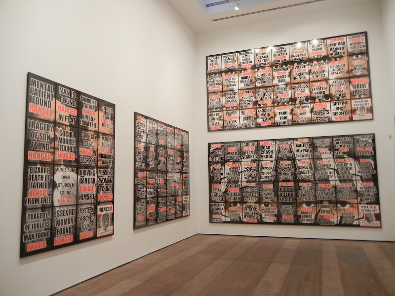 JTF (just the facts): A total of 66 multi-image works spread across 3 gallery venues. Each mixed-media work is made up a grid of individual images hung edge to edge, each framed in black and unmatted. The works range in size from 4 panels (2x2, sized 60x50 in total) to 36 panels (4x9, sized 119x225 in total). All of the works are unique and were made in 2011. A catalog of of all 292 of the works in this London Pictures series was recently published by Hurtwood Press (here) and is available from the galleries for $30. (Installation shots at right, from all three galleries.)
For each of the venues below, I have used the panel configuration as the method for tallying the number of works on view (in parentheses):
Lehmann Maupin Chrystie Street (18)
Front Room
2x2 (1)
4x4 (1)
5x4 (1)
 Main Space
4x4 (3)
4x6 (4)
4x9 (2)
Upstairs Room
2x2 (6)
Lehmann Maupin West 26th Street (23)
Main Space
3x3 (2)
3x4 (5)
3x6 (2)
4x6 (4)
Back Room
2x2 (6)
2x3 (4)
 Sonnabend (25)
Side Front Room 1
2x2 (2)
2x3 (1)
3x5 (1)
3x6 (1)
Side Front Room 2
2x2 (1)
3x4 (2)
3x6 (1)
Entry Room
2x2 (1)
Back Center Room
2x2 (2)
2x4 (1)
3x4 (1)
 Back Left Room
2x3 (3)
3x3 (2)
Back Right Room
2x2 (2)
2x4 (1)
3x3 (2)
3x5 (1)
.
Comments/Context: Gilbert and George's sprawling new series London Pictures is really the final outcome of a rigorously academic linguistics study, delivered in the form of contemporary art. It is a meticulous and exhaustive examination of words and their charged relationships in our attention starved modern culture, thrown back at us in carefully ordered groups of shouting, hysterical headlines from the tabloid press. Spread across three galleries here in New York (and countless others across the globe from London to Hong Kong), the works are a taxonomy of urban horrors, collated and ordered into surprisingly universal patterns.
 The back story to these pictures starts with the tearsheets found displayed outside newsstands across London. Gilbert and George managed to discretely steal a total of 3712 of these disposable posters over the period of several years, providing them with the raw material for their further sorting and classification of subjects and key phrases. The resulting clusters of common topics tell the story of 21st century urban life, with an eye for the shock factor that catches eyes and sells papers. Citizens are STABBED, HANGED, KNIFED, and MURDERED, while a parade of troublemakers and undesirables run rampant: ADDICT, MUGGER, PLAYBOY, BANKER, BURGLAR, RAPIST, GUNMAN, HOOKER, KILLER, DRUNK. TERROR, SEX and DEATH are never far behind (see the entire list in the installation shot from Sonnabend above). Displayed in large block letters and highlighted in vibrant red, these repetitive words and phrases dominate the artworks, the rest of the text (in black) fading into the background. The effect is both initially startling and ultimately dulling, as the weight of the text piles up.
The black and white photographic images that lie behind the graphic design elements are often patterned or kaleidoscopic, but in a supremely unassuming manner. Tree limbs and brick paving provide angled patterns, while rows of faceless windows, sidewalks, and car reflections are distorted by fish eye lenses. Gilbert and George appear as peach-faced, dapper-suited characters, like grim pedestrians on the street. And the profile of the queen (taken from various coins) makes an appearance in the corner of each work, hovering over the messiness of life with stiff upper lip formality. But all of this imagery is secondary to the bold overlaid text, which relentlessly pounds the viewer into submission.
 I visited all three NY venues for this mega-show, and there is certainly a sense that once you have seen a few of these works, you've seen them all. This is entirely a function of visual overstimulation; seen as stand alone works, these will all pop off the wall, but when seen together over and over again, they quickly lose their punch - the shocking is no longer so urgent once you've seen it a dozen times, which is perhaps an apt reflection of our media saturated lives. In any case, if you're only going to visit one of the three spaces, I'd suggest going to Lehmann Maupin's Chrystie Street venue, as it has both the largest grids its towering main gallery, as well as a selection of the small grids upstairs, so you can see the whole breadth of the project in one place.
In the end, I like the mix of appalling truth and the can't-make-this-stuff-up wackiness that is found in these grids of words. Gilbert and George have reminded us how the odious and the offensive have become everyday entertainment, and how commonplace and universal these tawdry tales really are. They have mapped the sensational, dumbed-down vocabulary of big city living, exposing the lurid extremes that we now take for granted.
Collector's POV: The works in these shows range in price from £50000 for the smallest 2x2 grids to £160000 for the largest 4x9 grids. Using an average selling price of £75000, the 292 works in the full series represent roughly £21900000 of primary market value; collectors should get used to seeing these works, as they are likely to become a fixture in the secondary markets for years to come. In general, works by Gilbert & George can be found at auction with regularity at this point, mostly in Contemporary Art sales as opposed to Photographs sales. Prices for their multi-panel works have ranged between roughly $50000 and $900000 in the past decade, with a few single image or editioned works at lower prices.
.
 Rating: ** (two stars) VERY GOOD (rating system described here)
.
Transit Hub:
- Features/Interviews: Art in America (here), Wall Street Journal (here), Telegraph (here), Daily Beast (here), Economist (here), Huffington Post (here)
Through June 23rd
Lehmann Maupin
540 West 26th Street
New York, NY 10001
Lehmann Maupin
201 Chrystie Street
New York, NY 10002
Sonnabend Gallery
536 West 22nd Street
New York, NY 10011
Tuesday, May 15, 2012
David Benjamin Sherry, Astral Desert @Salon 94 Bowery and Freemans
 JTF (just the facts): A two-part show, split between the Bowery and Freemans Alley gallery spaces. The Bowery show consists of 13 large scale color photographs, framed in white and unmatted; a few are hiding in back offices. All of the works are chromogenic prints from 2012, sized either 30x40 (in editions of 3), 48x58 (in editions of 2) or 60x72 (in editions of 1). The Freemans show consists of 15 unique works (framed in white and unmatted): 7 chromogenic photograms and 8 chromogenic prints covered in adhesive, sand and colored pigment. The photograms are each sized 30x40, while the sand images are sized either 20x24, 40x50, 48x58, or 60x72 (or reverse). All of these works are also from 2012. (Installation shots at right.)
Comments/Context: David Benjamin Sherry's use of vibrant, electric color is much more than a simple love affair with oversaturation. His monochrome images jump off the wall in a rainbow of Easter egg hues, as though they were recently dipped in pure bowls of food coloring, taking on uniform tints of plum and tangerine, ice blue and mint. His palette is strikingly bold, almost overpowering in its sunny, jelly bean brightness.
 In the Bowery space, Sherry has applied this audacious color to tightly cropped, skyless images of American desert dirt and rock formations, turning jumbles of stones, gully washes and smooth erosions into otherworldly landscapes in crimson and acidic lime green. Craggy patterns of swirls and lines, pits and deformations become almost abstract when swimming in such unexpected incandescent color. Each one is like a scene from some dusty uninhabited planet, lit by some strange combination of nearby stars.
 In the Freemans space, Sherry mutes the eye-popping color by applying a layer of fine sand to the surface of the photographs, making the lumpy rock formations more delicate and tactile. His tints move closer to pastels, and in some cases, the sand obscures the detail in the photographs to the point where the works become extremely subtle, striated gradients. This abstraction is taken one step further in a series of colored photograms, where the angles and shapes of the rock walls are used as inspiration for simple layered patterns, once again executed in a spectrum of undiluted radiance.
 To my eye, the bolder forms in the Bowery space are the more radical and unusual. I can imagine one of the large colored rock walls punctuating a survey show of photographic landscapes and truly throwing viewers off guard. These works bring something original to the view of the land, while still being tied to historical precedents (imaging hanging a bright purple Sherry rock wall adjacent to a 19th century view of Canyon de Chelly by O'Sullivan). I think I would actually like the photograms better if they were taken out of this desert sand context and allowed to function as stand alone abstractions. In this case, their extreme use of color would separate them from traditional darkroom practices and show off their innovation better.
 Color this buoyantly joyful might have a tendency to become too easily decorative, but I think Sherry has found ways to keep the edginess in many of the pictures. Effectively harnessing and applying such powerful color without becoming gimmicky is undeniably a stiff challenge. But Sherry's use of color here is clearly original, and seems likely to lead to further unexpectedly brazen chromatic explorations in the future.
Collector's POV: The works in this show are priced as follows. The standard chromogenic prints are either $8000 (30x40), $12000 (48x58), or $18000 (60x72). The photograms (30x40) are $12000 each, while the sand covered prints are either $8000 (20x24), $14000 (40x50), $16000 (48x58), or $22000 (60x72). Sherry's work has not yet entered the secondary markets in any significant manner, so gallery retail is likely the only option for interested collectors at this point.
.

Transit Hub:
Through June 2nd.
Salon 94
Salon 94 Bowery
243 Bowery
New York, NY 10002
and
Salon 94 Freemans
1 Freemans Alley
New York, NY 10002
Monday, May 14, 2012
Ryan McGinley, Animals @Team
 JTF (just the facts): A total of 23 large scale color photographs, framed in white and unmatted, and hung in the main gallery space and the smaller back room. All of the works are c-prints, available in editions of 3, and made in 2012. Physical dimensions range from 14x9 to 72x108, with most 30x45 (or reverse). (Installation shots at right.)
Comments/Context: Wild animals and nude bodies are an unlikely visual combination, and Ryan McGinley's unusual pairings of man and beast provide for some startling juxtapositions. Using exotic zoo animals and posing them with young men and women against candy-colored studio backgrounds, McGinley has made pictures that are alternately elegant and comic, but always bold and eye-catching. Bites, scrapes and even trickles of blood are evidence of the the untamed nature of this project, with feral chance clearly playing a role in the photographic outcomes.
 The best of these photographs are the ones where the lyricism of the forms is dominant. Green and white parakeets fly through enveloping pastel blue, partially obscuring a model with her arms outstretched like wings. The long white feathers of an albino peacock cover a model like windswept wisps of clouds against the rose red backdrop. And the curve of a guineafowl fits perfectly into the hollow of a woman's side, its densely patterned plumage a stark contrast to her pale skin. In each, the body, the animal, and the background color come together gracefully.
 Many of the rest of the images on view are more like jokes or one-liners, with varying degrees of harsh silliness. A bushy baby porcupine lies between a woman's legs, an albino skunk sniffs a bare bottom, a monkey's arms surround a man's torso, and countless animals nestle in crotches of men and women alike. There's even an homage to Avedon's Natassja Kinski and the Serpent, this time with an iguana doing the licking. But even in the funniest of these pairings, there is something frantic about the look in the eyes of some of these animals, a natural savageness that was held in check for just a moment. Put together with the vulnerability of the human nudes, every picture has an element of lively tension, just at the breaking point.
 All in, the contrast of human and animal bodies and the inherent anxiety in the poses gives these pictures some odd, agitated freshness. I think the more ornamental matches will ultimately be more durable than the salty wisecracks and the sexy horsing around, so look out for the handful of images that have a more refined sense of unexpected opulence.
Collector's POV: The prints in this show are priced by size, as follows:
- 14x9: $5500
- 13x20: $7000
- 24x16: $8000
- 30x45: $14000
- 57x38: $21000
- 48x72: $25000
- 72x108: sold out
 Rating: * (one star) GOOD (rating system described here)
Transit Hub:
- Artist site (here)
- Features/Reviews: NY Times T magazine (here), Wall Street Journal (here), Huffington Post (here), Hint (here)
83 Grand Street
New York, NY 10013
Subscribe to:
Posts (Atom)