Showing posts with label British Photography. Show all posts

Friday, June 21, 2013

Martin Parr: Life's a Beach @Aperture

JTF (just the facts): A total of 53 large scale color photographs, unframed and pinned directly to the wall, and hung against white walls in the entry area and the large single room gallery space. All of the works are pigment prints, made from negatives taken between 1985 and 2012. The prints are shown in two sizes: a smaller size (either 20x24 or 20x30 or reverse, in editions of 10) and a larger size (40x50 or 40x60 or reverse, in editions of 5). A monograph of this body was recently published by Aperture (here and here) and is available in the bookshop for $25/$300. (Installation shots at right.)

Comments/Context: While there might be an expanse of sand, a clump of palm trees, or some lapping waves in a Martin Parr beach photograph, the beach itself isn't really the subject. For Parr, the beach isn't inherently interesting for its natural beauty or its majestic grandeur; on the contrary, it's a nearly universal setting for studying human behavior. From his native Britain to far flung locales all over the globe, he has quietly documented what people do at the beach: how we dress ourselves, how families and lovers interact, what we read and eat, and how we relax. With his sharp eye for subtle absurdity, his pictures capture a broad spectrum of diverse cultures and quirky activities, all laid bare to catch the warmth of the sun.

Many of Parr's beach pictures get right up close and blast your senses with eye popping color, turning a striped beach hat, a pink bathing suit, or a sandy foot into a striking, off-kilter still life. In these images, the color takes over, exaggerating the visual volume of blue eye protectors and a matching blue towel or a bold American flag bathing suit. Parr's framing forces us look closely, often pointing out the brightly ridiculous.

These one liners are balanced by more complex compositions that use multiple planes of distance (front/back or front/middle/back) to create unlikely beach crowd juxtapositions. A couple in Goa is joined by a sacred white cow, while the paper trunks of fake palm trees at an indoor beach in Japan frame a father and child. Patterns knit stories together, from clashing floral beach umbrellas that surround a woman in a purple bathing suit to striped folding chairs that provide a jumbled set of angles and lines for a sleeping family. Whether it's eating crab legs and lounging in rubber tire tubes in China, headscarved picture taking in Thailand, musclebound posing in Rio, or tabloid reading in the UK, Parr tracks down geographical peculiarities and builds them into larger scenes using nearby props and contrasts. A flimsy blue plastic raincoat, an oversized ice cream cone, a perfect book title ("Summer Surrender"), a dolphin boogie board, a muddy backhoe, the head of a white swan, a yellow and black soccer ball, they all become focal points for overlooked regional oddity, collapsed into single frame stories.

This show is brimming with casual summer fun and Parr's discerning comic timing is in fine form. Every seemingly random snapshot reveals itself to be something more, a deceivingly complex compendium of bodies, cultures, and seaside pastimes.

Collector's POV: While prints on view at Aperture are not always overtly for sale, there was an actual price list for this show. The smaller prints range from $4500 to $6000, while the larger prints are $11000. Parr's prints are intermittently available in the secondary markets, with recent prices ranging between roughly $1000 and $12000.
 
Rating: ** (two stars) VERY GOOD (rating system described here)
 
Transit Hub:
  • Artist site (here)
  • Magnum Photos page (here)
  • Features/Reviews: Feature Shoot (here), GUP (here), Huffington Post (here)
  • DLK COLLECTION review of Martin Parr: USA Color at Janet Borden (here)

Martin Parr: Life's a Beach
Through July 3rd

Aperture Gallery
547 West 27th Street
New York, NY 10001

Monday, June 17, 2013

Tom Wood, Men and Women @Erben

JTF (just the facts): A total of 36 color photographs, framed in white and unmatted, and hung against white walls in the single room gallery space. The works on view are a mix of gelatin silver and c-prints, taken between 1975 and 2012. All of the prints come in three sizes: 12x16, 16x24, and 24x35 (there is one outlier print sized 15x15), in aggregate editions of 7+2AP (a few prints are available in editions of 12+1AP or 15+1AP). Apparently, a monograph of Men and Women will be released by Steidl later this year (here). (Installation shots at right.)

Comments/Context: The British photographer Tom Wood is having a bit of a revival of late. With a recent series of gallery shows and museum retrospectives in the UK and Europe and a new book coming from Steidl, Wood is being more clearly recognized as one the early pioneers of British color (along with Paul Graham and Martin Parr). This broad show brings together work from the better part of thirty years, providing ample evidence for Wood's eye for color as well as his consistent interest in the everyday lives of the inhabitants of New Brighton, just across the river Mersey from Liverpool.

It's clear from the works on view here that not only was Wood making color pictures as early as the mid 1970s, there are plenty of examples where color was the driving force behind his compositional decisions: an older woman peers out from behind a lace curtain door window, framed by the bright blue bars of stained glass, the "mother of the cleverest boy in England" wears a bright orange blazer that is exactly matched by the poster board behind her, and two sassy young women with feathered hair perch provocatively on the hood of a shiny red car, with the back end of a lemon yellow trunk intruding from the side. Wall colors, subway tiles, matching shirts, an orange coat here, some red pants there, color was clearly a integral part of how Wood was seeing and framing his surroundings.

Wood also had a street photographer's eye for the serendipitous moment. He captures a whisper between girlfriends, an illicit handoff between street corner hustlers, and a man pointing to his chin in the pub, presumably remembering where he was punched in the face. Fleeting tender gestures abound: a boy touches his father's hair, a mother shelters her child underneath her white sweater, and a woman takes a summertime rest in the heather. Wood alternates between an energetic snapshot aesthetic and something slower and more formal, nimbly matching his methods to the circumstances on the ground.

Part of what makes these photographs so successful is their relaxed ease; Wood was clearly a known quantity in his community and his subjects were comfortable with his camera. That he could move easily from shirtless lads in the streets to old women with their shopping bags and capture the swagger of one and the weary shuffle of the other shows his breadth as careful observer. This show makes a quietly compelling case for Wood's rediscovery, reestablishing his position in the larger sweep of recent British photography.

Collector's POV: The works in this show are priced based on size. The 12x16 prints are $2400 each, the 16x24 prints are $3000 each, and the 24x35 prints are $4200 each.  Wood's prints have been inconsistently available in the secondary markets in recent years. Prices for those lots that have come up for sale have ranged from roughly $1000 to $4000.

Rating: * (one star) GOOD (rating system described here)

Transit Hub:
  • Features/Reviews: New Yorker (here)
  • The Photographers' Gallery, 2012 (here)

Tom Wood, Men and Women
Through July 12th

Thomas Erben Gallery
526 West 26th Street
New York, NY 10001

Wednesday, June 12, 2013

Martin Parr: USA Color @Borden

JTF (just the facts): A total of 21 large scale color works, variously framed and matted, and hung against white walls in the divided main gallery space. The exhibit also includes a small hand held album of color prints, displayed in a glass case. The single images are either chromogenic prints or pigment prints, made between 1993 and 2012. Sizes range from 20x24 to 40x60, and the prints come in editions of 5, 10, or 25. The album consists of 100 4x6 chromogenic prints, the entire set originally available in an edition of 5. (Installation shots at right.)
 
Comments/Context: When you're as prolific a photographer as Martin Parr, at some point it becomes possible to put together a show or a book with nearly any theme - just pick a subject, drill a core sample through the archive, and out pop dozens of images that share a common connection. It's a testament to Parr's consistent originality across the decades that these subsets of work all bear his unmistakable blend of visual wit and saturated color. This particular show gathers together pictures made in America, but could easily have been called flags, food, and tourists given its clusters of imagery. It's a high voltage retrospective of American eccentricity, endearingly brash and conspicuously ridiculous.
 
While it's always easy to have a few laughs and smiles at a Martin Parr show, I think that his snapshot humor has often led us to discount his compositional craft and his exceptional timing. Parr's split second juxtapositions are culled from the river of ordinariness flowing by, his eye able to pick out the inherent oddness of the everyday and get it framed just right to highlight that moment of unexpected vitality. The tourist shots in this show all turn on the relationship of clothing to the surrounding environment: a dime store feathered headdress on a Grand Canyon watcher, a cowboy hat flanked by the Las Vegas sphinx, a black and white $100 dollar patterned hat near the spots of a giraffe at the Atlanta zoo. His pictures capture the unintended irony of simple things: the gaudy flowered shirts worn by middle aged men to a colorful Hawaiian luau, the jungle florals on a pair of beach swimsuits, the complex angle of a girl in a James Dean jacket that somehow matches the replica Eiffel Tower in the distance. In Parr's world, cultural signifiers go awry left and right.
 
Parr's images of American food opt for the subtly outrageous. Meat on a stick is a common theme, from an oversized corndog slathered in mustard and ketchup to a manly hunk of grilled lamb still on the bone; an overstuffed Las Vegas breakfast plate and a rainbow colored layer cake tell us more about the extremes found in the American diet. Parr's flags are equally bold and puzzling, from a speedo style bathing suit and golf headcovers in the stars and stripes, to a small flag draped amid sausages for sale. His fabulous album of flags taken in New York just after 9/11 (when American flags flew nearly everywhere in abundant variety) deserves to be a book of its own - it's poignant, patriotic, and wonderfully over the top all at the same time.
 
Parr's maverick vision sets him apart from most of his contemporaries, and even at his most caustic, I find it hard not to revel in the joy in his photographs. Even as we drown in an endless sea of digital snapshots, a Martin Parr image is still immediately recognizable at twenty paces. His photographs embrace the quirks of humanity with warmth and affection, reliably jolting us with bright color and understated comedy.
 
Collector's POV: The works in this show are priced as follows. The 20x24 and 20x30 prints are priced at $5000 or $6000 each. The larger 40x60 prints are $12000 each. The album is available for $5000. Parr's prints are intermittently available in the secondary markets, with recent prices ranging between $1000 and $12000.
 
Rating: ** (two stars) VERY GOOD (rating system described here)
 
Transit Hub:
  • Artist site (here)
  • Magnum Photos page (here)
  • Features/Reviews: New Yorker PhotoBooth (here)
Martin Parr: USA Color
Through June 28th
 
560 Broadway
New York, NY 10012

Monday, April 22, 2013

Bill Brandt: Shadow & Light @MoMA

JTF (just the facts): A total of 156 black and white photographs, variously displayed in white, grey, and black frames with mats, and hung against white walls with grey horizontal stripes in three interconnected gallery spaces on the third floor of the museum. The works on view are generally vintage prints, taken between 1929 and 1978. The exhibit was curated by Sarah Hermanson Meister with assistance from Drew Sawyer. A catalog was published by MoMA in conjunction with the exhibition (here). (Installation shots at right.)

The show is divided into six named sections, with a short introductory prelude. For each section, the number of prints on view has been tallied, along with relevant dates for the images. Books and magazine spreads shown in cases have also been listed.

(Prelude)
4 gelatin silver prints, 1929, 1930, 1933
1 case containing 9 album pages, 1920s-1930s

London in the Thirties
36 gelatin silver prints, 1932-1939

Northern England
12 gelatin silver prints, 1937

World War II
22 gelatin silver prints, 1939-1945
7 cases containing 11 magazine spreads, 1939-1945

Portraits
25 gelatin silver prints, 1946-1978

Landscapes
13 gelatin silver prints, 1945-1963
1 case containing 8 magazine spreads and 2 books, 1942-1961

Nudes
44 gelatin silver prints, 1945-1959

Comments/Context: When a photographer starts to have labels like "the most important British photographer of the 20th century" affixed to his name, it might be safe to assume that the story of his art and life would be well understood, that it could be summed up in a pithy sentence or two designed for easy recitation. But of all our modern masters, Bill Brandt remains the most stubbornly elusive. Whether we are looking at the trajectory of his life or the evolution of his photography, the facts just don't seem to fall neatly into place. This robust and scholarly retrospective does an admirable job of trying to make sense of it all, diving into the forgotten details and uncovering important missing links, but in the end, Brandt resists easy interpretation, remaining ever evasive and ambiguous, an artistic shape shifter quietly slipping through our fingers.

While most exhibition introductions feel like throwaways, this one sets the stage particularly adeptly. Four early prints from the late 1920s and early 1930s show Brandt searching for his own vision, trying on the styles and subject matter of Kertesz, Brassai, Man Ray, and Abbott, with a little rich Eastern European darkness here and a little distorted Surreal camera angle there. The albums of early snapshots displayed underneath find Brandt examining British life with an unexpected mix of outsider perspective (he was German by birth after all) and upper class insider access. Together, this smart prelude conceptually brings together the many influences of his early years and loosely predicts some of what would come later.

The first major section of the exhibit combines images from Brandt's first real claim to fame, his 1936 book The English at Home, and its speedy follow up, A Night in London, from 1938. The pictures capture a broad spectrum of British life, from parlourmaids and bar customers to top-hatted aristocrats and grimy miners, and from street kids and theatregoers to intellectuals and illicit lovers. But there is much more going on in these pictures than straight documentation; each photograph has an undercurrent of almost anthropological curiosity, an eye for the dark oddness of the everyday. Fancy men in morning suits and ladies in hats cluster atop a carriage for a better view of the hunt, while blank-eyed children stand frozen in a forest of weary birthday party balloons. A fish market porter balances a tuna on his head, while a young girl prances in the street saucily showing off a bit of leg. A raceday barker stands in a pose of crucifixion, while a policeman guards a gloomy brick alley. Back and forth, Brandt mixes high and low with unexpected deftness, highlighting the muted eccentricities of both with equal success. In his hands, even little details, like a display of opera hats and an elegant white egret in a grassy manicured garden, seem at once entirely ordinary and surprisingly weird.

Many of Brandt's 1930s images are steeped in deep darkness, full of shadows and hollows and printed with an eye for middle range greys. Brandt's photographs of the depressed coal mining and industrial towns of Northern England follow in this stylistic path, capturing sooty smokestacks, rainswept cobblestones, and dirty children with heavy visual weight. His images of the London blackout and the bombed out buildings of World War II are equally pensive and moody. Crowds sleep on top of each other in improvised air-raid shelters in tube stations, while moonlight darkly illuminates rubble piles in front of the looming dome of St. Paul's. As the years passed, it was almost as if the novelty of being British had started to wear off, and a more morose tone took its place.

I think the biggest revelation this exhibit has to offer is the examination of the middle years of Brandt's career in the context of magazines. The many spreads from Lilliput, Picture Post and others show Brandt on assignment, his images reproduced in thematic groups in small hand held (mostly vertical) formats. For me, this background material helped to fill in an underlying logic for how and why Brandt transitioned from his early work to the landscapes, portraits, and other subjects that seem less obviously connected. His 1940s landscapes have a rough, elemental wildness, from sheep grazing near the stones of Avebury to the dramatic wind-blown grasses of Top Withens. Forests and rolling hills are reduced to expanses of darkness, while paths and rivers burn with bright whiteness against the encroaching land. Brandt's commissioned portraits from the same period (and later) settle into a similarly serious mood: Norman Douglas glowers from his writing desk and Francis Bacon looks lost in a brooding reverie while walking along a grey park path. The shifting moods of these images point to a increasingly psychological approach to photography, with Brandt layering swaths of dark, personal emotion on top of whatever was in front of his camera.

When we finally get to Brandt's superlative nudes (in the final room), there is the sense that his full creative voice has come though, and that a further evolution of his artistic thinking continued to take place as he dove deeper into the subject matter. While a stupendous room of Brandt nudes should be enough to please anyone, my one quibble with this otherwise extraordinary exhibit is that I wish the nudes had been arranged more chronologically, rather than mixed together on the walls (salon style in one case). Then it would have been easier to see the minute transitions that took place from the late 1940s Victorian interior nudes, to the more distorted close-up interior nudes of the mid 1950s, to the rocky beach nudes of the late 1950s, and on to the sometimes scary and disturbed 1970s nudes (which have been omitted here), and the amazingly intense, close-up eye portraits of the early 1960s (shown in the previous portrait section) would have had a more time-specific context. The result of this hanging choice is that the nudes seem like an indivisible whole, a theme and variation story of body parts, fragmented forms, and elegant distortions, when in fact I think there is more sequential evolution going on (from more narrative infused, psychologically rich nudes on chairs and in dark rooms all the way to full abstractions over the course of more than a decade). There is so much to explore in these nudes, and I just wish the organization of this particular section had been more strictly rigorous, so Brandt's churning, changing brilliance could have been more step-by-step visible.

One topic that is touched on in this show and expanded on with more force in the accompanying catalog is a discussion of Brandt's printing techniques. As the years pass in this exhibit (and as you walk through the sections of the show), Brandt's palette very visibly moves from an enveloping thick blackness to a grainier, more exaggerated high contrast extremity of black and white; it's impossible to miss if you sweep your eyes across the rooms. If you look closely at Brandt's prints, they are heavily retouched, covered in ink blots, scrapes, highlights, and scrawls that enhance the visual effect. I always used to chalk this up to Brandt being a poor or messy printer, who required all kinds of post-production modifications to make his prints even workable. I have now come to see Brandt's tuning as something more consciously and controllingly artistic, a physical process of reinterpreting the negative again and again. Three prints of his famous nude with her elbow bent (unhelpfully entitled London, but iconic nonetheless) show how he was experimenting with size and contrast over the decades, moving between curved, nuanced depth and rough flatness. Lee Ann Daffner's text in the catalog is truly fascinating, showing thumbnails of each additive and reductive technique, a kind of parade of obsessive hidden craftsmanship.

What I find exhilarating about this exhibit is that even with all the obvious smartness poured in here, and all the new things to be learned, Brandt emerges with his elusiveness intact. I still walk away unsure of where exactly he stands. For me, this is part of his enduring draw; his photographs are mercurial, and volatile, and ultimately unknowable, even when I feel like I've found my way in.

Collector's POV: Given this is a museum show, there are of course no posted prices. Brandt's work is readily available in the secondary markets, with dozens of prints on offer each year. Recent prices have ranged from $2000 for lesser known works and later prints to more than $90000 for vintage prints of his most iconic images. The Brandt estate is represented in New York by Edwynn Houk Gallery (here).

Rating: *** (three stars) EXCELLENT (rating system described here)

Transit Hub:
  • Estate site (here)
  • Features/Reviews: NY Times (here), Boston Globe (here), TimeOut New York (here), New Yorker (here), Time LightBox (here)

Bill Brandt: Shadow & Light
Through August 12th

Museum of Modern Art
11 West 53rd Street
New York, NY 10019

Tuesday, March 5, 2013

Christopher Bucklow @Danziger

JTF (just the facts): A total of 19 color photographs, framed in white and unmatted, and hung against white walls in the two room divided gallery space. Aside from one fujiflex print, all of the works are unique cibachrome prints made between 2004 and 2012. 12 of the works are from the Tetrarch series and are each sized 60x40 (or reverse). The rest of the works are sized either 19x15 or 38x29. The show also includes a small sample of Bucklow's paintings and watercolors, shown in a side room. (Installation shots at right.)

Comments/Context: Christopher Bucklow's second show at Danziger Gallery combines a large selection of his now well-known radiant silhouettes with a new group of abstract works that leverage the same underlying technique but abandon the human form as a subject. It gives us a plentiful dose of what we already know and like, while also offering some new extensions to his signature aesthetic.

Bucklow has been making images in his Tetrarch series for the better part of a decade at this point, so there isn't much to say about these works (and their process) that hasn't already been said. To my eye, a few of the details have gotten a bit crisper in this bunch, with the curve of a breast or a wisp of hair providing a stronger sense of femininity. Pairs of figures have also been explored in more depth, with embracing male and female forms doubling the light output where they overlap. Tight hugs become largely indistinguishable blobs, while looser connections work like the intersection of a Venn diagram. In general, the best of these works remain graceful and elegant, glowing in fields of diffused color.

The other works on view take us down a decidedly different path. In these images, Bucklow's pinhole sunlight photogram technique becomes something more akin to the visual effect of a Lite Brite toy or an ancient green screen computer monitor (albeit in different colors). Delicate lines of abstract geometric patterns cover the surface, their rigid repeating forms shining like bright Islamic window screen arabesques. In a few cases, the intricate pattern begins to break down, allowing jagged lines to unravel down the page like loose threads of otherworldly technology or glitched code running amok. These forms seem strangely alive, thin tentacles of lines extending beyond the edges of the frame.

I think these new pictures open up some artistic doors for Bucklow, allowing him to draw with light in unexpected and original ways. As much as the ghostly silhouettes continue to be lovely (and saleable I imagine), it's probably time to move on and follow this new path wherever it might lead.

Collector's POV: The works in this show are priced as follows. The prints from the Tetrarch series are priced at either $19000 or $21000 (up from $15000 in Bucklow's 2010 show). The 19x15 works are $8000 each and the 38x29 work is $12000. Bucklow's prints are intermittently available in the secondary markets, with prices generally ranging between $5000 and $14000.

Rating: * (one star) GOOD (rating system described here)

Transit Hub:
  • Artist site (here)

Christopher Bucklow
Through March 23rd

Danziger Gallery
527 West 23rd Street
New York, NY 10011

Friday, July 6, 2012

Roger Mayne @Gitterman

JTF (just the facts): A total of 34 black and white photographs, framed in black and matted, and hung in the main gallery space and the smaller front room on the ground floor. All of the prints are vintage gelatin silver prints made between 1951 and 1961. Physical dimensions range from roughly 7x6 to 18x23 or reverse, and the prints were not editioned. (Installation shots at right.)

Comments/Context: Roger Mayne's photographs of children playing in the streets of working-class slums in 1950s postwar England are remarkably pared down and structured for what we call street photography. Using the linear geometries of the row houses and tenements as a controlling framework, his urban portraits and childhood vignettes play out with sparse, gritty clarity. Kids in proper school uniforms scramble around and improvise games, all with the dingy reality of the city as an ever present backdrop.
.
While we Americans might see a certain commonality between Mayne's images and those of Helen Levitt's New York, I think this parallel is mostly superficial. Mayne's pictures capture a time and place far different than our own, even though kids everywhere want to climb on window sills, create makeshift sculpture out of cardboard boxes, and play soccer in the street. Of course there is joy in these pictures (wrestling, giggling, fighting with swords, blowing bubbles), but shadows, broken bricks, and decaying architecture loom in the background, exhaustion and empty poverty never very far from view. Many of Mayne's photographs capture this emotional back and forth: an optimistic billboard with a huge sparkling cruise ship flanked by a dirty weed strewn vacant lot, girls happily scrambling over a pock marked, bombed out wall, and Teddy boys posing in fancy suits and pompadour haircuts, trying to find some way to rebel against the whole stifling situation.
.
Beyond the subject matter of these photographs, I was also struck by Mayne's use of scale in some of these prints. Very few photographers working in the 1950s were experimenting with print sizes nearing 20x24, and as a result, there is something strikingly unusual about the surprising bigness of a handful of these works. (Apparently, Mayne was interested in ensuring that his photographs would sit on equal footing with paintings from the St. Ives School.) Mayne was also often employing extremely high contrast (almost crossing into abstraction), with over bright windows set next to the deep black slash of a bridge girder, or patterns of smoke stacks and brick buildings placed against a featureless white sky. The combination of these two gives the images a heightened sense of darkness, often offset by the lightness of a game of hopscotch or sidewalk cricket.

Overall, I came away impressed with Mayne's ability to unobtrusively capture the fleeting moments of urban childhood, while at the same time infusing them with a heightened sense of heavy reserve. His pictures aren't just simple fun, but something more balanced and atmospheric.

Collector's POV: The prints in this show are priced between $3500 and $9000, with most under $5000. Mayne's work has been intermittently available in the secondary markets in the past decade, with prices generally ranging between $1000 and $4000.

Rating: * (one star) GOOD (rating system described here)

Transit Hub:
  • Artist site (here)
  • Review: New Yorker (here)
Roger Mayne
Through July 21st

Gitterman Gallery
170 East 75th Street
New York, NY 10021

Wednesday, May 16, 2012

Gilbert & George, London Pictures @Lehmann Maupin and Sonnabend

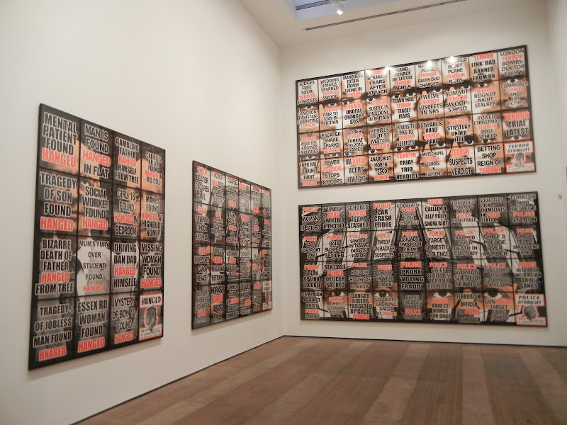
JTF (just the facts): A total of 66 multi-image works spread across 3 gallery venues. Each mixed-media work is made up a grid of individual images hung edge to edge, each framed in black and unmatted. The works range in size from 4 panels (2x2, sized 60x50 in total) to 36 panels (4x9, sized 119x225 in total). All of the works are unique and were made in 2011. A catalog of of all 292 of the works in this London Pictures series was recently published by Hurtwood Press (here) and is available from the galleries for $30. (Installation shots at right, from all three galleries.)
 
For each of the venues below, I have used the panel configuration as the method for tallying the number of works on view (in parentheses):
 
Lehmann Maupin Chrystie Street (18)
 
Front Room
2x2 (1)
4x4 (1)
5x4 (1)
 
Main Space
4x4 (3)
4x6 (4)
4x9 (2)
 
Upstairs Room
2x2 (6)
 
Lehmann Maupin West 26th Street (23)
 
Main Space
3x3 (2)
3x4 (5)
3x6 (2)
4x6 (4)
 
Back Room
2x2 (6)
2x3 (4)
 
Sonnabend (25)
 
Side Front Room 1
2x2 (2)
2x3 (1)
3x5 (1)
3x6 (1)
 
Side Front Room 2
2x2 (1)
3x4 (2)
3x6 (1)
 
Entry Room
2x2 (1)
 
Back Center Room
2x2 (2)
2x4 (1)
3x4 (1)
 
Back Left Room
2x3 (3)
3x3 (2)
 
Back Right Room
2x2 (2)
2x4 (1)
3x3 (2)
3x5 (1)
.
Comments/Context: Gilbert and George's sprawling new series London Pictures is really the final outcome of a rigorously academic linguistics study, delivered in the form of contemporary art. It is a meticulous and exhaustive examination of words and their charged relationships in our attention starved modern culture, thrown back at us in carefully ordered groups of shouting, hysterical headlines from the tabloid press. Spread across three galleries here in New York (and countless others across the globe from London to Hong Kong), the works are a taxonomy of urban horrors, collated and ordered into surprisingly universal patterns.
 
The back story to these pictures starts with the tearsheets found displayed outside newsstands across London. Gilbert and George managed to discretely steal a total of 3712 of these disposable posters over the period of several years, providing them with the raw material for their further sorting and classification of subjects and key phrases. The resulting clusters of common topics tell the story of 21st century urban life, with an eye for the shock factor that catches eyes and sells papers. Citizens are STABBED, HANGED, KNIFED, and MURDERED, while a parade of troublemakers and undesirables run rampant: ADDICT, MUGGER, PLAYBOY, BANKER, BURGLAR, RAPIST, GUNMAN, HOOKER, KILLER, DRUNK. TERROR, SEX and DEATH are never far behind (see the entire list in the installation shot from Sonnabend above). Displayed in large block letters and highlighted in vibrant red, these repetitive words and phrases dominate the artworks, the rest of the text (in black) fading into the background. The effect is both initially startling and ultimately dulling, as the weight of the text piles up.
 
The black and white photographic images that lie behind the graphic design elements are often patterned or kaleidoscopic, but in a supremely unassuming manner. Tree limbs and brick paving provide angled patterns, while rows of faceless windows, sidewalks, and car reflections are distorted by fish eye lenses. Gilbert and George appear as peach-faced, dapper-suited characters, like grim pedestrians on the street. And the profile of the queen (taken from various coins) makes an appearance in the corner of each work, hovering over the messiness of life with stiff upper lip formality. But all of this imagery is secondary to the bold overlaid text, which relentlessly pounds the viewer into submission.
 
I visited all three NY venues for this mega-show, and there is certainly a sense that once you have seen a few of these works, you've seen them all. This is entirely a function of visual overstimulation; seen as stand alone works, these will all pop off the wall, but when seen together over and over again, they quickly lose their punch - the shocking is no longer so urgent once you've seen it a dozen times, which is perhaps an apt reflection of our media saturated lives. In any case, if you're only going to visit one of the three spaces, I'd suggest going to Lehmann Maupin's Chrystie Street venue, as it has both the largest grids its towering main gallery, as well as a selection of the small grids upstairs, so you can see the whole breadth of the project in one place.
 
In the end, I like the mix of appalling truth and the can't-make-this-stuff-up wackiness that is found in these grids of words. Gilbert and George have reminded us how the odious and the offensive have become everyday entertainment, and how commonplace and universal these tawdry tales really are. They have mapped the sensational, dumbed-down vocabulary of big city living, exposing the lurid extremes that we now take for granted.
 
Collector's POV: The works in these shows range in price from £50000 for the smallest 2x2 grids to £160000 for the largest 4x9 grids. Using an average selling price of £75000, the 292 works in the full series represent roughly £21900000 of primary market value; collectors should get used to seeing these works, as they are likely to become a fixture in the secondary markets for years to come. In general, works by Gilbert & George can be found at auction with regularity at this point, mostly in Contemporary Art sales as opposed to Photographs sales. Prices for their multi-panel works have ranged between roughly $50000 and $900000 in the past decade, with a few single image or editioned works at lower prices.
.
Rating: ** (two stars) VERY GOOD (rating system described here)
.
Transit Hub:
  • Features/Interviews: Art in America (here), Wall Street Journal (here), Telegraph (here), Daily Beast (here), Economist (here), Huffington Post (here)
Gilbert & George, London Pictures (here, here, and here)
Through June 23rd

Lehmann Maupin
540 West 26th Street
New York, NY 10001

Lehmann Maupin
201 Chrystie Street
New York, NY 10002

Sonnabend Gallery
536 West 22nd Street
New York, NY 10011

Monday, April 23, 2012

Michael Collins: Pictures from the Hoo Peninsula @Borden

JTF (just the facts): A total of 10 color images, hung in the divided gallery space. The chromogenic color prints come in two sizes: 48x60 (framed in brown with no mat, in editions of 7) and 20x24 (framed in black and matted, in editions of 15); there are 7 images in the large size and 3 in the small size on display. All of the works were made in 2011 and 2012. (Installation shots at right.)

Comments/Context: Michael Collins muted photographs of English marshlands and salt flats have the timeless quality of Dutch landscape paintings. In a palette of understated greens, browns, and greys, his images of rotting wooden barges at low tide seem like a mournful song for this lonely graveyard of beached carcasses. Time has left this place behind, and soon enough, muddy waters and stringy grasses will reclaim what's left of these abandoned hulks.

Collins' large format photographs are extremely detailed, so every decayed plank and seaweed covered hull is rendered with gorgeous crispness. The curved shapes of the barges still have a hint of their old elegance, but they are now mostly decomposing skeletons, the color leached out to an almost monochrome dullness. Stubby dock pilings stand up like bones in the misty skies, a path through the sand and grass leading nowhere. Barges are left to rot where they lay, as solitary sculptural figures or as jumbles of decomposing lumber washed together by the ebb and flow of the squelching water.

These pictures are quietly meditative and subtly romantic, and I think my takeaway from them is the thought that the contemporary landscape genre need not necessarily be postmodern, ironic and/or overtly harsh to be effective. These are well-crafted images that tell a small, rich story. They capture the passage of time, the evolution of the land, and the changing priorities of the community, all in a handful of elegantly silent frames.
.
Collector's POV: The prints in this show are priced in ratcheting editions. The 48x60 prints start at $8000 and rise to $11000, while the 20x24 prints start at $3000 and rise to $5000. Collins' work has not yet found its way to the secondary markets, so gallery retail is likely the only option for interested collectors at this point.

Rating: * (one star) GOOD (rating system described here)

Transit Hub:
  • Artist site (here)
  • Features/Reviews: Financial Times (here), New York Photo Review (here)
Michael Collins: Pictures from the Hoo Peninsula
Extended through May 15th

Janet Borden, Inc.
560 Broadway
New York, NY 10012

Tuesday, March 6, 2012

Yinka Shonibare: Addio del Passato @Cohan

JTF (just the facts): A total of 5 large scale color photographs, framed in gold-edged black with no mat, and hung in the main gallery space. All of the works are digital chromogenic prints, sized between 59x71 and 59x78 (or reverse), each available in editions of 5. All of the works were made in 2011. The show also includes 2 costumes in glass cases, 1 video (17 minutes, in an edition of 6) on display an adjacent viewing room, and 3 sculptures on view in the front room. (Installation shots at right.)

Comments/Context: Staged photographic recreations of scenes from paintings are nothing particularly new in contemporary photography. Cindy Sherman famously reinterpreted a variety of characters from the pantheon of art history in her late 1980s "History" portraits, and more recently Sharon Core has made exacting reproductions of everything from Wayne Thiebaud's luscious cakes to exuberant 18th century Dutch floral still lifes. Yinka Shonibare's new photographs also employ this aesthetic device, taking the framework and structure of famous death scenes from centuries past and reimagining them with a wholly different cast of characters.

British hero Lord Nelson (complete with a white wig) takes center stage in these photographs, outfitted not in a standard naval uniform, but in one crafted entirely out of brightly colored patterned fabrics: a flashy ensemble consisting of a yellow overcoat, an orange shirt, blue pants and orange leggings. Shonibare has used these Dutch wax pattern textiles time and again in his work to signify the distinctiveness of African cultural identity. Along with a group of actors of contrasting races, these changes in costumes and staging give the pictures an incongruous metaphorical tone: a symbol of the British Empire lays dying, clothed in the unexpected trappings of colonialism. The effect is even stronger when the death is so obviously a suicide (a limp wrist holding a gun, a dagger thrust at the stomach, an empty pill bottle on the floor); the decline of the great power was self inflicted.

The Fake Death Pictures are surrounded by a number of other sculptural objects and a video, giving them the feel of a larger, integrated ensemble installation. But in the end, I was focused on the photographs. Shonibare's visual inversions (both eye-popping and more subtle) are relatively straightforward one-for-one replacements, but they are still remarkably effective in disrupting the dramatic balance of the original scenes. He hijacks these stories and rebuilds them with his own theatrical narrative, calling attention not only to an alternate view of history, but also to the many symbolic parallels in current times: the once powerful empires are decaying, challenged by the continuing rise of the once underestimated.

Collector's POV: The photographs in this show are priced at £25000 each, including the artist's frame. Shonibare's works have very little history in the secondary markets for photography, so discerning any kind of pricing pattern from so few data points is difficult. As such, gallery retail is likely the best option for interested collectors at this point.

Rating: * (one star) GOOD (rating system described here)
.
Transit Hub:
  • Artist site (here)
  • Features/Reviews: Artcritical (here), ARTINFO (here), TimeOut New York (here)
  • Interview: Whitehot (here)
Through March 24th

James Cohan Gallery
533 West 26th Street
New York, NY 10001

Tuesday, December 13, 2011

Cecil Beaton: The New York Years @MCNY

JTF (just the facts): A total of 96 photographs, variously framed and matted, and hung against wallpapered and white walls in the entry area and a large gallery space with several interior dividers. The prints are a mix of gelatin silver, bromide and pigment ink prints, taken between 1924 and 1970, although most were taken in the 1930s. No physical dimensions or edition information was available. The exhibit also includes 27 watercolor/ink sketches and drawings, 6 full body costumes, 1 video, and 16 glass cases containing magazines, books, letters, contact sheets, programs, and other related ephemera. A catalog of the exhibition has been published by Skira Rizzoli (here) and is available from the book shop for $65. (Installation shots at right.)

Comments/Context: While there is certainly plenty of photography on display at the new Cecil Beaton show at the MCNY, I'm not sure it makes sense to call it a photography show in the narrow sense of the definition. Instead of limiting the scope to just his photographs, this flashy exhibit broadens out to tell the story of an artistic Renaissance man, society gadabout, and relentless self-promoter, including watercolor sketches of award-winning costume designs he made for Broadway shows, movies, and the opera, published volumes of his journals, and even his own wallpaper designs. These artistic threads are then woven together with his celebrity and society portraits (seemingly just as often of himself as of famous people) and his fashion work for Vogue, tying it all together in a sumptuous and elegant package.

As a photographer, Beaton was essentially a classicist. While his compositions show borrowings and sprinklings from the avant-garde and Surrealism, he returned again and again to overtly staged interior scenes, heavy on theatricality and dramatic romance. It didn't matter if it was Greta Garbo, Mona Williams, Audrey Hepburn, or Marilyn Monroe, Beaton brought a refined sense of glamour to his portraits and commissions, following in the footsteps of De Meyer and adding a touch of more modern panache and sophistication. While he may not have been a wildly inventive visual innovator with his camera, the aura of his personality clearly became part of his productions, adding sparkle and excitement to mix.

This is a show brimming with visual stimuli, which in a way distracts from its ability to make an intimate or compelling case for the quality of the photographs. But the "going in all different directions" feel of this installation is tremendously effective in painting a picture of Beaton as a frenetic man about town, a multi-talented artist working a dozen projects at once while jamming in a few society portraits between cocktails. It's not so much "Beaton the photographer" as it is "Beaton the force of nature", whirling through New York in a tuxedo, hobnobbing with celebrities and society dames, multiplying the vibrancy of the artistic community with more than just his camera.

Collector's POV: Given this is a museum show, there are, of course, no posted prices. Beaton's photographs are generally available in the secondary markets, with a decent number of prints coming up for sale each year. Recent prices have ranged from $500 to roughly $8000, mostly correlated to the fame of the sitter. Similarly, I'm sure there are Beaton images of now-unknown society figures that can be had for even less.

Rating: * (one star) GOOD (rating system described here)


Transit Hub:
  • Features/Reviews: NY Times (here), New Yorker (here), T Magazine (here), Artnet (here)
  • Book Review: NY Times (here)
Cecil Beaton: The New York Years
Through February 20th

Museum of the City of New York
1220 Fifth Avenue at 103rd Avenue
New York, NY 10029

Monday, November 14, 2011

Simon Norfolk: Burke + Norfolk @Benrubi

JTF (just the facts): A total of 14 color photographs, hung in the tight entry hallway and the main gallery space. 7 of the works are archival pigment ink prints, framed in black and matted, each 20x24, in editions of 7+2AP. The other 7 works are also archival pigment ink prints, but framed in black and unmatted, each 40x53, also in editions of 7+2AP. All of the images were taken in Afghanistan in 2010. A monograph of this body of work entitled Burke + Norfolk, Photographs from the War in Afghanistan by John Burke and Simon Norfolk was published by Dewi Lewis in 2011 (here); it is available from the gallery for $80. (Installation shots at right.)

Comments/Context: Simon Norfolk's recent photographs of contemporary Afghanistan remind us that while the daily news might give us momentary examples of both apparent progress and discouraging set backs, there is a repetitive timelessness to the struggle that stretches back centuries. Using John Burke's 19th century photographs of the Second Anglo-Afghan War (1878-1880) as a source of inspiration and dialogue, Norfolk has responded with two sets of images that document the situation on the ground in complementary ways.
.
The first group of pictures reference the traditions and expectations of 19th century group portraiture, with rows of assembled peoples arranged and photographed with rigid stone-faced formality. While the subjects are locked in an ageless sepia-toned patina, there is evidence of change and modernization hiding within the dated visual vocabulary: a head-scarfed women's basketball team, young girls at an indoor skate park, the staff from a new Afghan airline, a group of high tech mine sweepers, and American marines paired with Afghan police trainees. Mixed in with shots of traditional musicians and Taliban sympathizers in dark robes, Norfolk highlights the contrasts of new and old, grounding his observed changes in the slow evolution of the society as a whole.

The second group of works are large scale color cityscapes, often taken in the light of the early morning or the twilit evening when the sky is misty and purple. These images explore the two sides of simultaneous modernization and war-torn destruction: a homeless family standing in the hazy, crumbled ruins of the old Presidential Palace, an optimistic pizza restaurant flanked by a massive pile of rusting bus carcasses, red bags of fresh apples piled amidst the frenetic motion of the traffic, and clumps of bamboo construction poles and ladders echoed by the surveillance towers on the dusty hills in the background. Norfolk's photographs capture the essence of the everyday struggle of the locals, where the details of the Western occupation coexist with the remnants of the endlessly beaten down city.

While there are no actual prints by Burke in this show for handy side by side comparison, the mix of ideas between the two seems to have been an effective way for Norfolk to catalyze new visual approaches to the subject matter. Both sets of new images feel very rooted in and mindful of the past, where if we look carefully, the events of today are an updated repetition of those from long ago.
.
Collector's POV: The prints in this show are priced as follows: the 20x24 prints are £2500 and the 40x53 prints are £6000 (note the prices are in British pounds). Norfolk's work has begun to slowly enter the secondary markets in recent years, with prices at auction ranging between roughly $6000 and $26000.

Rating: * (one star) GOOD (rating system described here)

Transit Hub:
  • Artist page (here)
  • Reviews: New Yorker (here), LA Times (here)
  • Features: Wayne Ford (here), Guardian (here)
  • Exhibit: Tate Modern (here)
Simon Norfolk: Burke + Norfolk
Through December 3rd

Bonni Benrubi Gallery
41 East 57th Street
New York, NY 10022