Showing posts with label German Photography. Show all posts

Wednesday, May 22, 2013

Wolfgang Tillmans, from Neue Welt @Rosen

JTF (just the facts): A total of 25 large scale color photographs, variously framed and displayed, and hung against white walls in the main gallery space, the connecting hallway, the back gallery, and the office area. Most of the works are inkjet prints on paper, some mounted on aluminum and framed in white, others unframed and clipped directly to the wall. These prints range in size from roughly 31x25 to 95x63 (or reverse) and are available in editions of 3+1AP or 1+1AP depending on size. 3 of the works are c-prints mounted on dibond and framed in white; they are each sized 93x71 (or reverse) and are available in editions of 1+1AP. The exhibit also includes a grid of 128 offset prints. All of the works were made between 2009 and 2012. Monographs of Neue Welt and Fruit Logistica were recently published by Taschen (here) and Walther König (here). (Installation shots at right.)

Comments/Context: In his most recent work, Wolfgang Tillmans has set himself an audacious goal - to capture the astonishingly diverse spirit of our sprawling, global, hyper-connected, 21st century world. Bouncing from continent to continent over the past few years, he has made pictures in countless locations, from Jeddah to Buenos Aires, Shanghai to Addis Ababa, and Los Angeles to Munuwata, selecting moments that have the first glance look of random snapshots, but soon coalesce into a deeper set of underlying patterns and rhythms. In his hands, our complex world resolves itself into set of contradictions, finding an uneasy balance between confusingly interwoven and juxtaposed realities.

Tillmans has always thought deeply about editing and image sequencing, and this exhibit is no exception. It moves back and forth with directed purpose, mixing emblems of old and new in a point-counterpoint dialogue, the visual conversation interrupted occasionally by an elegant abstraction to turn the viewer back inward for just a moment. The broadness of the starry night sky over Kilimanjaro is matched by computerized laser astronomy tools, improvised markets of crouching women and outstretched tarps are offset by the perfect displays at a futuristic food tradeshow, and the natural, earthy growth of mushroom spores on a tree trunk is set against the sleek, engineered headlights of high tech cars at an auto show. His eye pushes us to see the simultaneity of disparity and difference all around us. The hopelessly poor streets of Addis Ababa clash with the shiny escalators of a Jeddah shopping mall, the soot encrusted roof of a Masai hut fights with the mundane sterility of a hotel room, and the timeless games on the nighttime streets of Shanghai disregard the modern metal buildings of Los Angeles. We are at once pushing forward with energy and innovation and dragged back to the roots of our existence.

Given the complexity of Tillmans' overall argument, it might be reasonable to assume that the whole would be greater than the sum of the parts here, but there are more standout single images in this show than I can ever remember seeing in a Tillmans show. The car headlights are aggressively streamlined and technical, the fly perched on a mass of crab legs is bold and compositionally dense, and the water flowing out of a plastic pipe into the gutter is gracefully dirty. In this particular edit, his eye for color and detail is very strong, especially when he moves in close.

Trying to document the global zeitgeist is a perilous challenge, but Tillmans has found a way to represent the complexity of our age with remarkable coherence and legibility. His works capture both our lofty aspirations and our crude realities, without a sense of omniscient pretense or judgment. In these diverse photographs, he shows us all our glorious incongruity and discord, singling out its extremities with perceptive interest.

Collector's POV: The works in this show are priced as follows. The inkjet prints range from $28000 to $68000 based on size, while the large c-prints from the Silver series are $90000 each. Tillmans' work is generally available in the secondary markets, with a handful of images on offer in most auction seasons. Recent prices have generally ranged between $2000 and $90000.

Rating: ** (two stars) VERY GOOD (rating system described here)

Transit Hub:
  • Artist site (here)
  • Features/Reviews: New York Times (here), New Yorker (here)

Wolfgang Tillmans, from Neue Welt
Through June 22nd

Andrea Rosen Gallery
525 West 24th Street
New York, NY 10011

Tuesday, April 23, 2013

Peter Piller, Umschläge @Kreps

JTF (just the facts): A total of 25 color and 12 black and white photographs, variously framed/unframed, and hung in the divided gallery space. The color works are archival pigment prints mounted on alu-dibond, framed in white and unmatted, and made in 2011/2012. Each print is sized 25x33 and is available in an edition of 6. (The color works look like diptychs, but they are printed as single images.) The black and white works consist of 2 sets of 6 archival pigment prints, unframed and pinned directly to the wall, and made in 2011. The individual prints are also sized 25x33, and the sets are available in editions of 6. (Installation shots at right.)
 
Comments/Context: In recent years, the mining of archival visual material has grown into its own subgenre of contemporary photography. Drawing on the appropriation and recontextualization techniques of the Pictures Generation artists, newer names are unearthing photographs from any number of eclectic and forgotten sources and repurposing them in ever evolving forms of expression. The advent of high quality digital scanning seems to have catalyzed a flowering of experimentation and reinterpretation.

Peter Piller has been working with found images for more than 20 years at this point, and this show brings together two new bodies of work that play with unlikely juxtaposition. The first project pairs the front and back covers of an East German military magazine, each work a kitchy diptych of weaponry and a pin-up girl, with the original text covered by brightly colored geometric shapes. Modest, good looking young women pose in skirts and bikinis, exuding a subtle kind of chaste glamour, flanked by fighter jets, missile launchers, and amphibious trucks. The combinations are surprisingly varied, covering a wide range of military machinery and tactics: frogmen, winter skiing, rock climbers, rifle sharpshooters, water bridges, rubber rafts, and parachutes, each joined with an enticing 1970s era beauty. The works are like caricatures of male desire/interest, made all the more ridiculous by their original reality. They feel like a more restrained form of Robert Heinecken's magazine interventions, or a conceptual sibling of Anne Collier's recent work.

The second project puts together black and white post card images of destroyed World War I battlefields with cropped images of crashing waves taken from a 1920s geography textbook. Both have a sense of implicit violence, of power and force either poised for action or already unleashed. To my eye, the scarred landscapes somehow make the waves look more menacing, while at the same time, their grandeur makes the flattened, pockmarked wastelands look like the height of human folly. Piller has deftly matched these two groups of images, finding just the right balance without letting one dominate the other; the result is a satisfying back and forth rhythm.

At least in these two bodies of work, Piller's brand of archive mining seems rooted in a particular national history rather than a more universal, postmodern global reality. Part of what makes his pairings interesting is their German backstory, their context as much a part of what the images represent as the pictures themselves. Reconsidering that underlying identity or inherent point of view gives the works some edge, making his visual juxtapositions that much richer and more complex.
 
Collector's POV: The works in this show are priced as follows. The individual color prints are priced at €3500 each, while the sets of 6 black and white prints are priced at €15000 each. Piller's work has very little secondary market history, so gallery retail remains the best/only option for those collectors interested in following up.

Rating: * (one star) GOOD (rating system described here)
 
Transit Hub:
  • Features/Reviews: NY Times (here), Gallerist NY (here), Daily Beast (here)
 
Through May 18th
 
525 West 22nd Street
New York, NY 10011

Friday, April 19, 2013

Hanno Otten, Boulevard @Borden

JTF (just the facts): A total of 24 color photographs, variously framed and matted, and hung in the divided gallery space. 15 of the works are unique chromogenic color photograms, sized between 16x12 and 20x87. The other 9 works are chromogenic color prints, sized either 16x12 or 77x52; these prints are available in editions of 3. The images were made between 2001 and 2013. (Installation shots at right.)

Comments/Context: When we talk about color in photography, we are rarely discussing it in truly scientific terms. We throw around words like hue, and saturation, and lightness as handy descriptors for the color of the sunset, or a truck, or a pattered dress we are seeing, all without really acknowledging their specific definitions in the space of academic color theory. But from the moment you walk into Hanno Otten's new show, it is obvious that his interest in color is something entirely more systematic than we are generally accustomed to. Bright abstract color erupts from the walls, perfect for springtime, but deeply rooted in an intellectual study of the properties of colored light.

The earliest works on view (from roughly a decade ago) are built up from overlapped layers of strips and rectangles, where transparent blocks hover over vertical stripes, creating changing combinations of additive color. While photograms have traditionally included an element of chance, Otten's works feel rigorously precise - there are edges that are misaligned and touching, but these help explain the color transitions going on. These works then evolve into more blocked compositions that look a little like stained glass windows or harlequin patterns. There is more a sense of angle in these images, of parallelograms interlocking into slightly misaligned flatness. Other works from the same period play with bold layers of loose concentric circles that telescope inward with shimmering energy, like the poster from Hitchcock's Vertigo.

Otten's most recent works step out of the darkroom and reconsider the layered color of one of his own large abstract paintings. Starting with scans of the entire surface, he has then cropped the photographs down to smaller up-close fragments, in effect reprocessing the color washed across the canvas. The end result is compositions that are less hard edged and strict, that softly shift from one colored horizontal band to the next.

These works place Otten in direct dialogue with Jessica Eaton, Walead Beshty, and even Gerhard Richter's recent digital pattern making. They are each testing the limits of photographic color, paring down to Albers-like purity and then lifting the constraints to allow for new experimentation.

Collector's POV: The works in this show range in price from $3000 to $15000, generally based on size and whether the image is unique or editioned. Otten's work has very little secondary market history, so gallery retail remains the best/only option for those collectors interested in following up.

Rating: * (one star) GOOD (rating system described here)

Transit Hub:
  • Features/Reviews: New Yorker (here)

Hanno Otten, Boulevard
Through May 10th

Janet Borden, Inc.
560 Broadway
New York, NY 10012

Friday, April 12, 2013

Thomas Ruff: photograms and ma.r.s. @Zwirner: A Review Conversation with Richard B. Woodward

JTF (just the facts): A total of 22 large scale color photographs, framed in black and unmatted, and hung in two pairs of large divided rooms and two smaller transitional spaces. All of the works are chromogenic prints, made between 2010 and 2013. The photograms are sized 95x73 and are available in editions of 4. The images from the ma.r.s. series (including the 3D images) are sized 100x73 and are available in editions of 3. A small selection of vintage work can be found in a side gallery. (Installation shots at right.)
 
Comments/Context: It is altogether fitting that in the wake of the recent death of film critic Roger Ebert that today’s review of Thomas Ruff’s new show at David Zwirner should take the form of a back and forth exchange between two arts writers. The format Ebert perfected with his longtime partner Gene Siskel offers the freedom to actively (and sometimes aggressively) exchange ideas in a casual, approachable atmosphere, without getting mired in dumbed down platitudes and boring background description. While their face-offs were great for the movies, the direct discussion format is also a terrific match for a lively, open-ended conversation about contemporary art.
 
Last year, Richard B. Woodward and I talked through Alec Soth’s newest show at Sean Kelly Gallery (here), and when I saw the Ruff show appear on the forward calendar, I knew it wouldn’t fail to give us plenty of fodder for another wide-ranging discussion. As a reminder, Rick contributes regularly to the Wall Street Journal, where he covers major museum shows of photography all over the US. His crisp, well-argued essays can also be found in scores of photobooks and exhibit catalogues going back several decades.
 
Happily, Rick agreed to join me for a discussion once again, and graciously allowed me the first bite at the apple.
 
DLK: The work in this show can quite easily be divided into three discrete groups (photograms, Mars images, and 3D Mars images), so I propose that we take each in turn and cover them as individual projects before we jump up and talk about the connections between them. I have to say from the outset that I think Ruff’s photograms are nothing short of revolutionary. They innovate in radical ways on at least three different aesthetic axes: the unprecedented scale/size, the painterly use of color, and the creation of richly nuanced overlapping layers. Add to that the development of the underlying technical mechanisms that made it all possible, and we’ve absolutely traveled somewhere we’ve never been before.
 
What I think is fascinating is that Ruff has found a way to stay observant of the traditions of the genre while at the same time exploding its previous boundaries. Looking up at his massive works (and you have to look up given their scale), I could still see the remnants of Schad, Moholy-Nagy, and Man Ray, but their foundation ideas have been transformed into something modern and machined. Enlarged to roughly 8 by 6 feet, typical photogram ovals, swirls, and silhouettes take on different characteristics, the intimacy of hand-crafted darkroom experimentation and simple chance traded for bold, expansive gestures and increased compositional complexity. They’re truly immersive in a way utterly different than photograms have ever been before.
 
RBW: I hadn’t thought about them as revolutionary in terms of scale, but you’re right. All the previous examples by 19th century pioneers William Henry Fox Talbot and Anna Atkins, as well as the modernists you mention, are quite a lot smaller.
 
About your other claims, though, I’m more dubious. First of all, they’re not photograms in the traditional sense. Those were unique prints created by the laws of chance in a darkroom. These are multiples (limited to editions of 4) created inside a computer. His process allows for a degree of serendipity dictated by the algorithms of his software program. But I’m assuming he knows pretty much how the image will look on the screen before he hits “print.”
 
Yes, they’re suavely handsome. Their illusory depths are soothing, like watching translucent jellyfish in an aquarium or a giant lava lamp. But they are ultimately decorative and nothing more, the sorts of photographs that would look spectacular at night on the walls of a rotating restaurant high above a city or in a Richard Neutra house.
 
They’re just abstract photographs, not unlike what a dozen other photographers have done (including the recent work of James Welling, to name another Zwirner artist), and I don’t think he should be allowed to call them photograms when, by our usual definition, they’re not. What's more, they’re only big because digital printers now can handle huge amounts of information that Man Ray’s enlarger couldn’t.
 
DLK: I think you make a fair definitional point about the word photogram, but to discount their connection to the history of the genre and simply call them abstractions is overly dismissive. I see the works as deeply rooted in the visual vocabulary of the photogram process, but Ruff’s innovative computerized approach has opened up some degrees of freedom that weren’t previously available. We’ve already touched on the scale, but I think there are several more ideas embedded in the pictures that are worth kicking around.
 
The first is simply the idea of introducing color into these compositions and the quality of the color that Ruff has chosen to employ. The icons of this genre had no ability to use color (except cyanotype), so all the early works, those made between the wars, and even those made in the decades that followed were all constrained by the high contrast white on black palette (or the reversed positive). While some layering and transparency was possible, it wasn’t easy to collapse more than a couple layers without everything turning into a muddle. Fast forward to the present and we find artists like Walead Beshty bringing bold color into the mix. But to my eye, this type of color has a bright, machined saturation that is different than what Ruff has developed here. Ruff’s color billows and diffuses, minutely shifting and washing across his compositions. And the perceived distance between “front” and ”back” seems larger to me, so there is more area to traverse and filter through, more dimensional space for shadows and halos to wander. It’s a soft, hazy, diaphanous color, seemingly mysterious and painterly even though it is entirely digital.
 
The second point I would make is that I think there is a meaningful conceptual change going on here. Previous photograms draw some of their power from their existence as Duchampian readymades and the immediate physicality of their presence as objects. Ruff has moved away from that tangibility and the direct connection to identifiable forms; those “laws” have been broken now that we are in the digital realm, even though some visual echoes remain. Seeing these huge prints, I’m less focused on the physicality of the original items or worried about trying to identify the jaunty silhouette of a tea strainer, and more interested in how the shapes have been broken down and reconnected. Perhaps, as you say, we are simply talking about abstraction now, but I can’t help looking back to the old way of thinking and seeing just how much Ruff has disrupted our foundation assumptions.
 
RBW: I’m not dismissing them as photographs--the “billows and diffuses,” to quote from your apt description, are lushly handsome--I just don’t think they are what they claim to be. Unpredictability is part of the charm and risk of a photogram by Schad or Man Ray. They didn’t know what kind of shadows and forms would suggest when they assembled mismatched crap--bits of hair and a comb and thumbtacks and netting--on a piece of photographic paper and exposed it to light. They were making one-offs and, like automatic writing and other surrealist experiments, sometimes the surprise was so much more than anyone could have anticipated that the gamble paid off. And sometimes the results were so clotted or literal that they were thrown out.
 
Ruff isn’t making one-offs. They’re not unique photographs. His software does the work and when it produces a set of whirling shapes he likes, he stops the process and prints as many as he (or his dealer) wants. He’s using his computer as an optical printer, the way many filmmakers and videographers have done before him. The associations created by the unexpected collisions in a great Man Ray were often funny. Ruff’s “photograms” lack a sense of humor, and the chaos he harnesses is safer for being entirely virtual and situated in the realm of mathematical algorithms, not those of a three-dimensional world of objects acted upon by time and gravity.
 
I also don’t see his use of color as innovative either. Color was integrated into the abstract photographs of Moholy-Nagy in the 1930s and ‘40s and Henry Holmes Smith in the 1950s. I think what Penelope Umbrico and Marco Breuer have done with abstract color and computers is more interesting that what Ruff is doing with his software program.
 
Or maybe I'm being too fussy about terminology. Ruff’s photographs aren’t much different from Welling’s recent series Fluid Dynamics, which were also sold by Zwirner as photograms. Or the Gerhard Richters at Marian Goodman last fall, computer samples of his abstract paintings—which were printed on photographic paper and even more outrageously sold as unique “paintings”!
 
DLK: I absolutely agree with your point about the lack of humor in these Ruff photograms. The whole Dada photogram subgenre (and its randomly clever juxtapositions) has been forgotten here, as has the more general appearance of spontaneity and serendipity. But I think that’s OK. At least in my own mind, I haven’t come to terms with how to think about “algorithmic chance” or the idea that the software is recreating uncertainty. I think this is an area where the technology is likely far ahead of the viewer, and I need to get better educated about how digital photographers are implementing chance and what it looks like in the end product, so that I can identify real innovation more readily.
 
Let’s move on to the Mars landscapes. I use the word landscape with some hesitation, as I still haven’t exactly come to grips with the fuzzy line between fact and fiction Ruff is walking in these pictures. While he has begun with authentic NASA footage, his cropping, compressing, and coloration move the final results pretty far away from documentation in my mind. It reminds me of a discussion I was having with another writer who was troubled by Michael Benson’s recent space images, mostly because it seemed like they were too close to the scientific “truth” and that his original artistic input was less visible. In this case, I think it is clear that Ruff has used the Mars images as raw material for his own flights of fancy, and that we shouldn’t be confused about being somewhere “real”. That said, the windblown dunes, the tactile crater pocked expanses, and the sandy eroded washes are undeniably texturally seductive.
 
While space always has the potential to astonish, I have to admit to being a little underwhelmed by many of these photographs, even with their imposing, otherworldly presence. Ultimately, I think the intellectual questions Ruff is raising about the boundaries of the landscape genre and way artists can digitally interpret the land (or space) are much more interesting than the images themselves.
 
RBW: I much preferred the Mars landscapes so I guess we are fulfilling the tetchy Ebert-Siskel roles you invoked in your introduction. Ruff’s decision to make photographic works of art by rephotographing images of a place that no human being has visited and that we have seen only in photographs struck me as wonderfully perverse—smart and amusing.
 
Unlike the photograms, there are solid, if ghostly, referents here that his own artistic interpretations can play against. I saw the works as not only commenting on the new worlds we are exploring with cameras attached to wheeled and tractor vehicles and orbiting telescopes but a wry salute to the Internet itself, as a place where objects float around without boundaries and swim into our view without our having much control, like the objects that appear in the night sky.
 
Taken together, though, the photograms and the Mars landscapes have a lot of geometry in common—and that may be the point he is making and one that I was too grumpy or obtuse to recognize in my earlier posts. The two bodies of work reinforce each other. That said, don’t you think that the “real” images that the Rover has beamed back to us from the Red Planet offer more to ponder and decipher than Ruff’s pictures?
 
DLK: I like that connection you’re making between space and the Internet. There is a certain poetry to seeing the Internet in that way.
 
The conceptual connection I see between the two bodies of work is something akin to an ongoing (some might say relentless) investigation of machine seeing, or perhaps another way to think about it is an incremental deconstruction of photography. If you page back through Ruff’s career with the benefit of hindsight, it all starts to fit together as part of a larger pattern, at least to my eyes. The cropped starry skies, the newspaper rephotographs, the green night vision images, the composite face portraits, the pixelated porn nudes, the JPEGs, even the zycles, they’re all exercises in technology mediated vision, or images coming from somewhere else and becoming source material for further experimentation and technical manipulation. I think the new photograms and Mars images fit into that overarching logic as well, and of the two, I personally find the photograms much more daring.
 
Since we haven’t touched on them yet, I think a few words are in order on the 3D images. For me, these were the weakest works on view, mostly because they seemed the most literal and obvious, even though we haven’t seen many photographers embrace the technology yet. I won’t dispute that there is a gee whiz factor at work when seeing these vertiginous Martian craters and spires (get up close and it feels like you’re really falling in), but I worry that their power to surprise us will be severely diminished in a decade or two. They don’t seem as inherently smart as the others, but I appreciate that Ruff is taking risks with the new tools and trying to figure out what they can and can’t do. The images seem a little more like a work in progress, a necessary intermediate step, or a set of ideas that haven’t yet converged exactly, a little like the first round of candy colored space images (Cassini) that now seem like a preface to the Mars work. And who, by the way, keeps 3D glasses handy for home viewing? Without them, the 3D prints are a headache inducing blur.
 
RBW: I liked the 3D photographs of craters. They reminded me of flowers blooming on the bottom of the ocean—and hokey, like all 3D. The attempt by media conglomerates to sell us on 3D movies and TV feels like an act of desperation: the best, if panicky, solution they can devise for now to compete with free streaming content from the Internet. As you say, not many collectors are going to keep glasses around for their guests to admire 3D anything on their walls. It’s a losing technology, like stereography in the 19th century. You’re too young to remember but in the 1970s some critics and dealers thought that holograms were going to replace photography as the “next big thing.” We know how that turned out.
 
You’re right that Ruff’s interest in this technology and computer-generated abstraction is part of a pattern and dovetails with his fascination with other mediated imagery. He is a brainy, wayward artist and I like that about him. A previous show of his is never predictive of his next one. Zwirner has a small room that contains examples of four groups of pictures: a starry night sky, a portrait head, a building, and JPEG porn. They could be the work of four different photographers.
 
DLK: In general, I think my overall takeaway from this show is more positive than yours. I walked out of the gallery convinced that Ruff continues to be one of the most compelling and challenging artists working in contemporary photography, and one that we ignore at our peril. Even if I might quibble with the durability of some of his end results, the behind–the-scenes thinking that has gone into his projects is consistently smart and perceptive. His view point continues to evolve as he plays through different sourced imagery variations, getting more complex and nuanced as he dives deeper. More than many of his well-known contemporaries, he’s always testing limits, enlarging our understanding of the medium. Yes, he’s brainy, and brilliant, and sometimes inscrutably obtuse, but that’s what makes his work so important.
 
I think these new photograms continue to blur the line between photography and computer-based art, and I think we’re just at the beginning of that ongoing combination. Ruff is no dummy; he’s going where the largest unexplored white space is in photography, and he’s aggressively starting to map the territory.
 
RBW: I agree that his willingness to go in new directions and not to stay in a critically proven or popular style is admirable. But I’m not sure what “peril” we risk if we don’t honor everything he does and regard some of these directions as dead ends. His subjects change but the underlying message doesn’t. I don’t see any strong or unforeseen connections between Internet porn and outer space—except that he happened upon these images on the Internet. The JPEG nudes were big and boring and he seemed to think they would be less boring by making them big—a common mistake of our age. Artists who work with found imagery had better tell me something new and provocative about mediation other than the obvious point, reiterated constantly in postmodern theory, that we’re living in a time when pictures and text often originate from an unknown source and arrive on our screens without an author etc. etc. It may be unjust to club one German artist with another, but I find the material Thomas Demand finds on the Internet, and what he does with it, much more unexpected and obsessively crazy—in a good way—than what Ruff does with the stuff he fishes out of the water.
 
I don’t think Ruff has done anything as finished as those first huge portraits of young good-looking European men and women. They were simple head shots but the quality of detail and light gave them a quivering presence. I wanted to know what might happen to those kids in 10 years. The pictures weren’t about their own construction i.e. not like Chuck Close’s giant heads. Ruff himself seemed engaged by what he was photographing instead of out to prove how alienated we are from the source reality of pictures. He needs to get off his computer for a year or so and go play outdoors.
 
Incidentally, I first saw those portraits in the late ‘80s, when he was represented by 303. The gallery was then located in Soho and one of my strongest memories of that show was the hilariously snooty attitude of the young woman behind the desk. I asked her where the photographs were taken. Instead of telling me that she didn’t know, she decided to put me in my place and in that blasé voice that New York and L.A. gallery assistants wield to intimidate visitors, she said, “I don’t think it matters.”
 
Is it any wonder that so many people loathe and fear the art world? Thank goodness, people who work in galleries seem generally friendlier today—at least they are at Zwirner. That’s been one of the few benefits of the recession and the growth of art fairs: galleries need us to stop by and keep them company.
 
Speaking of company, I’ve enjoyed yours, if only online. We should meet up soon at a bar in Chelsea and resume the conversation in person.
 
Collector's POV: The prints in this show (both the photograms and the images from the ma.r.s. series) are priced at $95000 each. Ruff's work has become consistently available in the secondary markets in the past decade, with plenty of prints up for sale in any given auction season. Prices have generally ranged from roughly $2000 (lesser known early works or large editions) to $150000. 
 
Rating: ** (two stars) VERY GOOD (rating system described here)
 
Transit Hub:
  • Interviews: Conscientious (here), Aperture (here)

Thomas Ruff: photograms and ma.r.s
Through April 27th
 
525 West 19th Street
New York, NY 10011

Wednesday, February 27, 2013

Elger Esser @Sonnabend

JTF (just the facts): A total of 10 large scale color photographs, framed in light brown wood and unmatted, and hung in the entry gallery and two of the smaller rooms in the back (center and left). All of the works are c-prints on Diasec, made in 2011 and 2012. The prints come in one of two sizes: 73x95 or 55x73, both in editions of 7+1AP; there are 8 of the largest prints and 2 of the more medium sized prints in the show. The photographs were taken in Egypt and France. (Installation shots at right.)
 
Comments/Context: Elger Esser's newest photographs take us back to familiar territory: standing at the water's edge, looking out to a broad landscape with a low horizon and a big featureless sky. They are variations on pictures we have seen before from Esser, but this does nothing to lessen their contemplative power. When he gets the proportions of land, sea, and sky just right and the soft hues diffuse across the frame like watercolors, they reach a meditative sublime that few contemporary photographers can match.
 
The images in the first two rooms of the show travel the length of the Nile River, like modern day Grand Tour pictures that hearken back to the masters of 19th century landscape photography. But there are no pyramids or Sphinxes here, only slow river scenes with traditional sailboats, sandy banks, and oasis-style greenery, all bathed in a dry, warm, washed out yellow light. Evidence of modernity is subtle and fleeting - geometric concrete building shells perched on the banks, the ghost of an electrical tower or telephone pole, new whitewashed buildings nestled into the hillside in front of a timeless, hazy mosque. Their elegance seems faded in the heat, the water quietly lapping at the hulls of wooden boats.
 
The works in the final back room come from France and explore nuances of pastel color more deeply. A concrete dock looks out on a light green sea, long exposure waves crashing over it like wispy white fog. A dark band of land bisects a composition in soft cornflower blue, with a slight tint of pink wandering through the sky. The red cupola of shoreline church punctuates a rocky shoreline in desolate yellow. And the layers of clouds above tiny Mont St. Michel in the distance settle into an ethereal blend of gorgeous light blue; in my view, this last image is a breathtaking showstopper, its enveloping presence far better in person than in my marginal installation shots.
 
While not every image in this show entirely hits the mark for me, the few that do find the center of the target are memorably magnificent. This show is like the refrain of the chorus at the end of a well known song, when the singer cranks it up a notch with a little extra flourish to keep it fresh and exciting. We've been down this road with Esser in the past, but he still has the power to astonish us with his timeless sense of grace.
 
Collector's POV: The works in this show are priced based on size, with the 73x95 prints at 40000€ each and the 55x73 prints at 25000€ each. Esser's work is now routinely available in the secondary markets for both photography and contemporary art, with recent prices ranging from $5000 to $110000, with a sweet spot between $25000 and $75000.
 
Rating: ** (two stars) VERY GOOD (rating system described here)
 
Transit Hub:
  • Artist site (here)

Elger Esser
Through March 16th

Sonnabend Gallery
536 West 22nd Street
New York, NY 10011

Tuesday, October 2, 2012

Bernd and Hilla Becher @Sonnabend

JTF (just the facts): A total of 28 black and white photographic typologies, individually framed in white and matted, and hung against white walls in the entry gallery, the two side rooms in the front, and two of the rooms in the rear. All of the works are made up of gelatin silver prints, in groups of 2 to 15 prints, made between 1963 and 1998 and printed recently. The combinations in the typologies are never repeated, so they are all unique works. (Installation shots at right.)

The works on view come from three different subject matter series, with a mix of traditional typologies (one image per location) and other works which combine multiple perspectives of a single structure or site. For each series, the number of typologies, their makeup (number of prints), and the overall dimensions are provided below:

Industrial Facades:
6 nine image typologies, each sized 56x68

Coal Bunkers:
1 two image typology, sized 37x22
2 four image typologies, each sized 38x46 (or reverse)
3 six image typologies, each sized 37x55
2 eight image typologies, each sized 38x76
2 nine image typologies,each sized 68x55

Stone Works:
1 two image typology, sized 22x41
5 three image typologies, each sized 22x64 or 38x42
5 four image typologies, each sized 38x46 (or reverse)
1 fifteen image typology, sized 68x94

Comments/Context: What struck me most about the new show of photographs by Bernd and Hilla Becher at Sonnabend is something I really should have realized a very long time ago. Drag your hand across the volumes of their work on our library shelves and the idea starts to take hold: gas tanks, water towers, blast furnaces, framework houses, industrial facades, coal mine tipples, mineheads, and even a few industrial landscapes. To gather enough pictures to make their signature typologies, to find half a dozen or a dozen structures which exhibit the same underlying architectural forms so they can be grouped together for comparison, the sheer vastness of their artistic effort has to have been truly staggering. Across forty years and countless miles, they built up a vernacular archive like no other. And here we have a show of coal bunkers and stone works (with their own architectural idiosyncrasies), plus some more industrial facades, evidence that the archive was even bigger than we had assumed.

The large typologies of industrial facades in the entry gallery will feel the most familiar to Becher-philes. They use boxy factories and warehouses to highlight stepped roof lines in brick, curved barrel roofs, arched windows, rectangular boxes with repeating window patterns, peaked roofs with vertical striping, and buildings decorated with external pipes running horizontally. The theme and variation style of the typology structure focuses crisp attention on these overlooked details.

While traditional typologies have also been employed for the coal bunkers and stoneworks, with their boxy squared off forms, train tracks running underneath, angled chutes/conveyors, and cylindrical holding areas, the Bechers also used an organizational form called the "development" that instead collects multiple views of the same structure into one stand alone architectural portrait. Some of the images are frontal (on each side) while others use angled perspectives. The effect is almost like a stop motion circular panorama, where the viewer moves around the site to see the building from every vantage point. These works are not collections of like objects, but an in-depth examination of one place. The Bechers' rigid conceptual approach still comes through, but the intimate attention being paid somehow seems more intense. Trapezoidal shapes, arched concrete, graduated angled roof lines, wood siding in vertical and horizontal directions, these all seem more like personality traits of an individual rather than commonalities of a group. When hung together in a room, these "developments" tell a very different story about the evolution of functional motifs than the typologies; they provide a closer investigation of both similarities to and deviations from a common form, and they seem to imply both cross pollination of architectural ideas as well as elemental, universal styles that evolve strictly from local usage.

So for those of you who may think you have already seen everything the Bechers had to offer, this show brings together both lesser known subject matter and an unexpected conceptual twist on their signature typology. As always, the work is exquisitely crafted and meticulously considered; what I appreciated here was the sense of smart freshness that seemed to reanimate their much celebrated and highly influential photographic approach.

Collector's POV: The works in this show are priced as follows, and have stayed consistent (without price escalation) over the past few years. The works are priced based on the number of prints in the typology. As such:

2 image typologies: $26000
3 image typologies: $39000
4 image typologies: $52000
6 image typologies: $78000
8 image typologies: $104000
9 image typologies: $117000
15 image typologies: $195000

The Bechers' work is now consistently available at auction, in every season and every geography. Prices for single images have ranged from roughly $3000 to $35000 in recent years; typologies have ranged between roughly $25000 to $180000 during that same time.

Rating: ** (two stars) VERY GOOD (rating system described here)
 
Transit Hub:
Through October 27th

Sonnabend Gallery
536 West 22nd Street
New York, NY 10011

Wednesday, June 13, 2012

Ulrich Gebert, The Negotiated Order @Winkleman

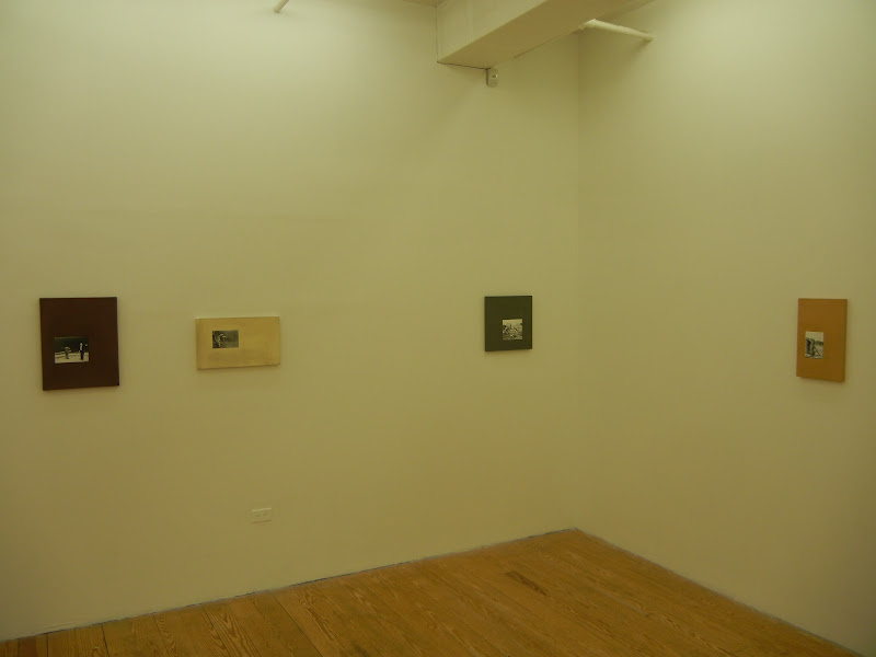
JTF (just the facts): A total of 13 photographic works hung unframed in the entry and the main gallery space. All of the works are gelatin silver prints mounted to Dibond, with cardboard, MDF, wallpaper, lacquer and/or linen, and were made in 2012. Physical dimensions range from 9x11 to 23x15, and each work is available in an edition of 3+1AP. (Installation shots at right.)

Comments/Context: Ulrich Gebert's newest works continue his conceptual exploration of the human urge to order the natural world, once again using our relationship with animals as the basis for investigating our controlling behavior. In his previous series, Life Among Beasts, he used appropriated images of humans interacting with domesticated animals to highlight the weirdly disturbing way we touch and handle these creatures. In these new works, he once again returns to archival and found imagery, this time deftly removing the animals, leaving the humans in strange one-sided exchanges and conversations.

While a trainer holding a hoop for a jumping dog or using a fish to entice a seal to do tricks in the air might seem like ordinary events, when the animal is erased, the narrative is interrupted and left unresolved, the human stuck in a kind of awkward, surreal pantomime. People call and pet invisible dogs, feed invisible horses, and stand back apprehensively, with sticks and whips at the ready for who knows what kind of invisible animals. Our gestures in this absence are disorienting, oddly formal, and often completely ridiculous. Instead of matting and framing these manipulated black and white photographs in a traditional manner (which would have made them look like a 1970s conceptual throwback), Gebert has embedded the photographs in off center rectangular canvases, which have been painted in muted colors. The effect is to make the works feel more like objects, reducing their tendency to seem like inexplicable documentary evidence.

The best of the images in this show avoid the trap of the obvious visual one-liner and leave us with something more open ended and uneasy. Gebert's sleight of hand has removed the certainty in our interactions with these animals, leaving behind a unsettling sense of not knowing what might happen next.
.
Collector's POV: The works in this show are priced at either $2800 or $3300 each, based on size. Gebert's work is not yet available in the secondary markets, so gallery retail is likely the only option for interested collectors at this point.

Rating: * (one star) GOOD (rating system described here)

Transit Hub:
  • Review: TimeOut New York (here)
Ulrich Gebert, The Negotiated Order
Through June 30th

Winkleman Gallery
621 West 27th Street
New York, NY 10001

Tuesday, June 5, 2012

Thomas Demand @Marks

JTF (just the facts): A total of 3 large scale color photographs hung unframed against white walls in the front gallery space, with 1 video projection shown in an adjacent darkened viewing room. The photographs are c-prints mounted on plexiglas, ranging in size from 55x45 to 79x118. The film and sound installation has a projected size of 148x197. No edition information was provided on the checklist. All of the works were made in 2011 or 2012.(Installation shots at right.)

Comments/Context: Thomas Demand is one of the reigning kings of the contemporary photographic installation. Starting with a source photograph, the artist creates an elaborate cut paper construction, reproducing the scene in exacting detail, but paring it down to a composition of geometric solids and shapes. He then photographs the resulting installation, making an image that is a recognizable representative of the original, but abstracted from its truth and reality. This generalization process drains away context and specificity, creating a simplified visual language that is both intellectual and reductivist. Demand is a kind of meta-matician, his works occupying an analytical space above the place where photographs normally operate.

His newest photographs continue his use of this meticulous methodology, documenting Whitney Houston's last meal at the Beverly Hilton, the shadowy vault at the Wildenstein Institute where dozens of long missing paintings were recently found, and the control room of the Fukushima Daichi nuclear power plant after the evacuation. When seen via Demand's cardboard short hand, the settings are neutered, our reactions and emotions muted by the subtle rigidity of the abstractions. There is still something sadly poignant about the disarray of sugar packets and leftover salad dressing on the room service cart and the jumbled white ceiling tiles which float like elegant weightless origami above the knobs, switches and computer readouts, but the feelings are detached and aloof rather than hot and immediate. His translation has sucked the juice out of these moments, leaving them dry and academic, like empty ghosts of themselves.

The short film on view amplifies the focus on Demand's astounding craftsmanship. Beginning with YouTube video taken by a security camera on a cruise ship during a heavy storm, Demand painstakingly recreated the ship's cafe, with its seating arrangements of chairs and tables and its bright orange counter with a cash register and bar supplies. Over the course of 2400 individual frames, the objects were then moved inch by inch (with apparent understanding of the laws of physics), the resulting full speed film depicting the crashing back and forth of the entire scene as the ship rocked and tumbled. There is something impressively precise and scientific about this work, where the furniture rumbles across the frame like a herd of buffaloes, the wind blows, the pendant lights sway, and the bucket of lemon slices topples over, all with increasing violence until the chaos subsides, straws, napkins and a lone pink shoe left strewn amidst the destruction. It's hard not to enjoy the whole raging spectacle, but there isn't much emotional payoff; I found myself feeling respect for Demand's prowess as a set builder (and wondering about how the sound was synched to the imagery), rather than paying much attention to the fate of the ship and its passengers.

Curators have long had a love affair with Demand, as his work is both conceptually rigorous and wholly original, and I do think there is something very intriguing about using increasing abstraction to push a photograph to the edge of its ability to communicate meaning. But there is a cerebral quality to this construction exercise that often times leaves me cold; my brain engages with systematic nature of his recreation process, but the pictures ultimately fail to grab me. Finding this tipping point of engagement and leaving the abstract physical objects to imply narrative is part of the interest of course, and I actually found these newest works by Demand more engaging than some of his prior efforts. His work seems to me more about questions than answers, the resulting images almost always unresolved.

Collector's POV: Unfortunately, even after two visits to the gallery and repeated emails to the directors and staff, I was unable to get anyone to respond to my simple questions about the prices and the edition sizes for the photographs on view. There was no printed checklist with prices on it, and the usual pass off to the sales director was never followed up, which is puzzling, since I would assume collector inquiries would merit at least cursory attention. I'm not sure if this was just inadvertent incompetence or deliberate indifference, since I have had nothing but perfectly friendly and cooperative encounters with the gallery in the past.

In any case, if I subsequently find out the price information, I will post it in the comments; other collectors who have had more success than I are encouraged to do so as well. On the auction front, Demand's work is becoming more routinely available in the secondary markets, with at least a handful of works up for sale every year. Recent prices have ranged between $15000 and $260000 for the works in small editions (3, 5, or 6), while works from larger editions (100) have typically found buyers between $1000 and $5000.

Rating: * (one star) GOOD (rating system described here)

Transit Hub:
  • Artist site (here)
  • Features/Reviews: NY Times (here), Wall Street Journal (here), New Yorker (here), ARTINFO (here), TimeOut New York (here)
Thomas Demand
Through June 23rd

Matthew Marks Gallery
522 West 22nd Street
New York, NY 10011

Monday, April 30, 2012

August Sander: Citizens of the Twentieth Century @Houk

JTF (just the facts): A total of 34 black and white photographs, framed in black and mounted, and hung against almond colored walls in the main gallery space. All of the works are posthumous gelatin silver prints with black borders, printed by Gerd Sander in 1990. 29 of the prints are roughly 10x7, in editions of 12. There are also 5 larger prints, ranging from 23x13 to 23x18 in size. The images were originally made by August Sander between 1906 and 1940. (Installation shots at right.)

Comments/Context: I doubt that there are any words worth adding to the celebration of August Sander's landmark photography project Citizens of the Twentieth Century. His ambitious and exhaustive portrait of the German people has influenced generations of photographers from across the globe, as evidenced by recent paired showings here in New York with both Seydou Keïta (here) and Boris Mikhailov (here). Edwynn Houk as recently taken on representation of the August Sander family collection, and this show is a foundation sampler of images from this iconic project.

The prints in this exhibit are not vintage rarities, but posthumous prints made by Gerd Sander relatively recently. So instead of the warm patina of age, they have a sharp crispness of silver tonality, making them seem surprisingly modern. The pastry cook, the bricklayer, the boxers, the three young farmers, the pairs of children, the soldier, they are all brisk and refreshed rather than tired. Several of the images have been enlarged to roughly twice the original size (I had never seen these before), but they too are clean and lively.

While this show doesn't give us any particularly new or original insights on August Sander, seeing a strong grouping of his portraits like this one never fails to impress. It's proof that greatness doesn't age, and that the true masters of the medium can be revisited time and again without becoming stale.
Collector's POV: The prints in this show are priced as follows. The 10x7 prints are either $4500 or $6000. The larger prints (roughly 23x16) are either $12000 or $18000. Sander's photographs are widely available in the secondary markets, including portraits, landscapes, and later prints/portfolios made by both Gunther and Gerd Sander. As a result, prices vary widely, from as little as $1000 for lesser known images to more than $100000 for iconic vintage portraits.

Rating: * (one star) GOOD (rating system described here)

Transit Hub:
  • Feature: Wall Street Journal, 2008 (here)
  • Exhibit: SFMOMA, 2002 (here)
Through May 12th

Edwynn Houk Gallery
745 Fifth Avenue
New York, NY 10151

Monday, April 9, 2012

August Sander/Boris Mikhailov: German Portraits @Pace MacGill

JTF (just the facts): A total of 23 black and white and color photographs, hung against grey walls in the main rooms of the gallery. All of the works by August Sander (11 prints in total) are gelatin silver prints hinged to board, framed in blond wood, and taken between 1924 and 1943. Each image is sized roughly 10x7, in an edition of 12. All of the works by Boris Mikhailov (12 prints in total) are archival pigment prints mounted to Sintra, framed in white, and taken in 2008. Each image is sized 29x20, in an edition of 5. A monograph of Mikhailov's body of work, Maquette Braunschweig, was published by Steidl in 2009 (here). There is no photography allowed in the gallery, so the installation shots at right are via the Pace/MacGill website.

Comments/Context: The pairing of contemporary portrait photography with the work of August Sander has now become a kind of subculture of exhibition all its own. Given Sander's wide ranging influence in the genre, showing paired juxtapositions of old and new offers an opportunity to set a baseline and provide aesthetic comparisons. Using Sander's formal portraits as a kind of gold standard, these exhibits both reinforce Sander's importance, and provide visual connections across photographic history.
.
Sander's foil in this show is Ukranian photographer Boris Mikhailov, and the pairing is particularly apt since Mikhailov just did a recent series of portraits of German citizens from the town of Braunschweig. So not only are their stylistic parallels to discover, but their are also social and cultural angles to be explored, separated by 70 years. The selection of Sander images has been meticulously edited and hung, placing like poses and profiles in small groups, rigidly reinforcing commonality and repetition in the gestures and looks.
.
Mikhailov's newer portraits are even more strict in their composition: crisp head shot profiles against deep black backgrounds. This approach accents the line of the profile, and the details of chins, noses and foreheads become more prominent, like a figure and ground illusion. Mikhailov's portraits take Sander's idea of the subject who is both an individual and a type to its logical extreme, where images of the men and women show quirks of hair style, skin, personality and genetics, while seeming anthropologically scientific at the same time. The portraits are simultaneously wholly contemporary and unabashedly classic, connecting to Ruff's deadpan frontal portraits from the late 1980s and Old Masters paintings with equal power.
.
In general, this is a thoughtful, subdued pairing, which to some degree mutes in the freshness of Mikhailov's works. This duet highlights ties to the past, reinforcing historical links and echoes, where a more contemporary pairing might have given the Mihkailov portraits a more radical frame. Regardless, it's a refreshingly solid one two punch of German portraiture.
.
Collector's POV: The photographs in this show are priced at as follows. The Sander prints are $4500 each. Sander's photographs are widely available in the secondary markets, including portraits, landscapes, and later prints/portfolios made by both Gunther and Gerd Sander. As a result, prices vary widely, from as little as $1000 for lesser known images to more than $100000 for iconic vintage portraits. The Mikhailov prints are $7500 each. Mikhailov's work has only been sparsely available at auction; prices have ranged between roughly $3000 and $30000, but the number of lots up for sale has been small. As a result, gallery retail may still be the best option for those collectors interested in his work.
.
Rating: * (one star) GOOD (rating system described here)
.
Transit Hub: 
  • Exhibit: August Sander: People of the Twentieth Century @Getty, 2008 (here)
  • Mikhailov Feature: Deutsche Bank ArtMag (here)
Through March 5th

32 East 57th Street
New York, NY 10022

Friday, January 6, 2012

August Sander and Seydou Keïta, Portraiture and Social Identity @Walther Collection

JTF (just the facts): A total of 55 black and white works by Seydou Keïta and August Sander, generally framed in black and matted, and hung in the main gallery space (with a dividing wall) and the side book alcove. There are 19 images by Keïta, taken between 1950 and 1959, most of which are modern or posthumous prints; there are 4 vintage prints (much smaller in size) and 1 self portrait on view in the side room. There are also 36 images by Sander, taken between 1910 and 1929; these prints were made by Gerd Sander in 1994, in an edition of 3. (Installation shots at right.)

Comments/Context: The second show at the Walther Collection Project Space matches the iconic portraiture of German photographer August Sander with 1950's portraits made by the Malian studio master Seydou Keïta. For most collectors, both of these bodies of work will likely be well known, and one might think that as a result, this show would be somewhat tired; on the contrary, their familiarity doesn't diminish the resonance between them in the slightest, and in fact, when seen together, I saw facets of each that I hadn't noticed before.

The pairing highlights the idea that both photographers were capturing societies in flux. In the past, I had tended to look at Sander's portraits individually, seeing the greatness of isolated single portraits of various types of people, all captured with Sander's signature deadpan, unembelleished, frontal style. When seen together as a group, I started to see the societal movement in between the portraits that Sander was actually documenting. In the beginning, there are stern farmers and country families, matched with coal miners, priests, and rural schoolteachers. But as the society began to change and more people moved to the cities, suddenly there were new occupations to document: bohemians and revolutionaries, writers and painters, politicians and more middle class families. In this period of time (1910s and 1920s), German society was being transformed from rural to more industrial/urban, and Sander's project captured much more of this wholesale national change than I ever really understood.

Keïta's photographs come at this same idea, but with a much different stylistic approach. 1950s Bamako was a place where traditional African society was mixing with post-colonial Westernism, creating a melting pot of visual and cultural influences. Keïta's portraits capture the aspirational aspects of his clients, their desire to create an identity, to be modern. Juxtaposing vibrant African fabrics with bold patterns (as backgrounds) with Western props like cars, radios, handbags, and sunglasses, he made posed portraits that found the essence of the mood of the times, with one foot in the past and one in the future. I particularly enjoyed seeing the intimate vintage prints in the side room (yellowed and wrinkled from age), as they seem to be a more authentic representation of Keïta's process than the larger, more contrasty modern prints.

Both sets of images consistently document formal dignity and grace, an almost regal quality that has nothing to do with wealth or station in life. Steely eyes peer out and tell stories of hopes and dreams and of the constraints of life in a changing world. Even though you've likely seen these images before, the quality of portraiture on view in this small show is nothing short of superlative, and the pairing makes both richer from the comparison.
.
Collector's POV: Since this is a non-commercial space, no prices were available for the works on view. Keïta's prints come up at auction from time to time, but very few are vintage; prices have ranged from roughly $2000 to $15000 in recent years. Sander's prints are much more available in the secondary markets; there are portraits, landscapes, and later prints/portfolios made by both Gunther and Gerd Sander. As a result, prices vary widely, from as little as $1000 for lesser known images to more than $100000 for iconic vintage portraits.
.
Rating: ** (two stars) VERY GOOD (rating system described here)
.
Transit Hub:
  • Seydou Keïta artist site (here)
  • Keïta background: NY Times, 2006 (here)
August Sander and Seydou Keïta, Portraiture and Social Identity
Extended through March 10th
.
526 West 26th Street
Suite 718
New York, NY 10001