Showing posts with label Bruce Silverstein Gallery. Show all posts

Tuesday, March 19, 2013

Nicolai Howalt and Trine Søndergaard @Silverstein

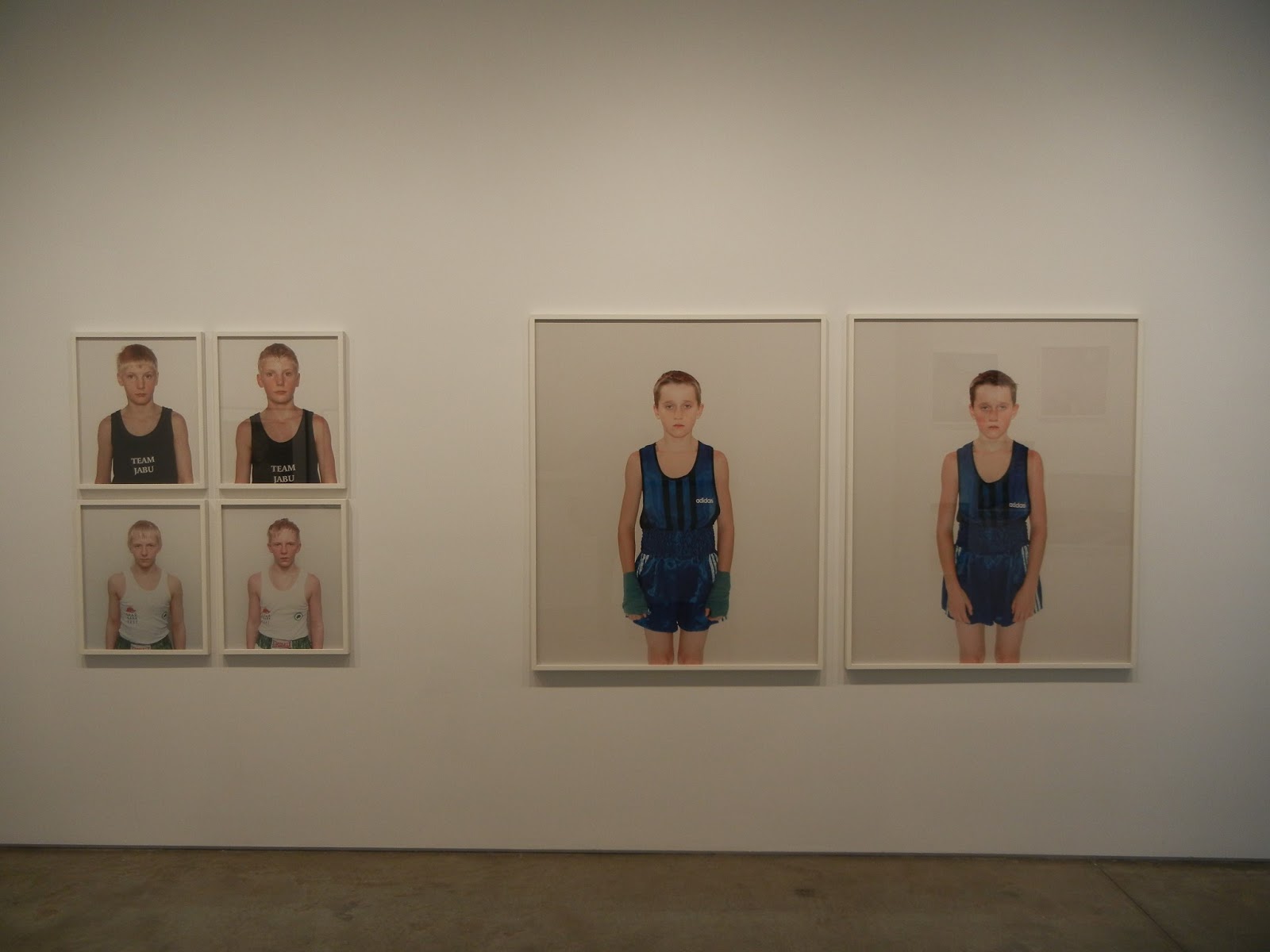
JTF (just the facts): A total of 35 photographic works, variously framed and matted, and hung against white walls throughout the front room/entry, the main gallery space, and the smaller back room. The show mixes individual works by Nicolai Howalt (14) and Trine Søndergaard (10) and includes collaborations by the two artists together (11). The works span the period from 1997 to 2012. (Installation shots at right.)
 
Details on the available photographs are as follows:
 
Howalt

3 analog c-prints, 17x20 or 26x35, editions of 5+2AP, 1998-1999
3 analog c-print diptychs, each panel 24x19 or 55x47, editions of 3+2AP, 2001
1 digital c-print mounted to aluminum, 71x87, edition of 5+2AP, 2009
1 set 6 digital c-prints, each 26x32, edition of 5+2AP, 2009
4 digital c-prints, each 12x15, editions of 5+1AP, 2010
1 pigment print, 24x29, edition of 5+2AP, 2011
1 digital c-print, 70x61, edition of 5+2AP, 2011

Søndergaard

2 analog c-prints, each 19x19, editions of 5+2AP, 1997-2000
1 analog c-print diptych, each panel 19x19, editions of 5+2AP, 2003
1 chromogenic print mounted to dibond, 59x59, edition of 3+2AP, 2008
2 chromogenic prints, each 39x39, editions of 5+2AP, 2008-2009
1 pigment print, 2 digital c-prints, each 23x23, editions of 5+2AP, 2009
1 archival inkjet print, 59x59, edition of 5+2AP, 2012

Howalt and Søndergaard

3 photogravures, each 21x18, editions of 18+2AP, 2005-2010
5 digital c-prints, variously sized from 19x14 to 38x30, editions of 5+2AP, 2007
2 digital c-prints, each 62x78, editions of 3+2AP, 2010
1 silkscreen print, 55x39, edition of 5+2AP, 2012

Comments/Context: It isn't often that a gallery show delivers not one but two mini-sampler career retrospectives, but this exhibit of the work of Nicolai Howalt and Trine Søndergaard does just that, with a selection of their joint collaborations thrown in for good measure. The overall effect is a bit bouncy (given the "one of each" style), but when you step back and sort through which pictures belong to whom, patterns, repeated themes, and visible progressions emerge for both artists. I had the distinct impression that in both cases, their work is getting stronger and more conceptually nuanced with each successive project.

Even a decade later, Howalt's before and after boxers remain sharp and incisive. Angelic young faces become bloodied, sweaty, flushed and exhausted, the boys passing through a ritual trial, emerging roughed up but knowing. The artist's more recent remnants of car crash violence and Danish border landscapes continue this study of edges and transitions, culminating in new nearly abstract images of cremation remains (the ultimate crossing point). What might sound dreary is in fact swirling and textural, with flecks of contrast mixed into the white and black powdery undulations.
 
Søndergaard's photographs continue an ongoing investigation into the nature of portraiture, considering how cultural identifiers move from past to present and how indirect angles and turned away faces create different kinds of narratives. While her Versus pairings of look alike portraits and sculpture from the Thorvaldsens Museum and her Strude images of young girls obscured by folk costumes begin this line of thinking, her most recent work is even more intriguing. I was particularly engrossed by the elusive darkness in Søndergaard's smart Monochrome Portraits, where sitters recede into enveloping shadowy color; the portraits are simple and straightforward, and yet entirely mysterious and uncertain. And in her Guldnakke series, the young women in ornate traditional bonnets face away, leaving the viewer to revel in the details of embroidery and threading but unable to directly connect the history to the modern world.
 
Their collaborative work over the years seems to weave their two separate perspectives into one seamless set of ideas. Silhouettes of crumpled birds shot midair, portraits of solitary trees fighting for existence in snow bound high altitudes, and composite scenes of hunting rituals (full of men, dogs, beaters, birds, and snowy forests) all mix portraiture with the fragility of life. Their recent screenprints of the gnarled, tactile forms of a 1500 year old tree continue this thinking, combining the rough texture of layered bark with the enduring puzzle of relentless, persistent growth.

I think what I liked best about this show as the sense that the artists were idea people first, and that their art was an evolving visual manifestation of their experiments with those ideas. I suppose this same thing might be said of all artists to some degree, but for me, there was a very real feeling of tracing their individual/mutual paths of ideas here. The sampler organization of the show provides the photographic bread crumbs to follow, allowing viewers not just to see the fresh, new pictures made recently, but also to place them into a larger, more comprehensive intellectual context.
 
Collector's POV: The prices in this show span a wide range, seemingly different for every single piece on view. Howalt's works range from $3000 to $30000, while Søndergaard's works range from $6300 to $19100 (with 1 NFS and 1 POR); their collaborations start at $1725 and rise up to $23000. While prints from both of the artists and their partnership have recently found their way into the secondary markets, there have been so few transactions that any kind of historical pattern is difficult to discern. As such, gallery retail likely remains the best option for those collectors interested in following up.
 
Rating: * (one star) GOOD (rating system described here)
 
Transit Hub:
  • Howalt artist site (here)
  • Howalt interview : Lay Flat (here)
  • Søndergaard artist site (here)
  • Søndergaard interview: Ahorn (here)

Through April 13th
 
535 West 24th Street
New York, NY 10011

Wednesday, July 18, 2012

Zoe Strauss, 10 Years: A Slideshow @Silverstein

JTF (just the facts): A total of 229 color photographs, displayed as a continuous slideshow (roughly 30 minutes long) in the darkened main gallery space. These images were made between 2001 and 2010. The show also includes 25 color photographs (and a map) of Strauss' installation of the work under the I-95 interstate highway in Philadelphia; these prints are unframed and tacked to the wall in a cluster in the front gallery. A single finished print, framed in white and unmatted, is hung on the wall outside the slideshow; it is sized 18x27 and is uneditioned. (Installation shots at right.)

Comments/Context: In this age of increasingly short attention spans, few contemporary photographers commit themselves to sustaining a single artistic project for an entire decade. What is lost in this manic flitting from one thing to the next is the steady accumulation of ideas that only becomes evident when we slow down and take a long view. Change, in the broadest sense, nearly always happens in increments too small to notice at the time and patterns don't emerge until we can stop for a moment to look back and see the repetitions. The power of the long term project is in its ability to provide rich, layered persepctive and to get much further into the hidden details than a cursory examination normally allows.

Zoe Strauss' decade long study of her South Philadelphia neighborhood (as well as other locales across America) tells the story of everyday life in our 21st century urban communities. Mixing straightforward documentation of the people and events around her with more abstract pictorial exercises, the body of work moves back and forth between various thematic threads and compositional approaches. It charts the the decay and disuse in her particular section of town (but common to many of our older cities), follows the dynamics of repeated waves of new immigrants as they are absorbed into the social fabric, and finds emblems of the daily struggle we now associate with the Bush years. The slideshow on view represents the final edit of the entire integrated project, merging old and new photographs and carefully sequencing them to reinforce refrains and harmonies.

Strauss' portraits of friends, neighbors and strangers cover an emotional landscape from weariness to proud defiance and from anxiety to everyday joy. In many cases, her pictures are startlingly direct and quietly poignant: a girl's evil looking puffy black eye, a woman holding a dead bird, a man with a pistol, a boy exuberantly flipping upside down onto a pile of mattresses in the street. In others, tiny details anchor a face (a squiggling curl of hair, pierced ears that have been stripped, missing front teeth, a hairnet) while scars (suicide, c section, heart surgery), tattoos, severed digits and bloody injuries provide other forms of personal identification.

Like Walker Evans before her, Strauss also has a fondness for vernacular American signage, particularly the one liner which has been made unintentionally ironic by its surroundings or condition. There's Let's Roll! next door to the depression clinic, POWER in bright lights with the P burned out, Satisfaction Guaranteed reduced to a ghost of itself, and the crumpled arches of a McDonalds sign. If the pessimism of the emotional landscape of the times has somehow been forgotten, Keep the fuck out! and This is your warning help to bring back the simmering harshness with heavy immediacy. Other pictures delve into more formal architectural geometries and Eggleston-like studies of color. Ice covered stairs flank a blue wall, a house is split down the middle into pink and white halves, and red horizontal stripes cover adjacent buildings. Colors pop in images of an electric green ceiling, red carpeted stairs, and the competing dress patterns in a butcher shop. A pile of pillows and a wilted corsage become elegant still lifes. Part of what makes Strauss' work so strong is its familiar looseness; compared with other successful photography documenting the same period (Soth, Epstein, Ulrich etc.), her images are grittier and more immediate, even when they are highly structured.

For an otherwise excellent body of work, my one complaint is that the slideshow format of this exhibit severely undermines its ultimate impact. The images click by, making it impossible to return to them later to savor their details or to orient them in a chronological progression. While I liked the sense of thematic variation and repetition that was apparent, the overall effect of the darkened room experience was underwhelming and vaguely dissatisfying. This is a big gallery space with lots of nooks and crannies; it could have easily held a decent sample of the project, especially if the prints were double hung, gridded, or otherwise clustered. Or maybe the slideshow should have run in the smaller far back room as an adjunct to a more formal presentation. While I watched the show, most people came in, sat down for a dozen slides or so, and then gave up. If the gallery had been filled with prints (instead of feeling largely empty), the experience of the project would likely have been more fully representative of the high quality of the work.

All in, this is a remarkably strong and consistent photographic project, with plenty of subject matter and stylistic breadth. Across the years and along the way, Zoe Strauss has refined her talents and honed her craft, emerging what likely seems like a lifetime later with a sharp and original eye. Based on the merits of the work alone, this show easily deserves a higher rating. But given its suboptimal installation, I was left wishing for a different and more triumphant summation.
.
Collector's POV: The main slideshow on display here is not for sale. Strauss' prints apparently come in three sizes: roughly 8x12, 12x18, and 18x27, all uneditioned. The largest size (like the one framed print on view) is priced at $3600; I didn't get the details for the other smaller sizes. Strauss' work has not yet reached the secondary markets with any regularity, so gallery retail remains the best option for those collectors interested in following up.

Rating: * (one star) GOOD (rating system described here)

Transit Hub:
  • Artist site (here)
  • Exhibit/Catalog: Philadelphia Museum of Art, 2012 (here and here)
  • Reviews: NY Times (here), Bloomberg (here)
Through August 3rd

Bruce Silverstein Gallery
535 West 24th Street
New York, NY 10011

Wednesday, May 30, 2012

Brancusi: The Photographs @Silverstein

JTF (just the facts): A total of 32 black and white photographs, framed in black and matted, and hung in the entry area, front room, main gallery space and back room. All of the photographs are vintage or early gelatin silver prints, taken between 1917 and 1936. Physical dimensions range from roughly 5x4 to 16x12 or reverse. A catalog of the exhibit is available from the gallery. (Installation shots at right.)

Comments/Context: The photographs that Constantin Brancusi made of his sculpture and studio are much more than static evidentiary documents of end product art objects and an overfilled workshop space. They do something quite a bit more radical, employing photography as an expressive method to entirely reinterpret these iconic works, using the interchange of light and shadow to expand our perception of the sculpted forms. Picking up from the small selection of Brancusi photographs in the Original Copy show at MoMA two years ago (review here), this show goes further in exploring how Brancusi used his camera to carefully control and expand our experience of his own work, in the process making photographs that stand on their own as fully formed artworks .

Brancusi's images of individual sculptures show him experimenting with reflected light, shadow, glare, viewing angle, scale, background color, and even multiple exposures to heighten our awareness of texture, form, and drama. Several of the rough wooden sculptures are lit with harsh direct light, turning the three dimensional objects into flat two dimensional shapes in dark black, echoed by multiple shadows on nearby walls. Sculptures made of brass/bronze and other shiny metals capture brilliant flashes of brightness and energy, or reflect artist's tripod in hidden self-portraits. Ovoid marble objects become soft and silky, or turn and pose amid lengthy shadows. An upwards view of one of his famous Endless Columns turns the bumpy totem into an angular thrust skyward. And Brancusi's series of thin, elongated vertical birds are transformed by all these visual effects in turn: black birds with white highlights, white birds with multiple black shadows, and golden birds with radiant glints.
.
Brancusi's wider studio views go beyond the singular attention paid to individual works and explore a deeper sense of spatial interaction between the various sculptures, pedestals, bases, and other objects in the workshop. Pairings accent contrasts of shape, form, and weight (thin and thick), while wider views mix scales into a dizzying jumble of blocky geometric forms and more refined objects. Textures overlap, and the natural light from the overhead windows brings areas of light and dark to the carefully arranged installations. When flattened into two dimensions by the camera, the studio views become complex abstract compositions, filled with interlocking relationships and spatial connections, with particular resonance in the shifting back and forth layering between figure and ground.

While these photographs were certainly successful in increasing (or reinforcing) my appreciation for Brancusi's talents with a chisel or an axe, I think the pictures definitively show that Brancusi was equally adept at controlling mood and emphasis with his camera. This is a well-edited gathering of deceptively complicated vintage photographs, well worth the time spent to savor their intricacies.
.
Collector's POV: The prices for the prints in this show range from $45000 to $250000. Over the past decade, Brancusi's photographic work has been intermittently available in the secondary markets, with roughly a handful of lots up for sale in any given year. Recent prices at auction have ranged between $5000 and $84000.
.
Rating: ** (two stars) VERY GOOD (rating system described here)
.
Transit Hub:
  • Reviews: New Yorker (here), StyleZeitgeist (here)
Through June 23rd

Bruce Silverstein Gallery
535 West 24th Street
New York, NY 10011

Monday, February 27, 2012

Police Work: Photographs by Leonard Freed, 1972-1979 @MCNY

JTF (just the facts): A total of 47 black and white photographs, framed in black wood and matted, and hung against dark blue walls in two adjoining rooms on the second floor of the museum. The prints are either gelatin silver (vintage) or archival pigment prints (later), taken between 1972 and 1979. No physical dimensions or edition information was available. The exhibit also includes 2 glass cases displaying 5 books by Freed, 2 magazine spreads, and a copy of his press pass. A monograph of this body of work was published by Touchstone in 1980. (Installation shots at right.)

Comments/Context: Leonard Freed's documentary photographs of 1970s era New York policemen and women tell a surprisingly even handed, matter-of-fact story about life on the beat. His pictures are less about dramatic moments, dangerous situations, and action-packed heroism, and more about the day-in, day-out life of rough and tumble police work. It's an inside look at the gritty realities of the occupation, its tedium, and the everyday people tasked with the job of trying to control an unruly world.

During these years, Freed actually rode around in patrol cars, spent time in police precincts, and tagged along for arrests and demonstrations. As a result, his photographs have an inside-the-barriers immediacy, often capturing the viewpoint of the officers or catching an unguarded moment during a break in the action. As a group, the pictures are unexpectedly comprehensive: suspects are frisked and handcuffed, bulletproof vests are put on, notes are taken, drug sales are spotted with binoculars from rooftops, confiscated handguns are forensically tested, composite sketches are drawn, and paperwork is filed. When the tension is low, the officers ham it up with parade watchers, play with kids and let them climb in the patrol car, or simply take a much-needed smoke break. Off duty, they lounge in above ground pools and ride motorcycles like the rest of us, but the sea of uniforms at one too many formal funerals is a poignant reminder of the ever present danger associated with this career choice.

What I liked best about this body of work is that it covers so much emotional landscape, without being too posed or biased. In Freed's tight photographs, the job of policing looks alternately high pressure and slack, unexpected and routine, fast paced and ploddingly boring. Knife scars, burned out buildings, vacant debris strewn lots, and a sink full of cash and syringes provide the seamy details, but there are an equal number of moments waiting, standing around, or talking with bystanders and locals. His pictures are more about the process of policing than the end results, and regardless of the particular time period, their continued strength lies in being open about the daily complexity that the job both offers and requires.

Collector's POV: Given this is a museum show, there are, of course, no posted prices. Freeds's photographs are available from time to time in the secondary markets, with perhaps a handful of prints coming up for sale each year. Recent prices have ranged from roughly $1000 to $5000. The estate of Leonard Freed is represented in New York by Bruce Silverstein Gallery (here).

Rating: * (one star) GOOD (rating system described here)

Transit Hub:
  • Magnum Photos page (here)
  • Features/Reviews: Time LightBox (here)
Police Work: Photographs by Leonard Freed, 1972-1979
Through May 6th

Museum of the City of New York
1220 Fifth Avenue at 103rd Avenue
New York, NY 10029

Thursday, November 3, 2011

Self Reflections: The Expressionist Origins of Lisette Model @Silverstein

JTF (just the facts): A total of 36 black and white photographs, framed in black and matted, and hung together with 10 works in other media, framed in blond wood and matted, together displayed in the entry area, front room, main gallery space and back room. All of the photographs are vintage or early gelatin silver prints, taken between 1933 and 1961. Physical dimensions range from roughly 13x10 to 34x27 or reverse, with most roughly 14x11 or reverse. (Installation shots at right.)

The following other artists have been included in the show, with number of works on view and image details in parentheses:
  • Max Beckmann (1 drypoint, 1918)
  • Otto Dix (2 lithographs, both 1923)
  • Lyonel Feininger (1 woodcut, 1920)
  • George Grosz (2 color offset prints on cream Velin paper, 1919 and 1921)
  • Karl Hubbuch (1 brush and lithograph chalk on wove paper, 1930-1931)
  • Ernst Kirchner (1 lithograph, 1912)
  • Jeanne Mammen (1 pen and ink on paper, 1933)
  • Bruno Voigt (1 watercolor, pencil and ink on paper, 1933)
Comments/Context: Bruce Silverstein is quietly making a name for himself as the go-to advocate for the estates of master photographers. After countless others have pawed through the storage boxes and picked out the saleable gems, he has repeatedly come in, brought fresh eyes to the remnants, and made compelling arguments for the importance of what was left behind, in the process doing a respectable job of buffing up the reputations of many who were arguably in danger of being forgotten amidst the ever more frantic search for the new.

Silverstein has recently taken on the estate of Lisette Model, and this show is nothing short of a complete reinterpretation of her place in art history. Many might characterize Model as a classic New York photographer, a friend and contemporary of Abbott, and the respected teacher of Arbus, Hujar, Solomon and others, all of which she certainly was. But this exhibit takes us back to her roots in Vienna, and makes a strong argument for placing her photography in the context of German and Austrian Expressionism. Through a series of side-by-side juxtapositions, the influences of the Expressionist style and mindset on Model's artistic approach come through as real and meaningful.

The images in the front rooms gather Model's layered shop window reflections, her shadow silhouettes, and her telescoping pictures of legs at sidewalk-level, which are then smartly paired with Feininger's chaotic black and white buildings, Grosz' mix of street caricatures, and Kirchner's leggy dancers. The main room contains mostly portraits by Model, some verging on the grotesque and the ugly, often with a knack for biting social critique.The visual echoes between these photographs and the works by Dix, Hubbuch, Voight, and Grosz are startling: bulging faces are twisted in similar ways, bodies are distorted and framed with matching poses, and bald heads take on a sinister quality. The back room contains Model's images of cafe life, punctuated by Arnold Schoenberg's Pierrot Lunaire playing in the background. The high pitched squeaks and throaty yells in the music are shrill and dissonant, matching Model's severe camera angles. The pairing of Model's famous Cafe Metropole with Mammen's The Fat Singer is an inspired one, making Model's exuberantly odd image seem not like an outlier in photographic history but more like a direct descendant from the artistic movements of her past.

Given this new context, Model's relationship to Expressionism seems so obvious that it is a wonder that this story hasn't been told more fully before. This is a well researched, carefully sequenced, and thoughtful show, brimming with new ideas and unexpected connections (i.e. should we now link Arbus to German Expressionism more explicitly?) Model's photography seems so much fresher and more innovative when seen through this lens, so don't miss this chance to reconsider your preconceived notions of what her art might mean.

Collector's POV: The prices for the Model prints in this show range from $9500 to $45000, with many intermediate prices. Model's work is generally available in the secondary markets, with roughly a dozen or so lots up for sale in any given year. Recent prices at auction have ranged between $2000 and $62000.

The other artworks in the show are priced as follows:
  • Max Beckmann: $35000
  • Otto Dix: $100000 and $25000
  • Lyonel Feininger: $24000
  • George Grosz: $3000 each
  • Karl Hubbuch: NFS
  • Ernst Kirchner: $50000
  • Jeanne Mammen: $20000
  • Bruno Voigt: $8000
Rating: *** (three stars) EXCELLENT (rating system described here)
.
Transit Hub:
  • Reviews: NY Times (here), New Yorker (here), La Lettre de la Photographie (here), Speaking in Tongues (here)
Through November 12th
.
Bruce Silverstein Gallery
535 West 24th Street
New York, NY 10011

Thursday, March 31, 2011

Frederick Sommer: Choice and chance, structure art and nature @Silverstein 20

JTF (just the facts): A total of 11 black and white photographs, framed in silver and matted, and hung in a small single room gallery space just off the reception area (the main body of the exhibit includes a large number of Sommer's collages, as well as few sculptures, and continues into the adjacent gallery space of Ricco Maresca Gallery (here)). All of the photographic works are gelatin silver prints, made between 1939 and 1951 (the single nude is an outlier and was made in 1963). The prints are a mix of vintage and later prints, with physical dimensions ranging between 9x8 and 11x7 or reverse, with most 10x8. (Installation shots at right.)
.
Comments/Context: Following up on the success of the excellent Circumnavigation show last year (here), Bruce Silverstein has come back with a deep dive exhibit focused mostly on Sommer's output of collages. What I liked best about last year's show was that it put Sommer's photography in the context of his other artistic endeavors, mixing photographs with drawings, musical scores, collages, and paintings, using both chronology and commonality of form to make exciting connections. This show goes back to the old formula of separating the different media, sequestering the photographs into a single small room, primarily as background material. This mutes the interplay of the pieces and makes it harder to follow the intellectual and visual threads. But no matter, the photographs are outstanding, as always.
.
Nearly all of the photographs on display are assemblages of found objects, layered groups of textural items that have been carefully combined into compositions that border on the surreal. Chicken beaks and gizzards, a bloody amputated foot with exposed tendons, melted rock formations, cut paper illustrations, random doll parts, and swirling wood panels come together in unexpected, often indecipherable installations. Sommer's meticulous control of the juxtaposition of forms and textures generates sublime pairings of tactile surfaces and crisp detail, and his masterful control over the gelatin silver printing process heightens the contrasts between the adjacent materials.
.
I continue to find Sommer's photographic assemblages astounding, even after seeing many over the years; the quality of the craftsmanship is so shockingly high that there is always something new to discover. This exhibit is really about Sommer's cut paper collages, but don't fail to swing into the side room and fall under the spell of these few splendid photographs.

Collector's POV: The photographs in this show are generally priced between $40000 and $50000, with one image at $90000; the nude is $28000. Sommer's photographs are intermittently available in the secondary markets, with prices ranging between $5000 and $85000 in recent years.

My favorite image in the show was Flower & Frog, 1947-48; it's second from the right in the top installation shot. It's a classic Sommer arrangement of seemingly unrelated textural items: a frog, a dress cutout, a small origami flower (is that what it is?), and some other unidentifiable objects, all set against a grainy, cracked wood background.

Rating: * (one star) GOOD (rating system described here)

Transit Hub:

  • Foundation site (here)
Frederick Sommer: Choice and chance, structure art and nature
Through April 9th

Bruce Silverstein/20
529 West 20th Street
New York, NY 10011

Tuesday, January 18, 2011

Todd Hido: Fragmented Narratives @Silverstein

JTF (just the facts): A total of 28 color images, framed in black with no mat, and hung in the entry area, front room, and main gallery spaces. The chromogenic prints come in three sizes (or reverse): 20x24 (in editions of 10+3AP), 30x38 (in editions of 5+1AP) and 38x48 (in editions of 3+1AP). The images were taken between 1995 and 2010. (Installation shots at right.)

Comments/Context: Todd Hido's new show is in many ways a mini-retrospective: it takes a handful of fresh new images and mixes them together with selections from a variety of older projects, going back to the mid 1990s. What is special here is that instead of being displayed in traditional chronological order, the pictures have been sequenced and sifted into clusters and groups, creating enigmatic, unknowable narratives from combinations and juxtapositions of misty wet landscapes, quiet interiors, shadowy female nudes, and night lit houses.

Hido's careful recontextualization of his work links single images into implied settings and cinematic stories, where a trailer, a barren road, and an austere nude can come together to create a lonely, introspective atmosphere. A similar combination of nocturnal houses with glowing windows, a vacant room or two, and a vulnerable, expressionless woman are woven into somber, open-ended suburban vignettes, where the viewer provides both the connections and the ultimate meaning.

Taken together, the works go beyond documentation of dreary physical surroundings to map deeper layers of emotional and psychological terrain, where snowy tracks, a crumpled pillow, and an unguarded pose are the clues to a personal mystery. While many of the images can stand well enough on their own as individual narrative threads, I was struck by how powerful and resonant they became when they were knit into a fabric. What is evident from this show is that Hido's projects from the past decade are all infused with a common underlying spirit, and that each distinct subject matter genre provides a different entry point into the larger tonal environment he is so tenderly exploring.

Collector's POV: The prices for Hido's work have inched up slightly since his last gallery show here in 2009. As a reminder, the prints come in three sizes, with new prices: $3650 for the 20x24 works, $6000 for the 30x38 works, and $9200, $9800, 0r $11800 for the 38x48 works. Examples of Hido's work have become more common at auction in recent years, finding buyers between $2000 and $24000.
.
There were actually several images in this show that I liked quite a bit. If forced to choose, I would likely select the empty blue bedroom (#3878, second from right in the third installation shot from the top), for its rich muted palette and its melancholy mood.
.
Rating: ** (two stars) VERY GOOD (rating system described here)
.
Transit Hub:
  • Artist site (here)
  • A Road Divided @Silverstein, 2009 (DLK COLLECTION review here)
Through February 12th
.
Bruce Silverstein Gallery
535 West 24th Street
New York, NY 10011

Wednesday, December 8, 2010

Michael Wolf: iseeyou @Silverstein

JTF (just the facts): A total of 31 color photographs, each framed in black with no mat, and hung in the reception area, front room, and main gallery spaces. The show is a mini-retrospective of sorts, with images culled from a variety of projects. The following projects are represented, with the number of prints on view and their details in parentheses:
  • Architecture of Density (1, 48x58, edition of 9+2, 2006)
  • Night (1, 48x60, edition of 9+2, 2008)
  • Transparent City (5, 48x60 or 48x64 or reverse, in editions of 9+2, 2008)
  • Transparent City Detail (2, 50x40 and 34x27, in editions of 9+2, 2008)
  • Paris Street View (4, various sizes from 27x34 to 60x48 or reverse, in editions of 3+1, 5+2 or 9+2, 2009)
  • Manhattan Street View (2, 40x50 or 48x60, in editions of 5+2 or 9+2 respectively, 2009/2010)
  • A Series of Unfortunate Events (5, various sizes from 27x35 to 48x60 or reverse, in editions of 3+1, 5+2, or 9+2, 2010)
  • Tokyo Compression (11, 42x34 or 10x8, in editions of 5+2, 2010)
All of the works are digital c-prints, except for those from the Tokyo Compression series which are archival inkjet prints. A selection of 13 black and white city views by André Kertész from 1954-1978 (curated by Wolf) is on view in the back room.

Comments/Context: Over the past five years or so, the work of German photographer Michael Wolf seems to be on a trajectory toward finer grained detail, moving inward from wide abstracted city scenes of anonymous hives of geometric apartment blocks to specific personal moments found on city streets around the world. Along the way, his images have opened up prickly questions about the pervasive nature of video surveillance and its impact on our evolving definition of privacy, encouraging and exposing our own implicit voyeurism.
.
In his newest body of work, Wolf has given up the use of his own camera and instead mined the endless stream of digital images being captured by Google's automated car-mounted cameras for its Street View product. While these pictures were taken to document buildings in a relentless block by block manner, given the number of people in these big cities, they consistently, if inadvertently, capture pedestrians and passersby. Wolf has appropriated these robotic photographs and then interpreted them via cropping and enlargement, discovering stolen glimpses of urban life. I found the resulting images random and disconnected: a couple kissing, layered reflections in a bus window and mirror, a man giving the camera the finger, a woman collapsed in the gutter; their durable individual significance was generally lost on me. What I liked best was the fabric of pixelization that covers each blown-up image like a thin screen; the repeated red, green, and blue shards resolve into tiny veiled grids of blocked color, creating an almost Pictorialist textured feel.

My favorite images in this exhibit were from the new Tokyo Compression series, where Wolf has photographed commuters pressed up against subway windows. Faces are smashed against doors, creating fogs of condensation; fingers claw as though trying to break free; people close their eyes or adopt masks of indifference and weary disgust to compensate for the crush of humanity. These images make the breakdown of personal space and the invasion of privacy much more explicit than in the context-free Street View scenes. Here the voyeurism is harsh and physical, and the people protect themselves from the onslaught by closing up.

Taken together, the show sees our world from a variety of distances, forcing the viewer to move back and forth, from close-up to broad scale and back again, always voraciously looking and being watched. I think Wolf's work asks us to consider more fully whether we have entered a 21st century version of Jeremy Bentham's panopticon, where the knowledge of being under surveillance has started to influence our behavior. In many ways, these new images are evidence of exactly this outcome, and it is this unnerving line of thinking that makes this show worth seeing.
.
Collector's POV: The works in this show are priced as follows. The larger prints from Architecture of Density, Night, and Transparent City range between $11750 and $15750. The images from Transparent City Details are either $5900 or $9000 based on size. The prints from Paris Street View, Manhattan Street View, and A Series of Unfortunate Events range between $5900 to $15750, also based on size. The large print from Tokyo Compression is $9000, while the 10 smaller prints from the same series are being sold as part of a set of 30 prints, together $20000. Wolf's prints have only recently entered the secondary markets, with a few large prints from Architecture of Density finding buyers between between $20000 and $26000.
.
Rating: * (one star) GOOD (rating system described here)

Transit Hub:

  • Artist site (here)
  • Reviews: New Yorker (here), New York (here)
  • Interview: The Morning News (here)
  • Aperture show, 2009/2010 (DLK COLLECTION review here)
Through December 24th

535 West 24th Street
New York, NY 10011

Thursday, October 7, 2010

Beyond COLOR: Color in American Photography, 1950-1970 @Silverstein

JTF (just the facts): A group show of 97 color photographs, variously framed and matted, and hung throughout the front, main, and back gallery spaces. The works on display were made between 1950 and 1970 by 11 different artists. Details on the photographers and prints included in the show are below, with the number of images and relevant specifics in parentheses:

  • Harry Callahan (9 dye transfer prints, made between 1951 and 1970, most printed later, ranging in size from 7x7 to 10x14)
  • Marie Cosindas (9 works: 5 archival inkjet prints, made between 1965 and 1968, printed in 2010, ranging in size 8x10 to 12x17, 3 dye transfer prints, made and printed in 1966, ranging in size from 11x14 to 13x15, and 1 c-print, made in 1966, printed in 1970s, 12x15)
  • Ernst Haas (5 works: 4 dye transfer prints, made and printed between 1953 and 1960s, ranging in size from 11x17 to 15x22, and 1 chromogenic print, made in 1969, printed later, 30x40)
  • Saul Leiter (8 chromogenic prints, made between 1956 and 1959, printed later, all 14x11)
  • Inge Morath (8 archival pigment prints, made between 1957 and 1965, printed later, all 13x18 or reverse)
  • Marvin Newman (9 archival inkjet prints, made between 1953 and 1956, printed 2010, all 13x19)
  • Ruth Orkin (7 archival inkjet prints, made c1950, printed 2010, all 11x14 or reverse)
  • Eliot Porter (10 dye transfer prints, made between 1950 and 1968, all 10x12 or reverse)
  • Arthur Siegel (6 dye transfer prints, made c1950, all but one vintage, ranging in size from 7x10 to 10x12)
  • Pete Turner (6 dye transfer prints, made between 1963 and 1970, printed 1970s, ranging in size from 11x15 to 40x60)
  • Garry Winogrand (20 slides, made between 1950-1970, shown as projected slide show)

Comments/Context: Given the overwhelming dominance of color photography in our lives today, it's altogether surprising that the art historical narrative for this particular medium is still rather fluid and incomplete. Earlier this summer, the Starburst show at Princeton (review here) helped clarify the exciting period between 1970 and 1980, when Eggleston, Shore, Sternfeld and many others took color photography in a variety of new directions. But what was happening in color prior to that time has received much less scholarly attention. This ambitious gallery show attempts to step into that murky void, providing a companion piece covering the two decades prior to the 1970s color explosion.

One of my most important takeaways from Starburst was that the 1970s photographers found new ways to liberate themselves from the bonds of traditional subject matter. That show was filled with everything but the normal; it was filled with the quirky, the political, the mundane, the suburban, the conceptual, and even with color as the subject in and of itself. In contrast, when I walked through this show chronicling the period just before the 1970s, my strong reaction was: this is mostly black and white photography made in color. There is a heavy dose of street photography, mixed with a few landscapes, some portraits, and a still life or two, and with a few exceptions, most of the images are rooted in a recognizable black and white aesthetic.

The conclusion I draw from ideas underlying this show is that there really was a violent schism in the 1970s, a breaking away from what had come before. I can't say that I have ever heard that any of the notable 1970s color photographers say they were influenced by any the artists on view in this show (deepen my understanding in the comments if you can add something specific), and seeing this work, I can't say that I am particularly surprised. To my eye, the impressionistic work of Saul Leiter (which I am finding increasingly amazing as I see more of it) and a few of Harry Callahan's dye transfers are the only images that seem to consistently reach for something beyond the boundaries of black and white. The others have moments when a single image crosses into the new world, but that innovative energy isn't sustained.

Overall, I think the gallery deserves credit for digging into a subject that needed some further investigation and for putting together a varied exhibit of representative work. This show is full of complex issues and ideas to keep your brain busy, but unfortunately the work itself is mostly forgettable. Even if all of the work isn't durably original, as a whole, this period of change is still an important historical link worth understanding. In many ways, this is a show of transitional, now extinct species, which tried to adapt to the new environment, but in the end, lost the battle of natural selection.

Collector's POV: The prints in this show are priced as follows:
  • Harry Callahan: $8500 or $9500 each
  • Marie Cosindas: dye transfers $15000 or $20000 each, c-print $7500, recent inkjet prints $3000 each
  • Ernst Haas: dye transfers between $25000 and $40000 each, chromogenic print $5250
  • Saul Leiter: $4000 each
  • Inge Morath: $2600 each
  • Marvin Newman: $3000 each
  • Ruth Orkin: $2750 each
  • Eliot Porter: most $2500 to $3000 each, one print at $12000
  • Arthur Siegel: between $8500 and $20000
  • Pete Turner: small sizes $5000, large sizes $38000
  • Garry Winogrand: not for sale
Rating: * (one star) GOOD (rating system described here)

Transit Hub:

  • Reviews: Wall Street Journal (here), New York Photo Review (here)
Beyond COLOR: Color in American Photography, 1950-1970
Through October 23rd

Bruce Silverstein Gallery
535 West 24th Street
New York, NY 10011

Tuesday, April 27, 2010

Silverstein Photography Annual 2010 @Silverstein

JTF (just the facts): A group show of 10 emerging photographers, with a single photographer chosen by each of 10 local NY curators. The works are variously framed and matted, and hung in the entry gallery, the main gallery space, and the back gallery. (Installation shots at right.)
.
The following photographers are included in the exhibit. Details of the works on view are below:
  • Bahar Behbahani: 1 triptych (3 chromogenic prints), each print 72x48, in an edition of 6, from 2007
  • Rob Carter: 2 digital c-prints, 48x35 or 40x51, in editions of 5, from 2009
  • Juliane Eirich: 3 chromogenic prints, each 39x39, in editions of 5, from 2007-2008
  • Ben Gest: 3 archival inkjet prints, 67x40, 59x40, or 532x40, in editions of 8, from 2005 or 2006
  • Charlotte Haslund-Christensen: 3 diptychs and 1 single archival inkjet print, each individual print 20x20, in editions of 5+2AP, from 2007
  • Dana Miller: 5 chromogenic prints, each 20x24, in editions of 8+2AP, from 2006 or 2007
  • Aude Pariset: 6 three dimensional works, made from inkjet or lightjet prints mounted to various materials (wood, aluminum, leather, etc.), various sizes, in editions of 3, from 2008 or 2009
  • Radcliffe Roye: 6 chromogenic prints, each 20x24 or reverse, in editions of 10, from 2009
  • Glenn Rudolph: 3 archival inkjet prints and 1 color carbon transfer print, each 30x30, in editions of 7, from 1976, 2002, 2004, or 2008
  • Nodeth Vang: 2 digital c-prints and 3 instant film diffusion transfers, 30x24 or 4x3, in editions of 5 or 1, from 2008 or 2009
The following 10 curators selected the photographers for inclusion in the show:

  • Patrick Amsellem, Brooklyn Museum
  • Sean Corcoran, Museum of the City of New York
  • David Harper, Brooklyn Academy of Music
  • Matthew Higgs, White Columns
  • Mara Hoberman, Hunter College Art Galleries
  • Mason Klein, The Jewish Museum
  • Beatrix Reinhardt, College of Staten Island, CUNY
  • Edwin Ramoran, Aljira, a Center for Contemporary Art
  • Carrie Springer, Independent Curator
  • Deborah Willis, NYU Tisch School of the Arts

Comments/Context: Since we haven't had a Silverstein Photography Annual since 2008, it would be easy to have forgotten its simple but elegant premise: choose 10 photography curators and let them each select one exciting photographer for inclusion in a group show of new/emerging work. This year's collection is a more recession-respecting local affair than prior years, with curators chosen from smaller New York metro area institutions rather than from far flung museums across the globe. These are the kind of photo curators who are likely down in the messy trenches of new photography, doing endless portfolio reviews and sifting through piles of fresh submissions, looking for new and original voices to champion; in many respects, they therefore represent a good cross section of what many institutions might be looking for (or finding of interest) right now.

Radcliffe Roye's sweaty images from Jamaican clubs were my favorites in the show, particularly the image Ballerinas, of three young women done up in short skirts and colorful makeup; the pictures have echoes of Malick Sidibe's images of the youth clubs in 1960s Mali, but with a more modern feel. The colors are eye-popping and the dancehall poses are lively and outrageous.

Bahar Behbahani's photographs really fall into the category of documents of performance art; the artist hangs upside down from an apple tree, with leaves strewn across the patio underneath, and the pictures capture the blurs of her struggle at various times during the day. While the premise is pretty straightforward, I found the work surprisingly unsettling and metaphorically memorable.

Dana Miller's images are so quiet and understated that it is easy to underestimate them in a quick pass through the gallery. Tennis balls trapped in a park fence, a grocery cart partially submerged in the water, these are not subjects that shout out from the walls. But there is a clarity and authenticity to these images, without a trace of self-conscious artifice, that makes these mundane scenes softly refreshing.

While I also found things to enjoy in Ben Gest's disaffected images of upper class boredom and Charlotte Haslund-Christensen's conceptual front and back portraits of Danish families, overall, the show itself felt a bit flat, with plenty of less remarkable work to go along with the few standouts. Intellectually, I can understand the logic for why each of these artists/bodies of work was selected, but that doesn't mean that they all pass the test of being thrilling or significant. As such, this is the kind of show that you can wander through without being jarred out of your comfort zone; all of it is good, but unfortunately not enough of it is striking or sensational.
.
Collector's POV: The works in the show are priced as follows:
  • Bahar Behbahani: $12000
  • Rob Carter: $5500 or $6000
  • Juliane Eirich: $3500 or $3950
  • Ben Gest: $5800 or $8800
  • Charlotte Haslund-Christensen: $1650 or $3500
  • Dana Miller: $2000 each
  • Aude Pariset: $1750, $2000, or $2200
  • Radcliffe Roye: $1500, $1800 or $2300
  • Glenn Rudolph: $3500 or $5000
  • Nodeth Vang: $1000 or $2000
Rating: * (one star) GOOD (rating system described here)
.
Transit Hub:
  • Bahar Behbahani artist site (here)
  • Rob Carter artist site (here)
  • Juliane Eirich artist site (here)
  • Ben Gest artist site (here)
  • Charlotte Haslund-Christensen artist site (here)
  • Dana Miller artist site (here)
  • Aude Pariset artist site (here)
  • Radcliffe Roye artist site (here)
  • Glenn Rudolph artist site (here)
  • Nodeth Vang artist site (unknown)
Through May 8th
535 West 24th Street
New York, NY 10011

Thursday, February 25, 2010

Frederick Sommer, Circumnavigation @Silverstein

JTF (just the facts): A total of 69 works, variously framed and matted, and hung throughout the entire gallery, including the entry, front room, main space, and back room. The exhibition includes 21 black and white photographs (a mix of vintage and later gelatin silver prints), 32 drawings/prints/musical scores, 11 collages, and 5 paintings. The works span more than sixty years, from 1932 to 1998, and have been provided by the Frederick & Frances Sommer Foundation. An exhibition catalogue has been produced by the gallery and is available for $50. (Installation shots at right.)
.
Comments/Context: If we look at a spectrum of artists who employ a camera for image making, at one end we might place those who are single-minded in their use of photography, and at the other, those who use a variety of mediums for their artistic expression, with photography as just one of many ways to make a picture. For those at the multivalent end of the continuum, depending on which of their chosen mediums becomes most recognized or "successful", these artists often get categorized as single medium artists, even though they continue to use multiple methods tailored to specific circumstances or aesthetic goals.
.
Frederick Sommer is one of those multi-talented artists who got branded a "photographer" from an early point in his career, thereby marginalizing, at least from the point of the world at large, the rest of his artistic endeavors. This museum quality retrospective exhibit makes a substantial effort to rebalance the Sommer narrative, to highlight the strengths of the photography, but in the context of Sommer's equally innovative drawing, printmaking, collage, and painting. The picture that emerges is less of Sommer as the master photographer, but more of Sommer as a gifted artist who was exploring a variety of cutting edge, interconnected themes and ideas, probing the edges of the various available mediums to try and match his visual problems with the method that would most effectively be used to solve them.
.
A tantalizing example of the linkages between Sommer's use of different mediums comes in the pairing of a painting and photograph, both from the mid 1940s. In the photograph, Sommer, documents the withered, bleached carcasses of dead coyotes in the desert, the bones and sinews left to erode in the parched landscape. While the subject matter is challenging, the print is precise and rigorous, Sommer's meticulous attention to detail coming through in a print of exceptional quality. The painting that hangs next to it mimics the tonalities, but heightens the contrast to dark black and pure white. More importantly, the specific details of the coyotes have now been abstracted into swirling, jagged outlines, a clear parallel to the beginnings of Abstract Expressionism. The pairing shows Sommer starting with a single subject (or set of ideas) and ending up with two wholly different artworks with surprisingly similar underlying compositions.

Connections like these are all over this exhibit. One wall connects a painting with a pair of glue drawings, only to have these ideas reappear further along the wall in photographs of smoke on glass and cut paper made decades later. Another wall contains a series of Sommer's abstracted musical scores, where the score itself is transformed from specific notation into an open ended expression of layers, lines, and curves; hung amidst these scores is a 1950s photograph of architectural arches, echoing the multiple voices and harmonies of the fictitious music. In the front room, early 1940s photographs of groups of puzzling found objects are juxtaposed with 1990s cut paper collages (mostly made from 19th century hand drawn anatomical diagrams), both exhibiting a staggering density of layered ideas, as well as painstaking attention to detail. The back room takes these ideas further, bringing together Surrealist skipreading (embodied in text heavy graphic prints), skeletons, and complete abstractions of the Arizona landscape - all looking for new ways to find meaning in easily recognized materials.
.
The reason this show is important is that it broadens the story of Sommer's art beyond his cult follwing by a devoted minority and his veneration as one of the greatest photographic printers of all time. While this part of the story is still altogether true (take a close look at the prints for a breathtaking display of virtuosity), I came away with a much deeper understanding of all that Sommer was trying to accomplish during his long career. My conclusion is that Sommer was even more radical and talented than I had imagined; the back story makes the photographs stronger and gives them a more complete foundation. This is the first can't miss show of 2010, as it takes what we know about one of the masters of the medium and explodes it outward, encompassing a much more complicated and interrelated view of how the visual ideas he was exploring eventually resulted in his many original and iconic photographs.
.
Collector's POV: The works in this exhibition are priced as follows:
  • Drawings/prints/musical scores: $4500 to $20000
  • Photographs: $10000 to $90000, with two NFS
  • Collages: $12000 to $30000
  • Paintings: $60000 to $70000
Sommer's photographs are often available in the secondary markets at this point, with prices ranging between $5000 and $85000 in recent years; his well known portrait of Livia (the girl with the mesmerizing stare) is the single image that drives the top end of the market.
.
For our particular collection, while we admire much of Sommer's work, we continue to look for just the right photographs to fit into our specific subject matter genres. Unfortunately, the exquisitely detailed still life combinations, collages and abstractions don't really match any of our categories. The horizon-less all-over image of a heap of broken glass and bottles (Glass, 1943) is perhaps the single best fit for our city/industrial genre from Sommer's series of abstract Arizona landscapes. We have also spent some time looking for just the right example from his series of blurry nudes; there is a solid one on view here (Lee Nevin, 1965).
.
Rating: *** (three stars) EXCELLENT (rating system described here)

Transit Hub:
  • Artist/estate site (here)
  • Philadelphia MoA, 2009 (here)
  • Getty, 2005 (here)
  • Book: The Art of Frederick Sommer (here)
Through March 20th

535 West 24th Street
New York, NY 10011