Showing posts with label David Zwirner. Show all posts

Tuesday, April 16, 2013

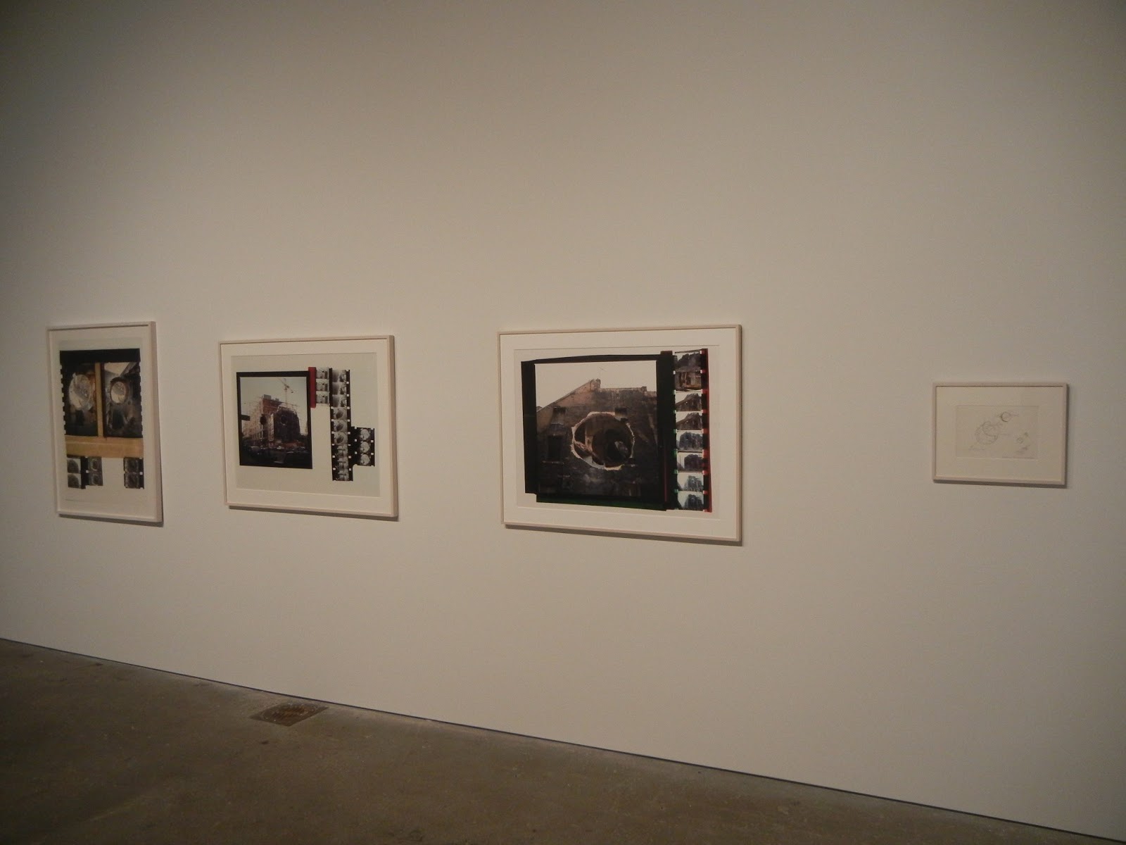
Gordon Matta-Clark, Above and Below @Zwirner

JTF (just the facts): A total of 10 photographic works, 26 pencil/ink drawings, 4 films, and 1 sculpture, variously framed and matted, and hung/shown against white walls in the large, two room divided space. Counting the photographs is a bit tricky as many have multiple images printed together as a single work, or come in groups that make up a single work. There are 6 works that are printed on a single sheet, 1 diptych, 1 triptych, 1 set of 4 images, and 1 set of 6 images. All of the photographic prints are either chromogenic prints, silver dye bleach prints, or gelatin silver prints, taken between 1974 and 1977. Individual sizes range from 36x27 to 92x20, with many at 40x30 (or reverse); edition sizes are generally 3, when noted. (Installation shots at right.)

Comments/Context: This smart show chronicles the late works of Gordon Matta-Clark, documenting each separate project via a combination of films, photographs, drawings, and other ephemera. The different mediums show us alternate sides of Matta-Clark's artistic thinking, from his whimsical and imaginative preliminary drawings to collaged multi-perspective photographs showing particular angles and views of his in-process and completed architectural interventions. His films layer in a sense of time and motion, of open-ended exploration and discovery rather than predetermined creation. Taken together, there is a richness of context here that brings the projects alive.

Photographically, Matta-Clark's works start as straightforward documentation of cut-throughs, holes, and multiple levels of demolished walls and construction debris, with an eye for the iterations and changes that came with each successive removal. The images are then collaged together, mixing sizes and vantage points to create a kind of spatial rhythm, moving outward through a conical oculus or downward through descending squares, often with an unexpected see-through vista. The pictures feature interlocking arced geometries that become more complex and abstract when seen from specific spots, the larger logic of his precise interventions finally coming into view when surrounded by smaller strips of contact sheet style pictures.

A second group of works play with vertical descent, moving from the street down through successive layers of tunnels and understructures, stairs and sub-basements. Laid out as stacks of images, the works provide a kind of visual core sample, diving down from a landmark like the Opera in Paris to the subterranean catacombs and forgotten caverns below. Two films capture these performance-like explorations, one in Paris and one in New York, following subways, sewer systems, and other dark, murky pathways underneath the two cities. This verticality takes a different form in Matta-Clark's film City Slivers, where city traffic and urban architecture are cut into thin strips, moving and changing within the confines of the narrow band of vision. It's a jittery, tight view of New York, full of cuts, reflections, and cramped tallness.

I certainly came away from this exhibit with a deeper sense for Matta-Clark's sophisticated visualization talents. The gathered works point to seeing built environments with a strong sense for their underlying structure, to getting beyond the superficial and manipulating the patterns underneath to get at the purity of their abstract geometries. The mix of brainy conceptual thinking and rough and ready physicality keeps the projects from becoming too clever; the dust and rubble adds a layer of authenticity to his crisp rationality. His eyes slash through walls and floors like lasers, seeing a elegance of form hiding within, waiting to be released.

Collector's POV: The photographic works in this show are priced between $150000 and $1500000 (the set of 6 images). Matta-Clark's works have not come up at auction with any regularity I recent years; prices have ranged between roughly $7000 and $115000, but this range may not be entirely representative of the market for his most sought after works.

Rating: ** (two stars) VERY GOOD (rating system described here)

Transit Hub:
  • Features/Reviews: Village Voice (here), Wall Street Journal (here)
Through May 4th
 
519 West 19th Street
New York, NY 10011

Friday, April 12, 2013

Thomas Ruff: photograms and ma.r.s. @Zwirner: A Review Conversation with Richard B. Woodward

JTF (just the facts): A total of 22 large scale color photographs, framed in black and unmatted, and hung in two pairs of large divided rooms and two smaller transitional spaces. All of the works are chromogenic prints, made between 2010 and 2013. The photograms are sized 95x73 and are available in editions of 4. The images from the ma.r.s. series (including the 3D images) are sized 100x73 and are available in editions of 3. A small selection of vintage work can be found in a side gallery. (Installation shots at right.)
 
Comments/Context: It is altogether fitting that in the wake of the recent death of film critic Roger Ebert that today’s review of Thomas Ruff’s new show at David Zwirner should take the form of a back and forth exchange between two arts writers. The format Ebert perfected with his longtime partner Gene Siskel offers the freedom to actively (and sometimes aggressively) exchange ideas in a casual, approachable atmosphere, without getting mired in dumbed down platitudes and boring background description. While their face-offs were great for the movies, the direct discussion format is also a terrific match for a lively, open-ended conversation about contemporary art.
 
Last year, Richard B. Woodward and I talked through Alec Soth’s newest show at Sean Kelly Gallery (here), and when I saw the Ruff show appear on the forward calendar, I knew it wouldn’t fail to give us plenty of fodder for another wide-ranging discussion. As a reminder, Rick contributes regularly to the Wall Street Journal, where he covers major museum shows of photography all over the US. His crisp, well-argued essays can also be found in scores of photobooks and exhibit catalogues going back several decades.
 
Happily, Rick agreed to join me for a discussion once again, and graciously allowed me the first bite at the apple.
 
DLK: The work in this show can quite easily be divided into three discrete groups (photograms, Mars images, and 3D Mars images), so I propose that we take each in turn and cover them as individual projects before we jump up and talk about the connections between them. I have to say from the outset that I think Ruff’s photograms are nothing short of revolutionary. They innovate in radical ways on at least three different aesthetic axes: the unprecedented scale/size, the painterly use of color, and the creation of richly nuanced overlapping layers. Add to that the development of the underlying technical mechanisms that made it all possible, and we’ve absolutely traveled somewhere we’ve never been before.
 
What I think is fascinating is that Ruff has found a way to stay observant of the traditions of the genre while at the same time exploding its previous boundaries. Looking up at his massive works (and you have to look up given their scale), I could still see the remnants of Schad, Moholy-Nagy, and Man Ray, but their foundation ideas have been transformed into something modern and machined. Enlarged to roughly 8 by 6 feet, typical photogram ovals, swirls, and silhouettes take on different characteristics, the intimacy of hand-crafted darkroom experimentation and simple chance traded for bold, expansive gestures and increased compositional complexity. They’re truly immersive in a way utterly different than photograms have ever been before.
 
RBW: I hadn’t thought about them as revolutionary in terms of scale, but you’re right. All the previous examples by 19th century pioneers William Henry Fox Talbot and Anna Atkins, as well as the modernists you mention, are quite a lot smaller.
 
About your other claims, though, I’m more dubious. First of all, they’re not photograms in the traditional sense. Those were unique prints created by the laws of chance in a darkroom. These are multiples (limited to editions of 4) created inside a computer. His process allows for a degree of serendipity dictated by the algorithms of his software program. But I’m assuming he knows pretty much how the image will look on the screen before he hits “print.”
 
Yes, they’re suavely handsome. Their illusory depths are soothing, like watching translucent jellyfish in an aquarium or a giant lava lamp. But they are ultimately decorative and nothing more, the sorts of photographs that would look spectacular at night on the walls of a rotating restaurant high above a city or in a Richard Neutra house.
 
They’re just abstract photographs, not unlike what a dozen other photographers have done (including the recent work of James Welling, to name another Zwirner artist), and I don’t think he should be allowed to call them photograms when, by our usual definition, they’re not. What's more, they’re only big because digital printers now can handle huge amounts of information that Man Ray’s enlarger couldn’t.
 
DLK: I think you make a fair definitional point about the word photogram, but to discount their connection to the history of the genre and simply call them abstractions is overly dismissive. I see the works as deeply rooted in the visual vocabulary of the photogram process, but Ruff’s innovative computerized approach has opened up some degrees of freedom that weren’t previously available. We’ve already touched on the scale, but I think there are several more ideas embedded in the pictures that are worth kicking around.
 
The first is simply the idea of introducing color into these compositions and the quality of the color that Ruff has chosen to employ. The icons of this genre had no ability to use color (except cyanotype), so all the early works, those made between the wars, and even those made in the decades that followed were all constrained by the high contrast white on black palette (or the reversed positive). While some layering and transparency was possible, it wasn’t easy to collapse more than a couple layers without everything turning into a muddle. Fast forward to the present and we find artists like Walead Beshty bringing bold color into the mix. But to my eye, this type of color has a bright, machined saturation that is different than what Ruff has developed here. Ruff’s color billows and diffuses, minutely shifting and washing across his compositions. And the perceived distance between “front” and ”back” seems larger to me, so there is more area to traverse and filter through, more dimensional space for shadows and halos to wander. It’s a soft, hazy, diaphanous color, seemingly mysterious and painterly even though it is entirely digital.
 
The second point I would make is that I think there is a meaningful conceptual change going on here. Previous photograms draw some of their power from their existence as Duchampian readymades and the immediate physicality of their presence as objects. Ruff has moved away from that tangibility and the direct connection to identifiable forms; those “laws” have been broken now that we are in the digital realm, even though some visual echoes remain. Seeing these huge prints, I’m less focused on the physicality of the original items or worried about trying to identify the jaunty silhouette of a tea strainer, and more interested in how the shapes have been broken down and reconnected. Perhaps, as you say, we are simply talking about abstraction now, but I can’t help looking back to the old way of thinking and seeing just how much Ruff has disrupted our foundation assumptions.
 
RBW: I’m not dismissing them as photographs--the “billows and diffuses,” to quote from your apt description, are lushly handsome--I just don’t think they are what they claim to be. Unpredictability is part of the charm and risk of a photogram by Schad or Man Ray. They didn’t know what kind of shadows and forms would suggest when they assembled mismatched crap--bits of hair and a comb and thumbtacks and netting--on a piece of photographic paper and exposed it to light. They were making one-offs and, like automatic writing and other surrealist experiments, sometimes the surprise was so much more than anyone could have anticipated that the gamble paid off. And sometimes the results were so clotted or literal that they were thrown out.
 
Ruff isn’t making one-offs. They’re not unique photographs. His software does the work and when it produces a set of whirling shapes he likes, he stops the process and prints as many as he (or his dealer) wants. He’s using his computer as an optical printer, the way many filmmakers and videographers have done before him. The associations created by the unexpected collisions in a great Man Ray were often funny. Ruff’s “photograms” lack a sense of humor, and the chaos he harnesses is safer for being entirely virtual and situated in the realm of mathematical algorithms, not those of a three-dimensional world of objects acted upon by time and gravity.
 
I also don’t see his use of color as innovative either. Color was integrated into the abstract photographs of Moholy-Nagy in the 1930s and ‘40s and Henry Holmes Smith in the 1950s. I think what Penelope Umbrico and Marco Breuer have done with abstract color and computers is more interesting that what Ruff is doing with his software program.
 
Or maybe I'm being too fussy about terminology. Ruff’s photographs aren’t much different from Welling’s recent series Fluid Dynamics, which were also sold by Zwirner as photograms. Or the Gerhard Richters at Marian Goodman last fall, computer samples of his abstract paintings—which were printed on photographic paper and even more outrageously sold as unique “paintings”!
 
DLK: I absolutely agree with your point about the lack of humor in these Ruff photograms. The whole Dada photogram subgenre (and its randomly clever juxtapositions) has been forgotten here, as has the more general appearance of spontaneity and serendipity. But I think that’s OK. At least in my own mind, I haven’t come to terms with how to think about “algorithmic chance” or the idea that the software is recreating uncertainty. I think this is an area where the technology is likely far ahead of the viewer, and I need to get better educated about how digital photographers are implementing chance and what it looks like in the end product, so that I can identify real innovation more readily.
 
Let’s move on to the Mars landscapes. I use the word landscape with some hesitation, as I still haven’t exactly come to grips with the fuzzy line between fact and fiction Ruff is walking in these pictures. While he has begun with authentic NASA footage, his cropping, compressing, and coloration move the final results pretty far away from documentation in my mind. It reminds me of a discussion I was having with another writer who was troubled by Michael Benson’s recent space images, mostly because it seemed like they were too close to the scientific “truth” and that his original artistic input was less visible. In this case, I think it is clear that Ruff has used the Mars images as raw material for his own flights of fancy, and that we shouldn’t be confused about being somewhere “real”. That said, the windblown dunes, the tactile crater pocked expanses, and the sandy eroded washes are undeniably texturally seductive.
 
While space always has the potential to astonish, I have to admit to being a little underwhelmed by many of these photographs, even with their imposing, otherworldly presence. Ultimately, I think the intellectual questions Ruff is raising about the boundaries of the landscape genre and way artists can digitally interpret the land (or space) are much more interesting than the images themselves.
 
RBW: I much preferred the Mars landscapes so I guess we are fulfilling the tetchy Ebert-Siskel roles you invoked in your introduction. Ruff’s decision to make photographic works of art by rephotographing images of a place that no human being has visited and that we have seen only in photographs struck me as wonderfully perverse—smart and amusing.
 
Unlike the photograms, there are solid, if ghostly, referents here that his own artistic interpretations can play against. I saw the works as not only commenting on the new worlds we are exploring with cameras attached to wheeled and tractor vehicles and orbiting telescopes but a wry salute to the Internet itself, as a place where objects float around without boundaries and swim into our view without our having much control, like the objects that appear in the night sky.
 
Taken together, though, the photograms and the Mars landscapes have a lot of geometry in common—and that may be the point he is making and one that I was too grumpy or obtuse to recognize in my earlier posts. The two bodies of work reinforce each other. That said, don’t you think that the “real” images that the Rover has beamed back to us from the Red Planet offer more to ponder and decipher than Ruff’s pictures?
 
DLK: I like that connection you’re making between space and the Internet. There is a certain poetry to seeing the Internet in that way.
 
The conceptual connection I see between the two bodies of work is something akin to an ongoing (some might say relentless) investigation of machine seeing, or perhaps another way to think about it is an incremental deconstruction of photography. If you page back through Ruff’s career with the benefit of hindsight, it all starts to fit together as part of a larger pattern, at least to my eyes. The cropped starry skies, the newspaper rephotographs, the green night vision images, the composite face portraits, the pixelated porn nudes, the JPEGs, even the zycles, they’re all exercises in technology mediated vision, or images coming from somewhere else and becoming source material for further experimentation and technical manipulation. I think the new photograms and Mars images fit into that overarching logic as well, and of the two, I personally find the photograms much more daring.
 
Since we haven’t touched on them yet, I think a few words are in order on the 3D images. For me, these were the weakest works on view, mostly because they seemed the most literal and obvious, even though we haven’t seen many photographers embrace the technology yet. I won’t dispute that there is a gee whiz factor at work when seeing these vertiginous Martian craters and spires (get up close and it feels like you’re really falling in), but I worry that their power to surprise us will be severely diminished in a decade or two. They don’t seem as inherently smart as the others, but I appreciate that Ruff is taking risks with the new tools and trying to figure out what they can and can’t do. The images seem a little more like a work in progress, a necessary intermediate step, or a set of ideas that haven’t yet converged exactly, a little like the first round of candy colored space images (Cassini) that now seem like a preface to the Mars work. And who, by the way, keeps 3D glasses handy for home viewing? Without them, the 3D prints are a headache inducing blur.
 
RBW: I liked the 3D photographs of craters. They reminded me of flowers blooming on the bottom of the ocean—and hokey, like all 3D. The attempt by media conglomerates to sell us on 3D movies and TV feels like an act of desperation: the best, if panicky, solution they can devise for now to compete with free streaming content from the Internet. As you say, not many collectors are going to keep glasses around for their guests to admire 3D anything on their walls. It’s a losing technology, like stereography in the 19th century. You’re too young to remember but in the 1970s some critics and dealers thought that holograms were going to replace photography as the “next big thing.” We know how that turned out.
 
You’re right that Ruff’s interest in this technology and computer-generated abstraction is part of a pattern and dovetails with his fascination with other mediated imagery. He is a brainy, wayward artist and I like that about him. A previous show of his is never predictive of his next one. Zwirner has a small room that contains examples of four groups of pictures: a starry night sky, a portrait head, a building, and JPEG porn. They could be the work of four different photographers.
 
DLK: In general, I think my overall takeaway from this show is more positive than yours. I walked out of the gallery convinced that Ruff continues to be one of the most compelling and challenging artists working in contemporary photography, and one that we ignore at our peril. Even if I might quibble with the durability of some of his end results, the behind–the-scenes thinking that has gone into his projects is consistently smart and perceptive. His view point continues to evolve as he plays through different sourced imagery variations, getting more complex and nuanced as he dives deeper. More than many of his well-known contemporaries, he’s always testing limits, enlarging our understanding of the medium. Yes, he’s brainy, and brilliant, and sometimes inscrutably obtuse, but that’s what makes his work so important.
 
I think these new photograms continue to blur the line between photography and computer-based art, and I think we’re just at the beginning of that ongoing combination. Ruff is no dummy; he’s going where the largest unexplored white space is in photography, and he’s aggressively starting to map the territory.
 
RBW: I agree that his willingness to go in new directions and not to stay in a critically proven or popular style is admirable. But I’m not sure what “peril” we risk if we don’t honor everything he does and regard some of these directions as dead ends. His subjects change but the underlying message doesn’t. I don’t see any strong or unforeseen connections between Internet porn and outer space—except that he happened upon these images on the Internet. The JPEG nudes were big and boring and he seemed to think they would be less boring by making them big—a common mistake of our age. Artists who work with found imagery had better tell me something new and provocative about mediation other than the obvious point, reiterated constantly in postmodern theory, that we’re living in a time when pictures and text often originate from an unknown source and arrive on our screens without an author etc. etc. It may be unjust to club one German artist with another, but I find the material Thomas Demand finds on the Internet, and what he does with it, much more unexpected and obsessively crazy—in a good way—than what Ruff does with the stuff he fishes out of the water.
 
I don’t think Ruff has done anything as finished as those first huge portraits of young good-looking European men and women. They were simple head shots but the quality of detail and light gave them a quivering presence. I wanted to know what might happen to those kids in 10 years. The pictures weren’t about their own construction i.e. not like Chuck Close’s giant heads. Ruff himself seemed engaged by what he was photographing instead of out to prove how alienated we are from the source reality of pictures. He needs to get off his computer for a year or so and go play outdoors.
 
Incidentally, I first saw those portraits in the late ‘80s, when he was represented by 303. The gallery was then located in Soho and one of my strongest memories of that show was the hilariously snooty attitude of the young woman behind the desk. I asked her where the photographs were taken. Instead of telling me that she didn’t know, she decided to put me in my place and in that blasé voice that New York and L.A. gallery assistants wield to intimidate visitors, she said, “I don’t think it matters.”
 
Is it any wonder that so many people loathe and fear the art world? Thank goodness, people who work in galleries seem generally friendlier today—at least they are at Zwirner. That’s been one of the few benefits of the recession and the growth of art fairs: galleries need us to stop by and keep them company.
 
Speaking of company, I’ve enjoyed yours, if only online. We should meet up soon at a bar in Chelsea and resume the conversation in person.
 
Collector's POV: The prints in this show (both the photograms and the images from the ma.r.s. series) are priced at $95000 each. Ruff's work has become consistently available in the secondary markets in the past decade, with plenty of prints up for sale in any given auction season. Prices have generally ranged from roughly $2000 (lesser known early works or large editions) to $150000. 
 
Rating: ** (two stars) VERY GOOD (rating system described here)
 
Transit Hub:
  • Interviews: Conscientious (here), Aperture (here)

Thomas Ruff: photograms and ma.r.s
Through April 27th
 
525 West 19th Street
New York, NY 10011

Wednesday, September 19, 2012

James Welling, Overflow @Zwirner

 
JTF (just the facts): A total of 42 black and white and color works, framed in white and matted, and hung in two connected gallery spaces and a smaller side room down an adjacent hallway. 29 of the prints come from the series Wyeth, made between 2010 and 2012. All of these works are archival inkjet prints on rag paper, available in editions of 5. The prints come in one of two sizes (or reverse): 16x24 (with one at 18x16) or 28x42; each image is available either small or large, but not both. There are 19 in the smaller size and 10 in the larger size on view. The front gallery contains 6 abstract works from the series Fluid Dynamics, made between 2009 and 2012. These are archival inkjet prints, available in editions of 5, sized either 48x40 or 52x40. The side room contains 7 works from the Frolic Architecture project, made in conjunction with poet Susan Howe in 2010 and 2011. These are gelatin silver prints, in editions of 3 or 4, sized either 18x14 or 22x17. This room also contains a glass case with several copies of the related book. (Installation shots at right.)
 
Comments/Context: James Welling's newest show combines three recent projects that all revolve around the relationship between photography and painting. It's evidence of complex thinking, of dissecting and reconsidering how the two mediums can interact, both in the physical gesture and in the pictorial scaffolding.
 
The main body of the exhibit is made up of images from Welling's project channeling Andrew Wyeth. Welling traveled to various locations in Maine and Pennsylvania to visit landmarks, recreate certain scenes, explore the artist's studio, and generally immerse himself in Wyeth's environment and mindset. The result is a set of pictures which are quintessentially New England, spare and unadorned, simple and quietly intense: a dark shingled saltbox looms against the grey sky, a set of white framed windows frosted with misty ice, a chimney rising from a pitched roof, a barn flanked by scrubby grass and wildflower meadows. Interiors echo with empty stillness: a doorknob, a rustic cabinet, Wyeths' dry pigments, a cup and saucer. The project is at once an investigation of place and a communing with the painter's tactile sense of formal precision. Even the scenes which are not direct recreations feel etched with the same sense of pared down care and acute attention.
 
The other two projects on view are process driven photographic abstractions, images made from chemicals and wet paper, full of drips, swirls, splotches, and gestural motion. The Fluid Dynamics series starts with this kind of darkroom experimentation and then layers digital color gradients on top of the images later; a few underlying compositions become the basis for several color riffs, almost like satellite photos or fractals, from soft ice white, to pink and light blue, to copper brown and darker blue. The works in side room also turn on this painterly kind of craftsmanship, but this time in gelatin silver, with folds, lines and washes of ghostly white flowing into light-filled grey abstractions. Both sets of images are physical (almost sculptural), playing with movement and fluidity in the depths of the process.
 
On the surface, the bodies of work in this show could hardly be more different. And yet I took away a common sense of probing, of looking at painting in all kinds of ways, of parsing it down in search of its relevance to photography. Welling is clearly an artist who is thinking rigorously and systematically, who is constantly unpacking his influences and rebuilding his tool box from the ground up.
 
Collector's POV: The prints in this show are priced as follows. The images from the Wyeth series are either $15000 (16x24) or $22000 (28x42). The larger works from the Fluid Dynamics series are $25000 and the smaller ones from the Frolic Architecture series are $12000. Welling's photographs have been become more available in the secondary markets in recent years, with auction prices ranging between $2000 to $22000.

Rating: * (one star) GOOD (rating system described here)
 
Transit Hub:
  • Interview: NY Times (here), Wadsworth Atheneum (here)
  • Feature: ARTnews (here), Photograph (here)
James Welling, Overflow
Through October 27th
 
525 West 19th Street
New York, NY 10011

Wednesday, April 4, 2012

Stan Douglas: Disco Angola @Zwirner

JTF (just the facts): A total of 8 large scale color photographs, framed in black with no mats, and hung in the smaller front room and larger back gallery space. All of the images are digital c-prints, mounted on Dibond aluminum, made in 2012. Physical dimensions range between 39x57 and 74x105, and each image (regardless of size) is printed in an edition of 5+2AP. Each image title includes a fictional date of 1974 or 1975. (Installation shots at right.)

Comments/Context: The nature of photographic truth is perhaps the defining conceptual question that the digital age has forced us to reconsider. The relative ease with which images can now be manipulated, wholly fabricated and broadly reproduced has called into question the very heart of what it means to be "documentary" as well as whether we can still derive meaning from the idea of a singular "decisive moment". These are complicated, unruly lines of thinking that form the center of the debate about what photography can and should become.

In his last few projects, Stan Douglas has been probing many of these thorny issues. Last year, he showed work in which he posed as a mid 1940s Weegee-like press photographer, making painstakingly period-accurate black and white pictures of crime scenes and gangsters. In this recent show, he has fast forwarded a few decades, now modeling himself as a 1970s era photojournalist, with one leg in the underground disco scene in New York and the other covering the war for independence in Angola. Once again, he has staged images which mimic the look and feel of the times (flash lit smoky interiors with crowded dance floors and coat checks paired with images of rebel checkpoints and escaping refugees), their large size and digital crispness the only clues to their artificiality.

I think the ideas here are the most important: if Douglas can faithfully recreate clubs filled with polyester suits, afros, ass cheeks, and kung fu dance moves with the kind of offhand snapshot aesthetic that matches the time and place, how are we as viewers to separate photographic fact from fiction? If soldiers doing martial arts exercises in far off civil wars can be so effectively faked, how are we to judge the photojournalism we take for granted? Douglas' photographs challenge our sense of authenticity and break our trust with the camera. We can longer be entirely sure that the moment we think we see is the one that actually occurred.

What I also find intriguing is that if we assumed these images were "real" and resized them down to smaller proportions, I doubt we'd find any of them particularly memorable in the context of their "true" times. But as contemporary examples of meticulous photographic restaging, their underlying conceptual structure makes the images much more rich and complex; their power lies in their inauthenticity. All in, this is the kind of show that is designed to upend your expectations, and that off balance uncertainty is what makes these images worth thinking about further.

Collector's POV: The prints in this show are priced at $40000, $45000, $50000, $60000, $65000, or $75000 each, based on size. Douglas' work has only been intermittently available at auction in recent years, with none of his more recent larger scale images coming up for sale. So while secondary market prices have ranged between $1000 and $35000, this data may not be entirely representative of his entire body of work. As such, gallery retail may still be the best option for interested collectors at this point.

Rating: * (one star) GOOD (rating system described here)

Transit Hub:
  • Reviews/Features: Daily Beast (here), Village Voice (here), ARTINFO (here)
Stan Douglas: Disco Angola
Through April 28th

David Zwirner
525 West 19th Street
New York, NY 10011

Thursday, April 7, 2011

Stan Douglas: Midcentury Studio @Zwirner

JTF (just the facts): A total of 28 black and white works, framed in black with no mats, and hung in the front and back galleries of both 525 and 533, as well as the hallway between the two spaces. All of the images are digital fiber prints, mounted on Dibond aluminum, made between 2010 and 2011. Physical dimensions range between 18x18 and 43x86, and each image (regardless of size) is printed in an edition of 5+2AP. Each image title includes a fictional date between 1945 and 1951. (Installation shots at right.)

Comments/Context: The press photography of Weegee from the late 1940s is almost like its own singular genre of photojournalism. Combining the visceral grime of the city with a sense for the dramatic, Weegee's flash-lit images of nightime crime scenes, bloody dead bodies, and gangsters headed for the police van have an unadorned mix of film noir glamour and gritty paparazzi reality that made him "Weegee the Famous". In his most recent works, Canadian artist and photographer Stan Douglas has added a conceptual twist to this bygone style of image making, crafting contemporary images that artificially mimic the look and feel of Weegee's world, down to the tiniest of period details.

Using authentic equipment and props from the 1950s (his "midcentury studio"), Douglas has meticulously restaged a number of Weegee's usual subjects: dead bodies lying on the floor covered with newspaper or burlap sacking, men in fedoras and suits playing dice, a hidden cache of booze, cash, cards, and plastic chips found behind a wallpaper panel, and a jowly boss in dark sunglasses being taken away by police. The works have a convincing sense of authenticity, foiled only by an over-sharpness up close that gives away their fabrication. Other images in the series have the look and feel of period advertising photography: women's shoes artfully displayed on a mirror, the intricate marbled curls of a woman's hairstyle as seen from behind, close-up shots of a magician's interlocking rings and and fire bursting from his hand, and a how-to demonstration of the right way to steal a watch right off someone's wrist. Taken together, the whole project is a satisfyingly atmospheric portrait of a particular time, albeit with the inherent push and pull of reverence and irony that comes from being a complete fake.

Overall, I think this body of work is a bit uneven: the best of these photographs fully entranced me with their celebratory melodrama and their painstaking attention to detail, while a few of the others left me wondering whether the tremendous effort was worth the somewhat underwhelming payoff. That said, for those of you interested in the latest iterations in the complex canon of contemporary photographic staging, this show is certainly worth a visit.  

Collector's POV: The prints in this show are priced at $30000, $45000, $50000, or $70000 each, based on size. Douglas' work has only been intermittently available in the secondary markets in recent years. Single image prices have ranged between $1000 and $7000, while multi-image groups have ranged between $15000 and $35000. That said, none of his recent large scale images have come to auction, so it's hard to say that the prices above are truly representative of his market. As such, gallery retail may be the only real option for interested collectors at this point.

I think that Hockey Fight, 1951, 2010, is one of the best single images I've seen anywhere all year; it's the middle picture in the top installation shot. It's filled with pitch perfect period detail (the haircuts, the clothes, the spilled popcorn) and captures an angry punch frozen in mid-throw. The flash lit cinematic scene is both visually engrossing from edge to edge and a fitting conceptual homage to the mastery of Weegee. To my eye, it's the "don't miss" image of the entire show.
.
Rating: * (one star) GOOD (rating system described here)

Transit Hub:

  • Reviews/Listings: PhotoBooth (here), Daylight (here)
Stan Douglas: Midcentury Studio
Through April 23rd

David Zwirner
525 West 19th Street
New York, NY 10011

Friday, February 18, 2011

Philip-Lorca diCorcia: ELEVEN @Zwirner

JTF (just the facts): A total of 26 color works, framed in white with no mats, and hung in large divided gallery space. All of the works are archival pigment prints, made between 1997 and 2008. Physical dimensions range between 32x40 and 32x50, and each image is printed in an edition of 15+2AP. The photographs were made on assignment for W magazine, in Paris, New York, Cairo, Havana, Los Angeles, Bangkok, and Sao Paulo. A monograph of all 11 commissions has recently been published by Freedman Damiani (here). (Installation shots at right.)

Comments/Context: Coming into this show, I will freely admit that I brought along a healthy dose of blunt skepticism. The fashion photographs on display were made by diCorcia over the past decade on commission for W magazine, and having not seen them before (I'm not a W subscriber), I assumed they would be the normal kind of sell-out we often see, where commerce trumps art and the results are less than inspiring. In a photographic year that has so far been generally unremarkable, I am happy to report that these pictures entirely undermined my expectations. I think this is the first photography show of the year that is truly worth a special trip to see, if only because it so consistently defies the standard fashion photography framework.

DiCorcia's careful staging of seemingly authentic scenes is by now entirely familiar to most collectors I would guess. What is different here is that he has broken down the walls of the fashion genre and mashed up his uncertain atmospheric narratives with traditional clothing-centric sales shots. In his pictures, the fashions have been placed in the context of a specific moment or life; they no longer stick out front-and-center to be pawed and gawked at - instead they have been muted, as though just one minor detail in the setting of a larger story (often in some exotic locale). As such, these photographs look like "diCorcias" rather than ads; sure, there are some stylish people here and there, but they are incidental to the larger theater taking place.

What I found most engrossing about these images is how uncertain they are. Nearly every work is a multiplicity of situations and perspectives in one frame, as though the complex action was paused for just a second. Gestures, stances, and glances give us clues to the relationships, but the layers are ultimately disconnected and unknowable, and we are left to fill in the gaps with our own conjectures. A naked man stands in a glass shower stall on display in the middle of a fancy New York apartment, a young woman poses ringside watching a kickboxing match in Bangkok, a headscarfed young woman in Cairo looks at a natural history exhibit of flamingos while a nearby man looks away, a bride stands on a ladder adjusting the elaborate light fixtures in an otherwise nondescript ballroom, a young woman sits in a chair while three chorus girls with chandelier headdresses stand nearby. What is going on in these pictures? Every single image in this show has this uneasy ambiguity, a light touch of sophistication and glamour mixed into silent cinematic stills. Again and again, we see women standing powerfully, while men, children, and other random people provide a carefully orchestrated backdrop open to interpretation. But diCorica has avoided the wild flights of fancy and crazy over-the-top scenes that have become a fashion photography cliche; his staged situations stand right on the edge of seeming truth and something slightly off kilter.

I guess what impressed and surprised me most about this body of work is how stubbornly diCorcia retained his own artistic voice in these commissions. The works on view consistently bear his hallmarks, and quite a few are strong, memorable compositions that will stand well with the best of his many other projects and series from his long career. All in, these pictures were FAR better and more nuanced than I expected they would be, and as such, they kicked me out of a deep rut of thinking that normally undervalues commissioned work.

Collector's POV: The prints in this show are priced at $30000 each. DiCorcia's work is widely available at auction, with recent secondary market prices ranging between $5000 and $72000, with a sweet spot between $10000 and $25000.

While I can say that I liked quite a few images in this show, my favorite was W, September 1997, #5, 1997; while it's not easy to see, it's the image in the center of the top installation shot. I like the way the red brick wall bisects the picture plane, with one story (a guy washing his car with a power sprayer) on one side and another (a young woman dressed in black on the street near a pawn shop) on the other. The two stories are unrelated, but somehow ambiguously connected.

Rating: *** (three stars) EXCELLENT (rating system described here)

Transit Hub:

  • Reviews: Daily Beast (here), T Magazine blog (here), La Lettre de la Photographie (here)
Philip-Lorca diCorcia: ELEVEN
Through March 5th

David Zwirner
525 West 19th Street
New York, NY 10011

Tuesday, April 13, 2010

James Welling, Glass House @Zwirner

JTF (just the facts): A total of 22 color works, framed in white and matted, and hung in two gallery spaces and the entrance hallway. 16 of the works are color inkjet prints, each roughly 33x50 (or reverse); they are printed in editions of 5, and were made between 2006 and 2009. The other 6 works are also color inkjet prints, but they have been individually overpainted with acrylic paint, making each unique. These prints vary in size from roughly 7x10 to 12x13, and were also made between 2006 and 2009. (Installation shots at right.)

Comments/Context: James Welling's photographs of Philip Johnson's famous Glass House in New Canaan, CT, are complex experiments in the properties of colored light. The house itself sits like a jewel box in lush landscaped grounds, and Welling has alternately used its transparency and reflectivity, in conjunction with a rainbow of colored filters, to create a kaleidoscope of flares, shadows, distortions, glares, and blurs. He has transformed the colorless glass building into a prism, where layers of colors seem to explode in all directions.

Welling's images highlight the combination of space in the architectural design, where interior and exterior merge, and views from the outside look right through the building, unbroken by the structure. But the real originality in these pictures lies in their wild overlapping colors, the psychedelic orange, the deep magenta, the neon green, the cool royal blue, and the acidic yellow. Sunsets, grassy lawns and snowfields take on unreal tints and hues, often made more chaotic by a multiple reflection of a nearby tree branch or the use of a negative reversal. Angles and geometries are carefully controlled to separate the colors, creating unexpected pairings and abstract mixtures. In a group of smaller images hung in the entry, Welling has gone further, adding a layer of painted washes to the photographs, the drips and swirls adding texture and further fogging to the already eye-popping compositions.

Stripped of their color, these images would likely be characterized as unspectacular shots of a masterpiece of Modernist architecture. The infusion of vivid, radical color has however taken this cool, detached structure and given it moods: melancholy, anger, anxiety, and hazy afternoon mellowness. The color is no longer embedded in the identity of the underlying subject, but sits as a layer or filter on top. In a certain way, it is as if Welling has "appropriated" this iconic building, and made it his own via mash-ups with intense, stratified veils of color. Straight representation and color field abstraction have been merged together, creating images that are both pleasingly decorative and intellectually challenging.

Collector's POV: The large color prints in this show are each priced at $25000; the smaller overpainted prints are available for $10000 each. Welling's photographs have been available in the secondary markets from time to time in recent years, generally pricing between $2000 to $10000. Welling is also represented by Regen Projects in Los Angeles (here).
.
Rating: * (one star) GOOD (rating system described here)

Transit Hub:

  • Artforum 500 words (here)
  • Review: LA Times (here)
  • Interview: Artinfo (here)
James Welling, Glass House
Through April 24th

David Zwirner
525 West 19th Street
New York, NY 10011

Wednesday, March 3, 2010

Thomas Ruff @David Zwirner

JTF (just the facts): A total of 18 color works, hung in a series of three interconnected gallery spaces. The show is comprised of images from two different projects (cassini and zycles) both executed in 2009. The 9 cassini images are all chromogenic prints, framed in brown wood and matted, and printed in editions of 6. For the most part, these prints are approximately 43x43 square, with some small variations in size from image to image. The 9 zycles works are either chromogenic prints or pigment prints on canvas. The 5 c-prints are face mounted to Plexi (making them very glossy), framed in brown wood and not matted, and printed in editions of 4. These prints are all approximately 73x73 square. The 4 paintings are framed in brown wood and made in editions of 3. Most of these works are approximately 101x81; one is 101x101 square. (Installation shots at right.)

Comments/Context: A common way to read the broad history of photography is to see it as a long series of technical inventions, the artistic wave being driven forward by the varied responses photographers have had to the availability of new tools. At every fork in the endless technology road, photographers have taken one of two divergent paths: using the tools to explore risky new frontiers, or using them to build upon what has come before, but with new twists and capabilities. At one end of the spectrum, we have disruptive innovation (which often fails, but generates radical change when it succeeds), and at the other, something altogether more incremental (which is generally much safer).
.
Thomas Ruff has been out on the bleeding edge, exploring the boundary lands of the contemporary photographic medium for the better part of the past thirty years. Starting with his experiments with large scale back in the 1980s, he has since tested a wide variety of visual and theoretical approaches: appropriation, stereo imaging, superimposition, blurring, and night vision, expanding these ideas using recent digital and computer-based systems, and adding in new concepts like Internet-based imagery, pixelization, and compression algorithms and artifacts. As the technology has changed, he has always looked forward, trying to think his way through the intellectual thicket of what these new approaches might mean for photographic image making. Underneath it all, there has been a constant objectivity, a search for the underlying structure of photography.
.
Ruff's newest work has almost entirely escaped from any traditional definition of the medium. In his cassini series, Ruff has appropriated black and white digital feed images of Saturn and its moons from NASA and transformed them into pictures that go beyond the scientific, into a realm of indefinite lyricism. Ruff has heavily processed the raw images: adding layers of color, cropping the pictures down to simple orbs, dense all-over cloud banks or slashes of line and curvature, and controlling the pixelization with precision to create up-close pointillism. The effect of all this modification is a feeling of otherworldly grace and elegance. But what struck me in these works was not their decorative quality, but the conceptual questions underneath: a stream of bits radioed back from the far reaches of our galaxy has now been manipulated and converted into a new physical art object hanging in a white cube gallery - which part of that is photography? And what might it foretell about where we go next?
.
I think the answer to these questions comes in the form of the companion works from Ruff's series zycles. In these images, Ruff has captured three-dimensional mathematical curves (based on cycloids) that spiral and intersect in layers of line and volume. The swirling patterns have been toned neon purple or bright yellow against opaque black backgrounds; the patterns jump out from the darkness with musical intensity (close-up detail images at right; the one above is unfortunately quite reflected by the Plexi). What's important here is that Ruff has abandoned the camera entirely - these are computer-generated visual manifestations of the inherent beauty of mathematical algorithms. The fact that the final art object is a photograph, or even a painting, seems irrelevant. Ruff has used the digital technology to get beyond photographs of "things" to explore pictures of abstract functions, expressions, or even computer code. As such, while these works might be visually reminiscent of Op Art, Minimalism, or even computer screen savers, these works seem to be a logical extension of the artist's effort to peel back the layers of photography to its inner technological core; the underlying structure of the medium is being revealed by the newest wave of tools, and Ruff is grasping for ways to expand the art-making capabilities of these exposed foundations.
.
On the surface, you may wander through these galleries and find these works pleasingly scientific and coolly intellectual, but I think this misses the importance of this show. These works are not attempts to recreate past masters using digital technology; they are not newfangled riffs of Wall, Sherman, Sternfeld, Eggleston or whoever else we might currently admire. Ruff is out in the hinterland, trying the to find the path to the future. One way forward is via the computer (this has become obvious), and he's already neck deep in his explorations. While these newest documents of his travels may not be thoroughly exciting as endpoints, they are likely a bridge to somewhere we haven't been before. As such, the reason to see this show is less about these specific works, but because the show signals a schism coming soon, a rupturing of what we call photography and the birth (or rebirth) of something that draws on the traditions of all the visual media, but manifests itself in the world of the computer.
.
Collector's POV: The works in this show are priced as follows:
  • cassini chromogenic prints: $30000 each
  • zycles chromogenic prints: $90000 each
  • zycles pigment prints on canvas: $120000 each
Ruff's work has become widely available in the secondary markets in the past decade, with many prints up for sale in any given auction season. Prices have generally ranged from $2000 (lesser known early works, or large editions) to $150000, with a sweet spot between $20000 and $60000.

Rating: ** (two stars) VERY GOOD (rating system described here)
.
Transit Hub:
  • Lecture @Aperture, 2010 (complete videos here)
  • Surfaces, Depths @Kunsthalle Wien, 2009 (here)
  • Review: Art Observed (here)
Through March 13th
.
David Zwirner
533 West 19th Street
New York, NY 10011

Friday, July 31, 2009

Book: James Welling, New Abstractions

JTF (just the facts): Published in 1999 by the Sprengel Museum Hannover (here), in conjunction with the DG Bank-Förderpreis Fotografie 1999 exhibit. 52 pages with 16 black and white images. Includes an essay by Alain Cueff in English, French and German. (Cover shot at right.)

Comments/Context: Given the recent surge of press around the Pictures Generation show at the Met (our review here), James Welling is once again back in the spotlight. This thin catalogue is, however, another of our recent finds at Printed Matter in Chelsea, and takes us back a decade or so, to the late 1990s, when Welling was experimenting with abstract photograms.

Welling's process for making these images is worth a quick review. He began by taking strips of cardboard/paper and placing them in intersecting and overlapping patterns on light sensitive paper, thereby creating a white on black image after developing. He then digitally scanned the images, reversed them, and created negative prints that were black on white.
.
My first reaction to these images were that they were a riff on Modernism, an echo of the patterns of fire escape shadows, architectural skyscraper skeletons and the Third Avenue El from 1920s New York, only cleaned up and made crisp in a geometric, graphic design mode. (Untitled #9, 1998, at right, via artnet.)
.
After looking at them a while, their representation of anything in particular fell away (particularly since the dark areas have no sense of depth or volume), and I was left with sharp edged angles and stark contrasts. Of course, there are obvious relationships to the history of photograms (Man Ray, Moholy-Nagy et al), but in many ways, these images seem to function more like Franz Kline Abstract Expressionist paintings, the thick lines anchoring the pictures and shaping the space.
.
To our eyes, there is an undercurrent of simple art school cleverness here, but overall, these are compelling and visually exciting abstractions that challenge the edges of what we define as photography.

Collector’s POV: James Welling is represented by David Zwirner in New York (here) and Regen Projects in Los Angeles (here). Welling's photographs have come up at auction from time to time over the past few years, generally in the $2000 to $10000 price range. For our collection, one of his flowers would be the obvious best fit, although a print from this series of abstractions would also make a compelling foil to our city scenes from the 1920s.

Transit Hub:
  • Welling's UCLA faculty page (here)
  • Surface Histories, Art in America, 2001 (here)
  • BOMB magazine interview, 2004 (here)
  • Flowers (here)
  • Whitney Biennial 2008 (here)
  • Upcoming event at MoMA in October (here)

Friday, March 20, 2009

Philip-Lorca diCorcia, Thousand @Zwirner

JTF (just the facts): 1000 Polaroid images, mostly color and mostly 3 1/2 x 4 1/2, each mounted to aluminum (not matted or framed) and displayed edge to edge on a small silver shelf hung at eye level around the perimeter of the gallery. The architecture of the gallery folds in on itself like a shell, creating a narrowing blocky maze. The images span approximately 25 years of the DiCorcia's career. There are also 4 large DiCorcia images, made recently, in a side gallery. (Installation shots at right.)

Comments/Context: Since we are used to standing back to see Philip-Lorca DiCorcia's normally wall sized images, this installation of 1000 (yes, one thousand, a staggeringly large number) pictures as tiny prints was a mind bending change in our perceptions. The prints literally force you to get your face within a few inches to see them well, and to take in the entire show, you must slowly meander along the monorail attached to the wall to see each and every picture. The prints wind around and around and finally spit you back out at the entrance, having traveled far further than a simple four wall walk around.
.
Along the way, many of DiCorcia's best and most memorable images can be found, representatives from all of his famous bodies of work (staged street scenes, hustlers, strippers, heads etc.) mixed into a chaotic brew of test shots, exposure mistakes, random still lifes, and seemingly ordinary family snapshots. There are clocks and flowers and skulls, people at home and people on the street.

The first effect of this display is that is exhausting. There are simply so many good images that require such intimate attention that they all fall into a blur quite quickly, with the repetitions and allusions of the sequencing coming to the forefront, rather than any one outstanding shot. The second effect for me was to turn the whole enterprise on its head; the exhibit seemed to become more about the process of editing than it did about individual frames. Why were these specific images chosen out of all those taken? What was it about this particular snapshot that resonated for the artist? How and why did he make the choices that he did? What is the larger narrative at work here?
.
The final effect of this smorgasbord of imagery was to see a single overall emotional state that seems to pervade all of DiCorcia's work, which I wasn't particularly aware of until I saw all of the images together. Regardless of the subject matter, there is very little joy in the world he has captured. There is plenty of isolation, and shadowy loneliness, and deadpan boredom, regardless of whether it was staged or captured live. I must admit that this mood (when I recognized it) dampened my enjoyment of the many treasures to be found in the mixed bag along the aluminum rail.

As a generally unrelated adjunct, there is a small room containing four new DiCorcia pictures, printed in their normal large size, just off the main gallery space.

Collector's POV: The thousand images in this exhibit are not for sale individually, but are being sold as one installation (I didn't ask the price). DiCorcia's work is widely available at auction, typically selling in the range between $10000 and $50000, with an outlier here and there.
.
Rating: * (one star) GOOD (rating system described here)
.
Through March 28th
.
525 West 19th Street
New York, NY 10011
.
Roberta Smith's short review of this exhibit in the NYTimes is here. A review by Horses Think is here.