Showing posts with label Janet Borden. Show all posts

Wednesday, June 12, 2013

Martin Parr: USA Color @Borden

JTF (just the facts): A total of 21 large scale color works, variously framed and matted, and hung against white walls in the divided main gallery space. The exhibit also includes a small hand held album of color prints, displayed in a glass case. The single images are either chromogenic prints or pigment prints, made between 1993 and 2012. Sizes range from 20x24 to 40x60, and the prints come in editions of 5, 10, or 25. The album consists of 100 4x6 chromogenic prints, the entire set originally available in an edition of 5. (Installation shots at right.)
 
Comments/Context: When you're as prolific a photographer as Martin Parr, at some point it becomes possible to put together a show or a book with nearly any theme - just pick a subject, drill a core sample through the archive, and out pop dozens of images that share a common connection. It's a testament to Parr's consistent originality across the decades that these subsets of work all bear his unmistakable blend of visual wit and saturated color. This particular show gathers together pictures made in America, but could easily have been called flags, food, and tourists given its clusters of imagery. It's a high voltage retrospective of American eccentricity, endearingly brash and conspicuously ridiculous.
 
While it's always easy to have a few laughs and smiles at a Martin Parr show, I think that his snapshot humor has often led us to discount his compositional craft and his exceptional timing. Parr's split second juxtapositions are culled from the river of ordinariness flowing by, his eye able to pick out the inherent oddness of the everyday and get it framed just right to highlight that moment of unexpected vitality. The tourist shots in this show all turn on the relationship of clothing to the surrounding environment: a dime store feathered headdress on a Grand Canyon watcher, a cowboy hat flanked by the Las Vegas sphinx, a black and white $100 dollar patterned hat near the spots of a giraffe at the Atlanta zoo. His pictures capture the unintended irony of simple things: the gaudy flowered shirts worn by middle aged men to a colorful Hawaiian luau, the jungle florals on a pair of beach swimsuits, the complex angle of a girl in a James Dean jacket that somehow matches the replica Eiffel Tower in the distance. In Parr's world, cultural signifiers go awry left and right.
 
Parr's images of American food opt for the subtly outrageous. Meat on a stick is a common theme, from an oversized corndog slathered in mustard and ketchup to a manly hunk of grilled lamb still on the bone; an overstuffed Las Vegas breakfast plate and a rainbow colored layer cake tell us more about the extremes found in the American diet. Parr's flags are equally bold and puzzling, from a speedo style bathing suit and golf headcovers in the stars and stripes, to a small flag draped amid sausages for sale. His fabulous album of flags taken in New York just after 9/11 (when American flags flew nearly everywhere in abundant variety) deserves to be a book of its own - it's poignant, patriotic, and wonderfully over the top all at the same time.
 
Parr's maverick vision sets him apart from most of his contemporaries, and even at his most caustic, I find it hard not to revel in the joy in his photographs. Even as we drown in an endless sea of digital snapshots, a Martin Parr image is still immediately recognizable at twenty paces. His photographs embrace the quirks of humanity with warmth and affection, reliably jolting us with bright color and understated comedy.
 
Collector's POV: The works in this show are priced as follows. The 20x24 and 20x30 prints are priced at $5000 or $6000 each. The larger 40x60 prints are $12000 each. The album is available for $5000. Parr's prints are intermittently available in the secondary markets, with recent prices ranging between $1000 and $12000.
 
Rating: ** (two stars) VERY GOOD (rating system described here)
 
Transit Hub:
  • Artist site (here)
  • Magnum Photos page (here)
  • Features/Reviews: New Yorker PhotoBooth (here)
Martin Parr: USA Color
Through June 28th
 
560 Broadway
New York, NY 10012

Friday, April 19, 2013

Hanno Otten, Boulevard @Borden

JTF (just the facts): A total of 24 color photographs, variously framed and matted, and hung in the divided gallery space. 15 of the works are unique chromogenic color photograms, sized between 16x12 and 20x87. The other 9 works are chromogenic color prints, sized either 16x12 or 77x52; these prints are available in editions of 3. The images were made between 2001 and 2013. (Installation shots at right.)

Comments/Context: When we talk about color in photography, we are rarely discussing it in truly scientific terms. We throw around words like hue, and saturation, and lightness as handy descriptors for the color of the sunset, or a truck, or a pattered dress we are seeing, all without really acknowledging their specific definitions in the space of academic color theory. But from the moment you walk into Hanno Otten's new show, it is obvious that his interest in color is something entirely more systematic than we are generally accustomed to. Bright abstract color erupts from the walls, perfect for springtime, but deeply rooted in an intellectual study of the properties of colored light.

The earliest works on view (from roughly a decade ago) are built up from overlapped layers of strips and rectangles, where transparent blocks hover over vertical stripes, creating changing combinations of additive color. While photograms have traditionally included an element of chance, Otten's works feel rigorously precise - there are edges that are misaligned and touching, but these help explain the color transitions going on. These works then evolve into more blocked compositions that look a little like stained glass windows or harlequin patterns. There is more a sense of angle in these images, of parallelograms interlocking into slightly misaligned flatness. Other works from the same period play with bold layers of loose concentric circles that telescope inward with shimmering energy, like the poster from Hitchcock's Vertigo.

Otten's most recent works step out of the darkroom and reconsider the layered color of one of his own large abstract paintings. Starting with scans of the entire surface, he has then cropped the photographs down to smaller up-close fragments, in effect reprocessing the color washed across the canvas. The end result is compositions that are less hard edged and strict, that softly shift from one colored horizontal band to the next.

These works place Otten in direct dialogue with Jessica Eaton, Walead Beshty, and even Gerhard Richter's recent digital pattern making. They are each testing the limits of photographic color, paring down to Albers-like purity and then lifting the constraints to allow for new experimentation.

Collector's POV: The works in this show range in price from $3000 to $15000, generally based on size and whether the image is unique or editioned. Otten's work has very little secondary market history, so gallery retail remains the best/only option for those collectors interested in following up.

Rating: * (one star) GOOD (rating system described here)

Transit Hub:
  • Features/Reviews: New Yorker (here)

Hanno Otten, Boulevard
Through May 10th

Janet Borden, Inc.
560 Broadway
New York, NY 10012

Wednesday, December 12, 2012

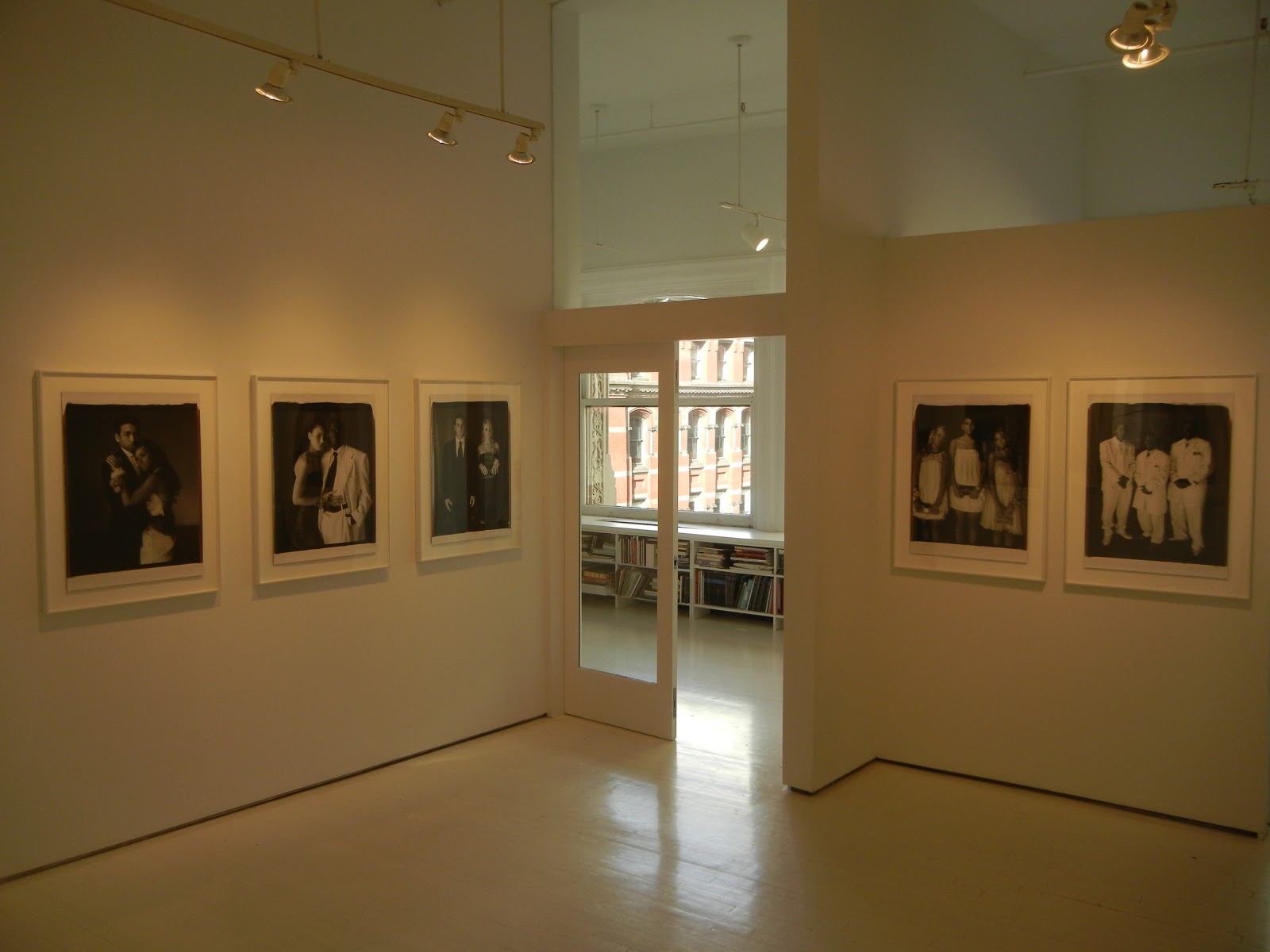
Mary Ellen Mark, Prom @Borden

JTF (just the facts): A total of 30 black and white photographs, framed in white and mounted but unmatted, and hung against white walls in the divided gallery space. All of the works are unique 24x20 Polaroid prints made between 2006 and 2009. A 33 minute film made by Martin Bell runs on a video monitor in the back viewing room. A monograph of this body of work was recently published by the J. Paul Getty Museum (here). (Installation shots at right.)
 
Comments/Context: The formal prom night portrait is a classic of American photographic cliche. Nearly every basement in the nation has a dusty box somewhere with a handful of snapshots of high school seniors in fancy clothes, standing in the front hall or lit up in the makeshift studio in the ballroom lobby, posing awkwardly with their dates. In a certain sense, the prom didn't really happen unless these kinds of pictures were dutifully taken, as they were (and still are) documentary evidence of the passing of an important coming of age milestone.
 
Before seeing this show, I was skeptical that Mary Ellen Mark could find a new way into this tired subject. And in many ways, she hasn't changed the formula for the standard portrait all that much, except to pare it down to its essentials: two (or sometimes three) teenagers stand against a uniform grey background (differentiated only by the patterns of the ballroom carpets underfoot) and are photographed in black and white in either full length or three quarter poses. The smart thing about this minimalist approach is that it pulls away all the other potential visual distractions, forcing the viewer to really look closely at the couple.
 
Before I even get to the people, their clothes, their hairstyles and their poses, I think the exquisite quality of the prints here is worth mentioning. These images were taken with a 20x24 Polaroid Land Camera (one of five in existence) and the prints have a depth of detail that is nothing short of astonishing, especially in the mid range tones. The glimmer of a dress, the worn shine of a rented tuxedo, the soft skin tone of an exposed arm, the sparkle of a handbag, they are all captured with an authentic richness that makes the subjects jump off the wall with vitality. Every single image deserves to be examined up close to revel in this meticulous precision. 
 
Mark has chosen her subjects from thirteen different proms across the country, from California to New York and everywhere in between, providing a diverse cross section of regional styles, fashions, and cultural phenomena. She clearly has an eye for mismatched pairs and outliers: the very pregnant girl, the dark eyed Emo guy, the same sex couple, the huge football player with his tiny girlfriend, the tall short combo, the nerds, the baby dolls. Closer inspection brings out more fabulous details: the nail polish, the Death belt buckle, the matching animal prints, the hooded cloak, the striped jacket and fedora, the mohawk, the tiara, the New England lace. It's an engrossing mix of the personal and the aspirational.
 
But I think in the end, it's the faces that make these pictures memorable. They bring together all the emotions that are part of the jump to adulthood: hope and trepidation, confidence and fear, swagger and uncertainty, unbridled joy and put on maturity. The photographs are unwaveringly honest and consistently optimistic; even the girl from the cancer ward, whose hair has fallen out, looks out with heartbreaking elegance and grace. Whether bursting with self-assurance or seemingly resigned to their fates, for one night, they get to show off their best and be who they had always wanted to be. Mark has deftly captured this elusive essence of prom, the bridge crossing significance that explains the long lasting durability of the ritual. The event mixes celebration of the past and the promise of the future, and Mark's photographs document that swirl of emotions with surprising openness.
 
Collector's POV: The prints in this show are priced at $15000 each. Mark's work has come up at auction consistently over the past decade, albeit in relatively small numbers (perhaps a handful of lots in any given year). Secondary market prices have generally ranged between $1000 and $9000.
 
Rating: ** (two stars) VERY GOOD (rating system described here)
 
Transit Hub:
  • Artist site (here)
  • Exhibit: Philadelphia Museum of Art, 2012 (here)
  • Features/Reviews: NY Times Lens (here), NPR Picture Show (here)
 
Mary Ellen Mark, Prom
Through January 26th
 
560 Broadway
New York, NY 10012

Monday, November 5, 2012

Tina Barney, Small Towns @Borden

JTF (just the facts): A total of 13 large scale color photographs, framed in black and unmatted, and hung against white walls in the divided gallery space. All of the works are chromogenic color prints, made between 2005 and 2011. The prints come in two sizes: 30x40 (or reverse) in editions of 5, and 48x60 (or reverse) in editions of 10; a couple of images have been printed even larger (70x88) and these prints are “included” in the 48x60 edition. A 6:55 minute video, entitled Tina Barney, Small Towns, runs on a monitor in the back room. (Installation shots at right.)

Comments/Context: Tina Barney’s photographs are nearly always built on small human nuances. Her pictures follow gestures, highlight overlooked details, chart invisible relationships and explore hidden emotional landscapes. At first glance, her pictures can seem offhand, but immersion in the details generally opens up something unexpected, where a knowing stare, the style of a piece of clothing, the distance between people, and the presence of a house all become the evidence of subtle but discernible social patterns.

While most of Barney’s previous photographs have centered on her intimate family and friends, her newest pictures find her wandering through nearby small towns, watching parades and historical reenactments, visiting farms, and interacting with strangers. Each scene tells the story of how we value traditions and customs, how we embrace small rituals that give our lives structure and meaning, and how we both present ourselves and see each other. Apparel and attire offer important clues: the howling wolf t-shirt and checkerboard skinny pants of a teenage bike rider, the standard issue red polo shirt and denim skirt of a bored waitress, the white shirt and black tie (collar unbuttoned) of a 4H kid showing off a rooster, and the slightly too long in the arms uniform of a marching band trumpeter waiting under a tree. Costumes are also a reminder of our shared history: the puffed out skirts and modest bonnets of young girls in a colonial reenactment, the tricorn hat and red, white, and blue coat of a serious boy from a fife and drum band standing stock still in a parking lot puddle, and the oversized striped bow and black silk parasol of a witchy Victorian woman standing in front of a cornfield. The best images in the show take these visual cues and surround them with even more elaborate found compositions: a young woman tries on a bridal dress, flanked by a triangle of blond flower girls, a tower of shoes, and a judgmental mother reflected in the mirror, and a grimacing farm kid does shoveling chores, his straight arms angling one way, the tilt of the falling down shed behind him going the other.

Even though Barney likely works fast with her large format camera, these pictures have just enough of a pause in them to let the scenes settle and come to rest. Her light touch “do what you were doing” staging ensures that her wall-sized tableaux stay firmly in the realm of reality, rather than veering off into overly contrived fiction. It is this attentive believability that makes the pictures successful for me; her photographs gently burrow into the in-between spaces in her subjects’ lives, uncovering the coded details that help explain who they are.

Collector's POV: The prints in this show are priced as follows. The 30x40 prints are $20000 each, while the 48x60/70x88 prints are $30000 each. Barney's work is remarkably absent from the secondary markets; very few prints have come up at auction in recent years. Prices have ranged from $3000 to $42000, but these data points may not be entirely representative of the real value of her work. As a result, gallery retail likely remains the best option for those collectors interested in following up.

Rating: ** (two stars) VERY GOOD (rating system described here)

Transit Hub:
  • Features/Reviews: New Yorker PhotoBooth (here), Time LightBox tumblr (here)
Tina Barney, Small Towns
Through November 21st

Janet Borden, Inc.
560 Broadway
New York, NY 10012
Tuesday, June 12, 2012

Alfred Leslie, The Lives of Some Women @Borden

JTF (just the facts): A total of 11 large scale color photographs, framed in brown wood and unmatted, and hung in the divided gallery space. All of works are digital c-prints mounted on Dibond, made in 2012. The prints come in two general sizes: single heads, each sized 25x22, in editions of 16, and images containing multiple figures, sized between 63x50 and 86x66, in editions of 6. (Installation shots at right.)

Comments/Context: In the past decade, we've seen the rigid edges of what we define as "photography" get more loose and permeable, especially as previously discrete artistic mediums have begun to overlap with more regularity. One heuristic I have developed to find the limit is to state that if the end product artwork is a photographic print of some kind, then we are still in the realm of photography in some manner. Famed painter and film maker Alfred Leslie's new photographic images just barely fit inside this definitional boundary line, but challenge almost everything else we hold sacred about the medium. We're way out on the bleeding edge here, which is why we ought to pay attention.

Perhaps the best way to explain what Leslie has done is to say that he is probing the intersection of painting and computer-based art, and then using the photographic print as his output. The works on view were made by "drawing" or "painting" on a tablet computer; I put those words in quotes not to be clever but to show that I am not certain that those words really represent his artistic process anymore. There is no ink or oil paint here (no camera either), no digital scanning of physical works made by himself or others, no appropriation or collage; it is all direct input of gestural motion, captured by a stylus as colored pixels, then further modified and manipulated via software.

What is truly fascinating about these images is the way Leslie moves back and forth between the realistic and the representational, making hybrid portraits that have alternating moments of rich detail and unexpected paint program flatness. In a few images, there are hands that seem crisp and lifelike, with convincing skin and fingernails (which raises the mind bending question - is it possible to make a photo-realistic photograph)? Right alongside, there are areas of computer-generated polygons used to create kimono patterns and decorate backgrounds, as well as oddly blank slabs of color that seem to float right on the surface. There are portions of the works that have all the hallmarks of layered underpainting, creating translucence and depth of color, flanked by stark undifferentiated, untextured notional items (a cup, the edge of a gown), with a minimum of explanation. What is hard to see in scans and only really visible up close is the revolutionary way these layers interact and overlap, moving from plausibly real to obviously not in continuous exchange.

These images are full of women, bare breasts and exposed skin galore, and at some level these scenes could be considered confrontational. But there really is no evidence of narrative here, and the fact that an arm or a breast or a crotch is front and center is remarkably unimportant. What draws you in is the experimentation with spatial dimensions, with different types of representation, and with the push and pull of simple abstraction and nuanced features. This isn't a love affair with New Aesthetics machine generated imagery and artifacts, but instead a ground breaking combination of old and new. In many ways, these works have nothing to do with issues inherent to photography, at least as we know it today. But the real reason to see this show is to be forced to consider what photography might evolve to mean (and include) if "painting" and "computer art" are permanently swirled into the mix, and what might emerge if these tools are then pushed to their limits by artists who defy categorization.
.
Collector's POV: The prints in this show are priced as follows. The smaller single heads are $12500 each, while the larger multiple figure images range from $18500 to $23500, based on size. Leslie's new photographic work has no secondary market history at this point, so gallery retail is likely the only option for interested collectors.

Rating: * (one star) GOOD (rating system described here)

Transit Hub:
  • Artist site (here)
Alfred Leslie, The Lives of Some Women
Through June 29th

Janet Borden, Inc.
560 Broadway
New York, NY 10012

Friday, June 1, 2012

Jim Dow in the food court at Grand Central Terminal

In a recent mad dash through Grand Central to catch a train, I swung through one of the central seating areas of the food court on the lower level and saw some images that looked awfully familiar. Upon closer inspection, they were indeed the works of Jim Dow, printed on large photographic transparencies and displayed on the lightboxes usually reserved for ads. It was certainly an unexpected surprise to find a fine art photography exhibit in this venue.

Selections from this body of work (entitled American Studies) were on view at Janet Borden last summer (review here), so I'll forgo repeating a full discussion here. There are a total of 20 lightboxes on display (2 are duplicates on both sides of the seating area with explanatory text), 12 of which are bordered by bright colors (3 each in orange, blue, yellow and green). The show edits down to just food related subject matter: drive-ins, snack bars, food trucks, roadside restaurants and classic American signage of burgers and ice cream. The bright colors and intense neon in many of the images really pop when backlit.

Apparently the show will be up until November, so make sure to take a look between your rushed bites of a sandwich or slice.


Monday, April 23, 2012

Michael Collins: Pictures from the Hoo Peninsula @Borden

JTF (just the facts): A total of 10 color images, hung in the divided gallery space. The chromogenic color prints come in two sizes: 48x60 (framed in brown with no mat, in editions of 7) and 20x24 (framed in black and matted, in editions of 15); there are 7 images in the large size and 3 in the small size on display. All of the works were made in 2011 and 2012. (Installation shots at right.)

Comments/Context: Michael Collins muted photographs of English marshlands and salt flats have the timeless quality of Dutch landscape paintings. In a palette of understated greens, browns, and greys, his images of rotting wooden barges at low tide seem like a mournful song for this lonely graveyard of beached carcasses. Time has left this place behind, and soon enough, muddy waters and stringy grasses will reclaim what's left of these abandoned hulks.

Collins' large format photographs are extremely detailed, so every decayed plank and seaweed covered hull is rendered with gorgeous crispness. The curved shapes of the barges still have a hint of their old elegance, but they are now mostly decomposing skeletons, the color leached out to an almost monochrome dullness. Stubby dock pilings stand up like bones in the misty skies, a path through the sand and grass leading nowhere. Barges are left to rot where they lay, as solitary sculptural figures or as jumbles of decomposing lumber washed together by the ebb and flow of the squelching water.

These pictures are quietly meditative and subtly romantic, and I think my takeaway from them is the thought that the contemporary landscape genre need not necessarily be postmodern, ironic and/or overtly harsh to be effective. These are well-crafted images that tell a small, rich story. They capture the passage of time, the evolution of the land, and the changing priorities of the community, all in a handful of elegantly silent frames.
.
Collector's POV: The prints in this show are priced in ratcheting editions. The 48x60 prints start at $8000 and rise to $11000, while the 20x24 prints start at $3000 and rise to $5000. Collins' work has not yet found its way to the secondary markets, so gallery retail is likely the only option for interested collectors at this point.

Rating: * (one star) GOOD (rating system described here)

Transit Hub:
  • Artist site (here)
  • Features/Reviews: Financial Times (here), New York Photo Review (here)
Michael Collins: Pictures from the Hoo Peninsula
Extended through May 15th

Janet Borden, Inc.
560 Broadway
New York, NY 10012

Wednesday, February 29, 2012

Jan Groover, Formalism is Everything @Borden

JTF (just the facts): A total of 37 photographic works (32 single images, 2 diptychs and 3 triptychs), variously framed and matted, and hung in the main gallery space with a dividing wall. The vintage prints use a mix of gelatin silver (2), chromogenic (15), platinum palladium (18) and inkjet (2) processes. Physical dimensions range from 2x3 to 30x40, and proposed edition sizes include 1 (unique), 3, 5, 10, or 15, depending on the work. The images were taken between 1973 and 2003. A short documentary film on Groover, entitled Tilting at Space (produced by Tina Barney), is on view in the back gallery. (Installation shots at right.)

Comments/Context: Jan Groover passed away earlier this year, and while this show was already on the gallery's exhibition calendar, it now has the feeling of a memorial tribute or a summing up. Taking the form of a loose retrospective, it gathers together superlative work from four decades and examines Groover's evolving sense of photographic formalism. As I walked into the gallery, I had the immediate feeling of a weight being lifted off my shoulders, as if the sea of endless artistic mediocrity that I had been trudging through had fallen away. Here, at last, were a group of photographs made by someone who knew what she was doing.

While the show isn't organized chronologically, the earliest pictures on view come from the mid 1970s, when Groover's work was rigidly conceptual. Using sign posts and light poles to bisect the picture plane, she captured truck trailers and cars at the exact moment when the passing vehicles met the vertical element, creating flat rectangles of space or witty dollops of red, yellow and blue. They poke and prod at elements of elapsed time, visual structure, and two-dimensional composition.

Groover's kitchen sink still lifes from the late 1970s are perhaps her best known works, and they haven't lost one iota of their ability to astound some thirty years later. Whether in silvery tactile platinum or seductive color, they explore the essence of form, where the tines of a fork, the edge of a bowl, the scallop of a cake tin, and the flatness of a knife are carefully arranged to intersect and react, creating both reflections and areas of negative space that bring harmony to the compositions. The addition of a chambered nautilus, glass bowls, and whorled, undulating green peppers gave her even more shapes and volumes to play with, leading to overlapping lines and voids of grace and sophistication. Part of me is completely flabbergasted that these bravura kitchen images are still floating around; they should all be in museums by now.

The images from the early 1980s go back outside, applying lessons of formal structure to industrial buildings (reminiscent of Renger-Patzsch), picnic table arrangements, and even intertwined legs and arms, all in luminescent platinum. Her seemingly simple images of folded knees and elbows are intricately layered and sublimely elegant. In the late 1980s, Groover moved into the studio once again, playing with the scale of her still life objects (smaller), their surfaces (glossy or matte), and their interrelationships and orientations. While the color is more boldly operatic here, the forms lead back to Morandi, albeit with more depth of space. A few more recent images made digitally swing back to severity, removing the backdrops altogether and opting for deep blackness, her painted bottles and jugs piled in more clustered groups. It seems that the potential for innovative formal exercises never ceased.

While this show isn't a comprehensive scholarly statement on Groover's long and productive career, it is undeniably a powerful sampler of control and craft. It deftly combines wow moments, unexpected treasures, and deservedly iconic images into an impressively heady mix. In the end, her work is an attention-grabbing reminder for me that words like meticulous, restrained, precise, ordered, and disciplined still have a central place in the vocabulary of photography.

Collector's POV: The prints in this show range in price from $9000 to $35000, based on age and scarcity. Groover's work is not routinely available in the secondary markets, and auction outcomes in recent years (between $1000 and $13000) may not be entirely representative of the market for her best images.
.
Rating: ** (two stars) VERY GOOD (rating system described here)

Transit Hub:
  • Obituaries: NY Times (here), Wall Street Journal (here)
  • Review: New Yorker (here)
Jan Groover, Formalism is Everything
Through March 17th

Janet Borden, Inc.
560 Broadway
New York, NY 10012

Wednesday, December 7, 2011

Merry Christmas from Lee Friedlander @Borden

JTF (just the facts): A total of 48 black and white photographs, framed in dark grey and matted, and hung in the main gallery space. All of the prints are gelatin silver prints, printed 16x20 or reverse for both 35mm and square format images. The works were taken between 1963 and 2010, and the prints were made between 2003 and 2011. Friedlander does not edition his prints, so there are no edition sizes/numbers. (Installation shots at right.)

Comments/Context: Given how prolific Lee Friedlander has been over his long career, it isn't particularly surprising that he can dig back into his archives and unearth groups of pictures that turn on a common theme. Just pick a visual motif, a geography, a time period, or a specific subject matter, sort out the 50 or so best or most representative, and voila, it's the makings of another book. This show uses this approach to paint an offbeat portrait of the Christmas season, gathering pictures made over five decades into a sampler of Friedlander's signature visual devices, each with a holiday twist.

While there is an entire review to be written here about rotting garlands, tired paper window decorations, insanely over-the-top front lawns, broken roadsigns, and snowless dirty holiday cheer, and about what Friedlander might be pointing out about our uniquely American Christmas celebrations (wryly cynical or understatedly optimistic?), I was actually struck more by Friedlander's toolbox of photographic techniques than by his underlying commentary. Fresh from his Whitney show, there are Santas framed by rental car interiors and decorated with side mirror picture-in-picture reflections. Another set of photographs uses the empty beds of pickup trucks as a spatial device, adding angles and distance to decorations in windows and on middle distance house fronts. Telephone poles (complete with imitation greenery on top) make repeated appearances, dividing compositions. Storefront window displays enable multiple layers of refractions, mixing the staged scenes of the items for sale (look for the S&M Santa) with echoes of nearby street decor. Even chain link fence dividers and shadow self portraits are thrown in with oddly fashionable nativity scenes and West Texas holiday sidewalks.

Sure, there is something off kilter or quietly strange about each of these Christmas adornments; but there is more here than found tinsel, trashy blow-up lawn ornaments, wreaths on solar panels, and audaciously pedestrian baubles and gewgaws. These are extremely well made photographs that capture a tiny bit of Christmas spirit in the midst of making a much more complicated and mature artistic statement. Only Lee Friedlander takes a street scene covered in fuzzy faux trees, interrupts it with a telephone pole, and uses the pane of a phone booth to frame the people on the far corner, or uses skewed iron railings, front stoop stairs, and overflowing garbage cans to tell a chaotic visual story about Christmas in Brooklyn. Every single picture has visual pyrotechnics and hidden Christmas jokes to unpack, so take your time and savor these holiday eccentricities.

Collector's POV: The prints in this show are priced at $8500 each. Friedlander's work is routinely available in the secondary markets, with prices at auction ranging from approximately $2000 to as much as $80000 in recent years.

Rating: ** (two stars) VERY GOOD (rating system described here)

Transit Hub:
  • Reviews: WSJ (here), Time LightBox (here)
Merry Christmas from Lee Friedlander
Through December 31st

Janet Borden, Inc.
560 Broadway
New York, NY 10012

Wednesday, July 13, 2011

Jim Dow: American Studies @Borden

JTF (just the facts): A total of 18 color and 4 black and white photographs, generally framed in black and matted, and hung against white walls in the main gallery space. The color works are chromogenic prints in various sizes: 5 images at 30x40, in editions of 10, 8 images at 20x24, in editions of 25, 4 images at 16x20, in editions of 25, and 1 triptych of 20x24 prints. The black and white works are gelatin silver prints; 3 are 20x24, in editions of 25, and 1 is 16x20, also in an edition of 25. Aside from the larger 30x40 color prints (which were made recently), all of the prints are vintage. The images were taken across the United States between 1972 and 2004, mostly in the 1970s and 1980s. A monograph of this body of work was recently published by powerHouse Books (here and here). (Installation shots at right.)

Comments/Context: Recently I've been thinking more and more about the increased layering and boundary breaking going on in contemporary photography and trying to make sense of what it all might mean. What is clear is that when an artist begins with a photographic document and then adds in elements of conceptual theory, performance, staging, purpose-built construction and other sometimes obtuse ideas, something more complex is undeniably generated; what I have been struggling with is whether this increase in scope is giving us "better" or more durably memorable pictures in any definable way. It seems that we are quickly evolving away from many of the basic tenets that have formed the basis of the medium since its inception, and that in doing so, we may be inadvertently misplacing some of the core principles that gave us some of our most beloved images.

Jim Dow's photographs of vernacular America are a passionate defense of the old school idea of storytelling in photography, a manifesto for a return to the value of direct visual connection to the richness of place and time. Starting with any one of the pictures in this tight retrospective, it is possible to jump off into an open ended, uniquely American short story. His works capture disappearing fragments of our collective cultural personality, bypassing easy nostalgia for a more nuanced look at who we are and who we have wanted to be, offering a slice of the unadorned optimism that led us to build these barber shops, burger joints, baseball stadiums, and barbecue shacks.

Dow's vision of America is a undeniably a descendant of Walker Evans, whose love of the idiosyncrasies of commercial signage and roadside advertising have spawned many who have traveled a similar photographic road. But Dow's connection to these folk art subjects is less formal and rigid than his mentor's, opting for forgotten icons that go beyond strict compositional purity to examples of quirky uniqueness and understated humor, delivered with an affectionate eye for a people constantly reinventing themselves. Using a large format camera, he has gathered brimming scenes which reward longer looking and offer unexpected and often unpretentiously poetic discoveries.

Dow is also clearly a product of his times, particularly in the context of 1970s color photography, where color became another tool in the visual toolbox: bright neon sizzles and pops in the darkness, a cloverleaf-shaped donut counter swirls in attention grabbing orange, and rainbows of paint jump off a seasonal sno-cone hut announcing a parade of available flavors. And who wouldn't wish for a warm summer night to swing by the local Dairy Queen to stand in the enveloping buzz of the yellow glow emanating from inside? His drive-ins, gas stations, and even sober court houses remind us of how a photograph can be a portal to somewhere else, giving us just enough clues and details to spark our imagination.

I think it is fair to say that some might see Dow's work as a kind of throw back to a now historic style of photographic picture making. But what struck me most about this show was less that vernacular America continues to be a revealing subject, but that what I have been missing of late in my relentless gallery wanderings is that sense of a photograph as a familiar and relevant place to get lost in, a venue for finding some connection to what brings us together. Some may scoff at such a sappy and simple conclusion, but this show was a strong reminder for me that photographs can still be a celebration of our collective story, even when there are no people in them.

Collector's POV: The works in this show are generally priced based on size: the 16x20 prints (either black and white or color) are $3000, the 20x24 prints are $3500, the 30x40 prints are $5500, and the stadium triptych is $9000. Dow's work has only been available intermittently in the secondary markets in recent years, with prices ranging from roughly $1500 to $3500. That said, only a small number of lots have changed hands, so gallery retail is likely the only real option for interested collectors at this point.

Rating: ** (two stars) VERY GOOD (rating system described here)

Transit Hub:
  • Reviews: New Yorker (here), DART (here), La Lettre de la Photographie (here)
Jim Dow: American Studies
Through July 29th

Janet Borden, Inc.
560 Broadway
New York, NY 10012

Tuesday, April 26, 2011

Ray Mortenson: Full Scale / Meadowland Still Lifes @Borden

JTF (just the facts): A total of 9 large scale black and white works, framed in black and not matted, and hung against white walls in the main gallery space. All of the works are gelatin silver prints (with thin black borders) and were made between 2002 and 2003. The prints come in two sizes: 40x50 or 50x60, both in editions of 2; there are 2 images in the large size and 7 images in the small size on display. (Installation shots at right.)

Comments/Context: I'll bet if you did a quick study of the visitors to Ray Mortenson's new show, a decent percentage would exhibit the following behavior: drift in, scan the walls in one continuous circular movement (like being on a moving walkway), and then exit without registering much more than a cursory summary: big pictures of middle grey garbage. The reason I think this is happening is that these images defy a quick ADD reading, and only reveal themselves after slow, elemental looking, when this unruly mess of hard, dirty ugliness is quietly transformed into something astoundingly beautiful.

I found the scale of these works to be the key to their originality. Mortenson has carefully controlled the depth of field, choosing cross sections of decaying strata, all in generally the same plane so that everything is in crisp focus. He has then enlarged the images to make the objects life sized; a rusted shovel head, rubber tire, or soda can is shown in normal one-to-one proportions. As a result, the compositions have the feel of excavations, where layers of natural and manmade refuse are mixed into a dense bog of junk: railroad ties, rebar, the cover of an old oil drum, tree trunks, girders, a broken fan, pipes, roots, a ripped car seat, plastic bags, and scraggly weeds are deposited like sediments, in chaotic, messy, almost abstract formations. These gatherings of forgettable stuff are then photographed in a palette of muted grey, with very few contrasts of pure white, bringing juxtapositions of textures and surfaces to the forefront.

Given their large scale, the viewer is enveloped by this environment, and each image offers details to be deliberately unpacked and discovered. These specifics move at the pace of a geological dig: look over here between the vertical stripes of an old iron fence, brush away some dirt to see a slippery bag, prod further to get beneath the strands of weeds. It's easy to get lost in the small pieces, traversing the face of the pictures, seeing the fragments of a dark hole in a boiler or a pile of concrete chunks. This is one of the most consistent shows I have seen in quite a long time; every single image offers a surprisingly lyrical view of this swampland of gritty detritus.

I suppose this show will appeal most to that ever shrinking tribe of purists who find enchantment in the lushness of a masterfully executed gelatin silver print. But these pictures aren't a throwback to the 1970s. Their combination of scale and detail is altogether contemporary, but if you fail to invest the time in really looking at them, all you'll see is a heap of trash.
.
Collector's POV: The works in this show have two prices: the larger 50x60 prints are $11000 each and the smaller 40x50 prints are $9500 each. Mortenson's work is largely absent from the secondary markets, so gallery retail is likely the only real option for interested collectors.

While I liked almost all of the images in this show, my favorite was UNTITLED (Chain Link), 2002; it's on the far right in the middle installation shot. I liked the waves of twisted chain link fence, punctuated by slashes of angled pipe, a line of rubber wire, and a shredded plastic bag. The fencing is furrowed and wiggled, like a thicket of manmade bushes.

Rating: ** (two stars) VERY GOOD (rating system described here)

Transit Hub:
  • Review: NY Photo Review (here)
Ray Mortenson: Full Scale / Meadowland Still Lifes
Through May 27th
.
560 Broadway
New York, NY 10012

Thursday, December 23, 2010

A Sincere Plug for our 2010 Sponsors

I'd like to end this year with a sincere plug for the 2010 sponsors of DLK COLLECTION. Given that the vast majority of our readers subscribe to the feed (rather than arriving directly to the site), many of you may not even realize that we have sponsors. In fact we do, and their banners fly proudly along the sidebar.

As a friendly reminder, although we don't have non-profit status, being a photography critic/blogger is undeniably a money losing proposition. It's also a massive time sink, and if it wasn't such an amazingly gratifying and challenging labor of love, a rational person would give it up right away.

Our sponsors provide something extremely valuable that our mostly silent readers, followers, and intermittent anonymous visitors don't: they provide a public vote of confidence for what we are doing. With their dollars and their brands, they support the grand idea of a multitude of hopefully intelligent voices engaging in thoughtful discussion about photography of all kinds.

But let's not be confused however. While counting the number of click throughs or page views of a banner is mildly entertaining, the point of sponsoring this site is to get bodies in the door, to add subscribers (for the magazines), and to generate tangible sales. If we can reliably connect the dots between reading reviews on this site and buying photographs in the real world, then we're doing much more than just shouting into the void.

While each and every one of our 2010 sponsors is deserving of my heartfelt thanks and your disposable income, I would particularly like to highlight the support of Janet Borden Inc. (here). Janet's gallery has been an anchor sponsor of this site for the entire year, taking the top banner slot month after month. She has been tirelessly enthusiastic about the evolution of this blog, and has been quick to point out my delusions and misguided opinions with her biting wit. Her persistent encouragement, even when her show of the moment didn't get 3 STARS, has been invaluable. If you find enjoyment in what we are doing here, I urge you to reward Janet for giving her support when it wasn't even remotely obvious. Get down to Soho and buy that Lee Friedlander, Tina Barney, Martin Parr (or whoever) that you have been coveting, and tell Janet that one of the reasons you are there with your dollars out is that you read DLK COLLECTION. You can thank me by thanking her.

Our other monthly sponsors also deserve your attention and your patronage. They have chosen to stand and be counted as well, so open your wallets folks and show them you value their commitment to independent photography writing:

Amador Gallery (here)
ClampArt (here)
Robert Koch Gallery (here)
Lee Gallery (here)
Photograph magazine (here)
Von Lintel Gallery (here)

Finally, I'd like to send out an authentic thank you to the many sponsors (past, present and future) of other photography blogs. This is a vibrant and collegial community and the dollars that are spent in support of Joerg Colberg or AD Coleman, Marc Feustel or Andy Adams, or countless other important voices are critical to keeping them on the air. I know from experience: don't underestimate what a small amount of support will do for the confidence of a writer wondering if they can feed the beast with something intelligent for yet another day. And by the way, their daily traffic of targeted, photography-loving visitors is likely larger than the entire client database of most galleries.

This is the last post of 2010. We'll be back in January, starting with the posts that didn't get done this week: the 2010 Auction Summary, the Top 10 Photobooks of 2010, and hopefully some reviews of books that came out from under the tree. Happy Holidays!

Tuesday, November 9, 2010

Tina Barney, Players @Borden

JTF (just the facts): A total of 11 large scale color works, generally framed in black and not matted, and hung against pink and white walls in the main gallery space. All of the works are chromogenic color prints and were made between 1998 and 2010. Barney's prints come in two sizes: 30x40, in editions of 5, and 48x60, in editions of 10; there are 10 images in the large size and 1 image in the small size on display. A monograph of this body of work is should be available from Steidl soon (here). (Installation shots at right.)

Comments/Context: In the past decade, Tina Barney has spent much of her time making commissioned work, doing magazine shoots, fashion editorials, family portraits and other commercial assignments, in short, applying the special "Tina Barney look" to a spectrum of different subjects. This show gathers together examples from a multitude of recent projects, loosely tying together images of actors and actresses at work, celebrities, fashion models, and various other staged scenes into a broader exploration of the ideas of drama, artifice and theatrical role playing.
.
The best of the works on view here recreate some of the same tension and intensity found in her portraits of her own family, and leverage many of her trademark compositional and aesthetic approaches: the subtle gestures and expressions that tell complex quirky stories, the layered insights to be found in furnishings and environments, the psychology of interaction, and the importance of rituals and traditions. Leo Castelli and his young wife (holding a black cat) pose in their modern living room, surrounded by art that echoes the sweep of her hair. A staged family portrait includes a defiant daughter in a white prom dress holding a snake, a bored brother, and a delusionally proud mother, all set among a floral couch and grandfather clock. A daughter carefully applies bright red lipstick in a mirror while her perfectly-coiffed mother (also dressed in black) looks on in boredom. They are classic examples of multi-generational, nuanced moments of Tina Barney insight.
.
The images of actors and fashion models at work have a little less emotional punch; the play acting is more overt and the scenes are less tiered and layered with information. An up-close image of two women from The Wooster Group is the most bold and unsettling of the group - a female face adorned with devil horns, arched eyebrow makeup and a mess of lipstick is perfectly jolting and creepy. Rock star Michael Stipe sits on a leather couch with a dog on his lap, squinting at his glasses held in his outstretched arms, with the black molding on the wall behind him running right through his head - it's an odd, out-take kind of moment that somehow coalesces into something more. I think the staged fashion shots are the least successful: beautiful facades, yes, but generally hollow of meaning or tension. They are almost like caricatures in their moody seriousness.
.
With these pictures, Barney has taken the artistic methods she developed by looking inward at her own immediate family and applied them by looking outward at strangers playing at roles. Is the conclusion that we are all "playing", all the time? By mixing these various genres and projects together as one intermingled whole, she has made a compelling case that the lines get quite a bit blurrier than we might like to believe.

Collector's POV: The works in this show have two prices: the larger 48x60 prints are $30000 each and the smaller 30x40 prints are $20000 each. Given Barney's long and successful career, the secondary market for her work is surprisingly thin. Only a few prints seem to change hands at auction in any given year, with prices ranging from $3000 to $42000; the collectors and institutions that bought her work years ago seem to be happily holding on to it. As such, gallery retail is likely the best (and only) option for those who want to follow up.

Rating: * (one star) GOOD (rating system described here)

Transit Hub:

  • 2010 Lucie Award for Achievement in Portraiture (here)
  • Interview: BOMB, 1995 (here)
  • Review: Wall Street Journal (here, scroll down), NY Times, 2007 (here)
Tina Barney, Players
Through December 18th
.
Janet Borden, Inc.
560 Broadway
New York, NY 10012

Wednesday, October 27, 2010

Lee Friedlander: America By Car @Whitney

JTF (just the facts):
A total of 192 black and white works, framed in white and matted, and double hung nearly edge to edge in a pair of adjoining gallery spaces on the fifth floor mezzanine level of the museum (down the back stairs). All of the works are gelatin silver prints, 16x20 framed square, and made between 1992 and 2009. There are 65 images in the first room and 127 in the second room. A monograph of this project has recently been published by DAP/Fraenkel (here). The Whitney does not allow photography in the galleries, so unfortunately, there are no installation shots of this show. The single images at right are taken from the Whitney website. (Lee Friedlander, Texas, 2006, at right.)

Comments/Context: As I came down the stairs into the funky, low ceilinged mezzanine space at the Whitney and got a first glimpse of the newest Friedlander show, I couldn't help but chuckle. Once again, the prolific Friedlander seems to have gotten his way - it's a densely packed installation of more pictures than any other normal photographer would dare to hang in such a cramped space.

What I found most interesting about this particular body of new work is that it feels a little like a victory lap. Friedlander has gone back out on the road, traveled through the truck stops and big cities of this great land once again, and made pictures of nearly all the same subjects he covered earlier in his career. There are mountain and desert landscapes, images of monuments, chaotic urban cityscapes, witty jokes made from vernacular architecture and roadside signage, self-portraits, and angular juxtapositions of abstract geometries in flat picture planes. There's even some chain link fence for those of you who want to go back to the early 1960s.

The difference here is that he has upended this personal retrospective by making each and every one of these pictures through the obstructed window of his rental car. Not content to make the same pictures twice, he has given himself a new challenge, with a new set of aesthetic mechanisms to break up his vision. The features of the cars provide him with a variety of complex compositional tools: square frames, borders, and dark slashing lines (from the car frame itself), sinuous curves (from the steering wheel and molded plastic dashboards), and picture in picture effects (from the reflections in the side mirrors, echoing a similar motif from the 1960s). Friedlander uses these structural devices to create additional disorienting layers of juxtapositions and perspectives that make the old subjects new again. (Lee Friedlander, Montana, 2008, at right.)

The show itself is carefully sequenced into loose groups of common subject matter that flow into one another. Stop signs become broad landscapes, which become road signs, which become portraits, which become industrial views, which become echoes of circles, which become trucks, which become roadside memorials, and so on and so on. Patterns repeat and replicate, blossoming into new ideas that morph once again. The commonality of the framing device becomes a bit monotonous across so many images, but it is altogether amazing that Friedlander can take such a simple, almost boring idea (pictures taken through the car window) and explode it into something so multi-faceted and original. His voracious eye takes the organizing principle and then extends it to its limits, creating an entirely new vocabulary out of the obvious. He does all this with impressively consistent joy; jokes, puns and ironies are to be unpacked and discovered everywhere.

Overall, I think this is a highly accessible and likeable body of work, that entertains on the surface and rewards a deeper and more thoughtful examination. The crowded rooms were full of "did you see that one?", "look over here" and smiling pointed fingers, from school groups and adults alike, all equally fascinated to see the world through Friedlander's restless eyes.

Collector's POV: Of course, none of the images in this museum show are for sale. See our review of the recent Friedlander gallery show at Mary Boone (here) for details about current price levels. As a reminder, Friedlander is represented by Janet Borden in New York (here) and Fraenkel Gallery in San Francisco (here). (Lee Friedlander, Alaska, 2007, at right, via the Whitney website.)

Rating: *** (three stars) EXCELLENT (rating system described here)

Transit Hub:
  • Reviews: NY Times (here), New Yorker Photo Booth (here), Wall Street Journal (here), Vanity Fair (here)
Through November 28th
.
945 Madison Avenue
New York, NY 10021

Tuesday, September 28, 2010

Lee Friedlander: Recent Western Landscape @Boone

JTF (just the facts): A total of 65 black and white photographs, framed in blond wood and matted, and hung against mottled grey walls in the main gallery space and a smaller side gallery (44 prints in the main room and 21 in the side room). All of the works are recent gelatin silver prints on 20x16 paper, framed square. The images were taken between 2008 and 2009 in California, New Mexico, Wyoming and other Western locations and are uneditioned. An exhibition catalog is available from the gallery. The show was curated by Klaus Kertess. (Installation shots at right.)

Comments/Context: If you were to take a representative sample of traditional landscape photography greatness and compare these chestnuts with Lee Friedlander's recent landscapes, I think the most reasonable conclusion would be that Friedlander, even at his advanced age, is a bomb-throwing, rule-breaking subversive. His pictures disregard nearly every landscape convention and cliche on the books, throwing away the heroic long view, trading it for claustrophobic immersion in the roughness of the land.

While Friedlander's landscapes might be thought of as the anti-Ansel Adams (a thorough rejection of prettied-up grandeur), they remain rooted in a deep sense of American love of nature. His images have the immediacy of walking on foot, of bushwhacking through endless thickets and catching a glimpse of something glorious in the distance. They are human scaled, independent, self-sufficient, reminiscent of what you might have really encountered on a day hike with Muir, or Thoreau, or Whitman.

In general, this body of work seems like a logical extension from The Desert Seen and Apples and Olives; there is a similar aesthetic on display, just applied to different subject matter on the ground. Nearly every image is some kind of blocked view, often with some specimen shrub right in front, poking its twiggy fingers right in your eye. The view is constantly frustrated, obstructed, obfuscated, to the point that we feel hemmed in, trapped by the forest, attacked at every angle by layers of trees and underbrush; perhaps we have forgotten how to feel comfortable in these natural surroundings. And yet there is a graceful elegance to these all-over compositions, the feeling of really being there and letting go a bit, becoming involved rather than watching safely from afar, seeing the beauty of the overlooked details - the tree bark, the leaves, the delicate snow cover.
.
And then for just a fraction of a second, a glimpse of mountains appears in the distance, screened off by the branches. It's a double-edged moment: maybe it reminds us that all the effort of scrabbling through the inhospitable bush was worthwhile, that the land is indeed amazing, or maybe those mountains are just Friedlander's irreverent joke, a reminder that his pictures are anything but traditionally grand. I think the pictures can be read both ways: both intensely, dirt in your shoes human, and entirely ironic.
.
A few quick thoughts on the show details. In many ways, the polished floor, dimmed lighting, hushed tone venue of Mary Boone seems like a mismatch for these pictures; the photographs are brash, full of life and in your face; they'd do just as well against a rough brick wall or plywood paneling, with a raucous, energetic, expressive conversation going on in the background. As always with the prolific Friedlander, there are a few too many images on view (the side room doesn't add much to what is already on display in the main gallery), and some tighter editing might have made the effect a bit stronger; the straight-line hanging encourages the pictures to blend together a bit too much. And finally, I think some of these works would be truly mind-blowing if they were enlarged to massive scale (say 40x40).

All in, Friedlander has once again demonstrated that he has an immense reserve of originality, and can find an innovative point of view for nearly every photographic genre. In these works, he has expertly deconstructed the landscape, reconnected to the perspective from the ground, and found satisfaction in the first-hand experience of being altogether insignificant.
.
Collector's POV: The prints in this show are priced at $8500 each, which represents another step up in gallery pricing for Freidlander's newest work. Friedlander is represented by Janet Borden in New York (here) and Fraenkel Gallery in San Francisco (here).
.
A wide variety of his images are routinely available in the secondary markets, ranging in recent years from as little as $2000 to as much as $80000; at the low end of the price range, one can find later prints, broken up portfolios and lesser known images, and at the high end, vintage prints of his most recognizable images from the 1960s and early 1970s.
.
Rating: ** (two stars) VERY GOOD (rating system described here)

Transit Hub:

  • Related books: The Desert Seen (here), Apples and Olives (here)
Through October 23rd
.
745 Fifth Avenue
New York, NY 10151